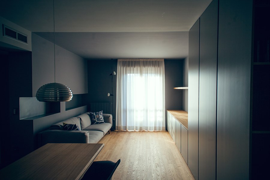
House#03 designed by Andrea Rubini architect is the result of a renovated 80 square meter apartment owned by a newly retired couple in Vigevano, a small city near Milan, Italy.
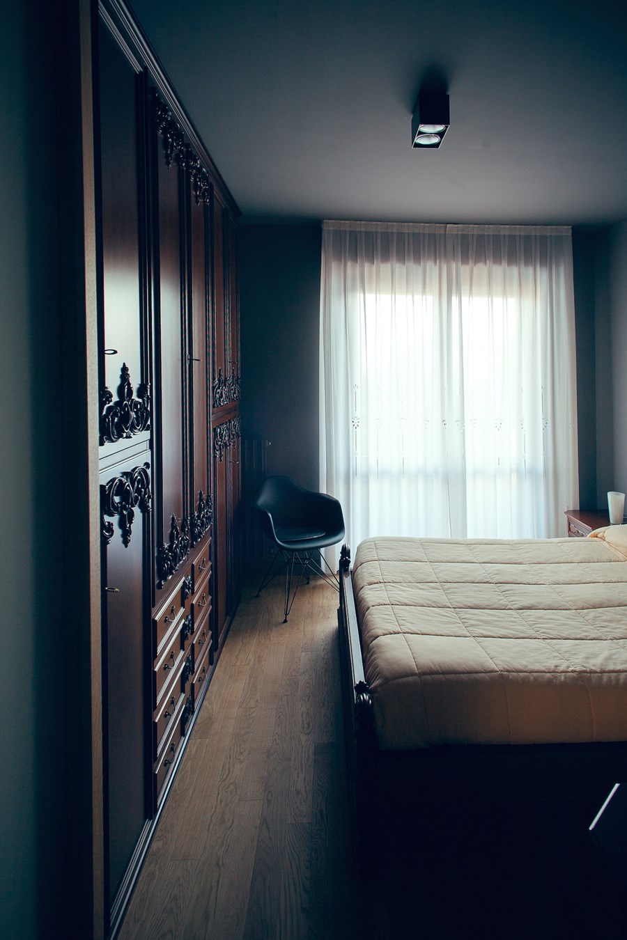
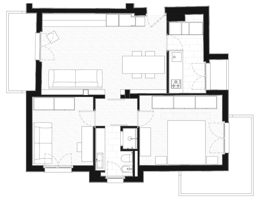
The house, built in the late ’80s under a project of affordable housing, has minimal spaces and no characteristic features. For this reason, the project includes a search for few higher quality materials and the redefinition of the living room to create a more generous space.
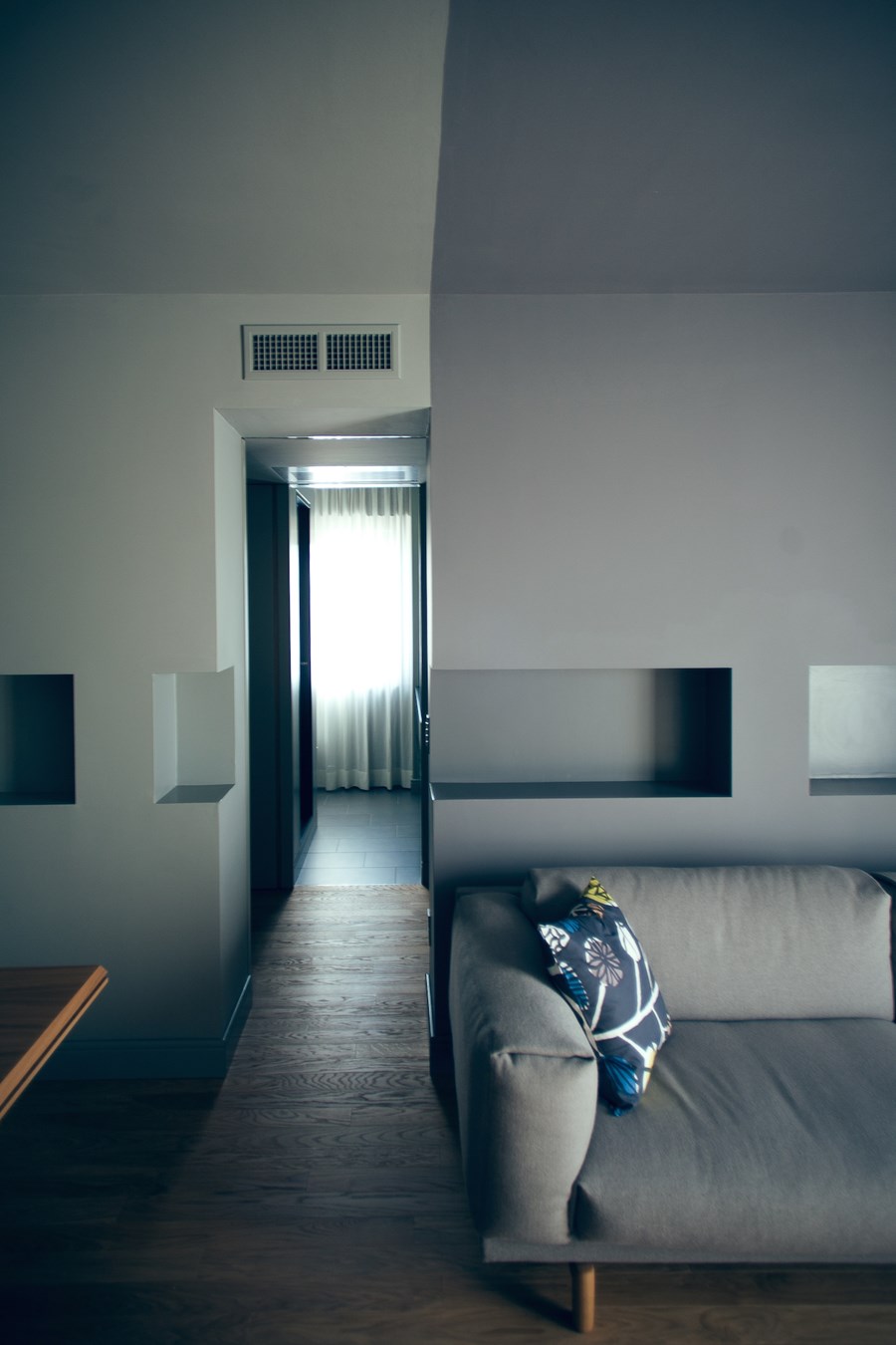
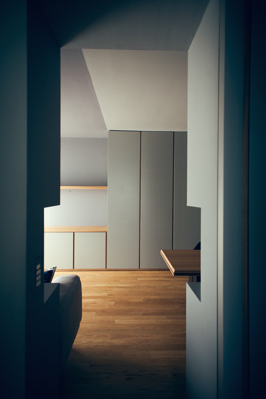
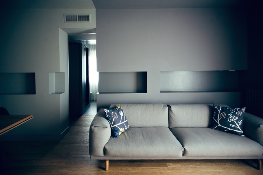
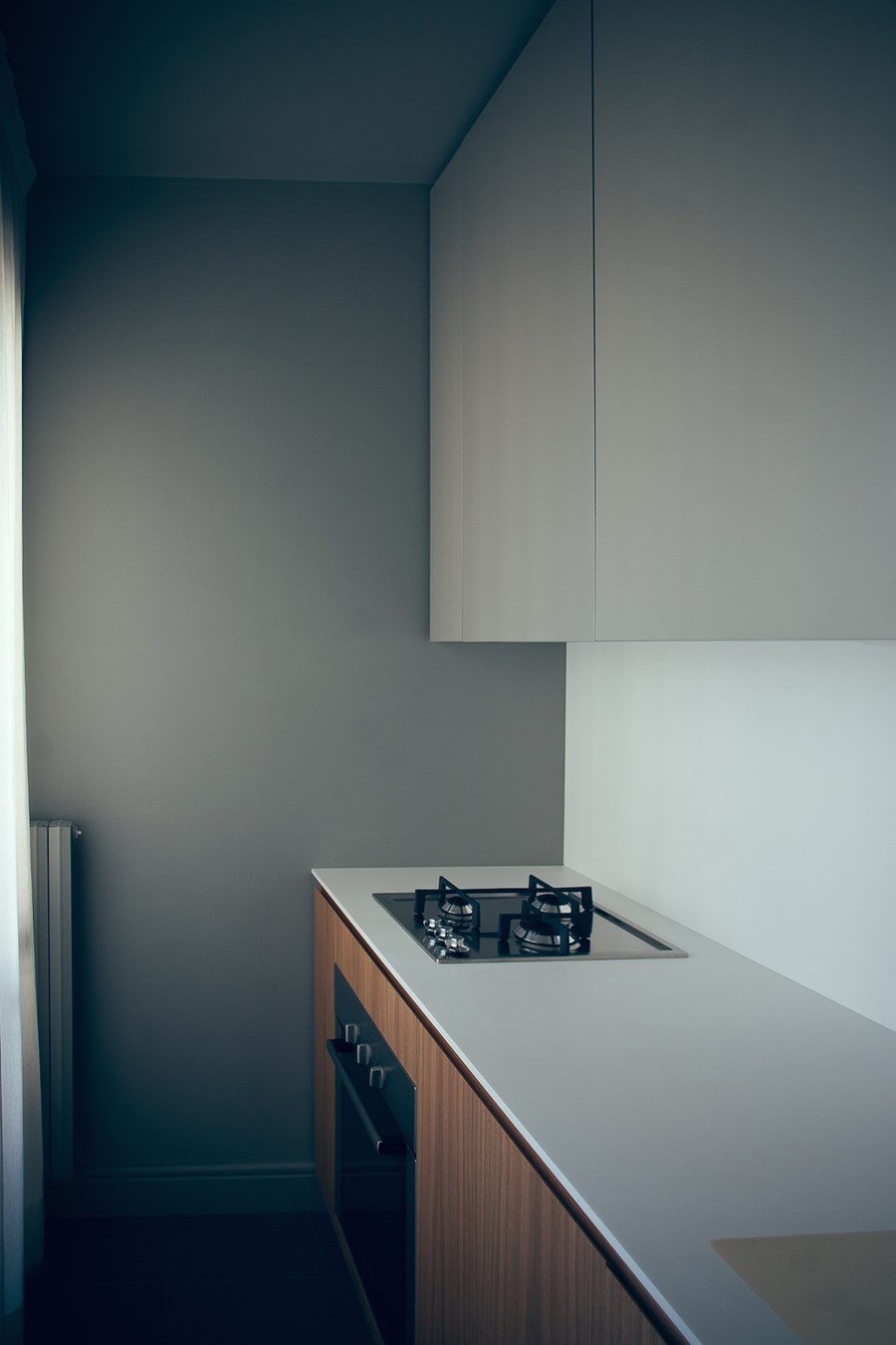
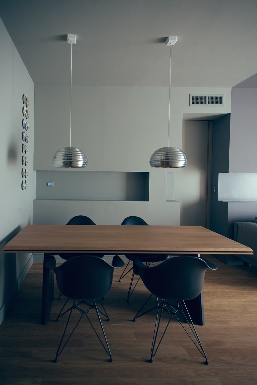
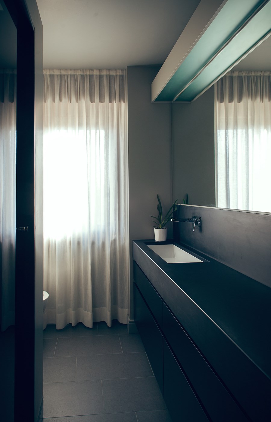
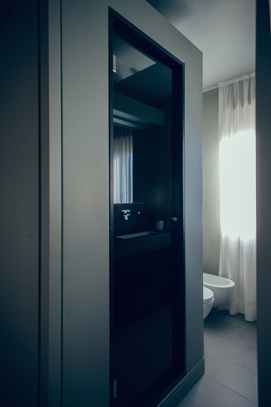
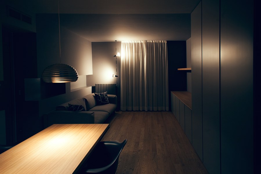
To increase the surface of the living area the existing kitchen had to be reduced into a service room consisting of a worktop and high volumes. The outcome is a long narrow living area that is divided into both dining and living room. You can almost feel a sense of separation when looking at the two-coloured walls and ceiling. Two shades of grey that give a greater sense of three-dimensionality. The sight is interrupted by a series of modular niches on the front wall. Despite being cut by a door these are a supporting element and perfect hiding spot for lighting. The bathroom and bedrooms didn’t undergo substantial changes, only a few swaps to higher quality materials like throughout the house. Oak replaced old ceramic floors and slate embraced the bathroom.
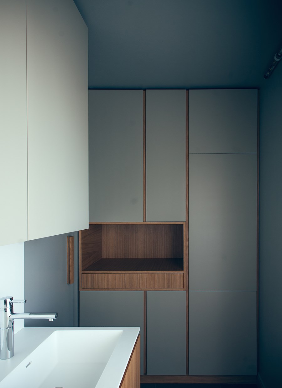
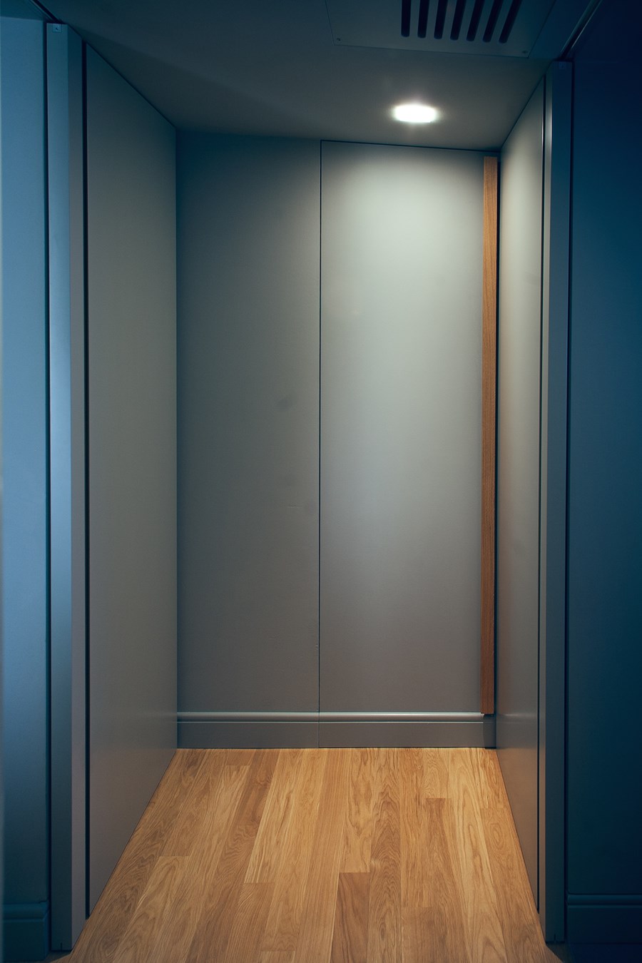
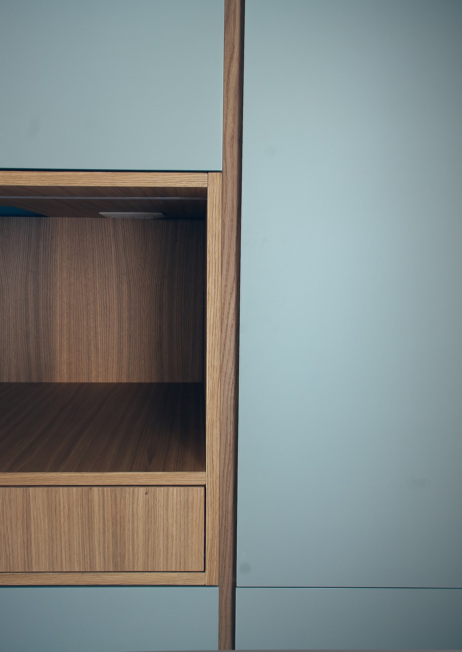
Furniture and doors are tailored to a mix of lacquered surfaces – the colour of the walls – and oak shutters.
The white hi-mac worktop wins over the oak furniture in the kitchen, whereas pantry and cabinets in the living area follow the opposite concept. Shutters, niches and surfaces become the precious parts of the project at the expense of the doors that blend in with the walls.
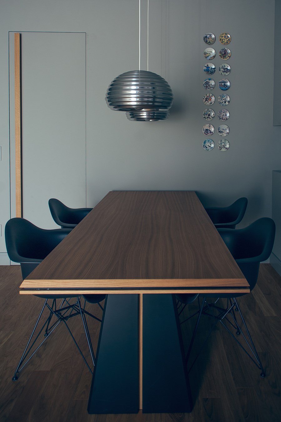
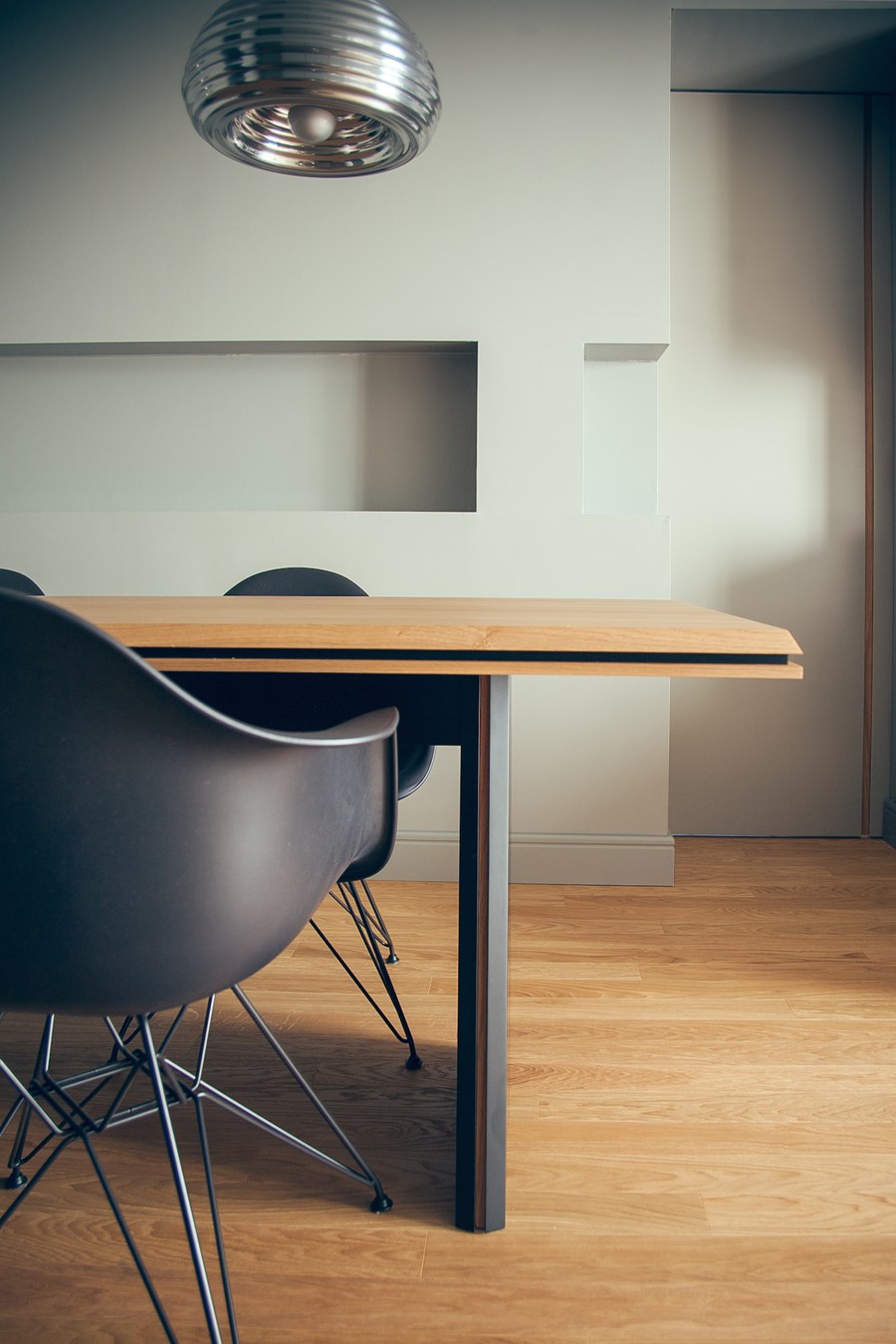
The table perfectly summarizes the contrast between materials, weights and shutters. In addition to the difference between essence and lacquered surfaces, you can easily spot materials of different thickness and a general softness granted by the slanting edges.
Doors can be divided in two categories: the sliding ones are characterised by an oak shutter serving as handle, the swing doors by a sculpture oak handle.
Photos by Andrea Rubini
