Between Madrid and Warsaw is a project designed by Anna Koszela. Warsaw’s Górny Mokotów is one of the most beautiful and climatic districts of the city. Full of greenery, intimate cafés and traces of the history of Warsaw, far from the typical soulless urban settlements.
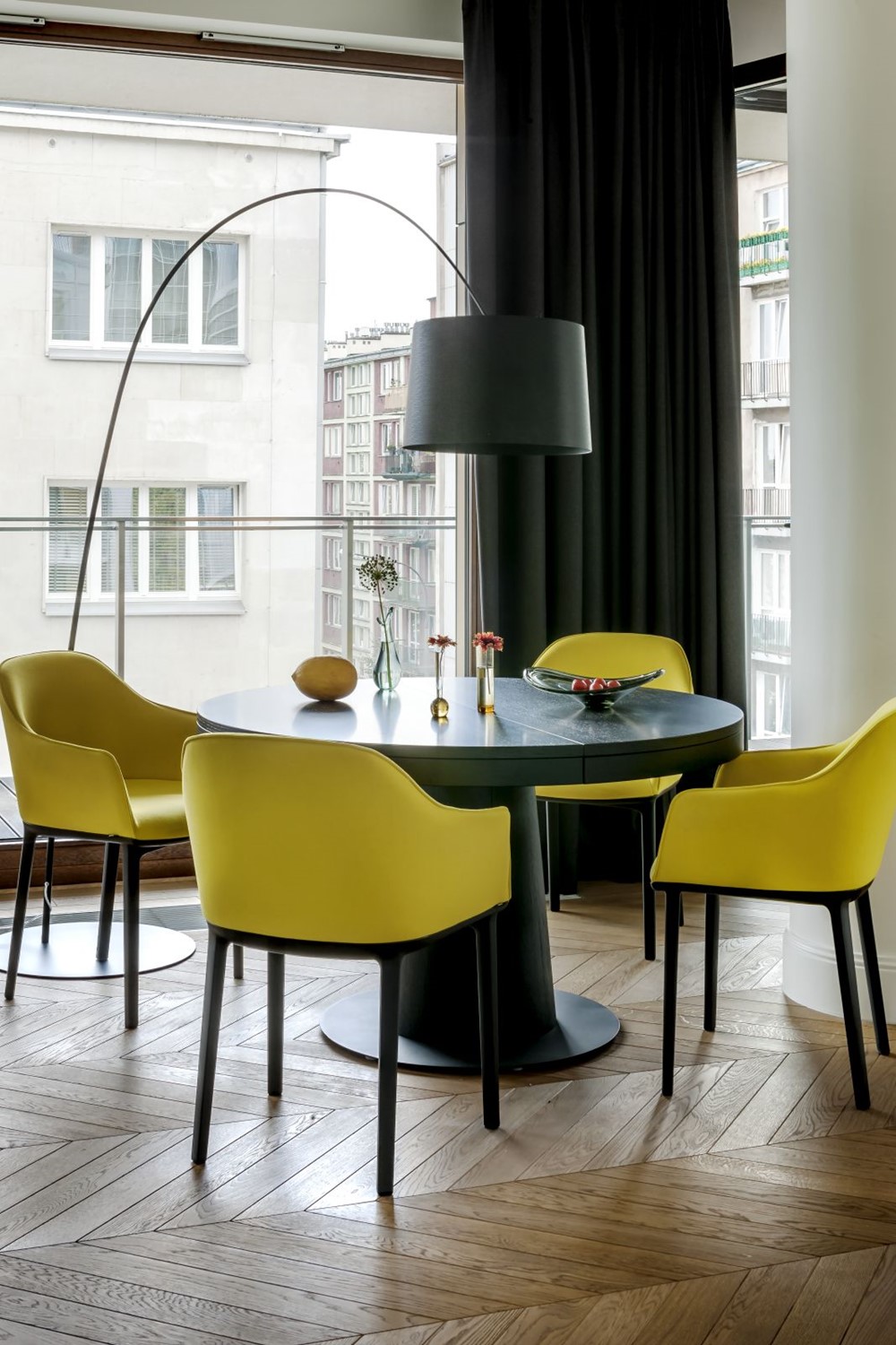
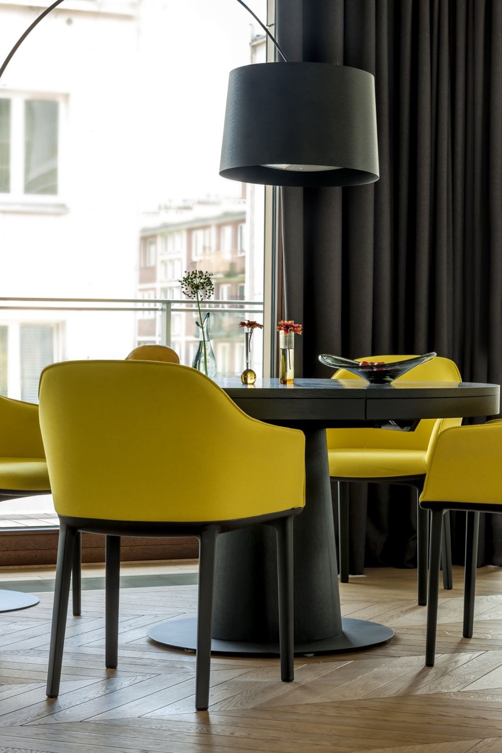

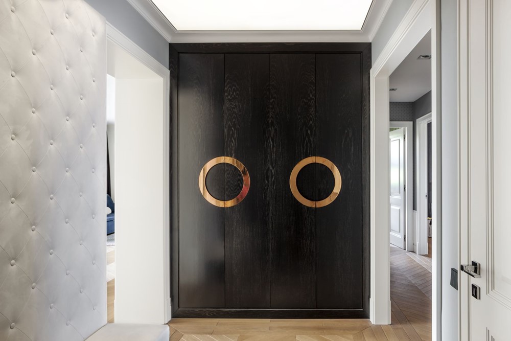

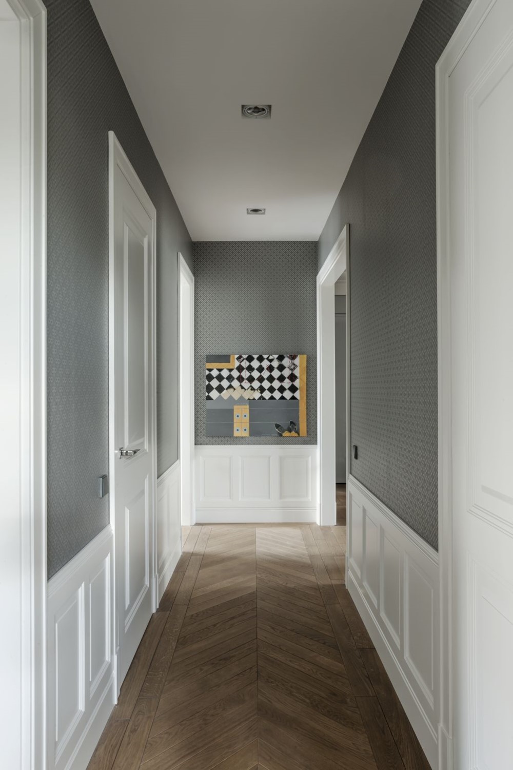

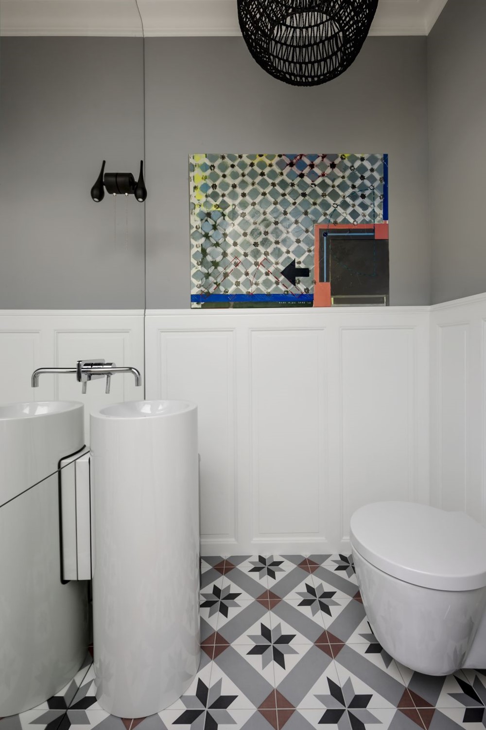
Here, life flows to the rhythm of social gatherings, outdoor concerts and interpenetrating modernity and tradition. Mokotów was the place of choice for Rafał, a lawyer for whom this part of city is a reminder of his beloved Madrid. He bought a spacious apartment, the design of which he entrusted to the well-known interior design studio of Anna Koszela (www.annakoszela.pl). He wanted the space to be stylish, but with a dash of imagination and Mediterranean cool to it. The work on the project lasted several months. To what effect? It is possible to say that the apartment, made to the design of Anna Koszela and Maria Widelak is an illustration of how to ideally combine the elegance, fresh energy and spirit of modernism. The interior is “tailor made” and the architects have taken care of the finest details, including decorative glass or plants. A lot of the decor elements have been specially designed for this apartment, so that it has the most personalized character possible. There was also the art, that is one of the hallmarks of the projects signed by Anna Koszela.
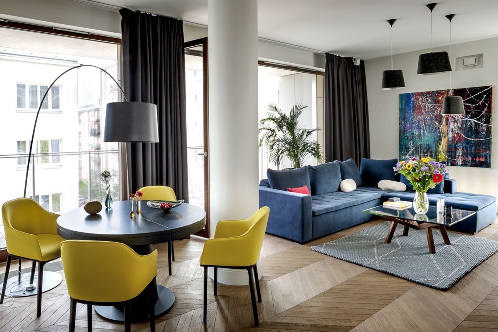
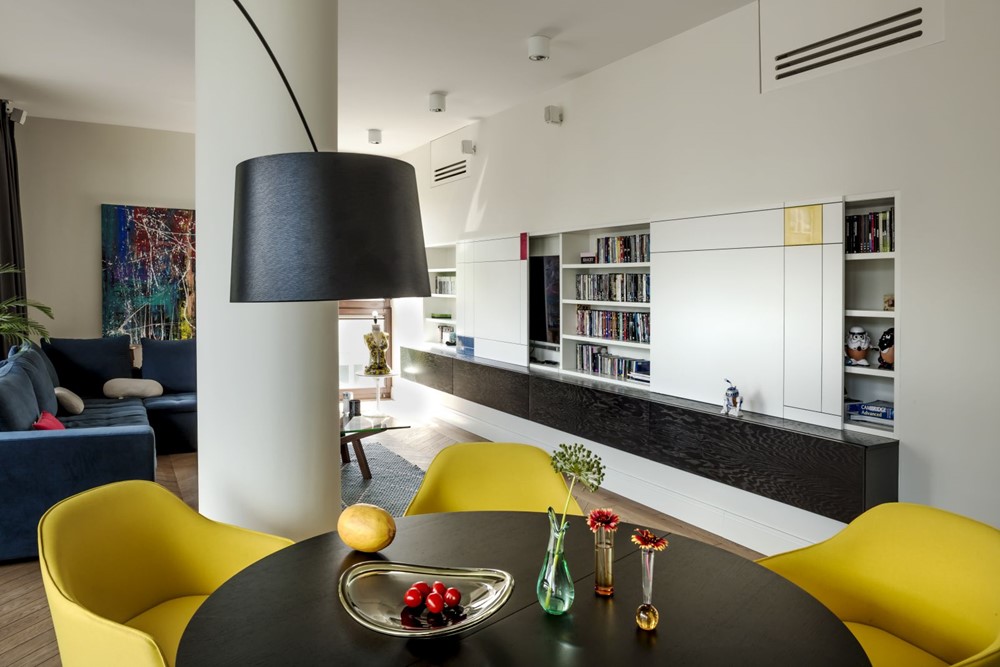
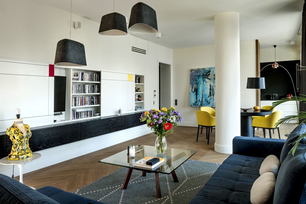
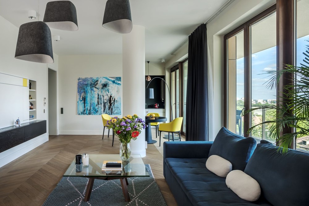
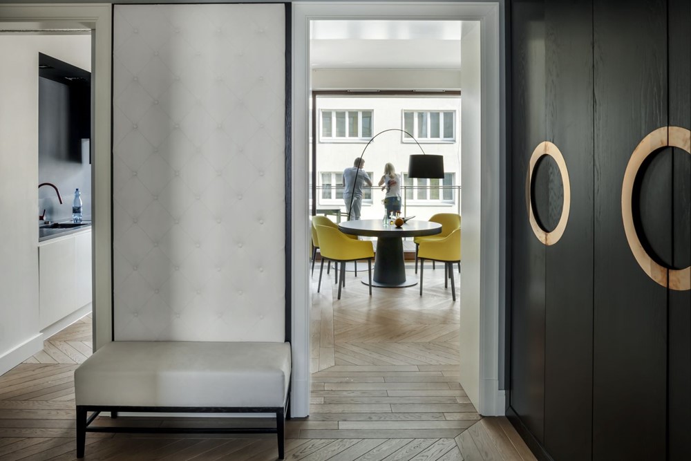
As expected by the owner, the apartment has an open layout. Division into individual functions is marked by discrete walls and the arrangement of floorboards. The interior consists of an elongated living room combined with a kitchen, a bedroom, two studies and two bathrooms. The strength of the interior is the unconventional combination of colors of different temperatures and saturation. The sunny living space is done in very energetic colors – cobalt and sunflower. Their mediums are the furniture, decorations, but also modern, abstract paintings, including “Abstraction 5” by Łukasz Stokowski (www.galeriaornament.com). Thanks to the varied colors and the large amount of daylight in the interior offers a friendly, artistic atmosphere. References to the tradition are visible in the beautiful oak parquet floor in Parisian herring-bone pattern. Coziness is lent by Felt Shede ceiling fixtures by Tom Dixon.
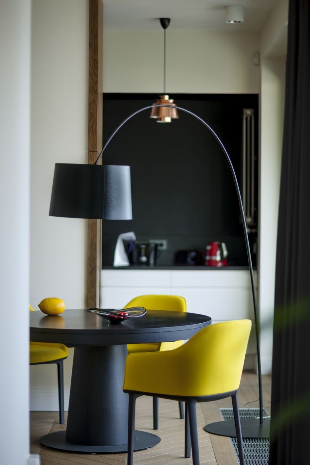
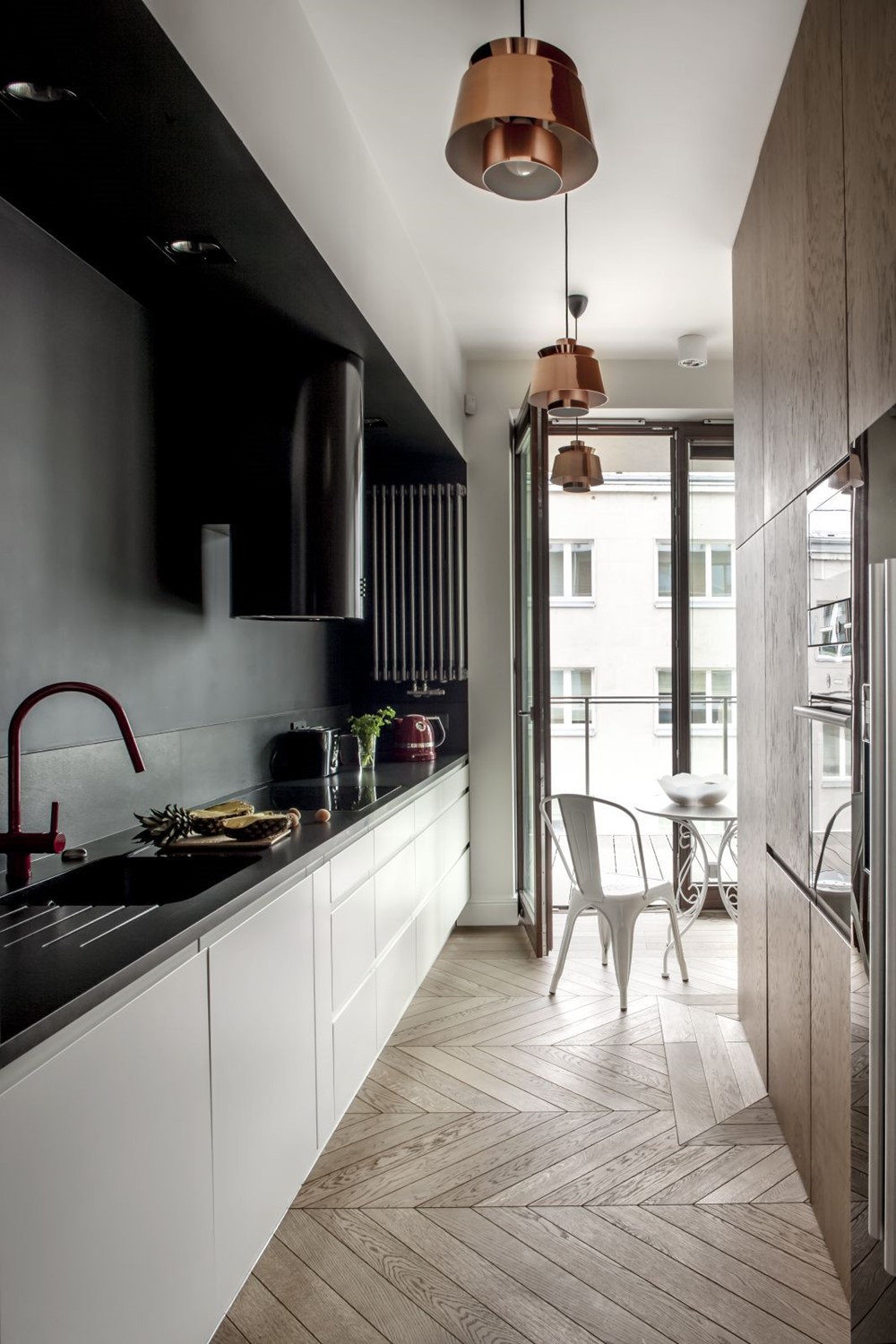
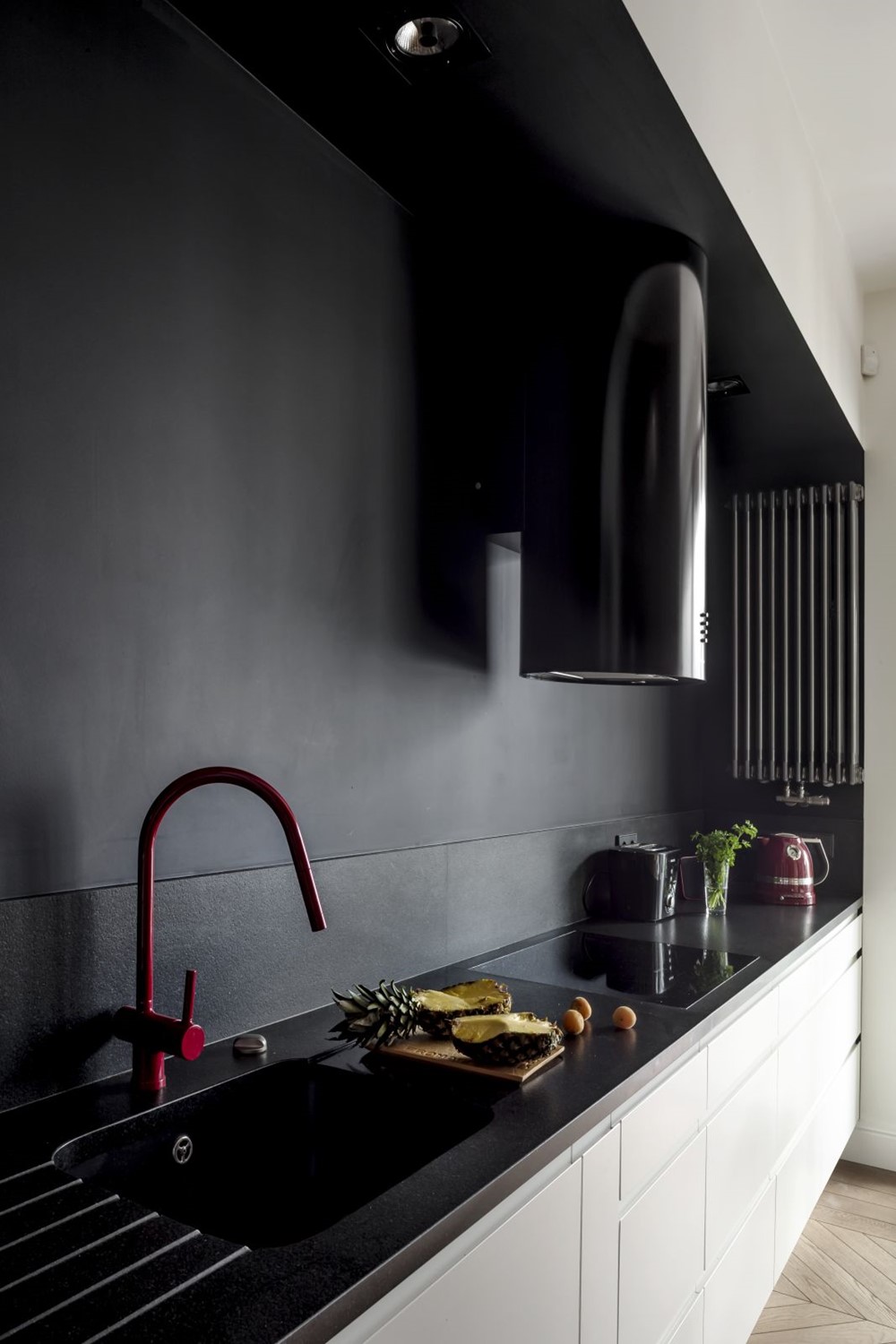
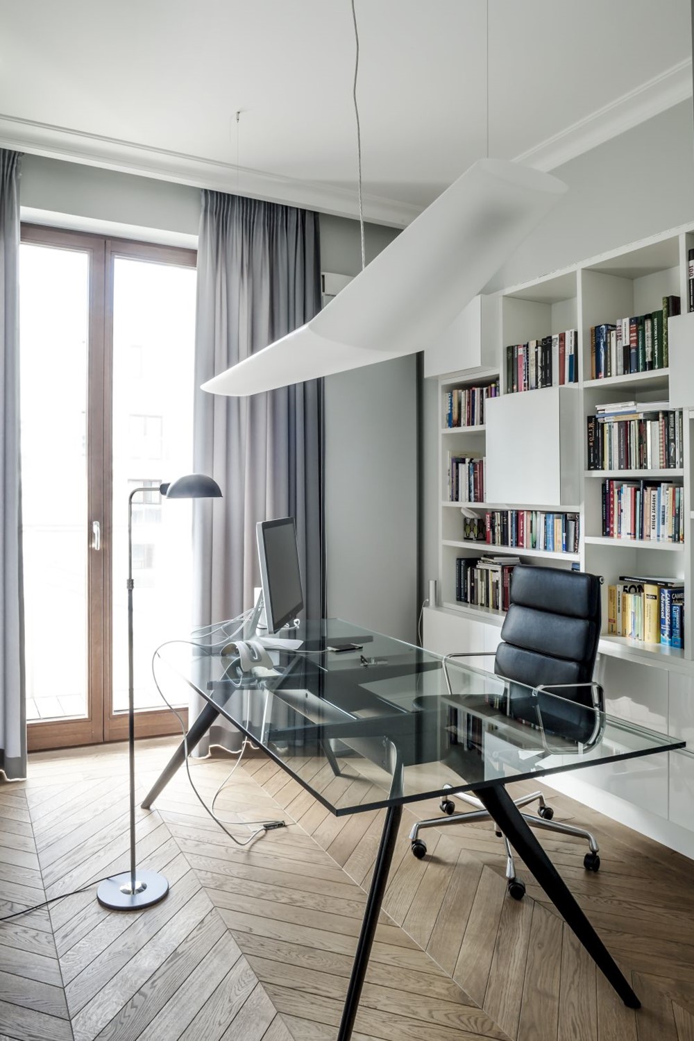
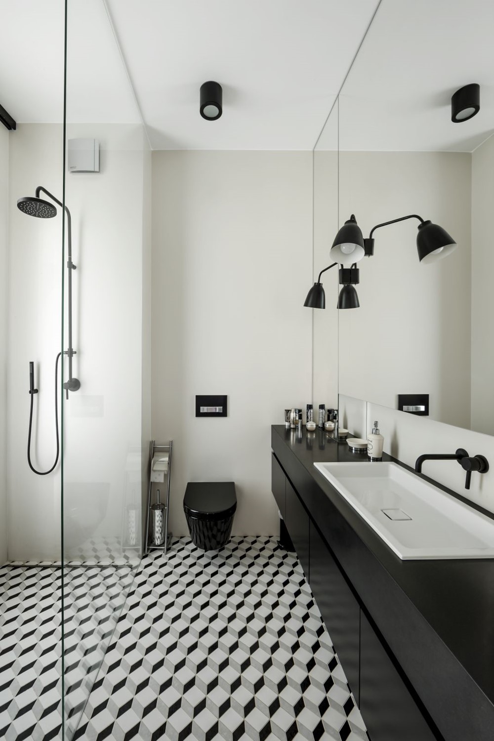
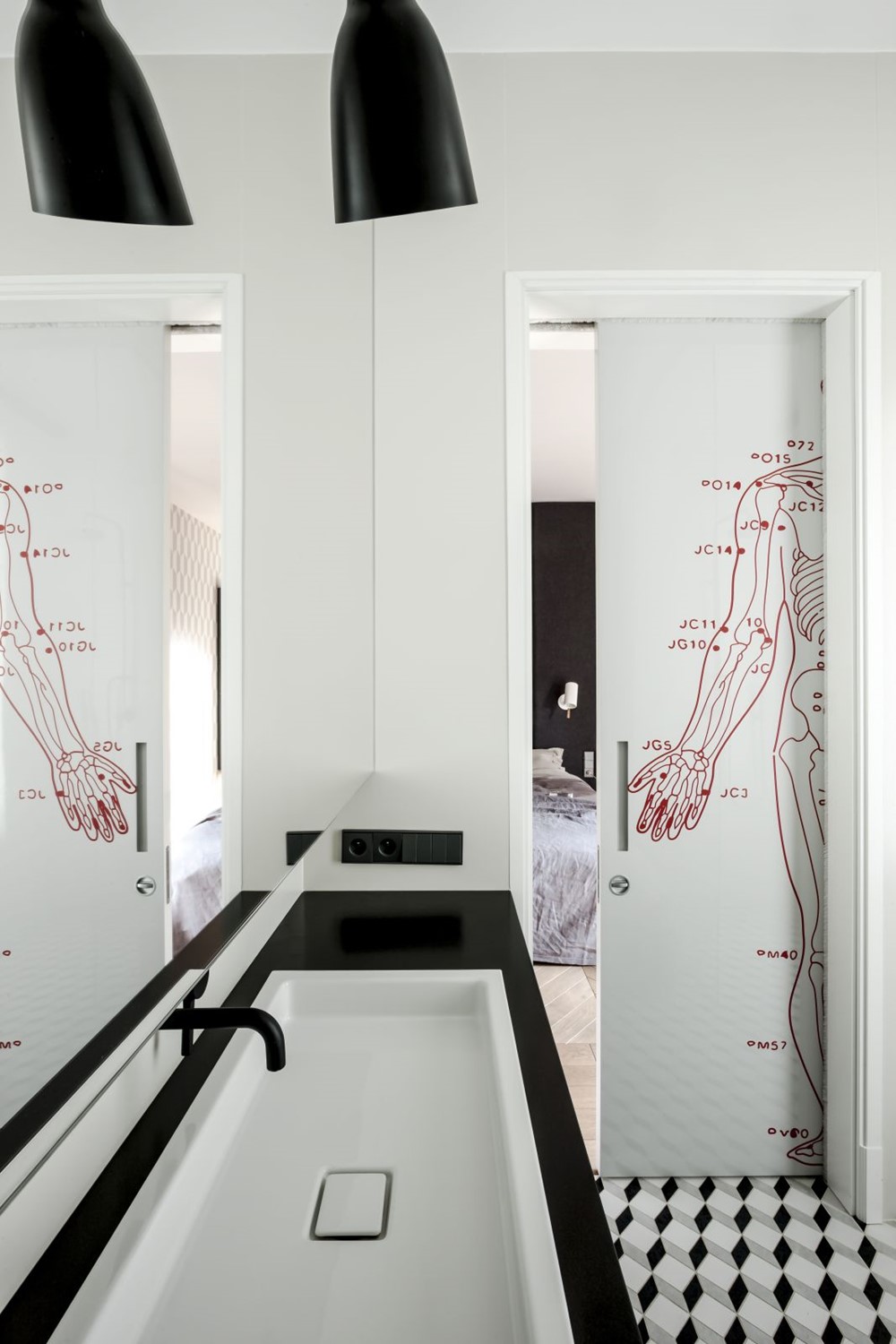
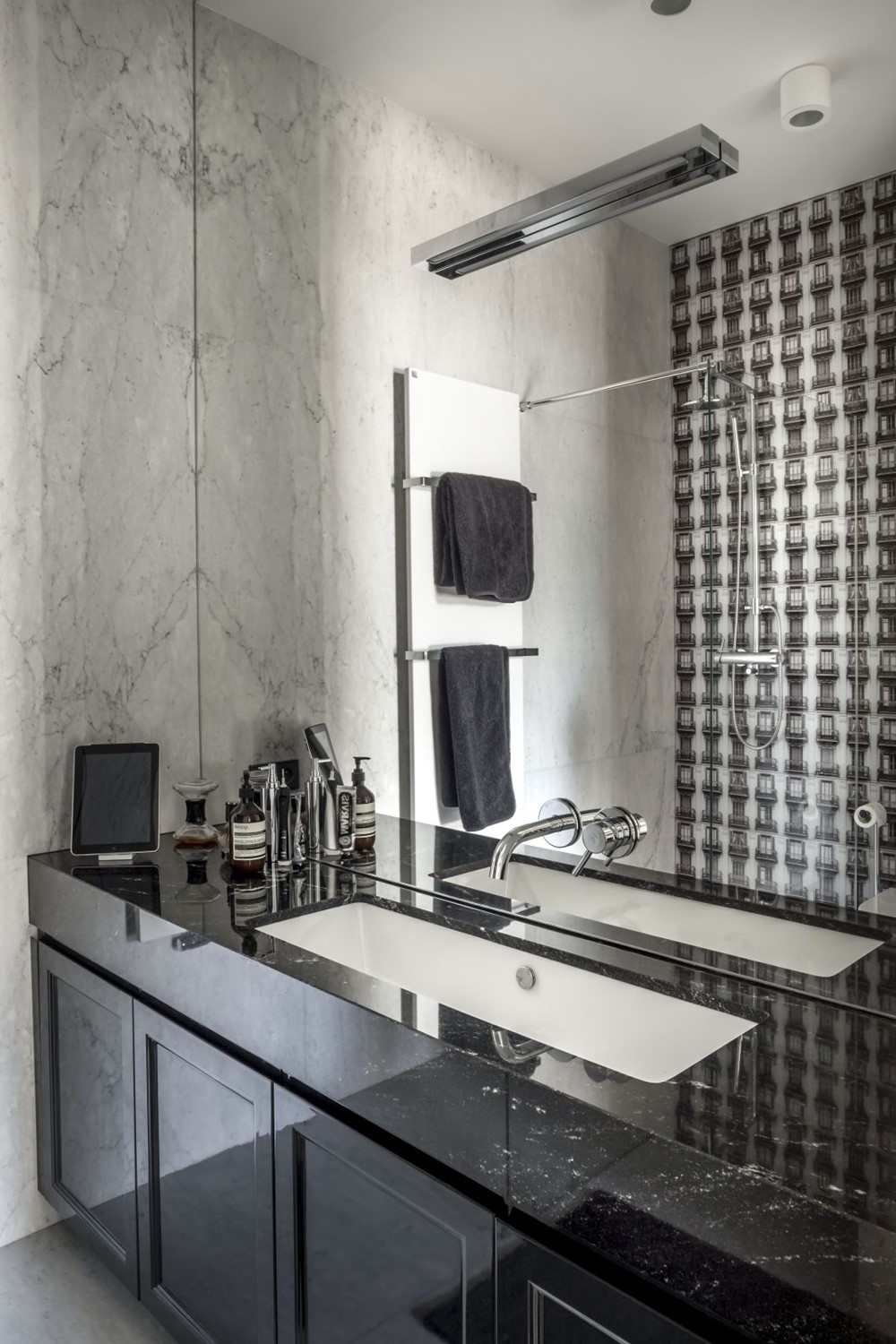
Aside from the color-strong living room, the other spaces are done mostly in black, gray and copper. The kitchen is also not entirely devoid of unconventional ideas, despite the first impressions. Note the red faucet, the steel radiator, Jørna Utzon’s Utzon Cooper (& Tradition) decorative lighting and Tolix Xavier Pauchard chairs. Anna Koszela had an original idea for the bedroom. It was divided into day and night sections, by means of a wool wall. Thanks to that there was no need to install a door and the night part, despite having no windows, is well illuminated. The bathroom is dominated by a timeless duo of black and white. The sliding door is adorned by an amazing graphic by Maria Widelak, depicting the energy map of the human body. Bathroom tiles from the Barcelona collection, designed by Maciej Zień, correspond very well with the spatial motif on the Cole & Son wallpaper, covering the walls of the bedroom. The window of one of the studies opens to the north, so the designers applied a lighting trick: light forms, lots of white and transparent “invisible” materials. The glass desk T-NO.1 (Fritz Hansen) is completed by an Aluminum Group Executive chair, designed by the Eames duo.
Photography by Rafal Lipski
