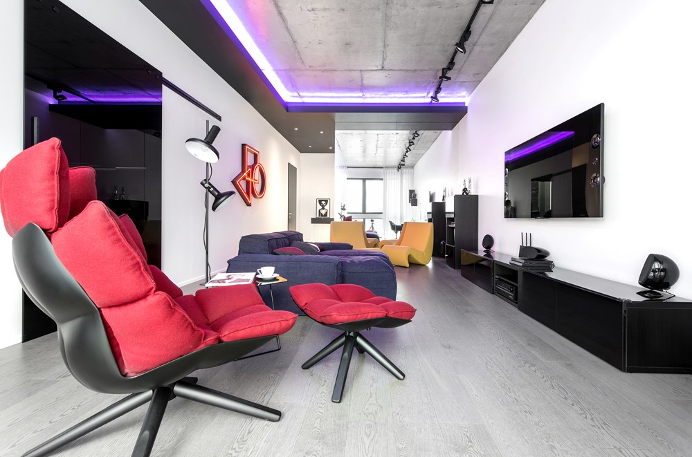
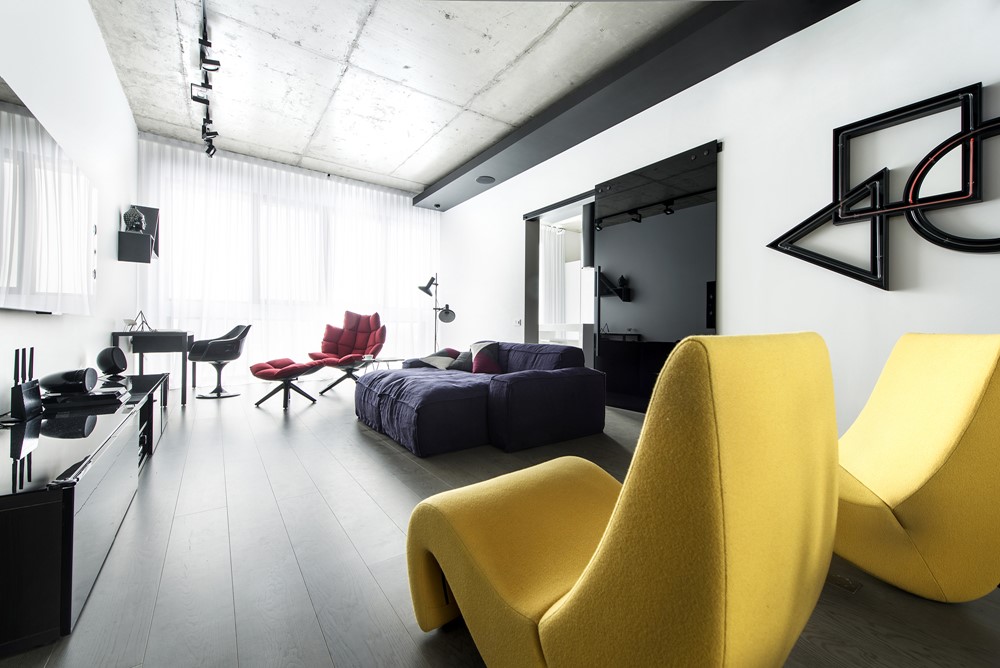
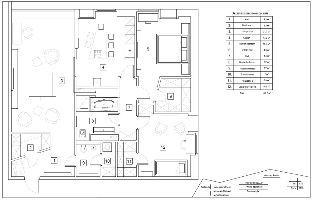
The game of contrasts is a project designed by Geometrix, covers an area of 117 sqm and is located in Moscow, Russia.
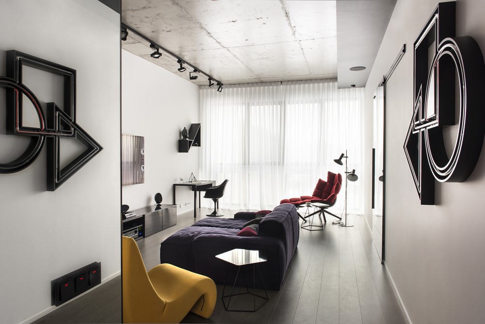
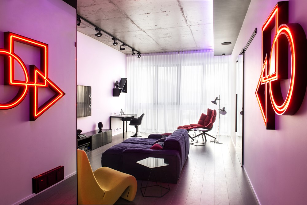
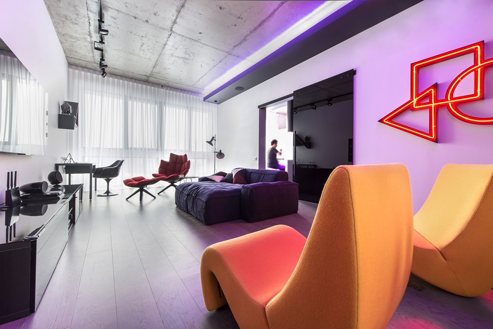
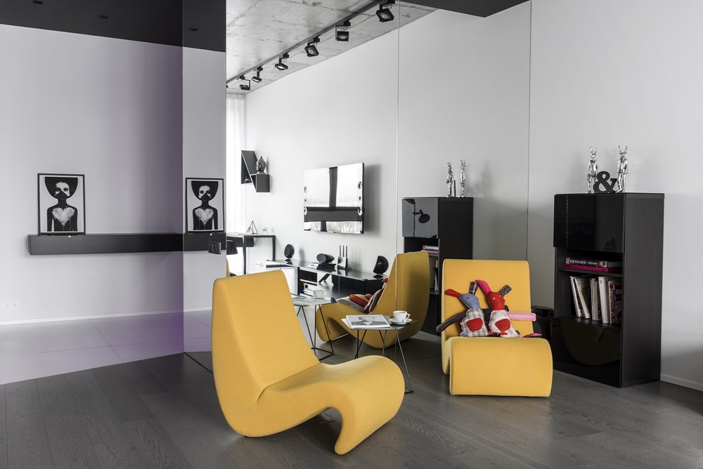

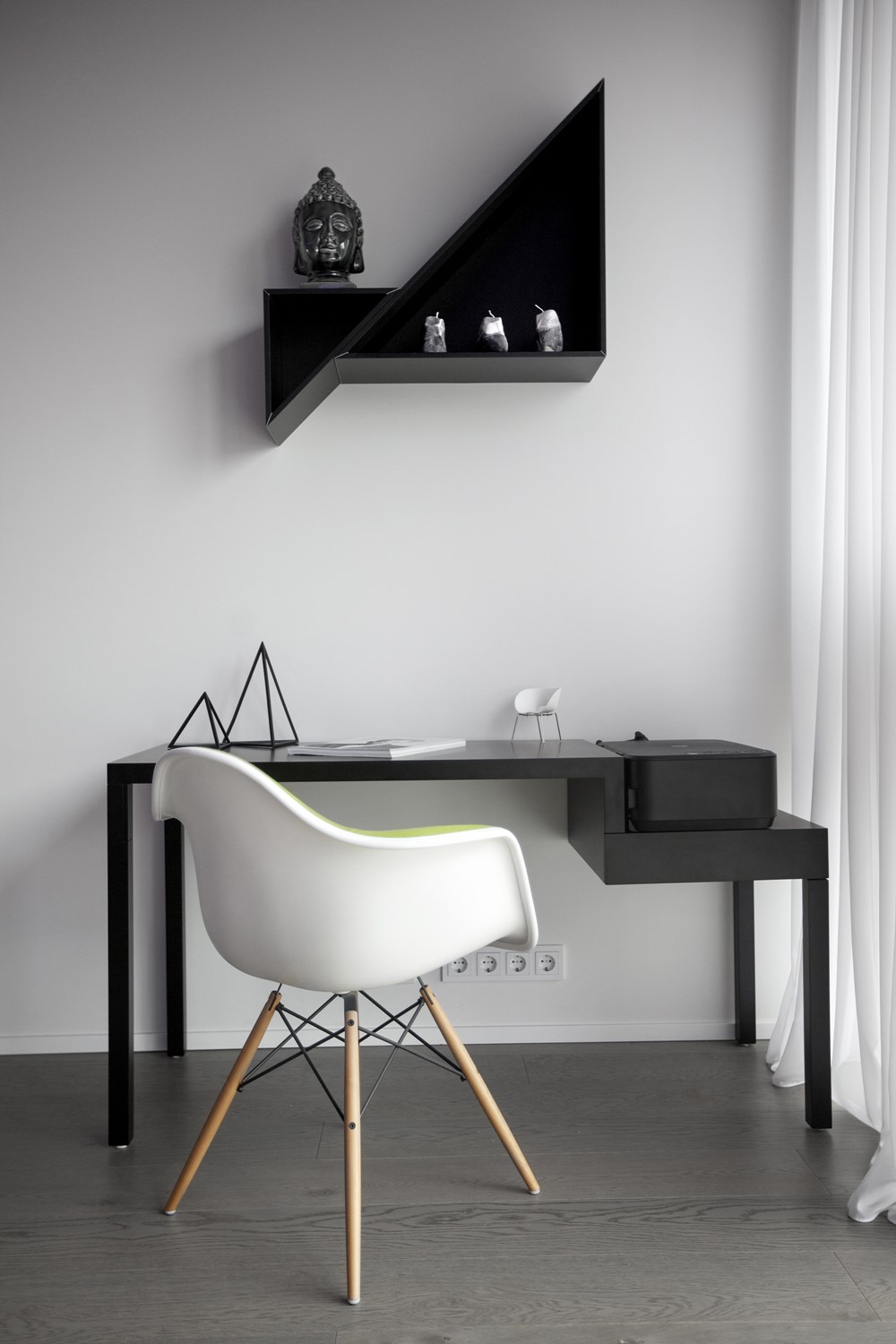
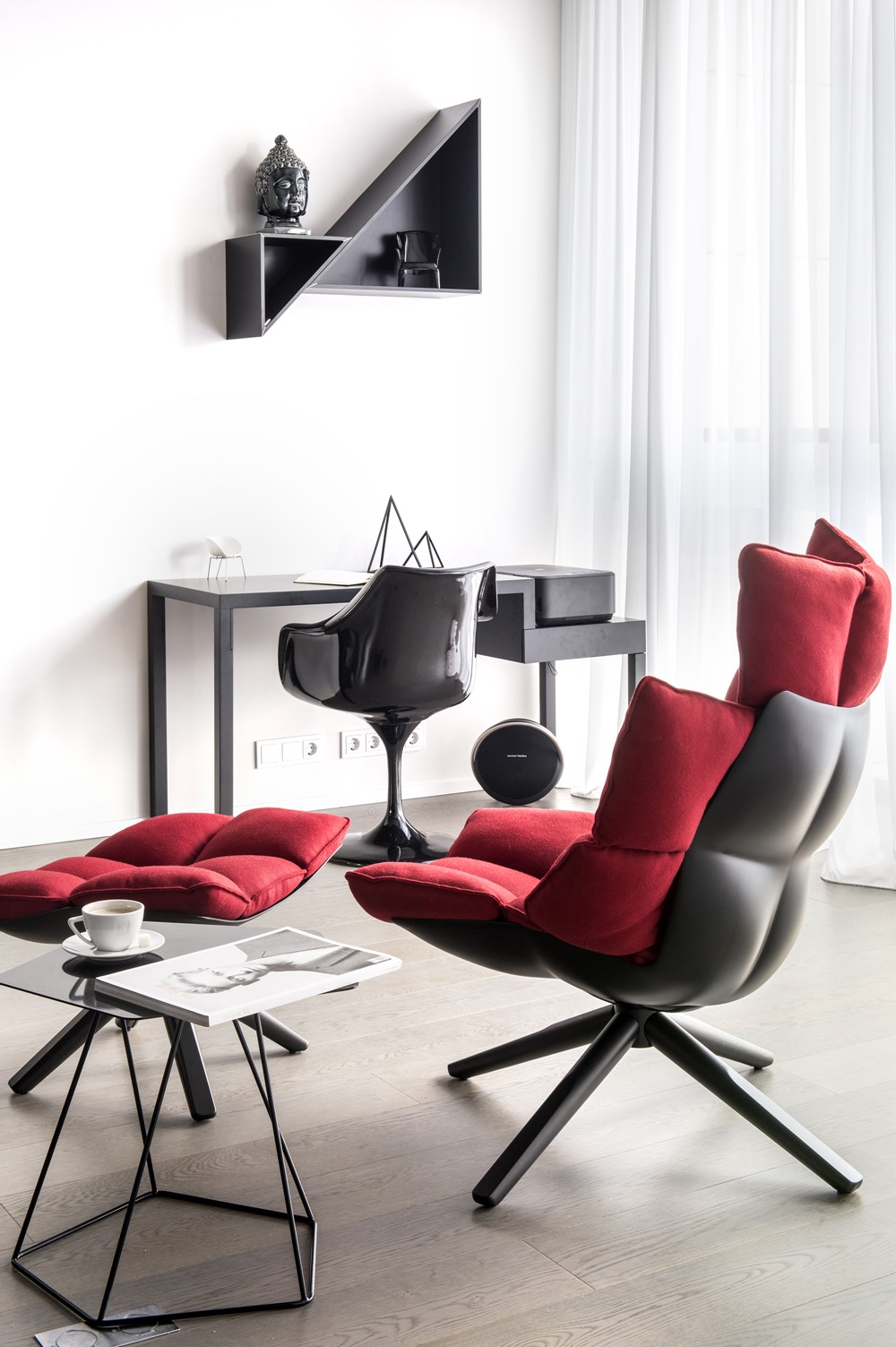


“There is only one problem there when you make renovation of your own place: you are not limited and may do whatever you want. In the long view, it sounds great. But it’s important to be certain in what you want to see more: an audacious color layout, or something brutal, or an unusual architecture and materials combination, or everything listed… For a designer, an apartment is a ground for actualization of what most clients are not ready to see in their place. We like monochrome colors, concrete, nice and comfortable furniture, effects of light and nonstandard space arrangement. These are the ingredients for the ideal ‘design cocktail’, and here we come to a brutal interior with some ironic accents.
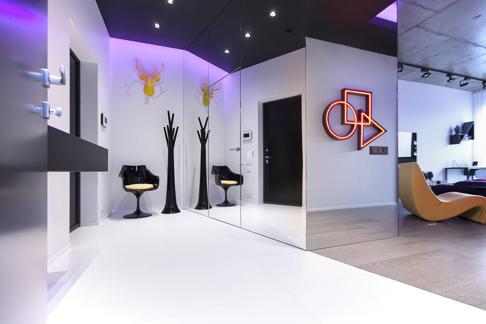
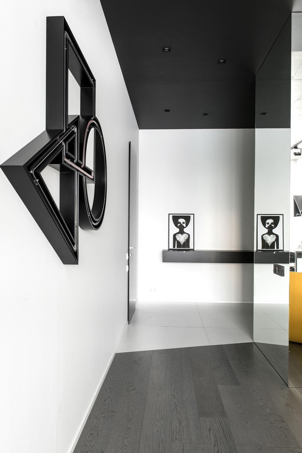
As the background is monochromic, we got an opportunity for us to put an emphasis on furniture and light effects. The ante-room zone is separated with a living room by a mirror three-dimensional structure which includes a wardrobe, and the mirrors allowed us to visually save (or even widen) the volume of the living room and disguise another room.
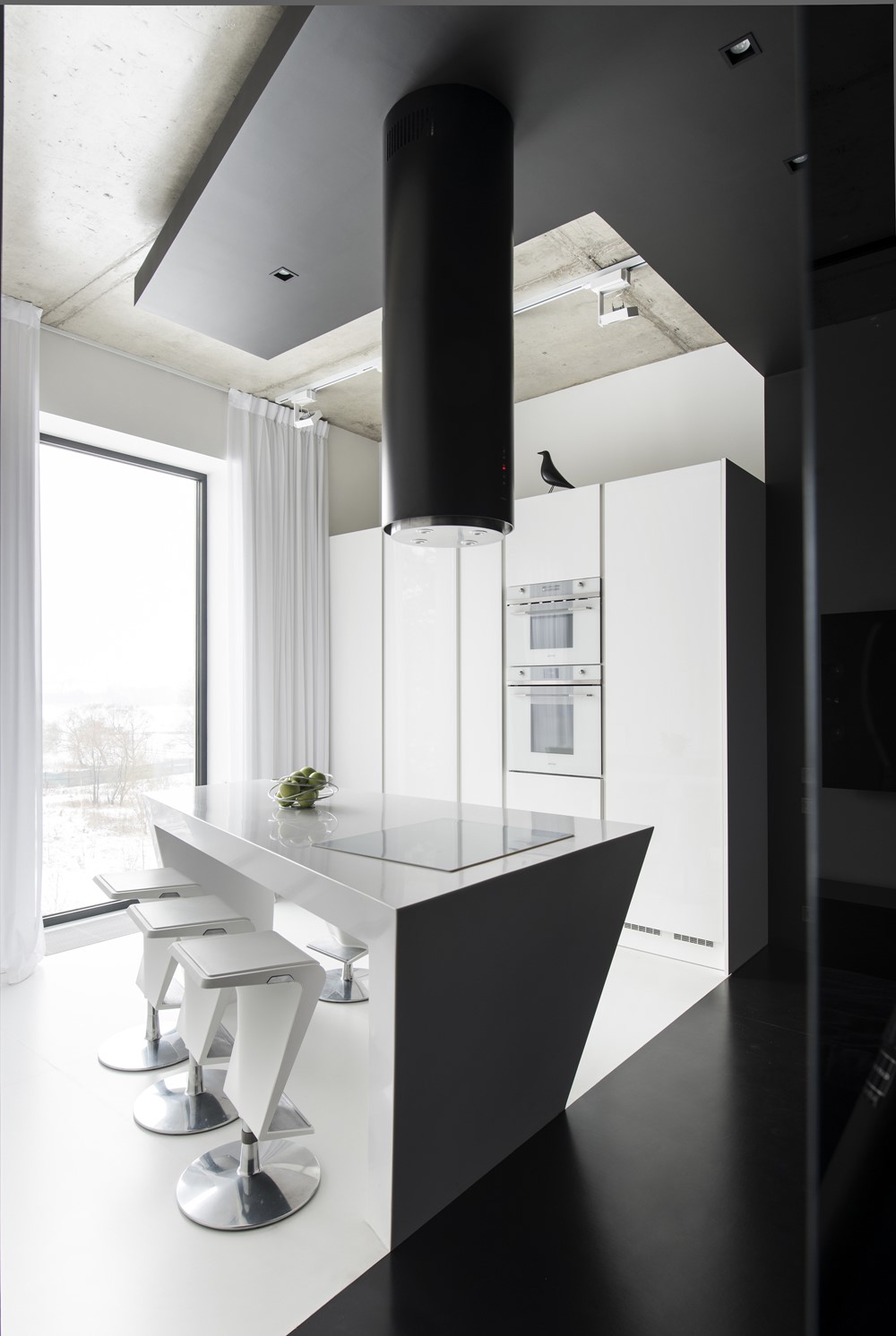
The living room is designed and decorated with contrasting materials and colors: brutal concrete and mild hue of oak wood, monochrome and bright ironic color accents of the furniture. There is no standard white ceiling in the apartment, we did it different way: we made the ceiling concrete and painted the downdrops deep graphite. The built-in ceiling lighting softens this contrast and allows us to change the mood of the interior, and the track spotlight system of the basic lighting emphasizes the brutality of the ceiling.
On the wall, there is a neon luminaire of our own design: each geometric figure symbolizes a member of our family.
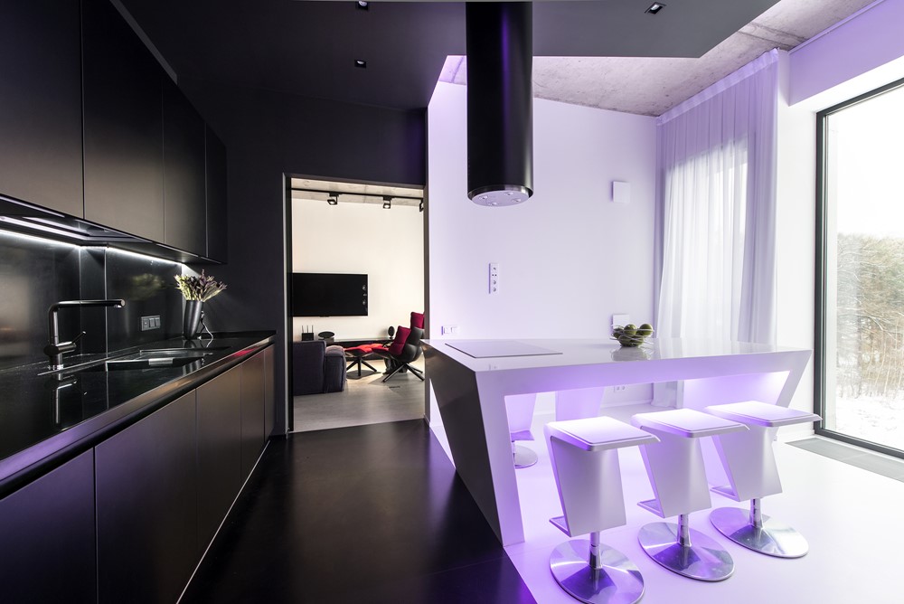
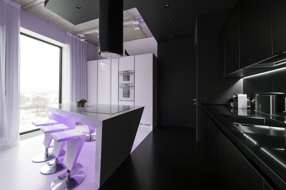
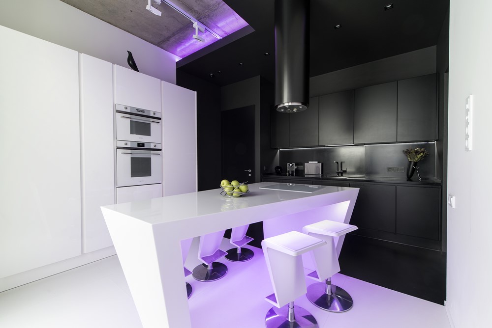
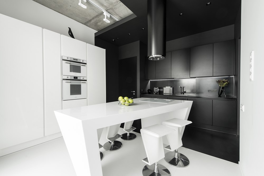
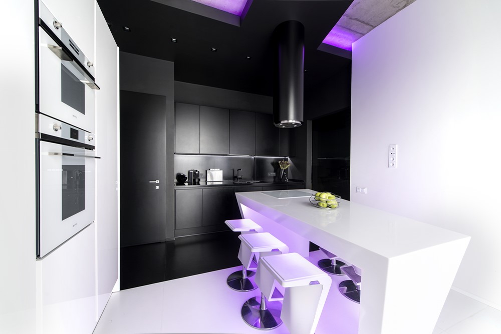
The kitchen is distinctly separated into two zones by contrasting colors: the tabletop space and wall-hanging cupboards are merged into the black zone, and the white zone is devoted to the bar counter, made to our own design, and columns.
There are as many lighting scenarios here: soft built-in ceiling lighting, rgb-lighting of the bar counter, lighting of the tabletop space, track spotlight system, and a soft lighting from wall-mounted light.
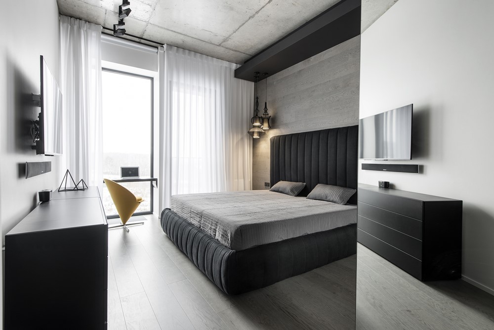
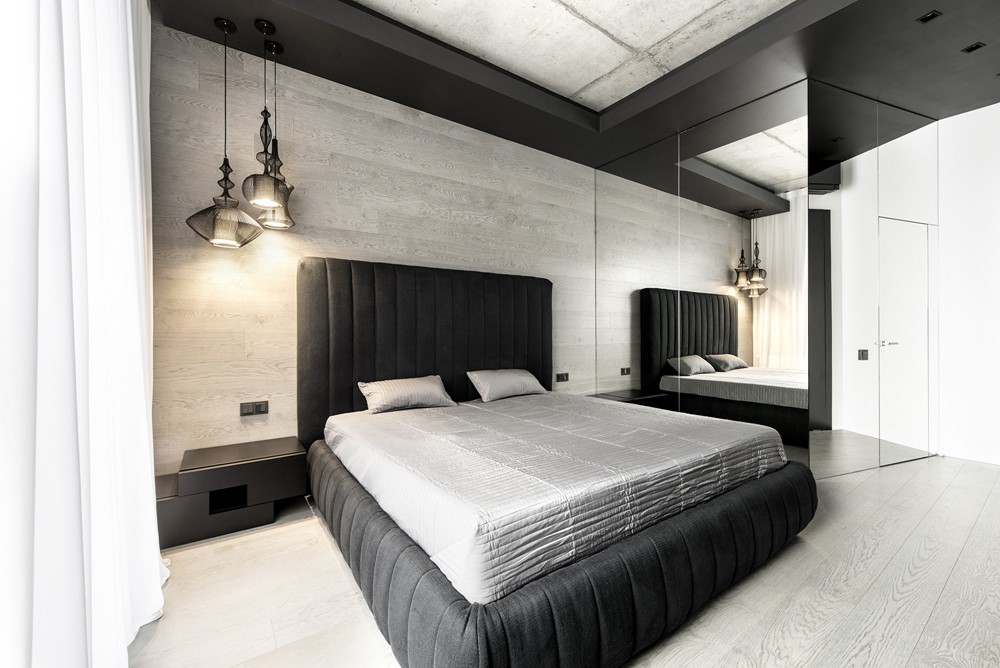
Also, the door is hidden here in the black zone that leads to a private part of the apartment. Behind it, there is a bedroom, a nursery, and a toilet. In the bedroom, the contrast is used too: concrete is combined with oak wood on the wall, a high bed back and soft light of suspended luminaires make the room cozy, and the mirror three-dimensional structure hides a wardrobe.
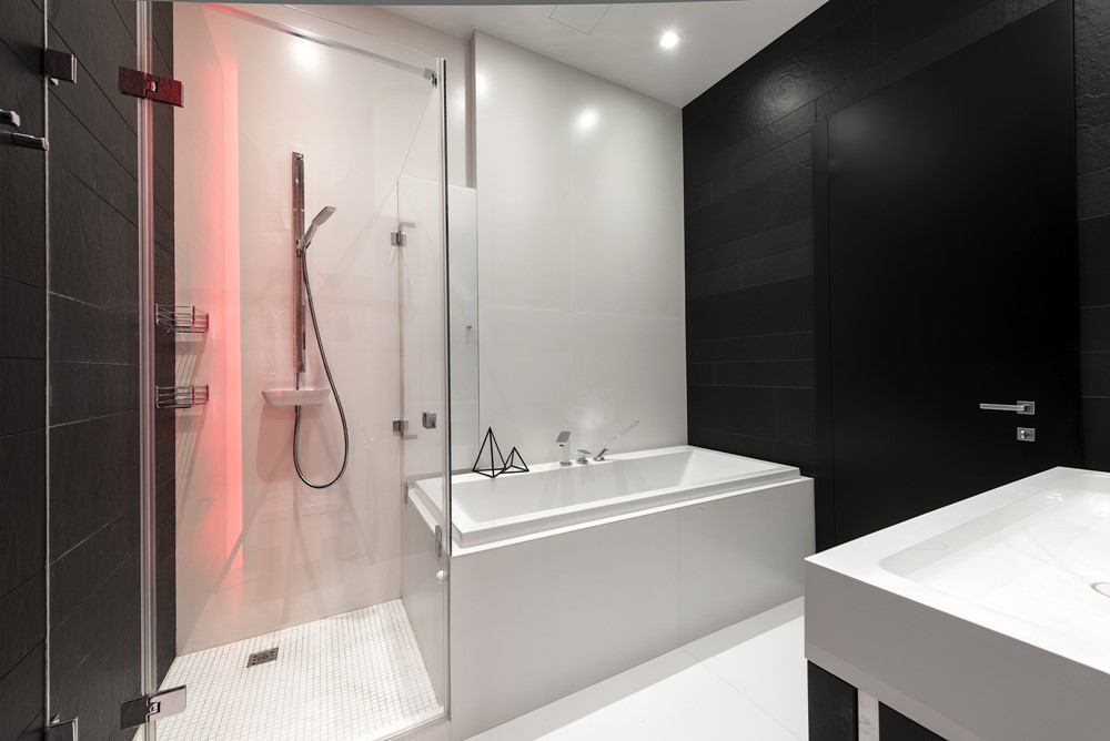
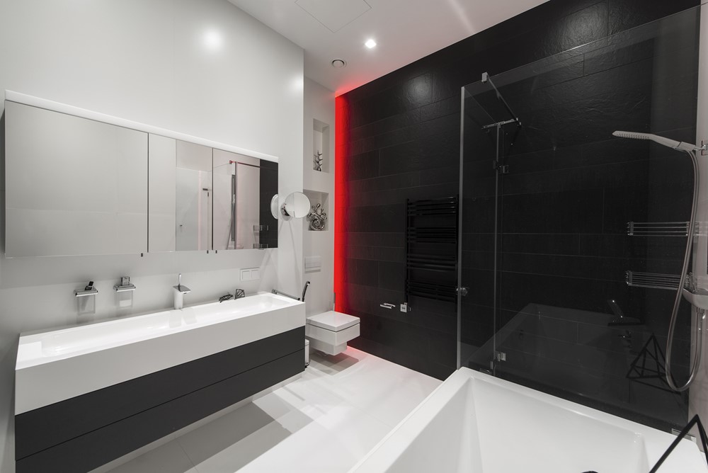
The main toilet is decorated in austere black and white; here, white ceramic granite combines with slate-like tiles. Surprisingly, the guest toilet is rather ironic: on one of the walls, there is wallpaper depicting a collage of photos by a scandalous photographer David LaChapelle, that you can look upon endlessly, and the other walls are decorated with soft eco-leather panels. It’s just we like to amaze!”
Photography by Alexandr Kamachkin
