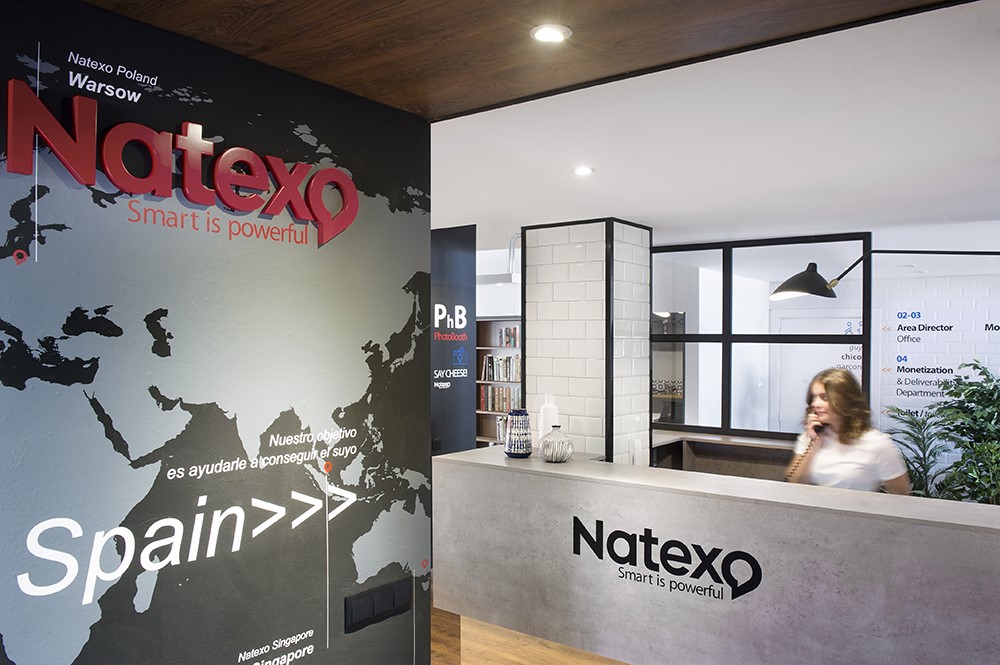
A More Domestic Branding by Egue y Seta. Ever since Google Headquarters’ bold office space design hit the media, the idea that corporative spaces were a lot more than mere rows of desks and chairs behind a front desk and waiting area became an indisputable fact. Nevertheless, turning your office space into a playground for professional adults isn’t something that necessarily has to match every company´s DNA or renovation budget. Photography by Vicugo Foto.





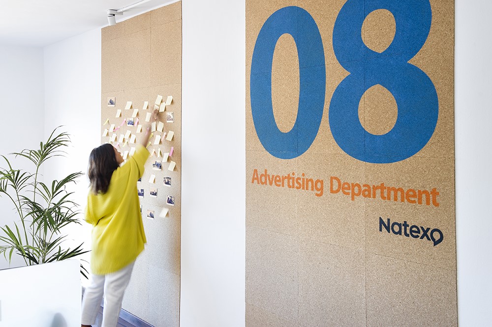
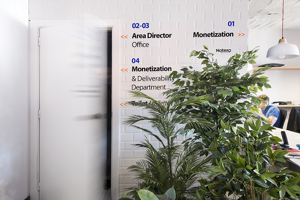
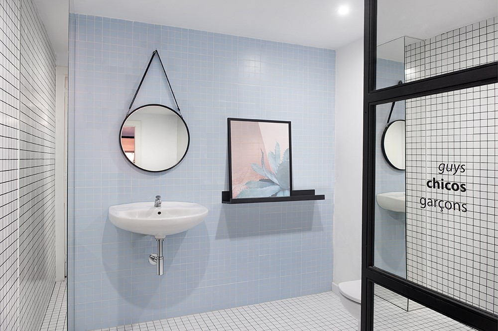
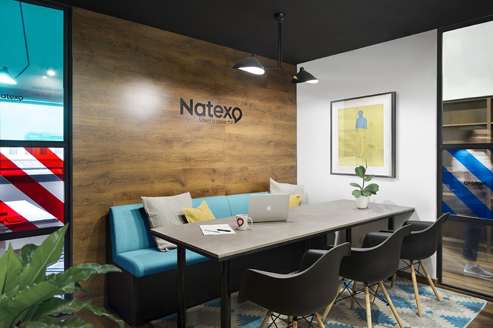

For those corporative clients wanting to make a comprehensive branding of their workspace without overdoing the playground theme that was set up as the trend to follow by all Silicon Valley tech start-ups, there is still a path to follow that allows for the premises to effectively convey brand values with a direct and warm approach borrowed from the domestic realm rather than filling up the space with video arcades, massage armchairs or sports equipment. That, precisely, has been the direction Egue y Seta design studio has wanted to take along with their French based direct mailing client, Natexo, when commissioned for the renovation of their Spanish main hub located in Barcelona, exactly where the glamorous Eixample neighbourhood meets the ever-trendy Barrio de Gracia.
Cheating on the Natexo “red” over white (or vice versa) design guideline was an intentional move intended to allow the incorporation of all the repertoire of hues and textures commonly present in homelier or less formal interior design schemes. A strategy that makes possible for us to see the traditional corporative branding systems, usually combining logotypes, slogans and wayfinding signs running over wood, cement, tile or crystal indistinctively, offering all their original colouring and texture as a contrasting background opposing the flatness and solidity of dye cut vinyl lettering. The colour palette employed in this interior design scheme wasn´t limited by the brand´s style manual but guided towards the inclusion of a wide range of complementary shades and real textures that bring greater depth, tactile richness and some sense of authenticity to the renovated environment.
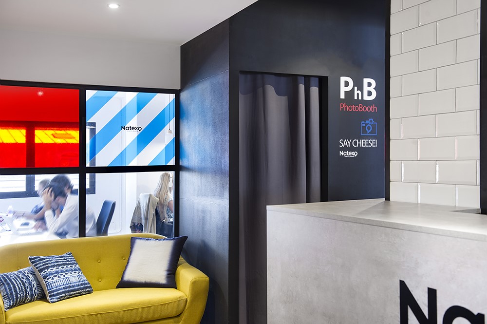
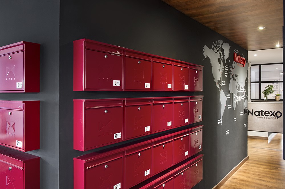
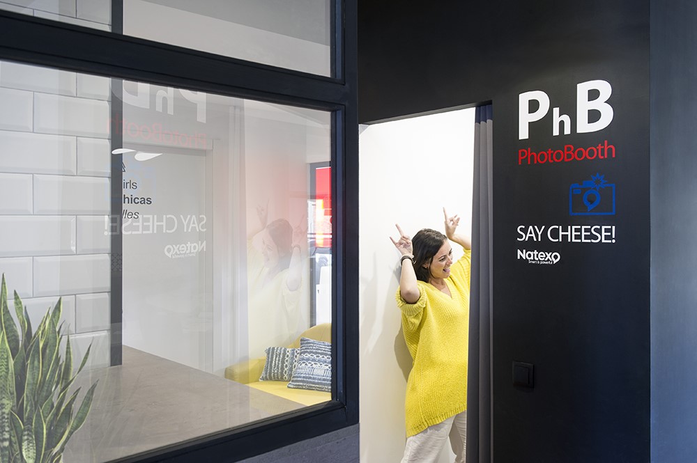
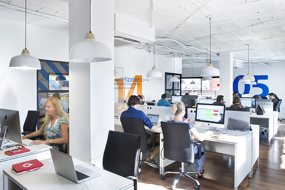
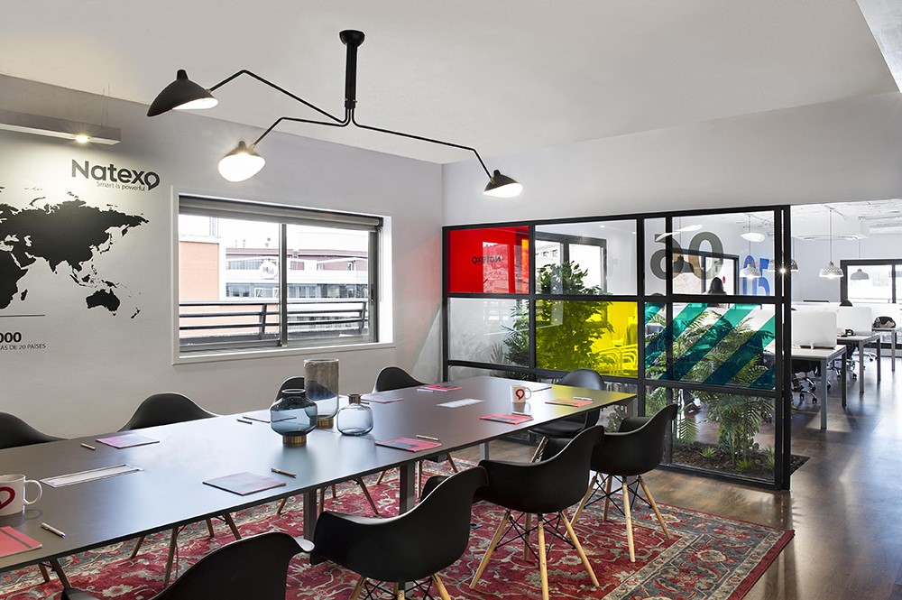
Instead of making employees work over common tables and fancy chairs not designed for such purpose, for Natexo we opted to establish a dialogue between the ergonomic features of modern office furniture and the warm unique personality of decorative objects found in hotel and restaurant space design. Therefore, we can see the typical pair of white desk and black chair, surrounded, framed or “spiced up” by open shelves filled with unrelated (to business) books, whimsy decorative objects; accent lighting pieces, colourful high resistance rugs, graphic pattern upholstered sofa´s and cushions; cork or blackboard paint finished walls that allow ever-changing messages; personal, bright red, wall mounted employee mail boxes; a company world branch locator map and a whole lot of other decorative details that make this Spanish headquarters outstand among other more traditional office spaces. ¿or can anyone honestly say, having a digital photo-booth at the office is customary everywhere?
Not all of the differentiating strategy, however, has fallen upon décor. Lay-out wise, to be precise, that total openness that has been set as a standard for the less hierarchy-driven office structures, it’s been here, somehow, reinterpreted, towards the inclusion of partitions that allow some seclusion, privacy and acoustic comfort where needed. Namely, meeting rooms and a number of conveniently located “refuges”, adjacent to every main work station hub. These individual or common use refuges rather than encouraging sports playing or game, offer themselves as the perfect spots for resting or working in private and their seclusion, necessarily requiring vertical soundproofed partitions, has been resolved through colourful stained-glass effect and black joinery glass walls that manage to frame the view over interior gardens that bring a sense of exteriority and freshness to the whole. Their venetian blinds, always in charge of controlling the light and heat input of Barcelona´s ever present sun.
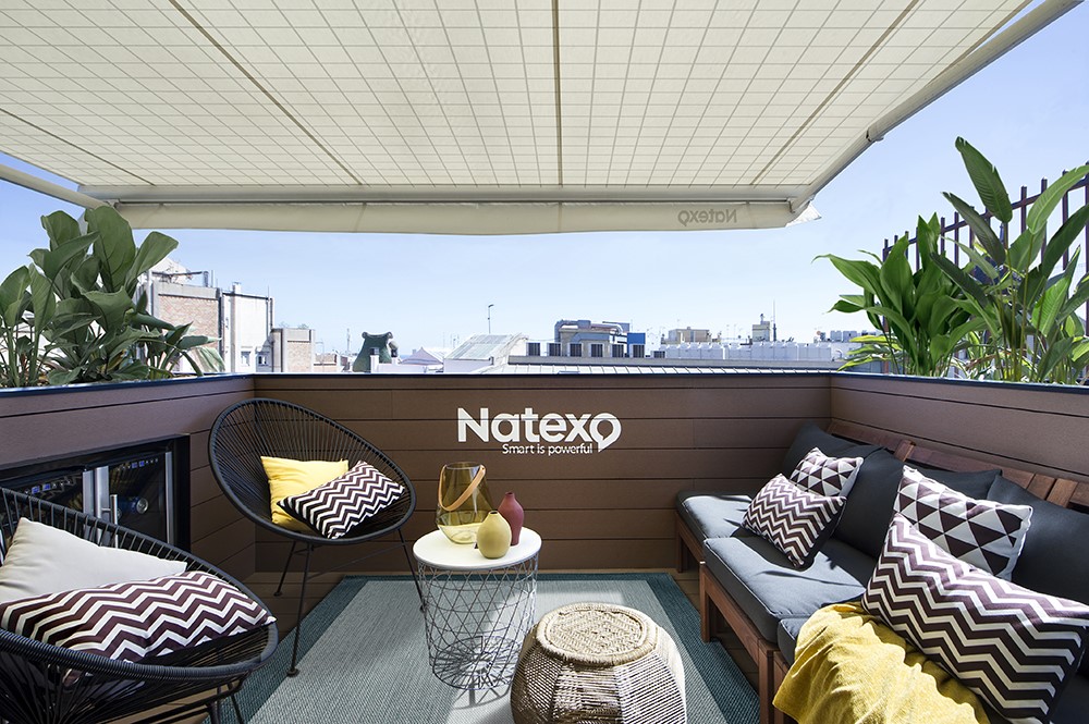
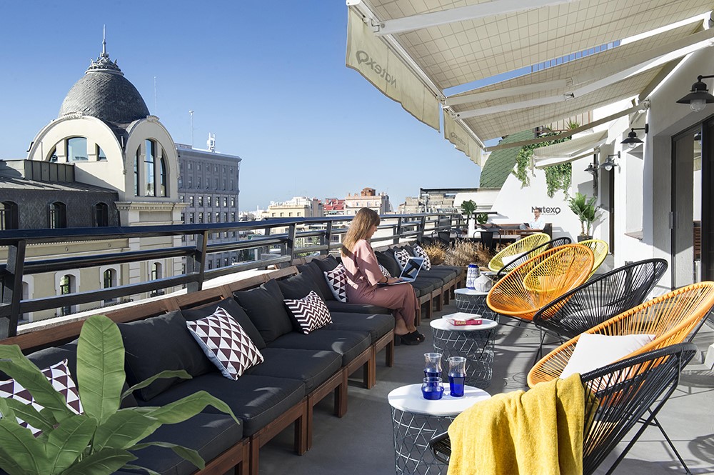
Revolving around the staircase, elevators and common services module, the indoor areas of Natexo´s offices lay themselves adjacent to a surrounding terrace that has been turned into a generously sized outdoor meeting room; as a series of roofless working stations looking over Barcelona´s skyline; and, at the same time, and according to need, as an area that can be transformed into (in this case, yes!) a decidedly recreational space, that includes ping-pong tables, video arcades, a bar, kitchen dining facility with beverages and popcorn vending machines and other service installations.
