Wine Cave is a project designed by McGregor Westlake Architecture in 2017, covers an area of 50 m2 and is located in Sydney, Australia.


“Conceptual Framework:
The site lies under an Edwardian mansion, which also had a pre-war bomb shelter put under it’s front lawn. Rectification of these pre-war works, due to poor underpinning and water issues was well underway when we came to the project. The client working directly with a builder and engineer wanted to renovate and repurpose the space, intending at that point to clad the underpinning in some kind of matching rusticated cladding. We, Gobsmacked by the sheer physicality of the engineering and building works, suggested to him that some kind of “architectural concept”, could do justice to the remedial engineering.
Relationship of Built Form to Context:
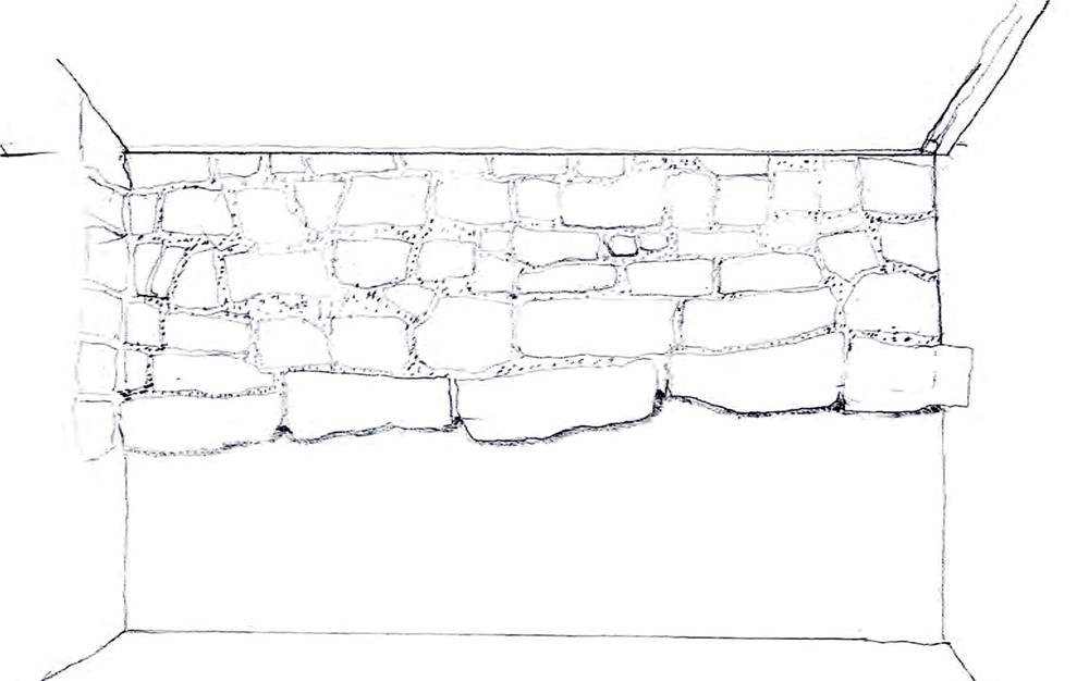
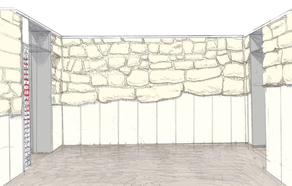
One of the things that struck on this first site visit was the primary wall of the proposed dining room. Already partly under-pinned by concrete the foundation blocks, now suspended mid-air, still revealed the slope of the land upon which they were laid. The existing topography, outside the house, could still be read inside the room. There was a kind of poetic to the persistence of this permanence, when all else was in a state of flux. It was the narrative of this highly figured wall, tracing the topography, and showing the tectonic of construction that drove our approach.
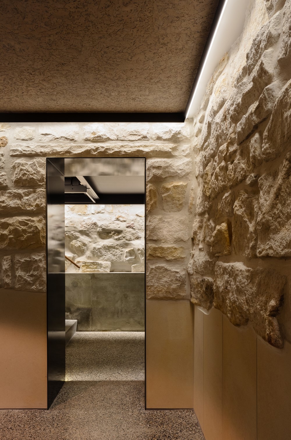
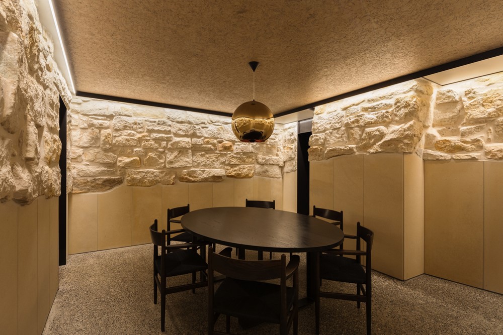
Rather than clad the underpinning in a similar “faux” like stone work, we proposed a vertical cladding of smooth sawn “Bondi” stone to off-set the horizontal rusticated block. This contrast of cladding enabled the “landscape” and tectonic of the original foundation stone to be clearly read.
Program Resolution
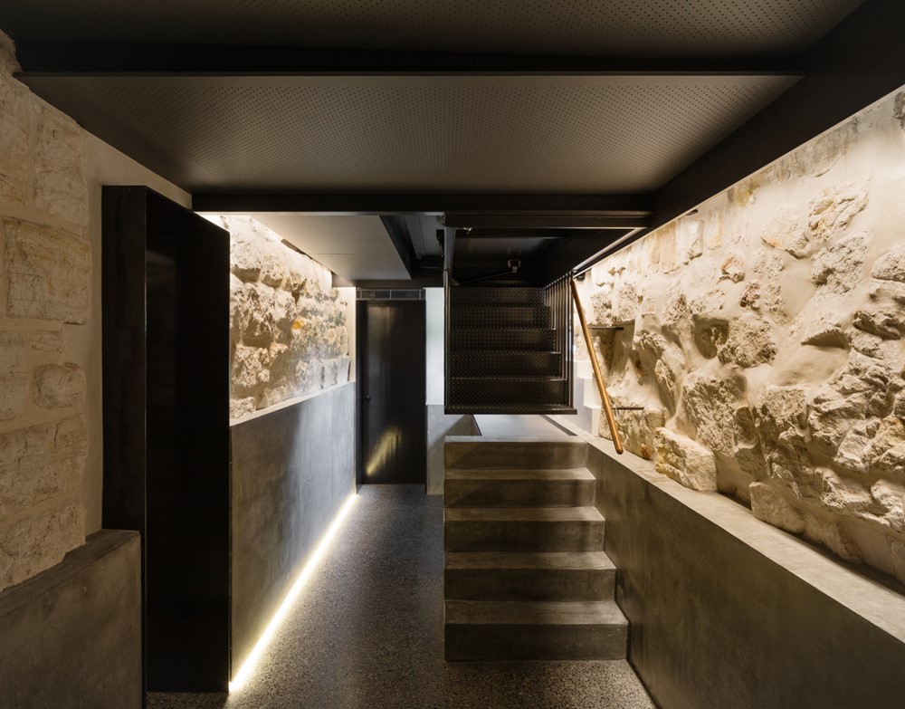
There were 3 rooms being formalised within the original and pre-war foundation stone work; the original cellar was made good, a new dining room and gallery were formalised and a new bathroom was added at the end. A new remote controlled entry hatch over a new stair was added, providing a more civilised and easier connection from the main house into the cellar.
The three rooms; dining, gallery and bath are all treated slightly differently according to their circumstance.
The vertical sandstone cladding around the 4 walls of the dining room, reinforce it’s more volumetric space and sandstone ambiance.
The in-situ-concrete for the gallery with an expressed plinth, Incorporating the stair), emphasises it’s more linear plan, revealing the foundation material of these new works, much like the sandstone blocks reveal the original works. Here stone was patched with a matching creamy off white cement. Where necessary larger panels were smoothly troweled, to off-set the existing figuration of the stone.
The bathroom with it’s Shiraz like mosaics, brass detailing and strategic placement of mirror to further amplify the depth of the stone blocks bring drama and colour to a room otherwise more removed from the project.
The entry stair is in 2 parts, the base aligned to the concrete plinth, the top suspended from the floor above. The separation of the stair into 2 parts creates a sense of drama to the entry into the cave like space.”
Photography by Katherine Lu
