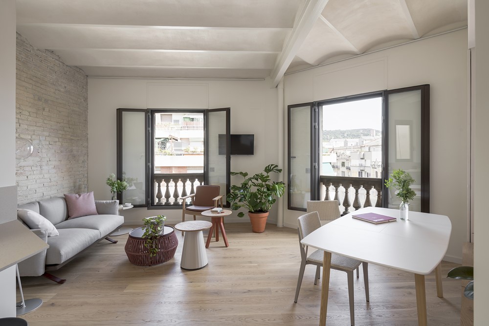
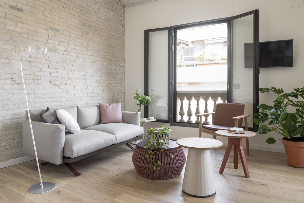
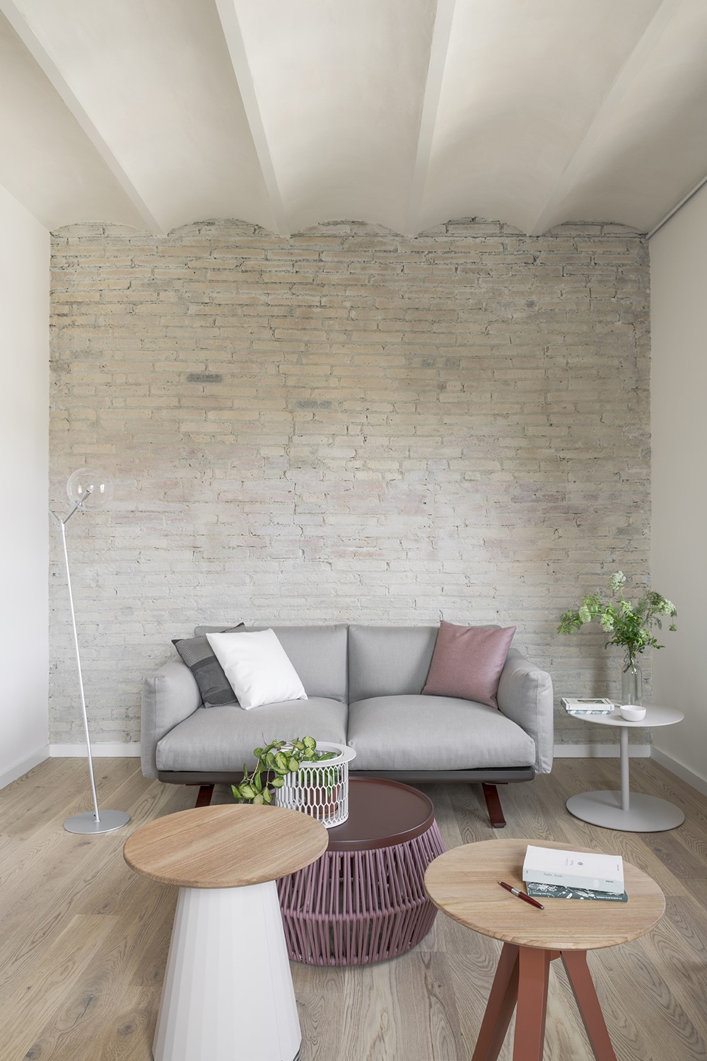
T111 Apartment is a project designed by CaSA, covers an area of 51m2 and is located in Barcelona, Spain. Photography by Roberto Ruiz.
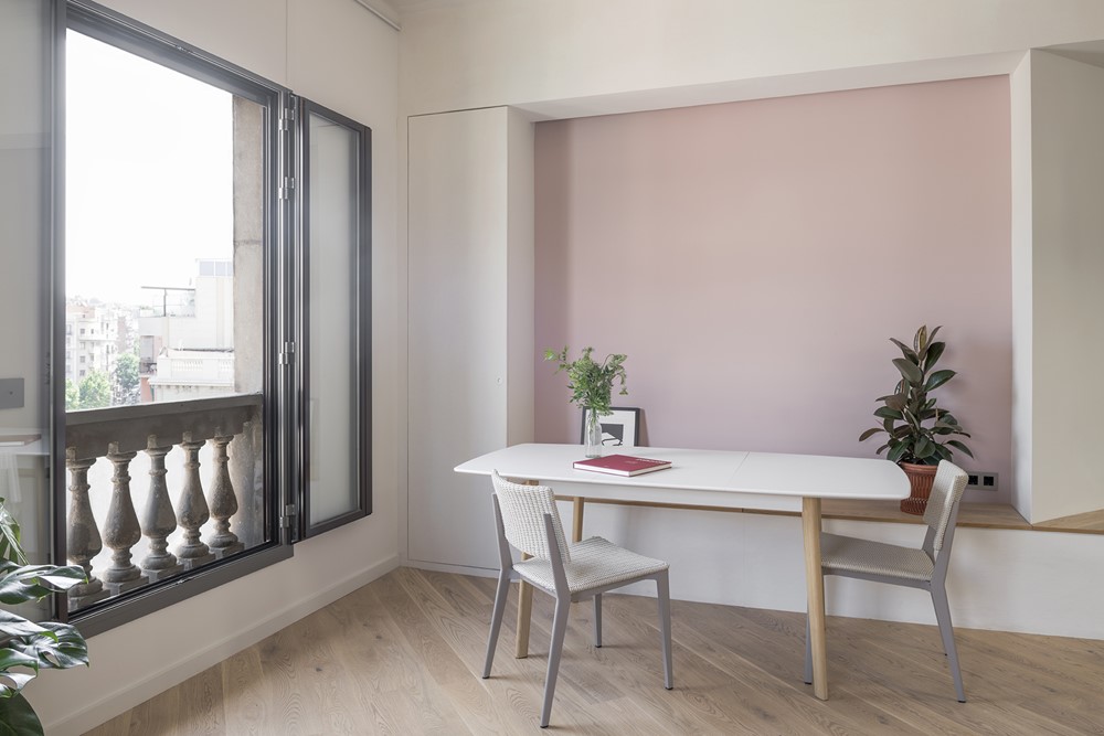
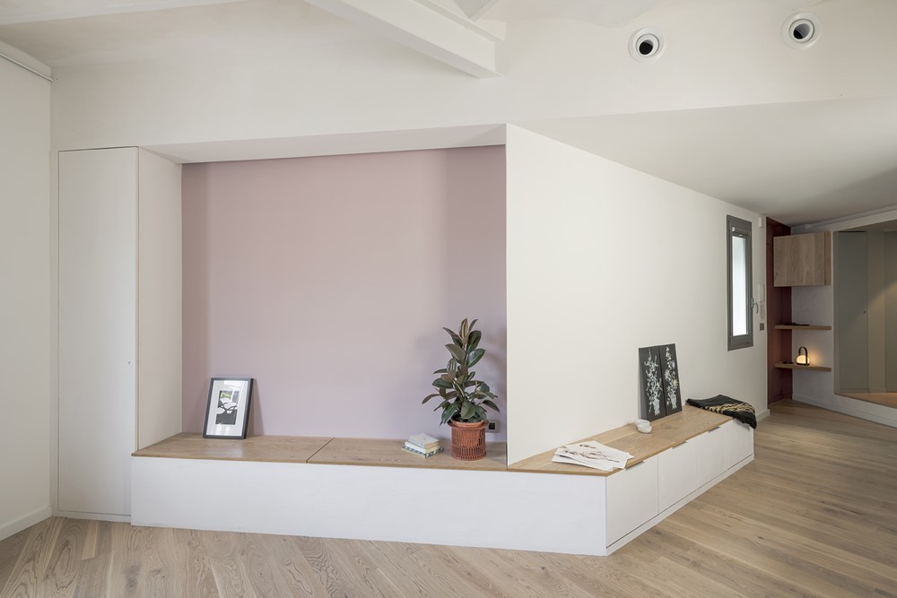
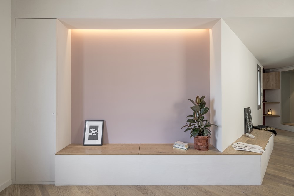
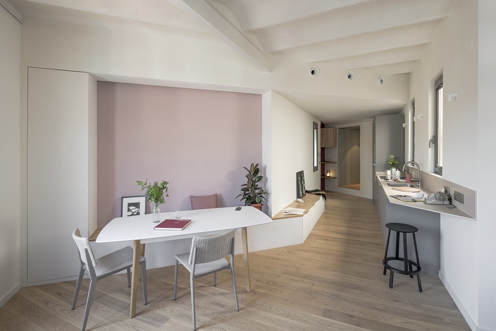
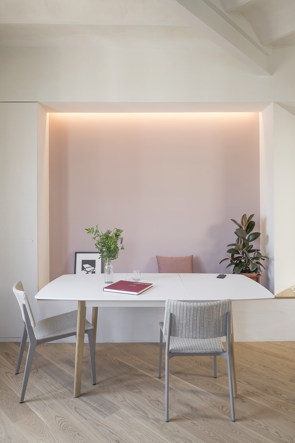
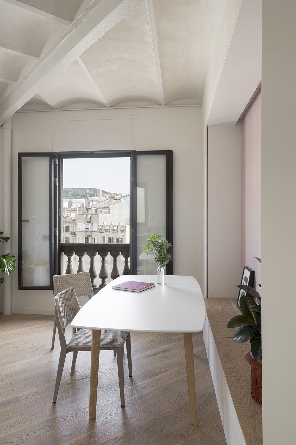
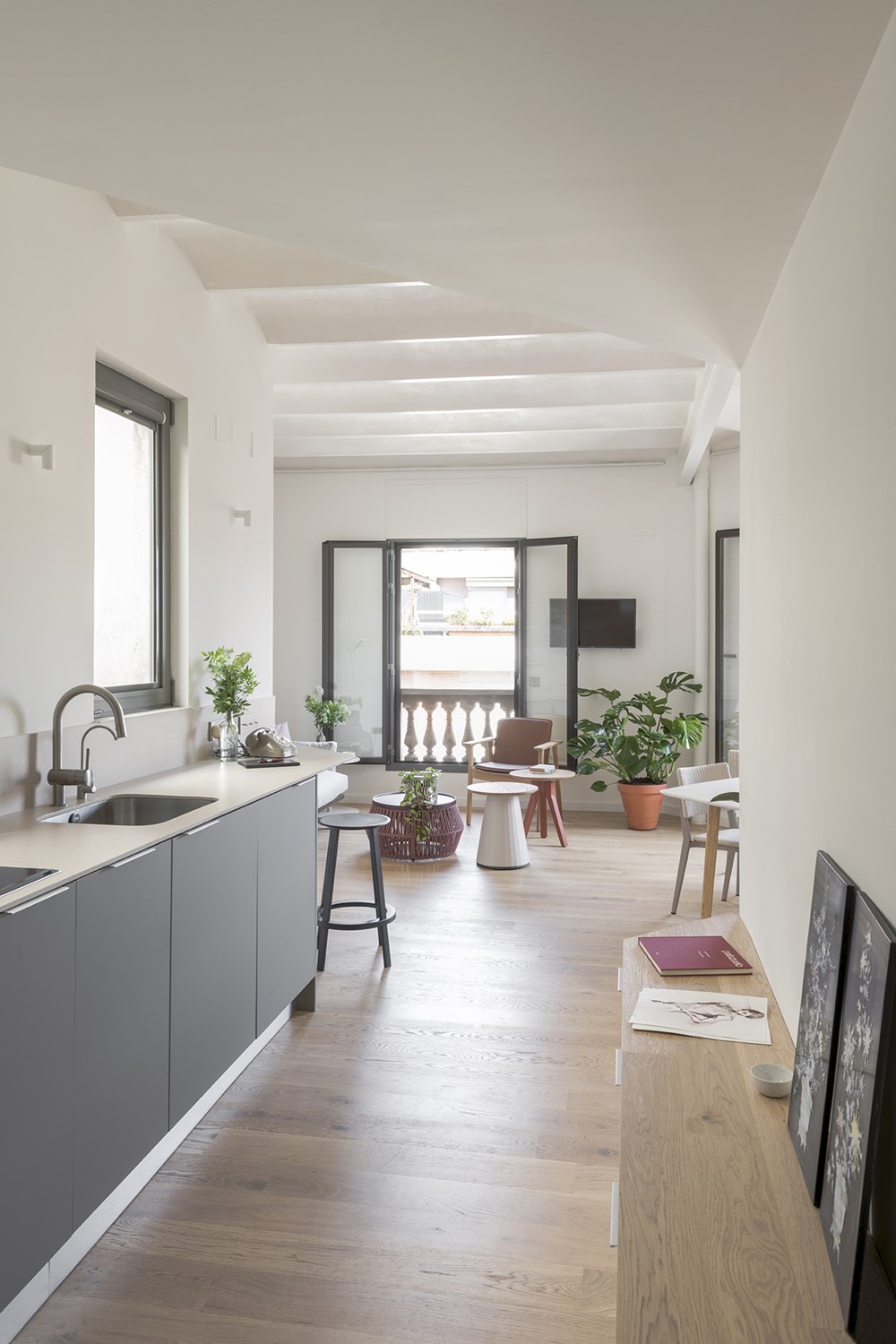
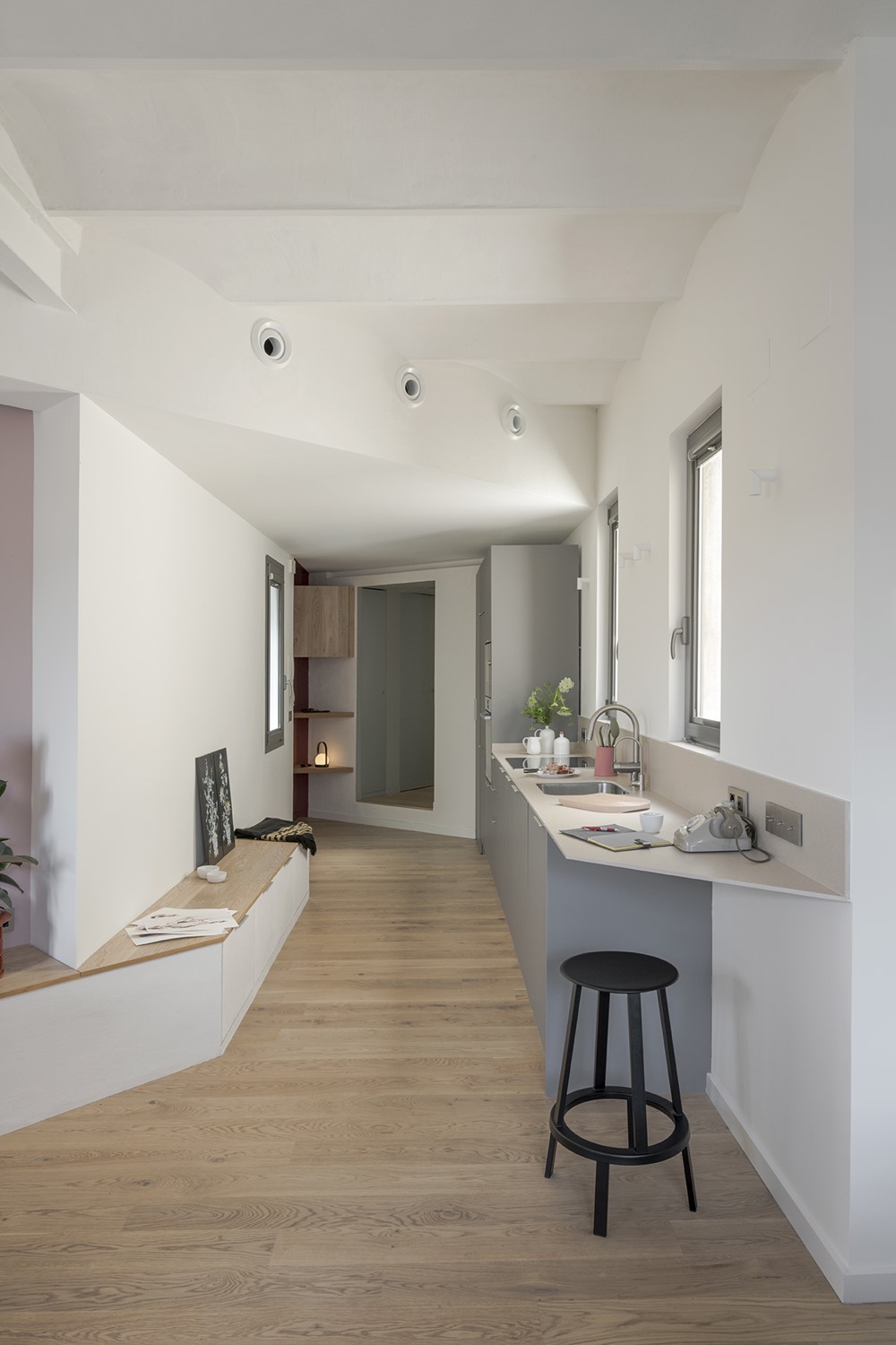


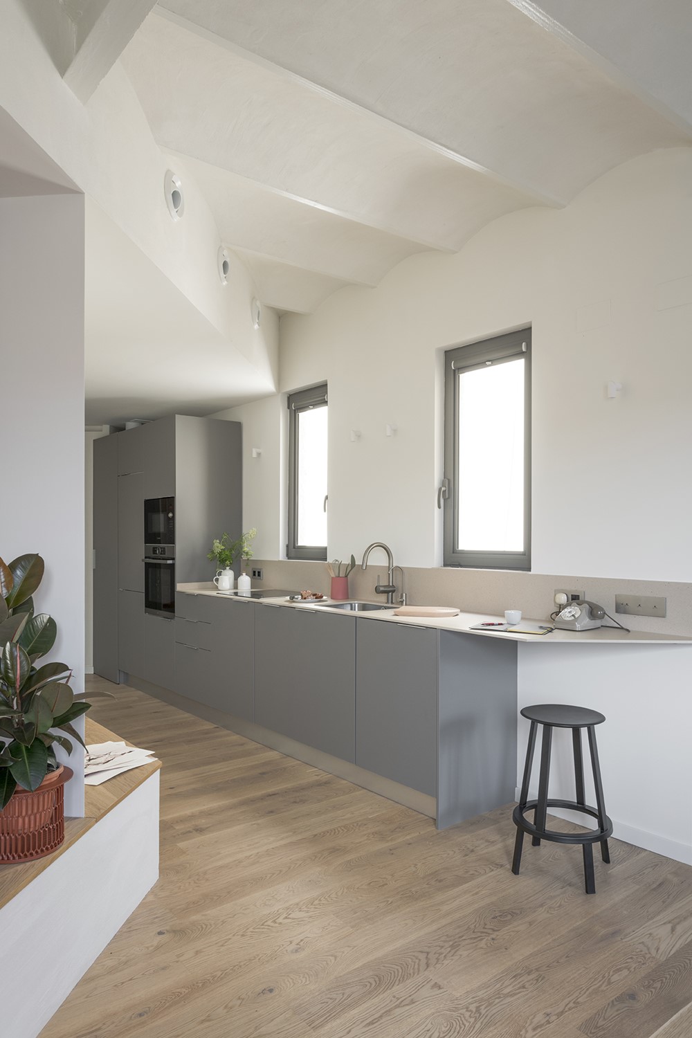

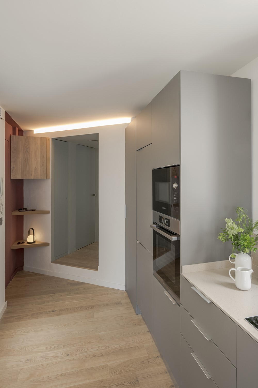

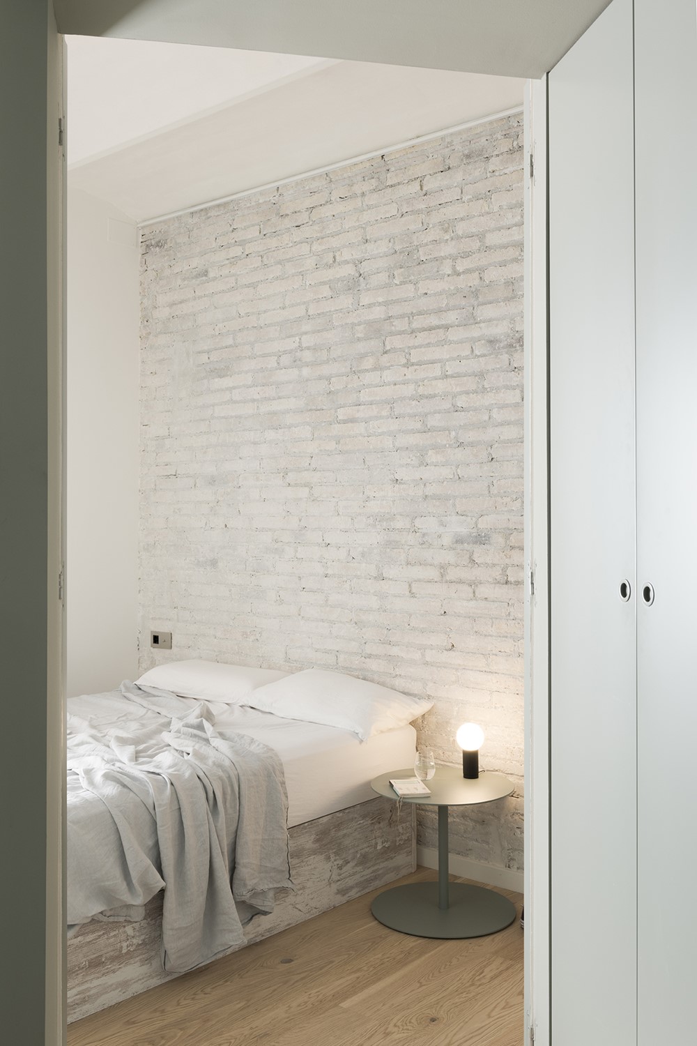
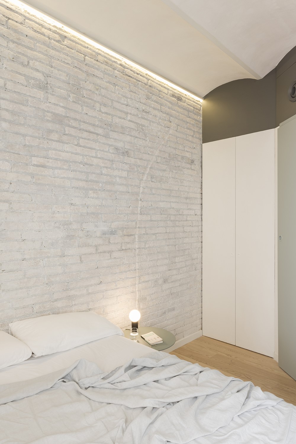


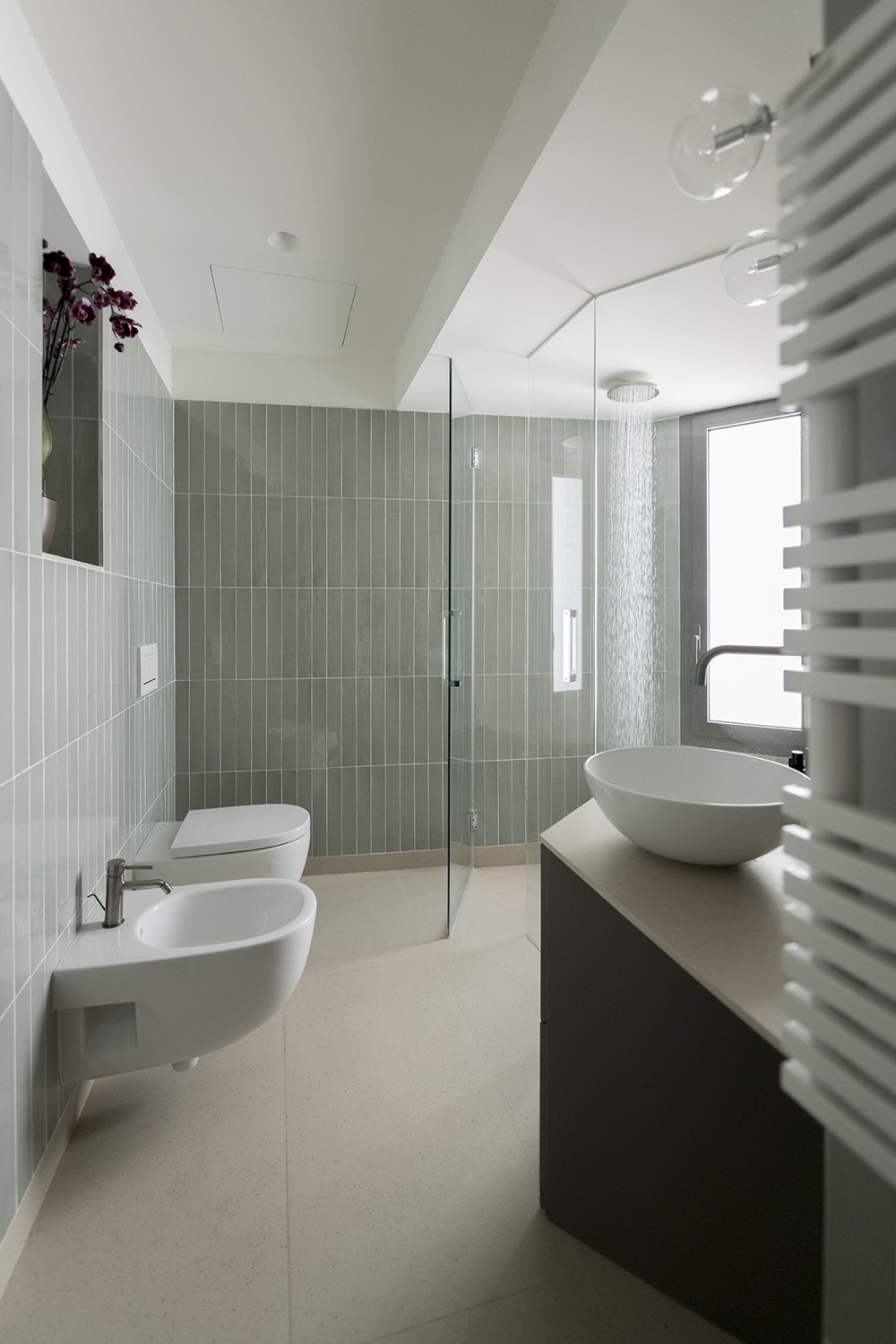
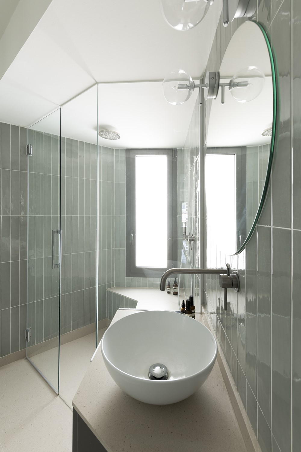
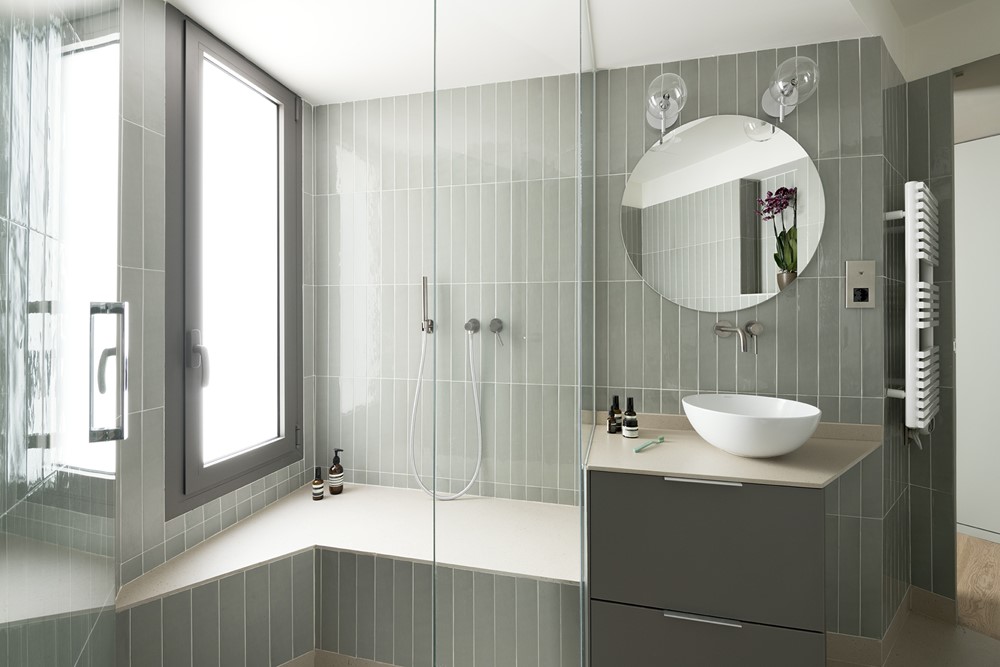


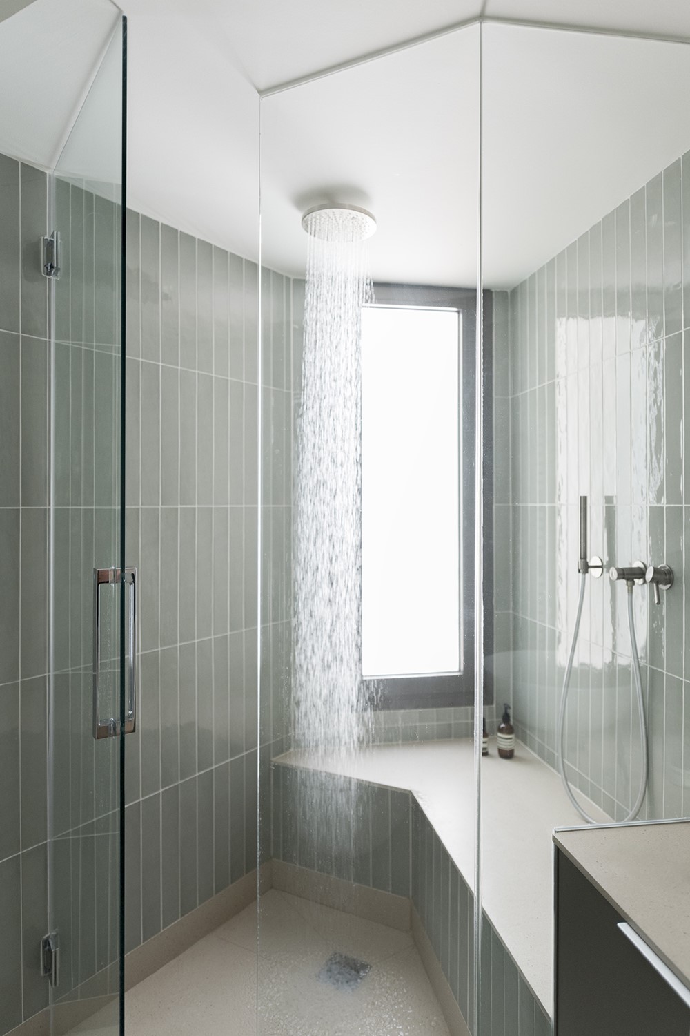
This small apartment is located on a top floor in hip Sant Antoni neighborhood, Barcelona. The brief was to take the empty, irregular floor plan (demolitions had already been carried out) and transform it into the perfect home for a young professional Italian woman. The client’s wishes were an open-plan day area, a clean-lines project, loads of light, a big kitchen unit, one double bedroom that could be minimal and a bathroom, as big as possible, with natural light and ventilation, serving the bedroom but open to guests. The project had to provide plenty of storage in order to keep the spaces tidy, be very practical, while contemporary and cozy.
The floor plan has a narrow central body with two peak-shaped spaces at each end, an awkwardly shaped property. A lot of thinking had to go into ways of providing space for everything. The entrance and corridor-like central space was clearly to become a linear kitchen space. The wider area overlooking the street, with the two balcony windows facing south was to be an open dining and living area.
More complicated was to define the use and layout of bathroom, bedroom, and storage area, wedged tightly and strangely between entrance and the back of the property. The architects’ aim was to create spaces that felt as wide and comfortable as possible, dissimulating the reduced dimensions of the apartment.
For this reason, CaSA chose to work with a concept that enhances the diagonal lines of the existing apartment’s contour, not working against them but seconding the shape of the walls, slicing portions at an angle to amplify the feeling of width.
Architects first defined different intersecting areas based on these diagonal lines, creating two wedge shaped volumes with different functions, covered in a rugged paste, then carving voids within them and filling the remaining spaces with colors.
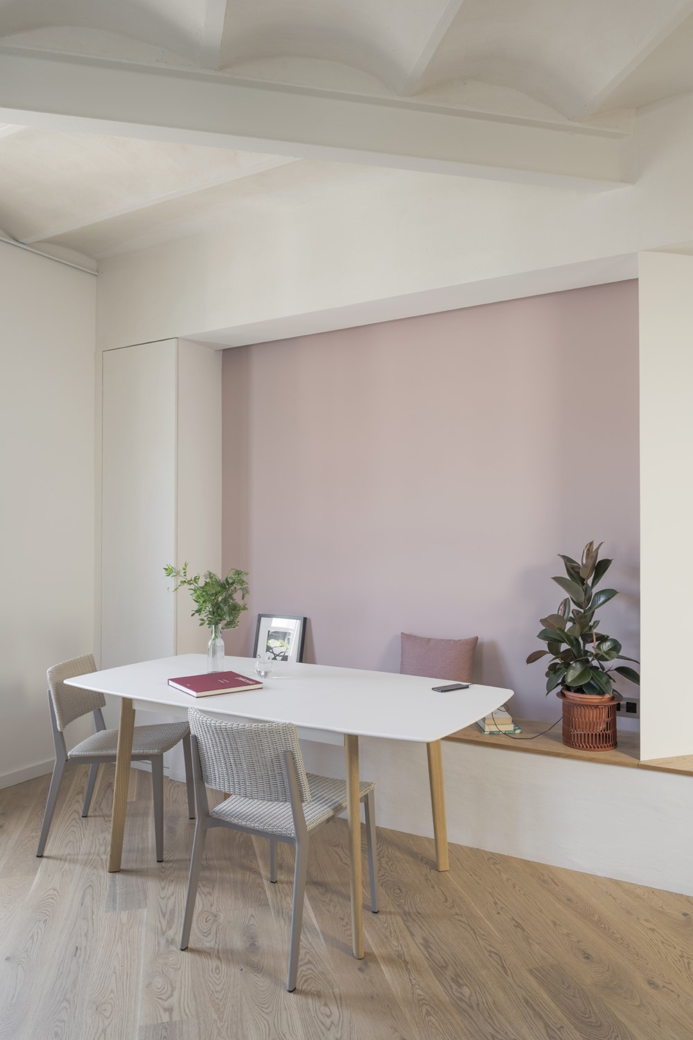
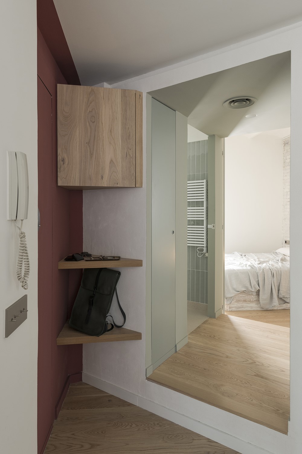
For these areas, they opted for a neutral palette of muted, undertone colors: a sage grey for the interior of wardrobe and bathroom block, an ash pink for the dining table niche and a wine red in the entrance recess, playing with different textures, seeking an atmosphere that softens the light.
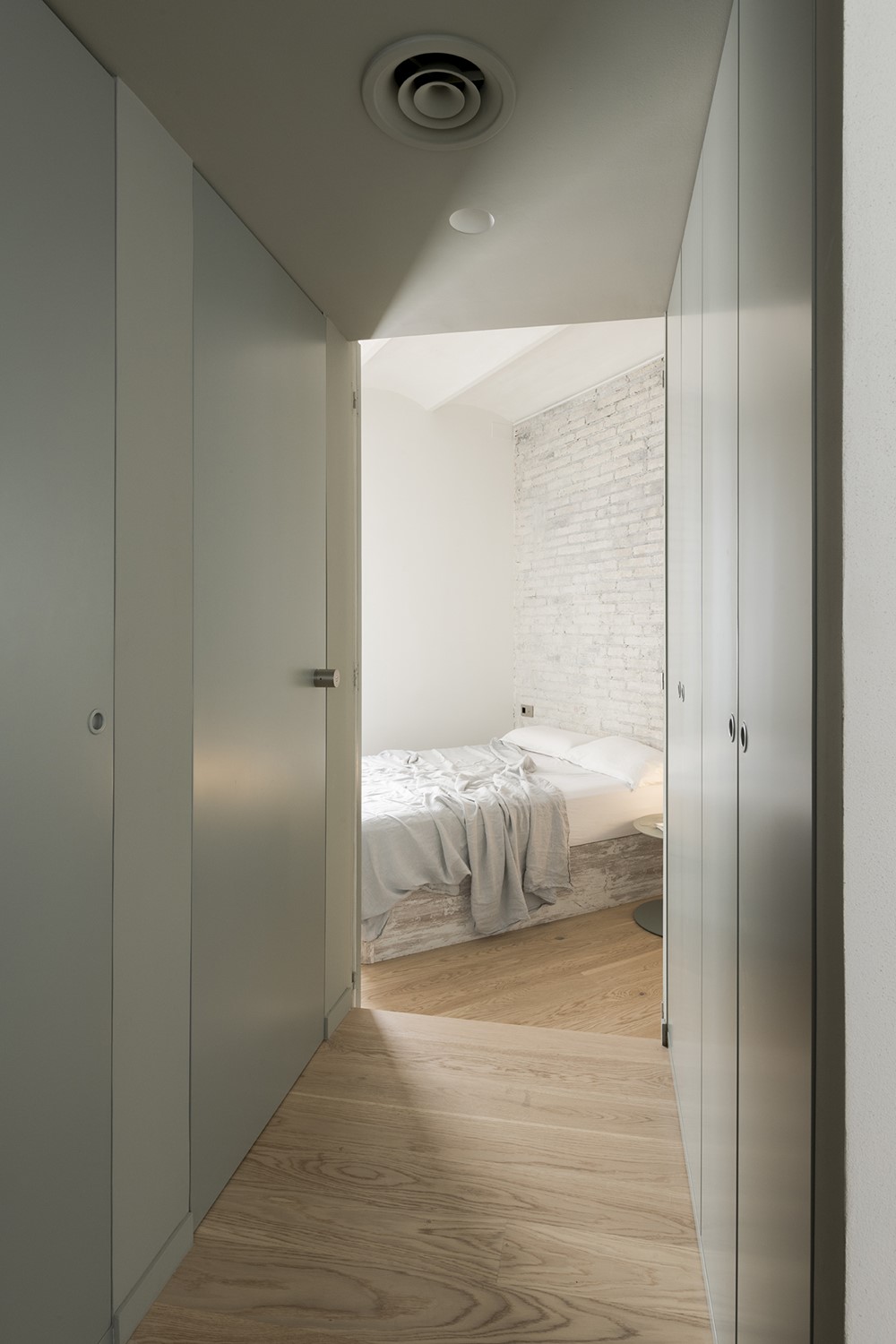
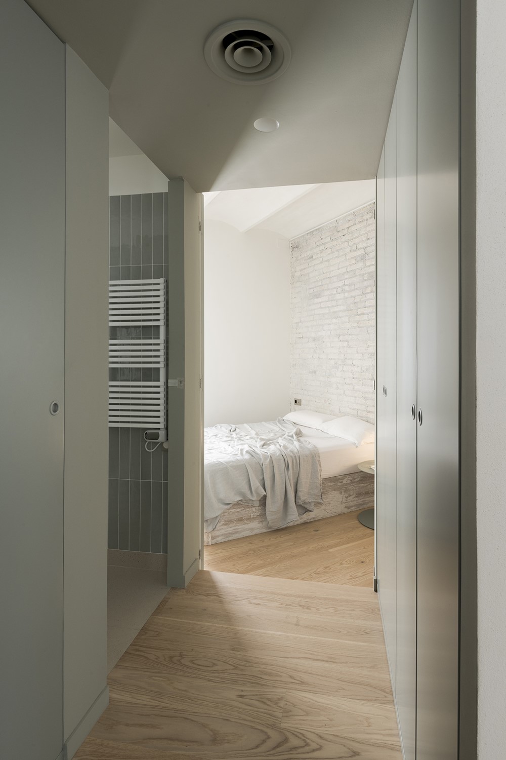
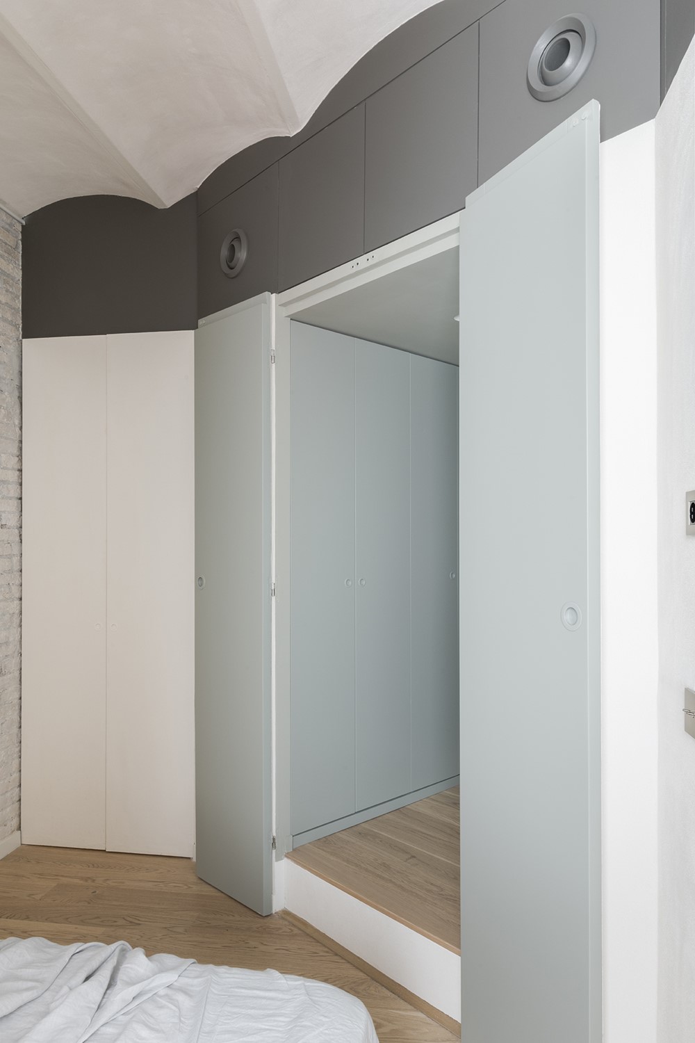
The chosen layout creates a filter between entrance and the private night-area: a rough-textured volume, with a cut-through, sage color-block passage.
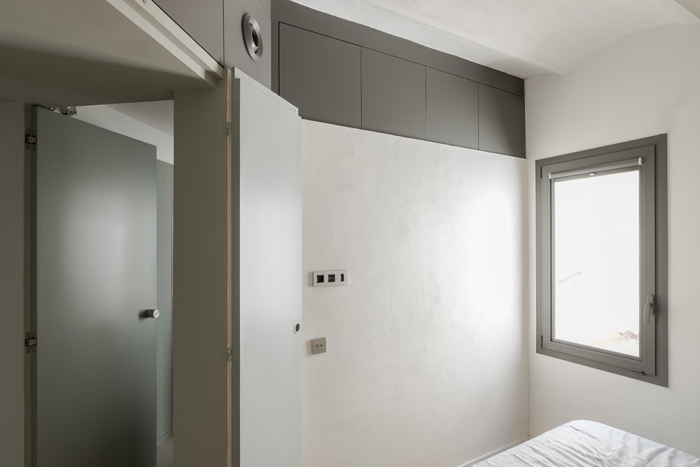
This two-sided walk-through wardrobe has room enough for all the client’s clothes, shoes and accessories and also conceals the bathroom access.
A tactile, coarse, ivory-colored paste covers the outside of the bathroom and wardrobe volume, as well as the other angle-cut volume around dining and kitchen, helping defining subtly those two concept-generating blocks. The same coating (an effective thermal and acoustic insulation system by Weber) covers all the Catalan vaults of the ceiling, keeping the heat and noises of the rooftop from passing into the apartment, while softening the light, and covering tactilely some of the bespoke furniture.
Architects: Andrea Serboli and Matteo Colombo for Colombo and Serboli Architecture
Contractor: Global Projects
Styling and art direction by CaSA
