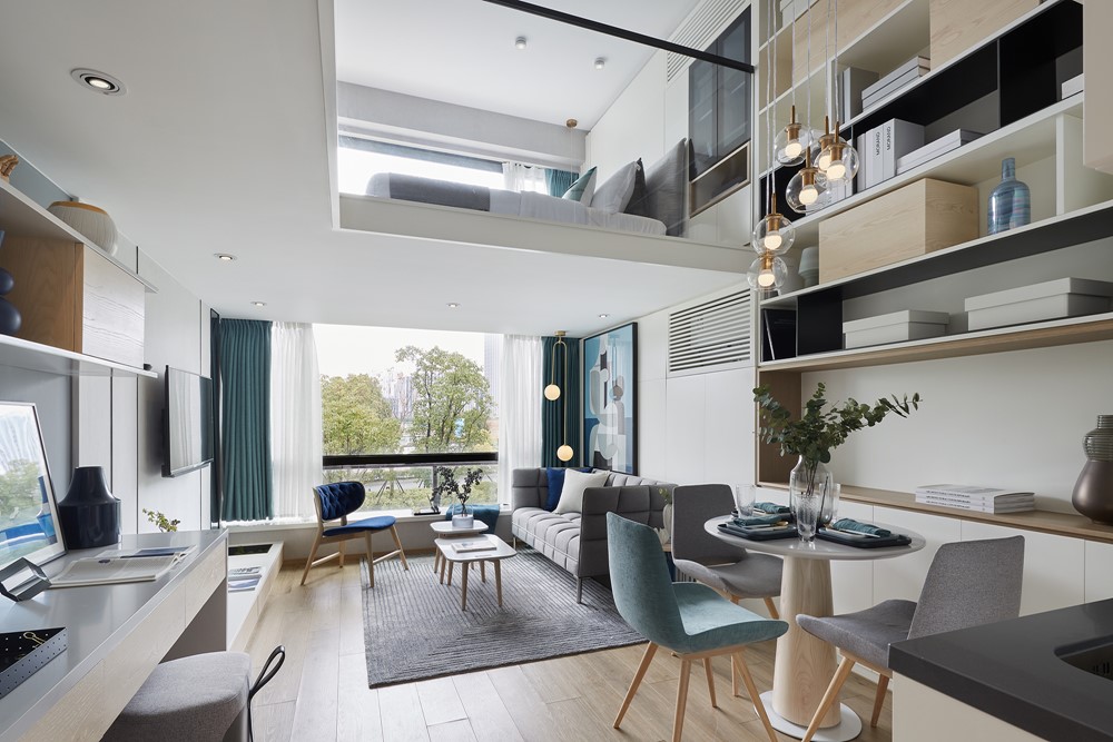
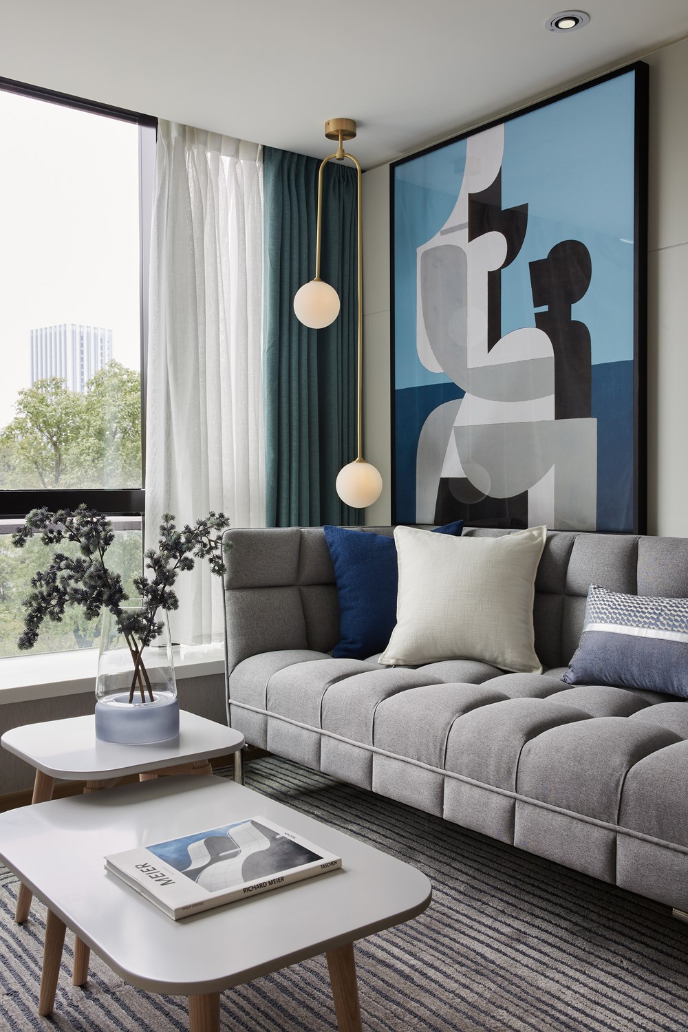
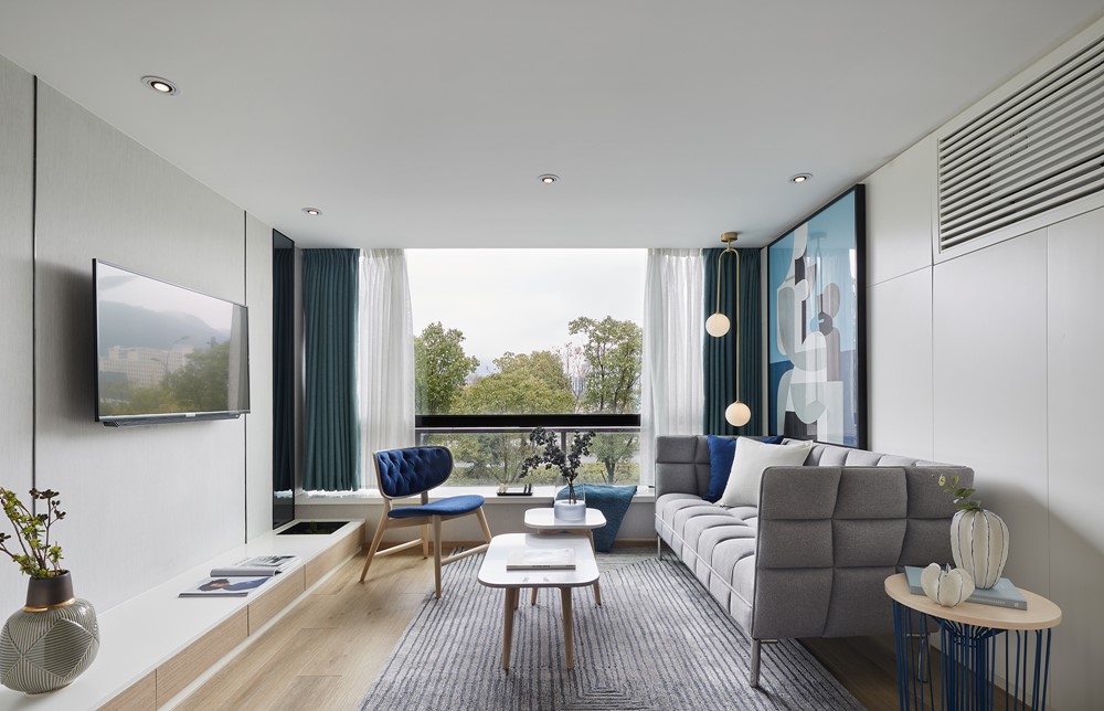
In the DoThink · Hangzhou 2022 Sales Center, the designer broke the traditional “Metropolis” concept, injecting new elements into the “Metropolis” style, showing urban fashion and avant-garde style with a simple and bright space atmosphere.
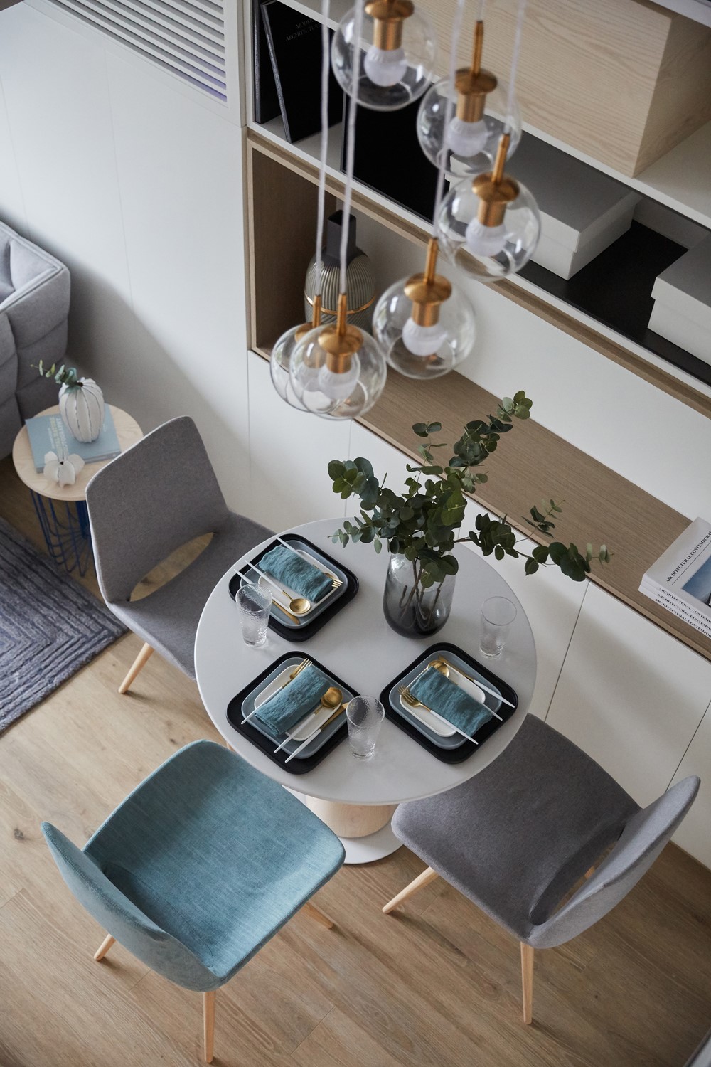

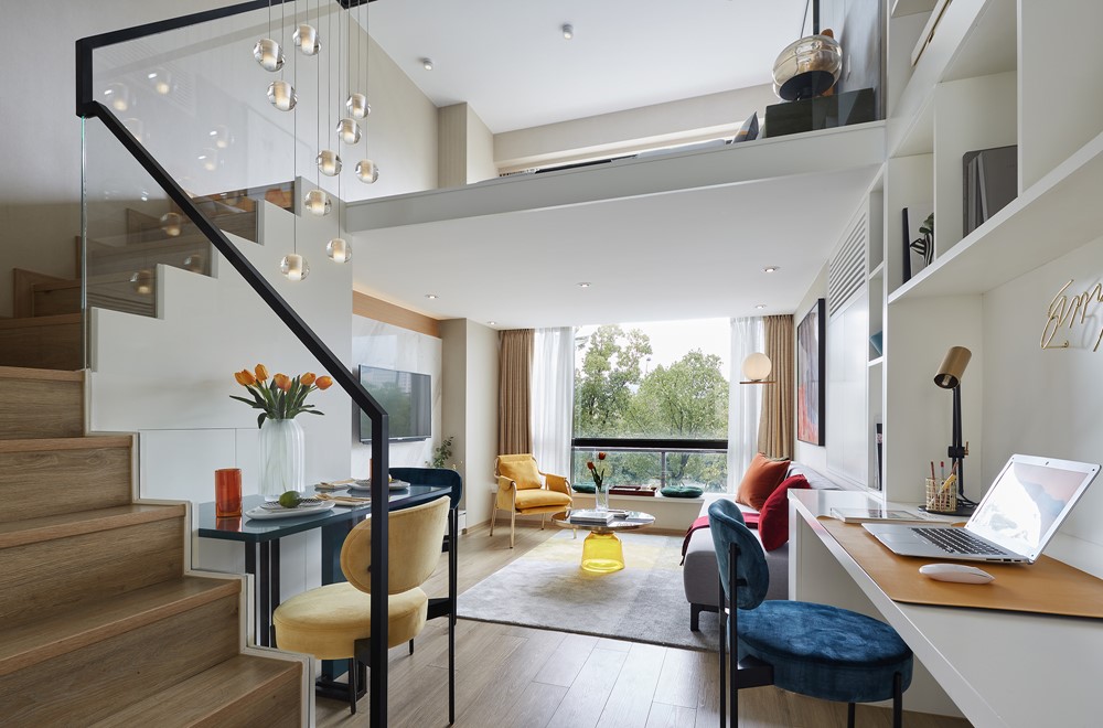

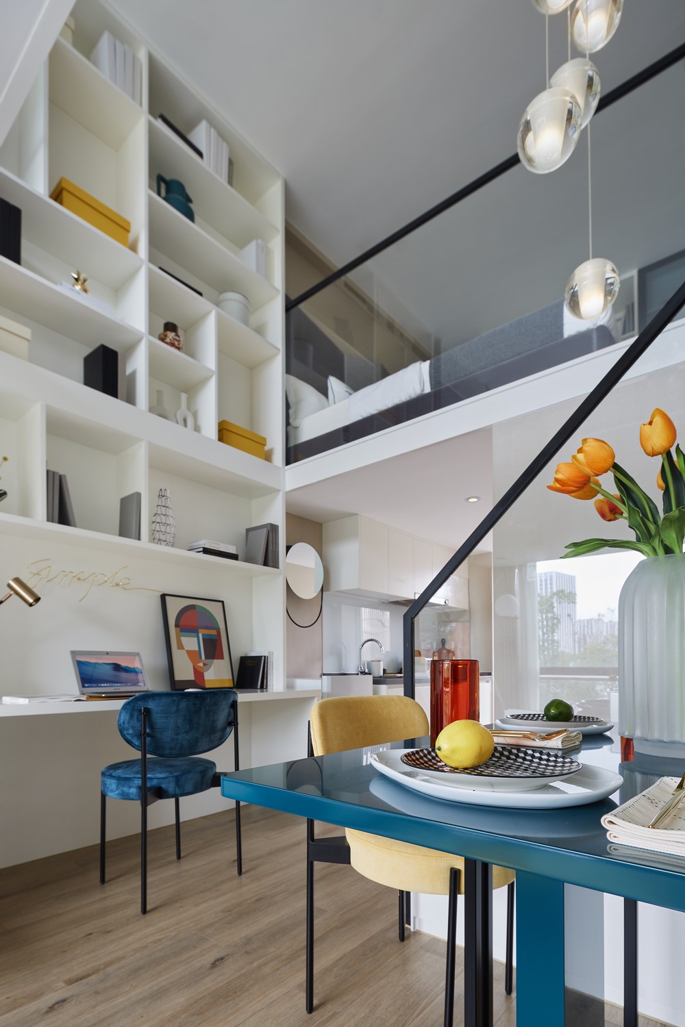

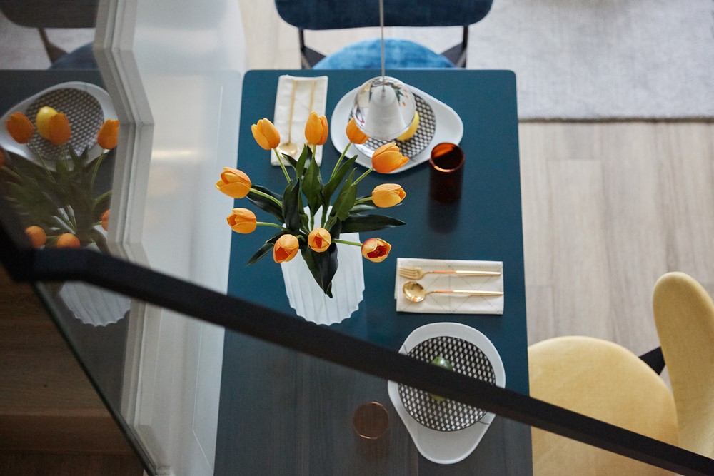
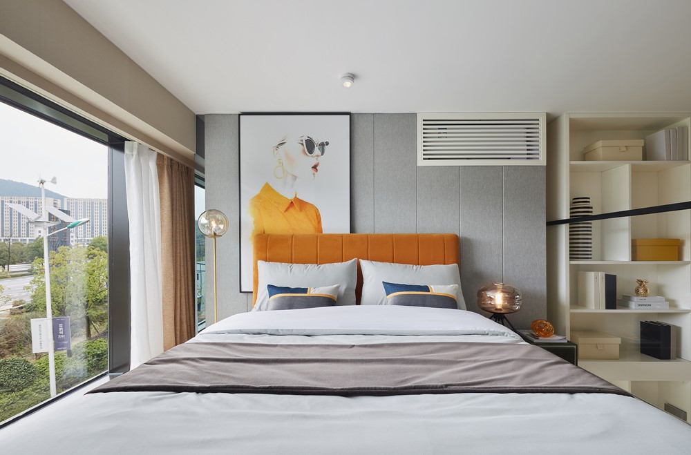
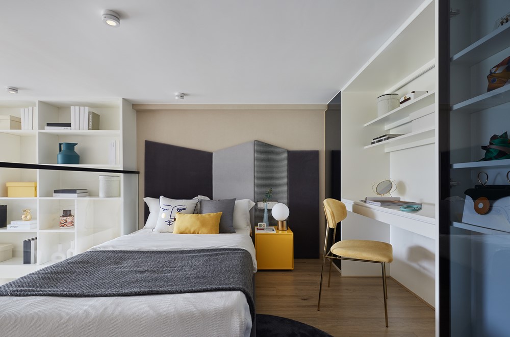

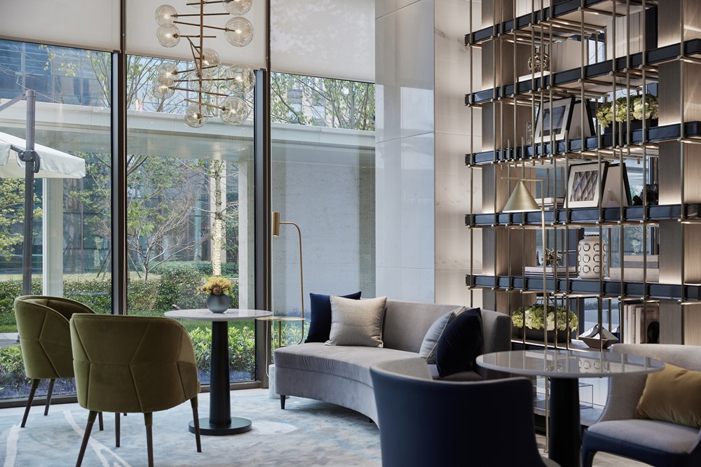
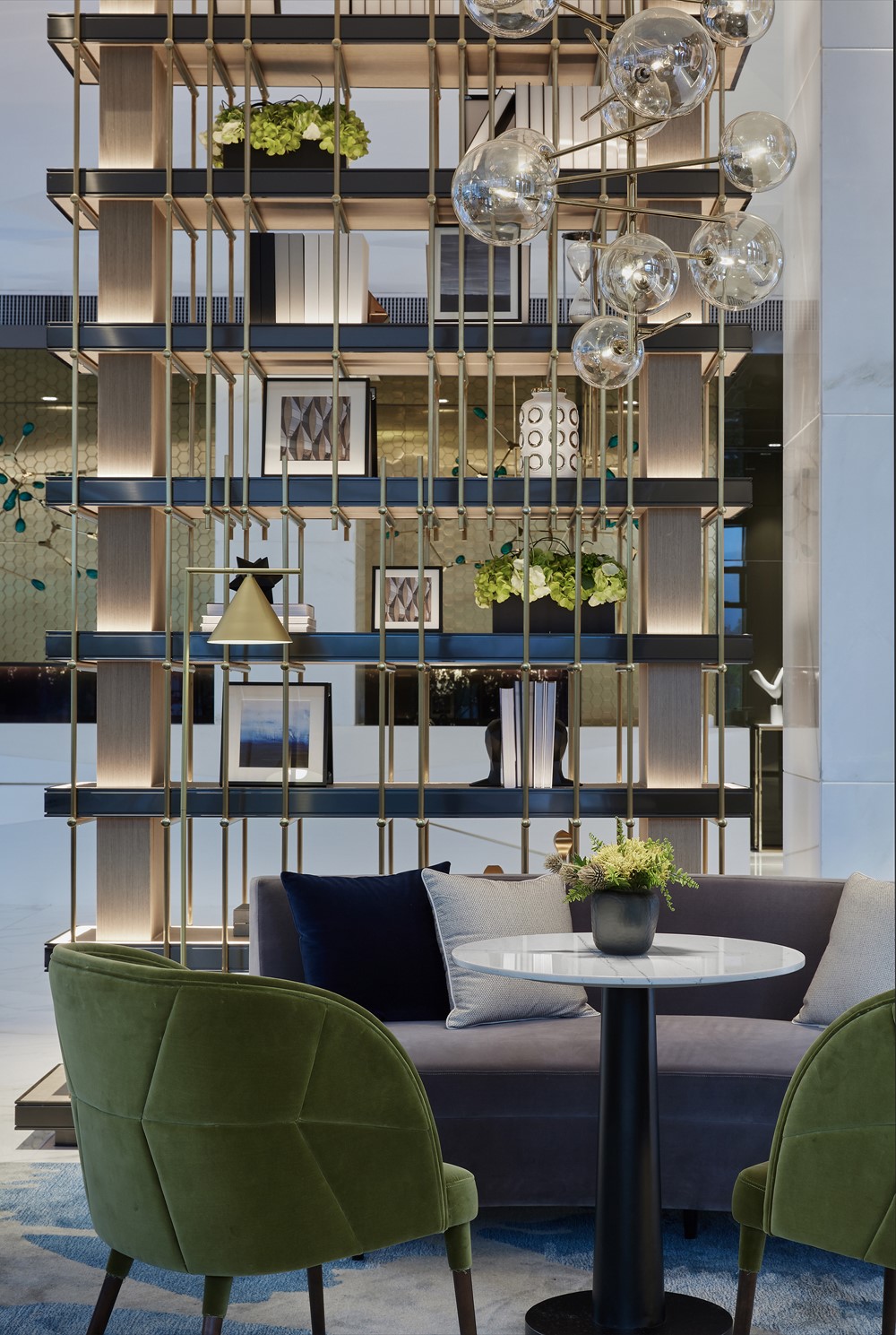
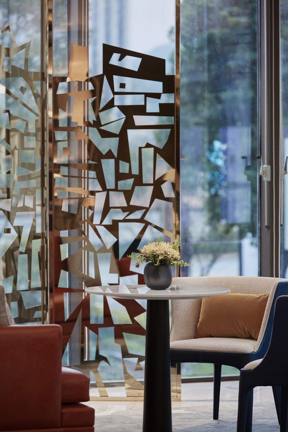
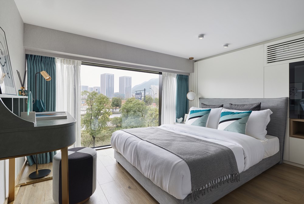
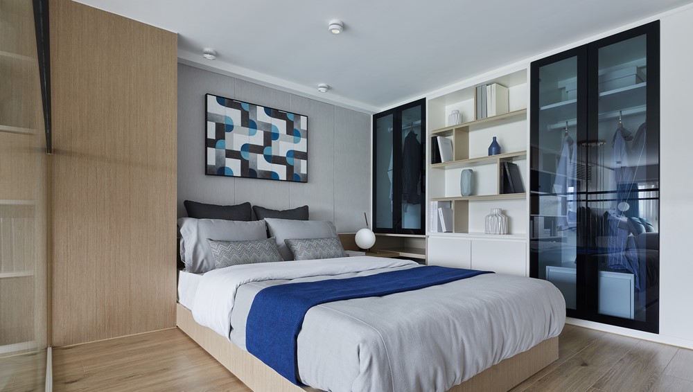
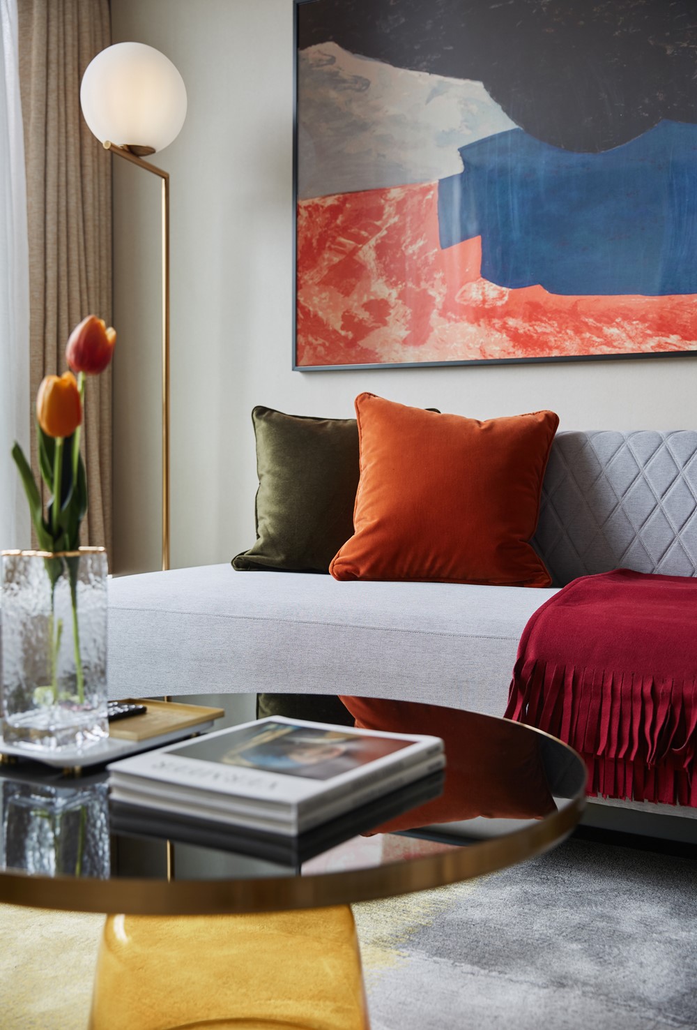
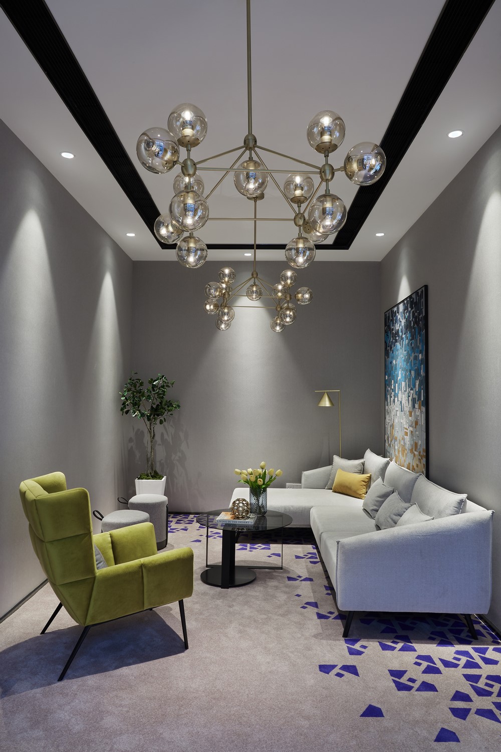
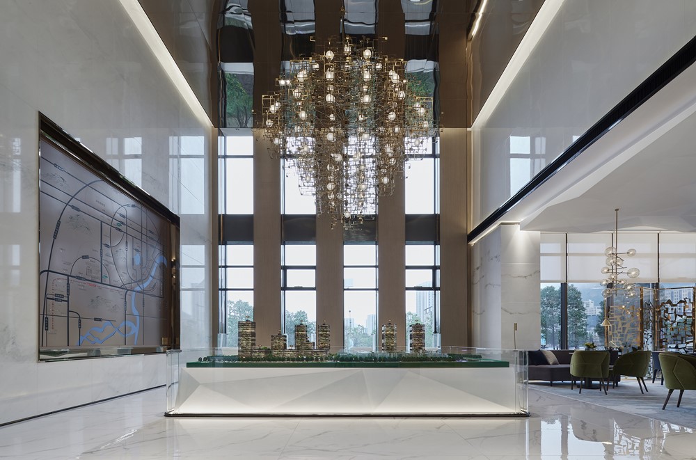
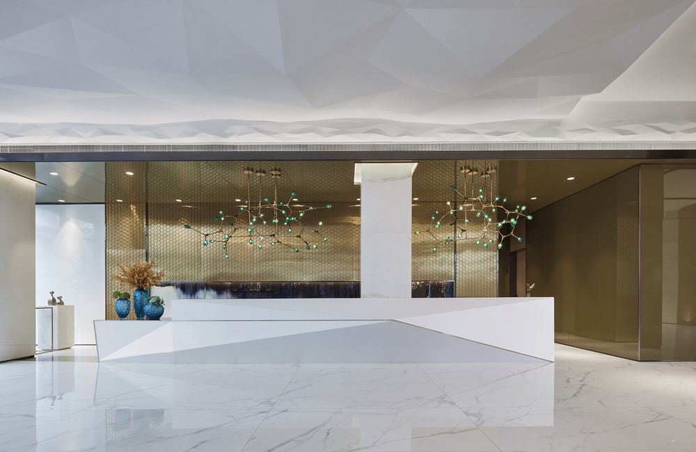

In the interior design, the designer made full use of the space of the existing building to redesign, in order to create an indoor space with reasonable layout, smooth movement, comfortable and elegant feelings, and conducive to business management. For example, the designer made full use of the advantages and disadvantages of the main structure of the interior building, through the different forms of partitioning, the space was divided into one virtual space after another, so that the space of different functions can be independent of each other, and also can maintain the overall sense of consistency in the circulation of large space.
The building space of the sales office is relatively square, and the designer used the exquisite and wrought iron bookshelf and marble wall to divide the space into sections, so that the cubic indoor space forms different space scenes.
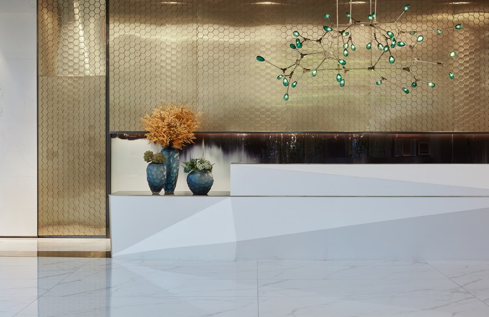
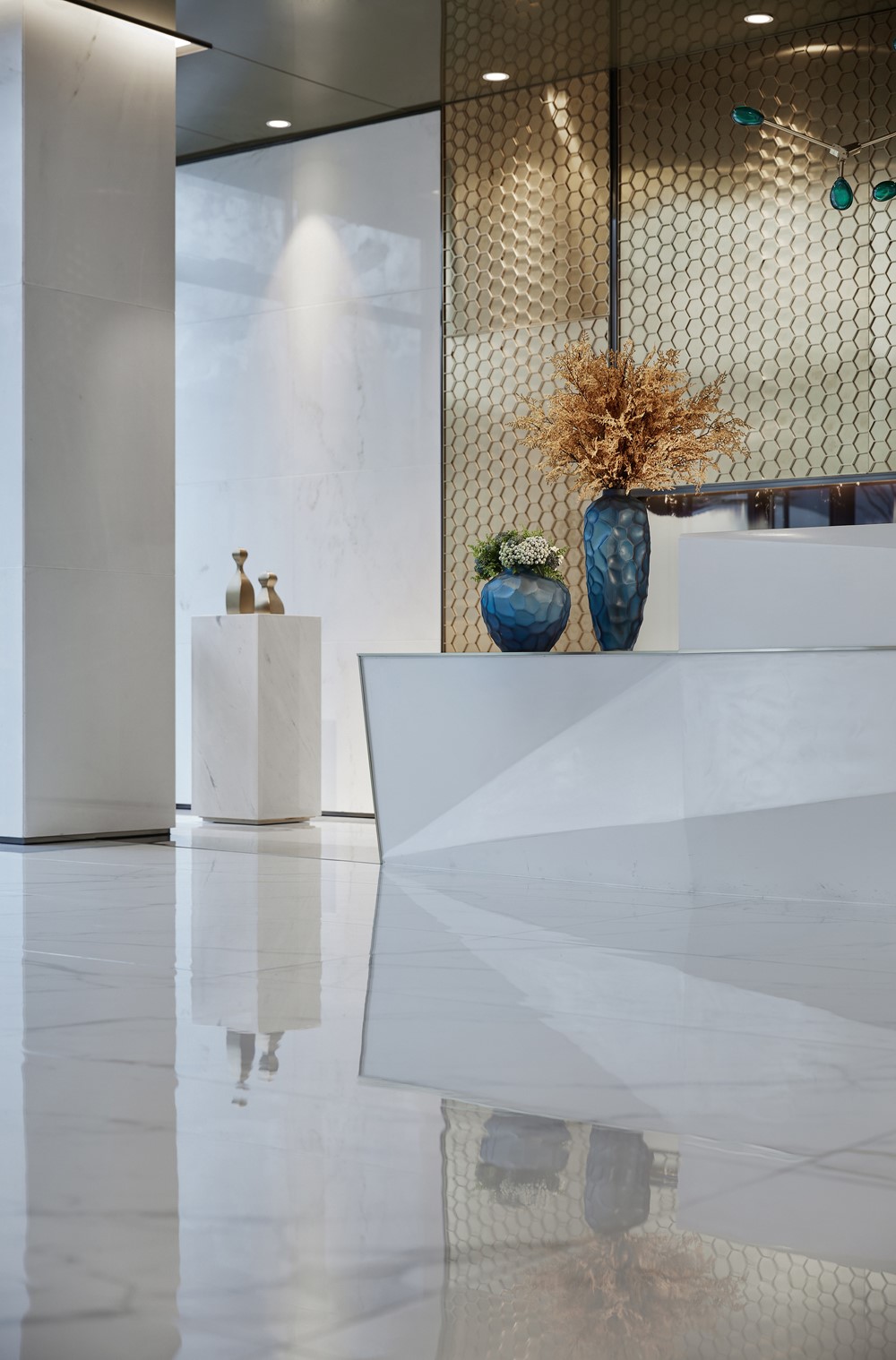
Another eye-catching place in the sales office is the background wall of the reception area, the design of the hexagonal honeycomb elements, with a light and simple reception desk, and a glass chandelier make the space simple, gorgeous and elegant design tone.
In the negotiation area, the sapphire blue is used as the main color, and the bright colors of yellow and green are added to enrich the space level. The softly-lined sofas are arranged in an orderly manner in the space, neutralizing the toughness of the linear lines of the space, but adding a bit of active enthusiasm. The designer also used exquisite metal hollow screens in the space layout, echoing the space materials and color tones, and building several functional spaces that are connected to each other.
In the construction of the sand table, the large metal lighting made up of geometric lines and block surfaces reflects the main theme of the space. It shows a feeling of being different from the coldness of modernism. The simple shape , the exquisite texture , makes it generous and smooth, simple and perfect , revealing a low-key luxury.
The design of the VIP room is a good description of what is the beauty of space. That is, it evolves by the essential elements that have been carefully selected, from the form to the spiritual purification, rather than just some simple surface decorations.
The project is located in the silver Lake Science Park. The project will focus on technology and innovation in the future. This means that more young white-collar workers become the main customers. Returning home from a busy job, they are more eager to take the noise off and let all their senses stretch freely in silence. Therefore, we take “regaining quiet from the busy,” as the starting point of the design of the whole space, and then create a stable and comfortable atmosphere through concise design words.
Interior design: DA GROUP
Interior furnishing design: DA GROUP
Project location: Hangzhou, Zhejiang Province, China
Art/design instruction: Luo Yufeng
Furnishing instruction: He Wen
Project area: 670 m2
Completion time: December 2018
Main materials: artistic glass, marbles, champagne gold stainless steel with specular finish, GRC
Photography: THREEIMAGES
