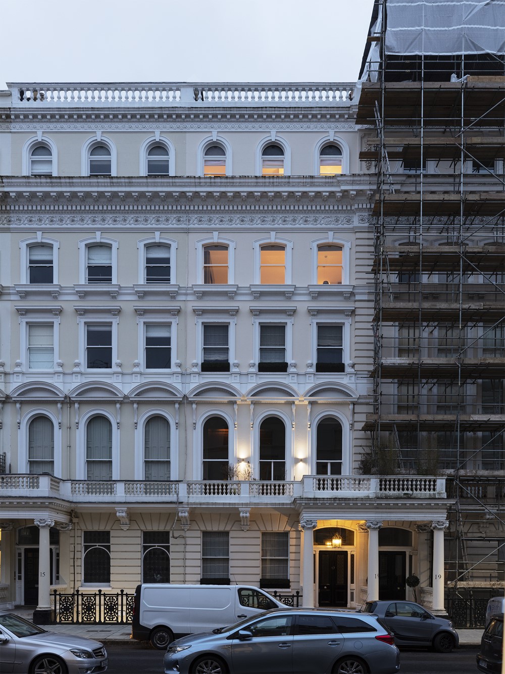
Amos Goldreich Architecture has completed the renovation of a listed maisonette in Chelsea, West London, adding ample storage space and a melange of statement stylings to update the tired interiors. Photography by Ollie Hammick.
.
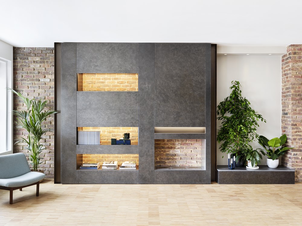
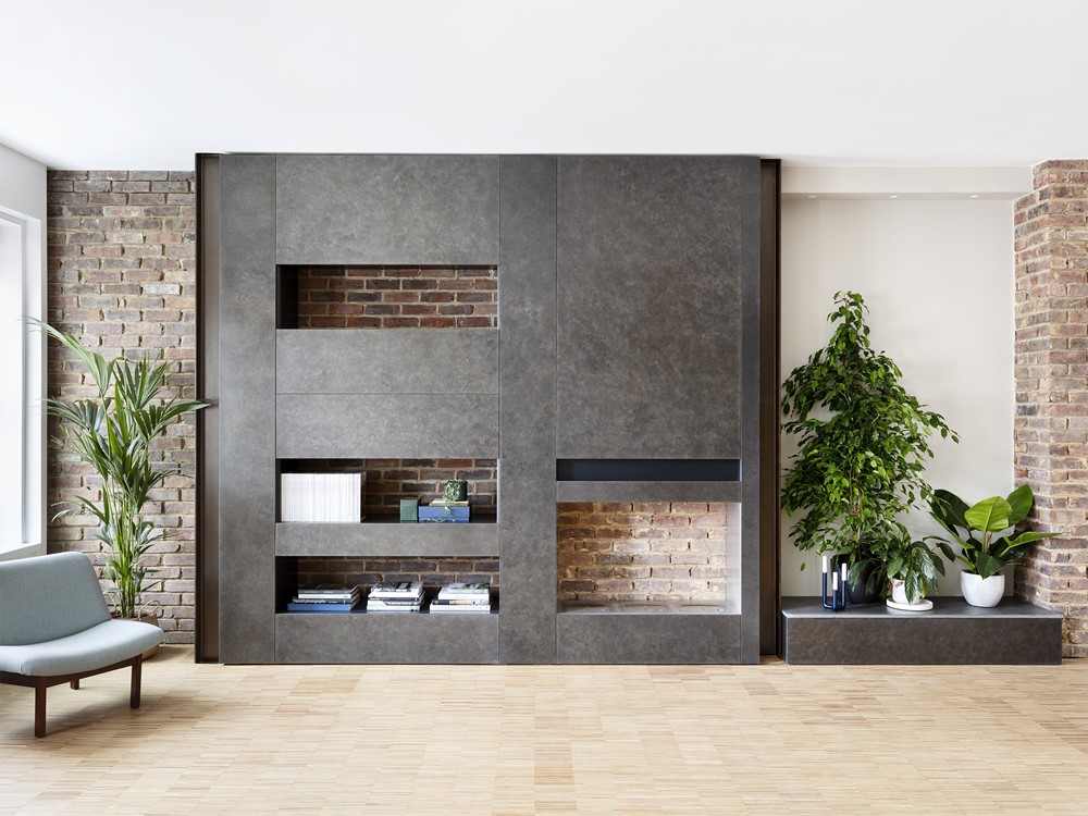
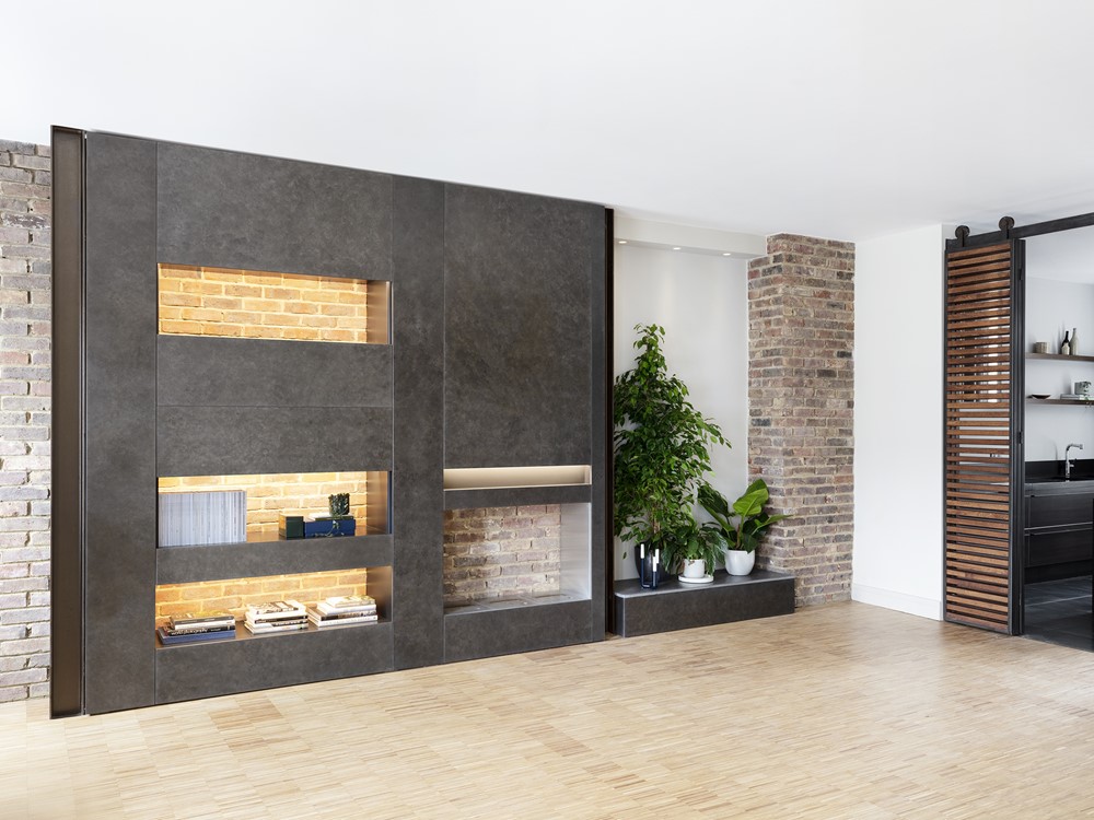
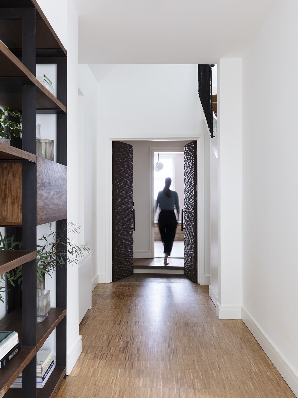
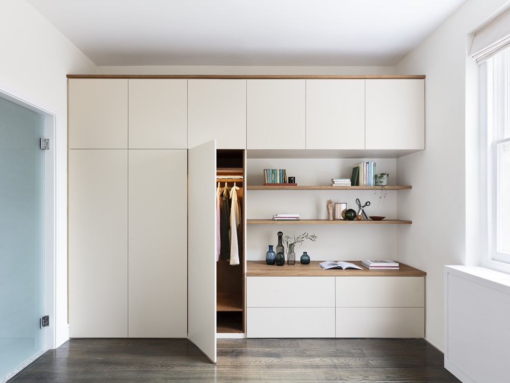

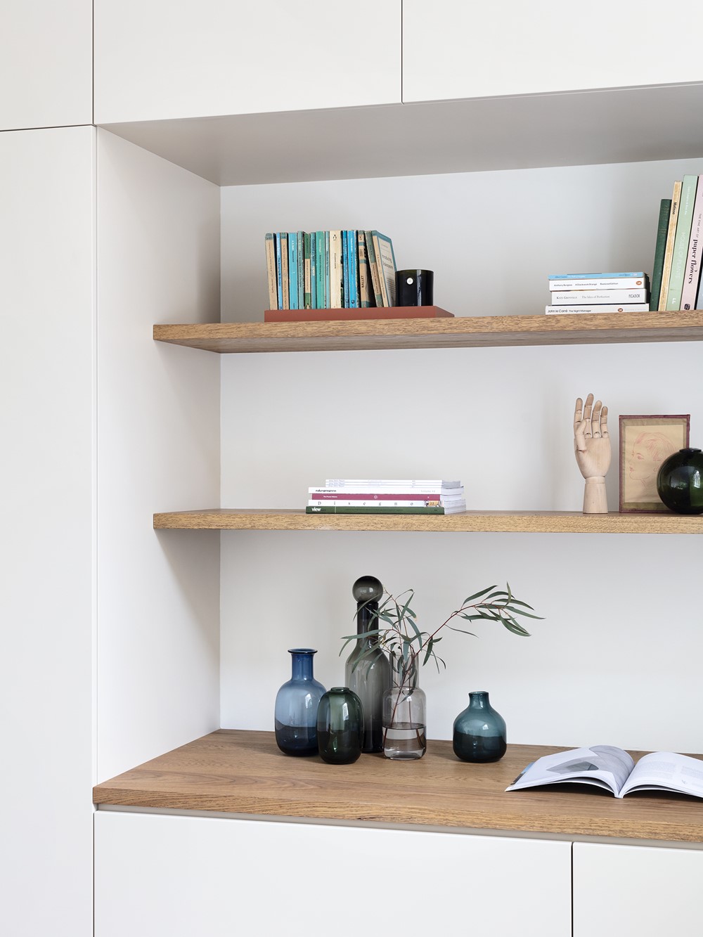

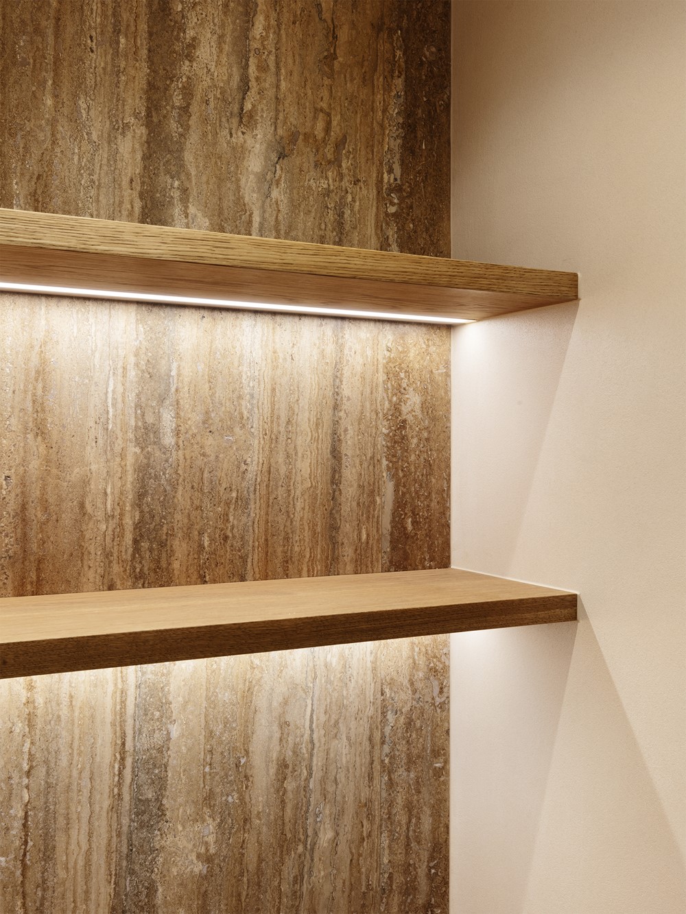
The architects were charged with refreshing the living room, bathrooms and bedrooms with bespoke statement joinery to hide any clutter and make the spaces more practical for everyday use. Briefed by the client to marry varying styles including urban industrialism, marble, and asian woodwork, Amos Goldreich Architecture found harmony amongst the varying themes by carrying textures, tones, and materials throughout the project.
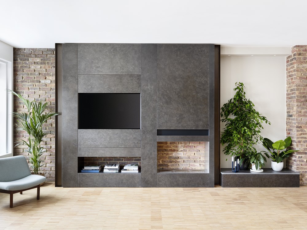
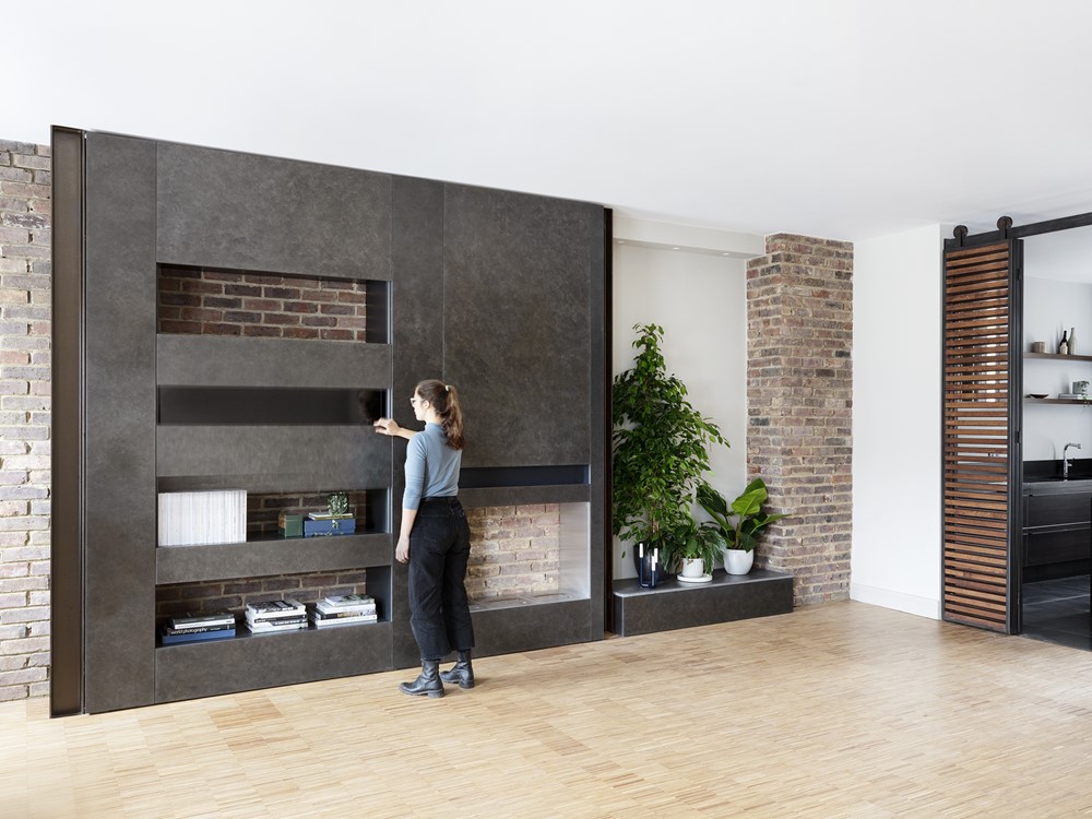
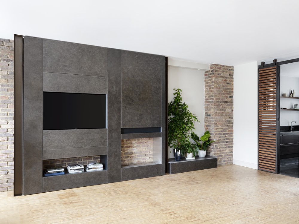
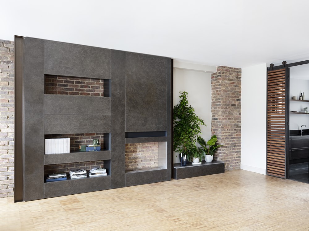
The living room features a prominent custom-made media wall which was designed both as the centre-piece in the space and as a highly functional unit to house a large television, fireplace and shelves which in turn can be hidden or displayed. The client strove for an industrial-inspired effect for the unit and, after extensive research and experimentation, we opted for a liquid-applied metal finish, Metal FX.
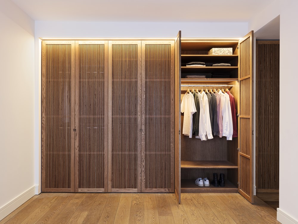
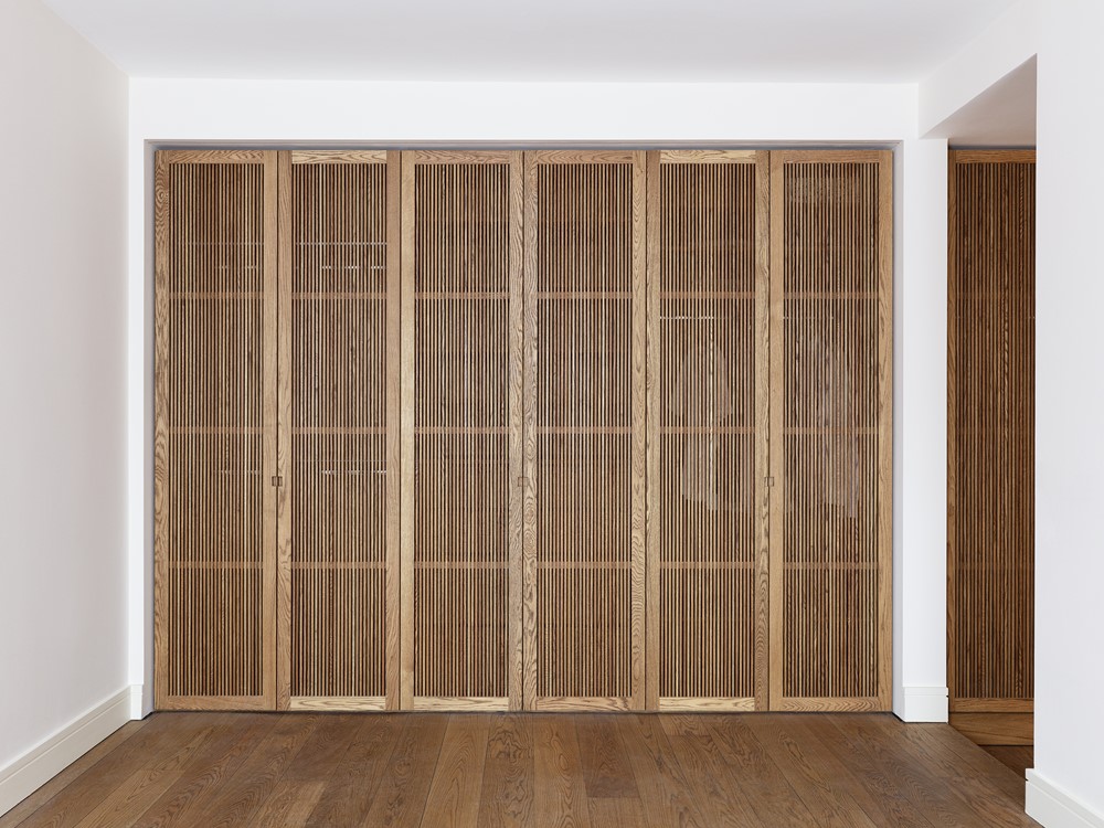
In the bedroom, a slatted timber wardrobe inspired by North African and Asian joinery traditions references the clients’ extensive travels in these regions, and brings new functionality to the space.
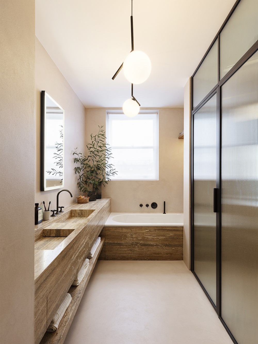
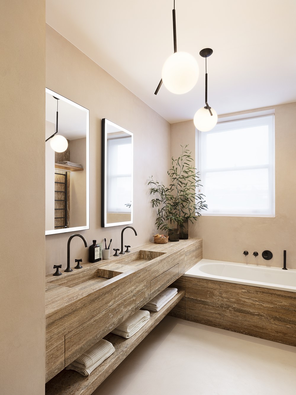
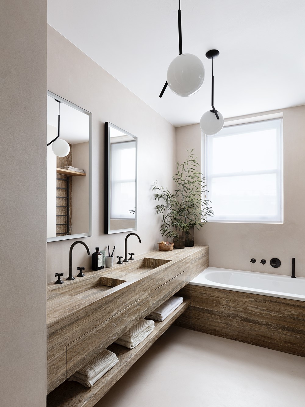
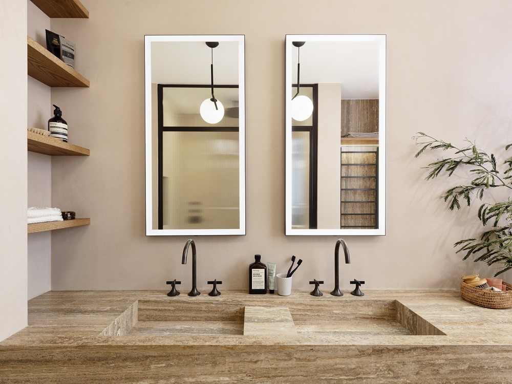
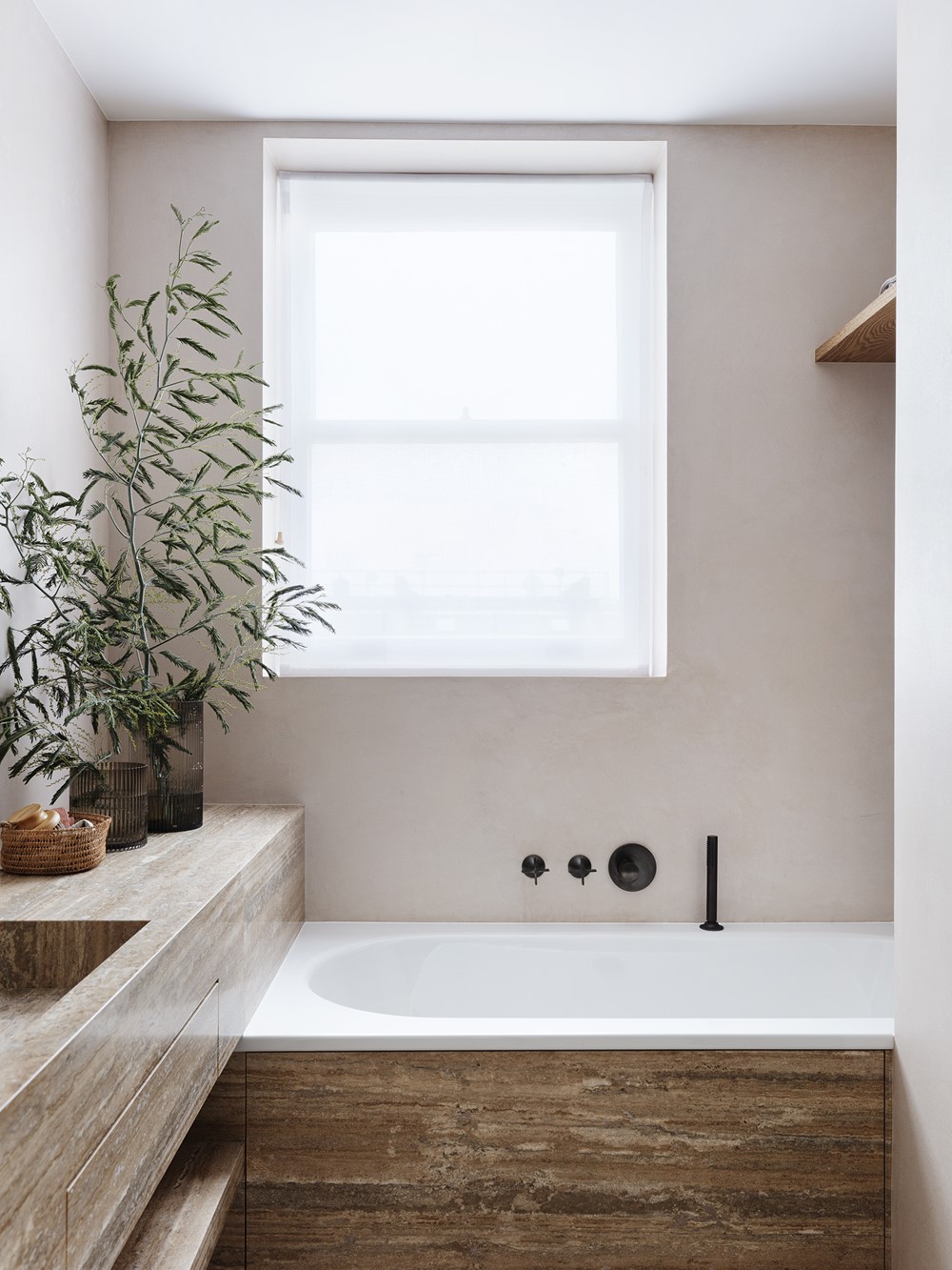
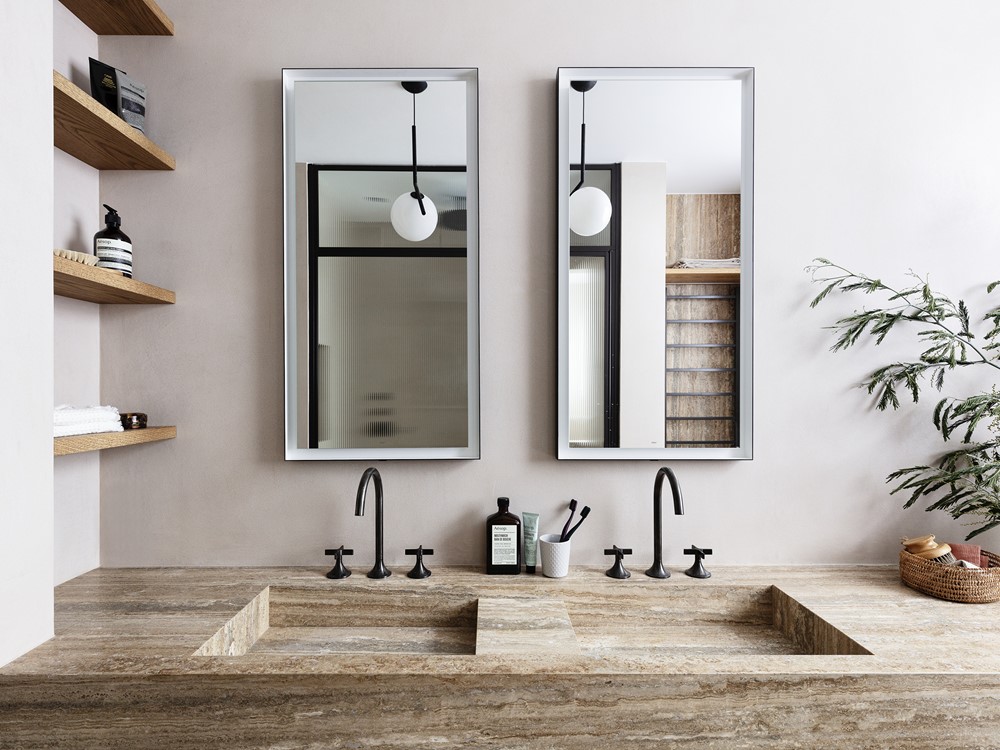
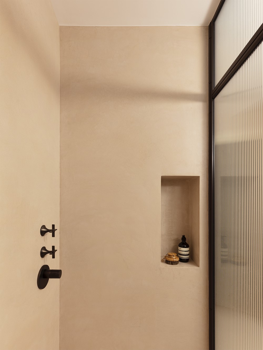
In the master en-suite bathroom, the double-basin and vanity unit and bathtub are clad in travertine stone. The floor and walls are seamlessly covered in durable microcement, creating a unified look and offering a conceptual contrast of materials which sets off the stone. The dark platinum finish of the taps complements the earthy and industrial tones found throughout.
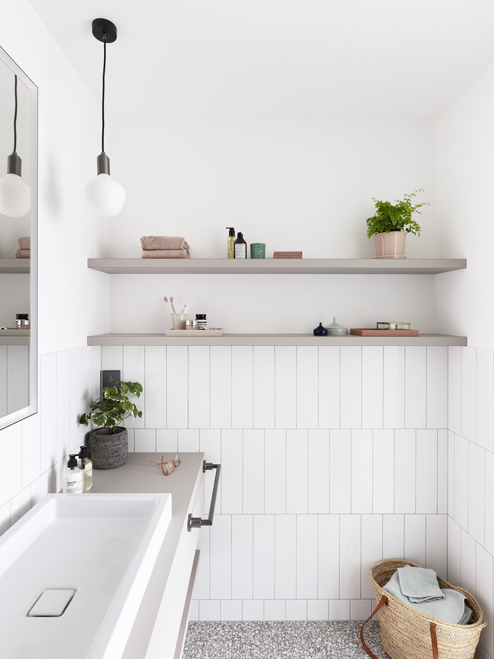
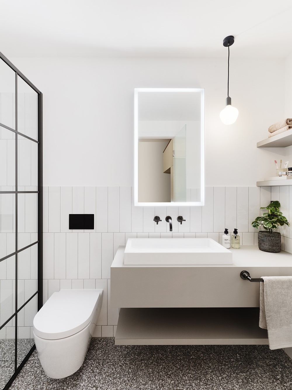
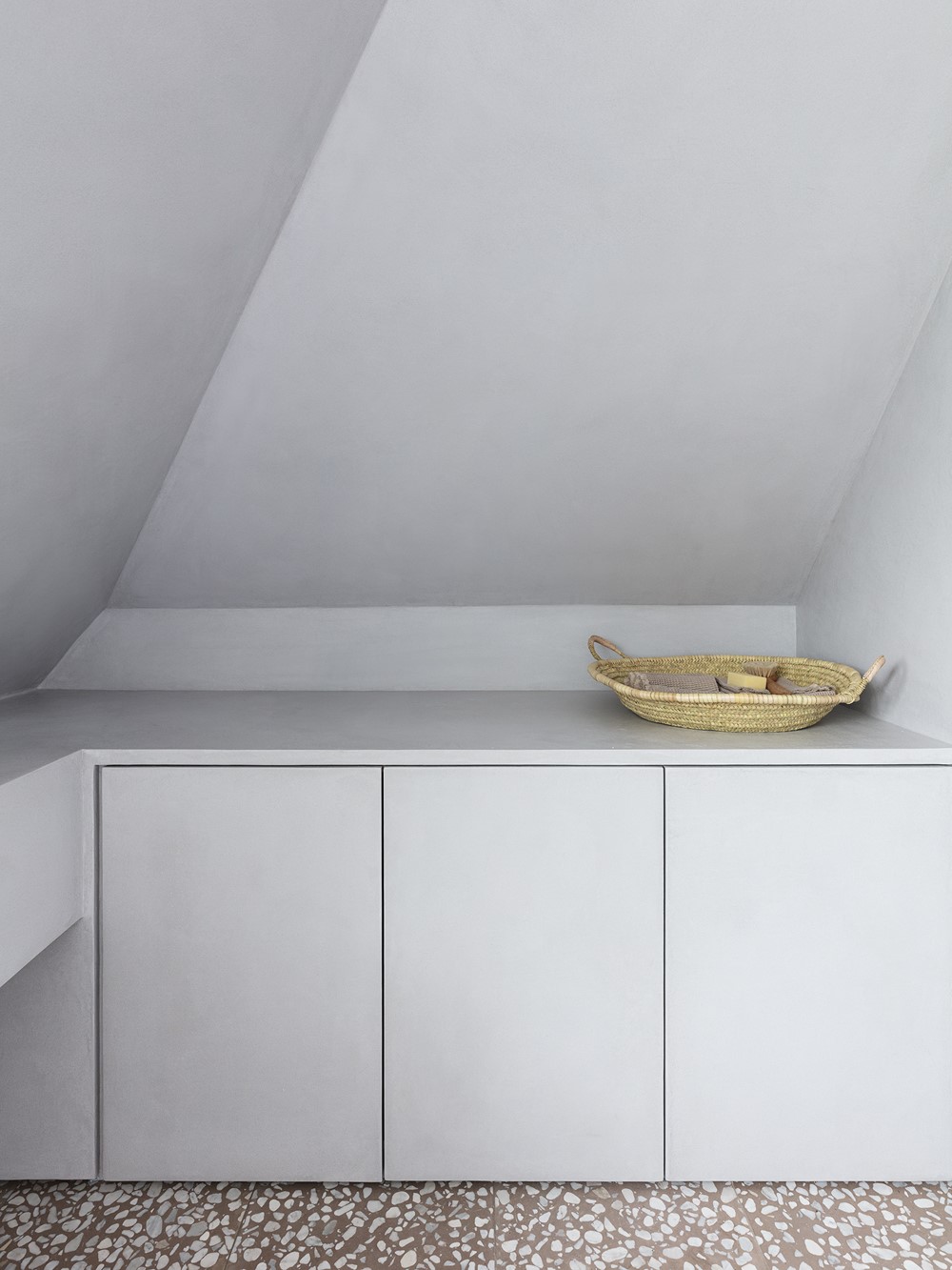
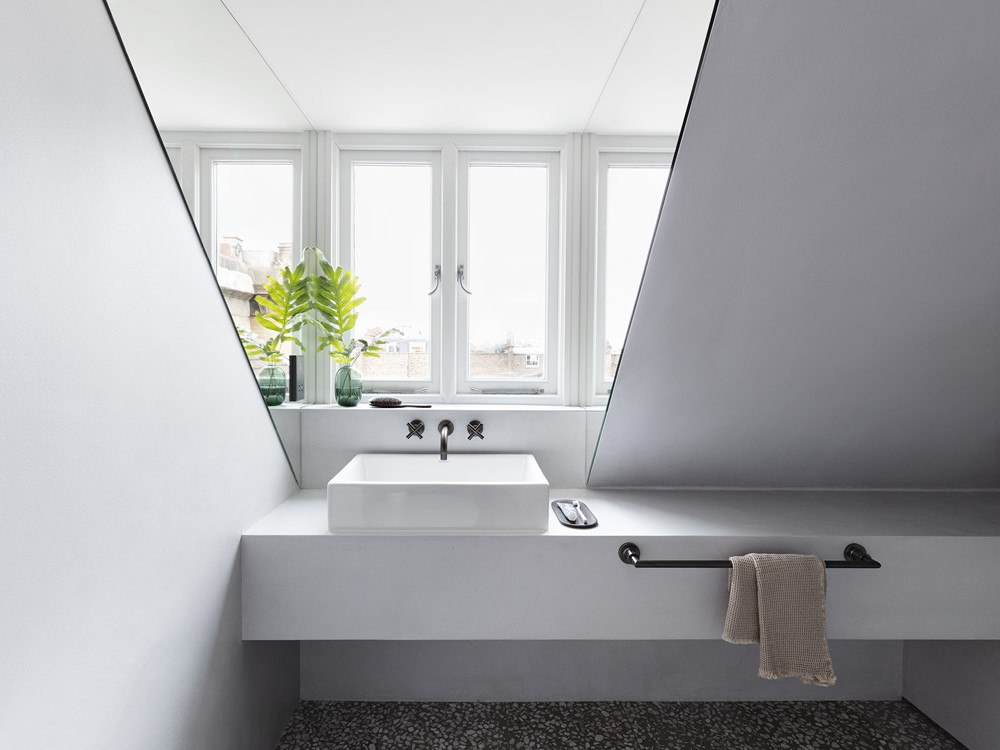
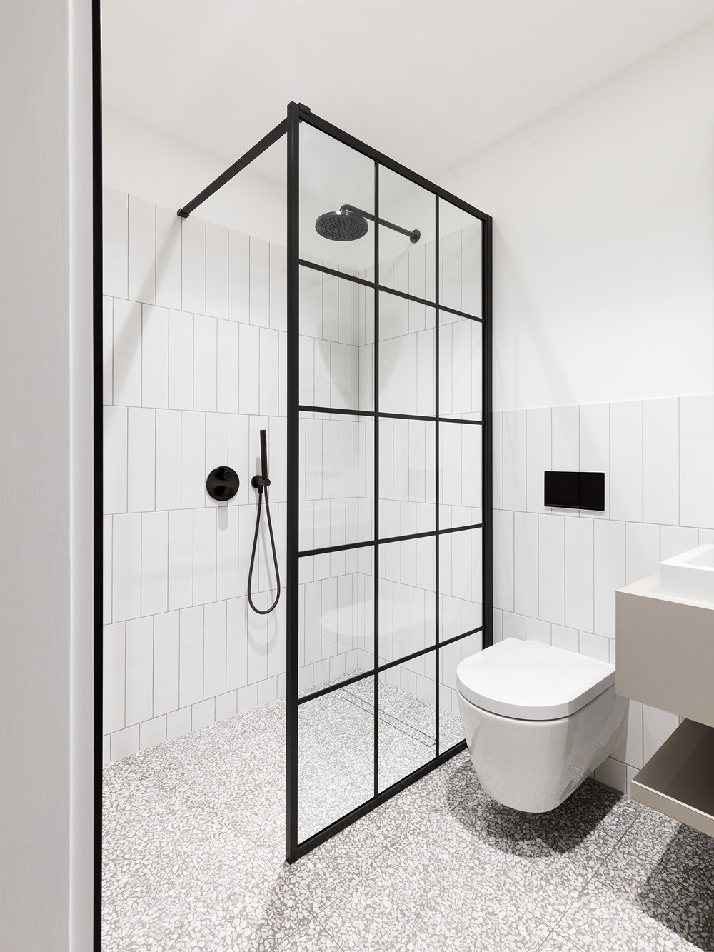
Another smaller bathroom has a striking terrazzo floor which is effectively highlighted by the all-grey microcement-clad units and walls, here too providing a cohesive, monolithic look. They also act as a neutral backdrop to any accessories.
Quotes:
Amos Goldreich, Director, Amos Goldreich Architecture
“Maison Melange was an exciting opportunity for the studio to flex our creative thinking in functionality and materiality. We were challenged by the unusual collection of styles incorporated into the brief, and found clever ways of blending them together to create a sense of cohesion in the spaces.
It’s the thing we touch everyday that are the handshakes of the home. We opted for quality fittings that would age beautifully over time, and add a sense of luxury to the apartment.”
