Mardaloop Residence is a project designed by Reena Sotropa In House Design Group. One of the most incredible sources of inspiration for your home is travel, and it was during a stay at NYC’s chic Gramercy Park Hotel that our clients found inspiration for their own pending bathroom renovation. Upon returning home from their trip, they called our team to help bring their vision for a “crisp, clean and high contrast space” to life. As their bathroom renovation began to take shape, they started to fall back in love with their inner city home and asked us to help re-imagine the remainder of their 2000 square foot property. Photography by Phil Crozier.
.
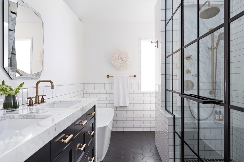
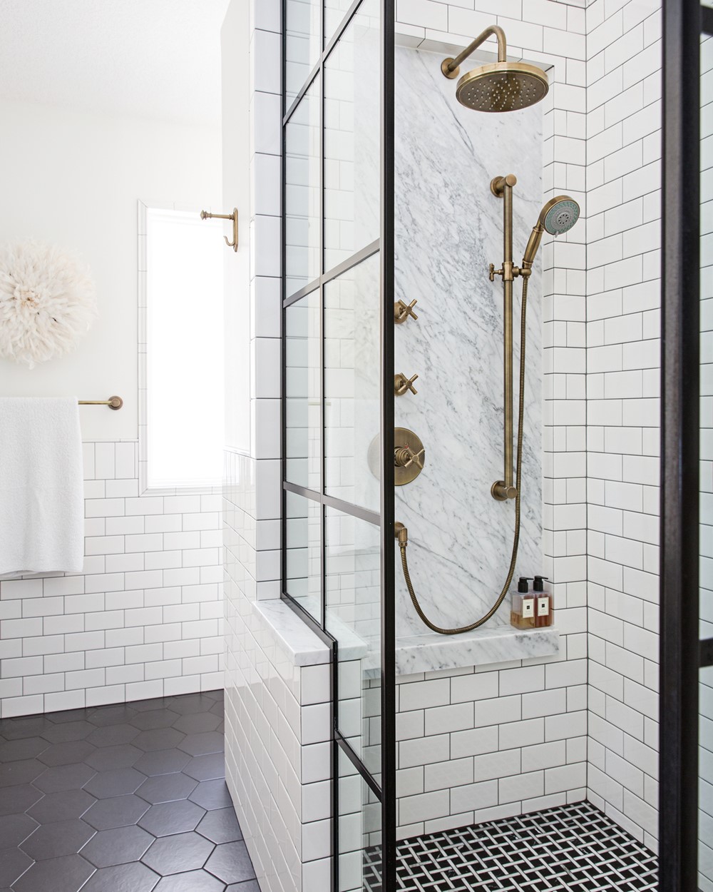
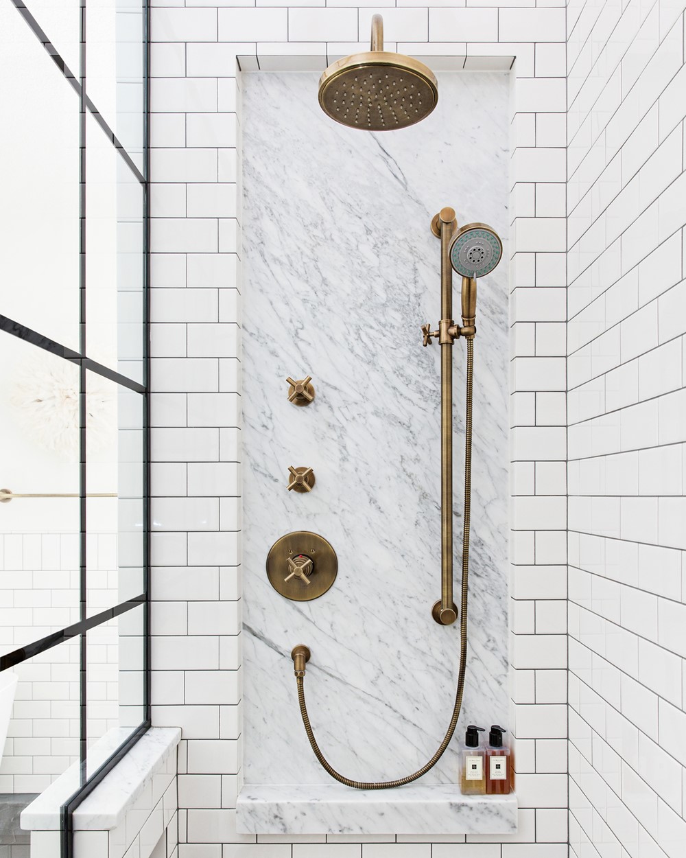
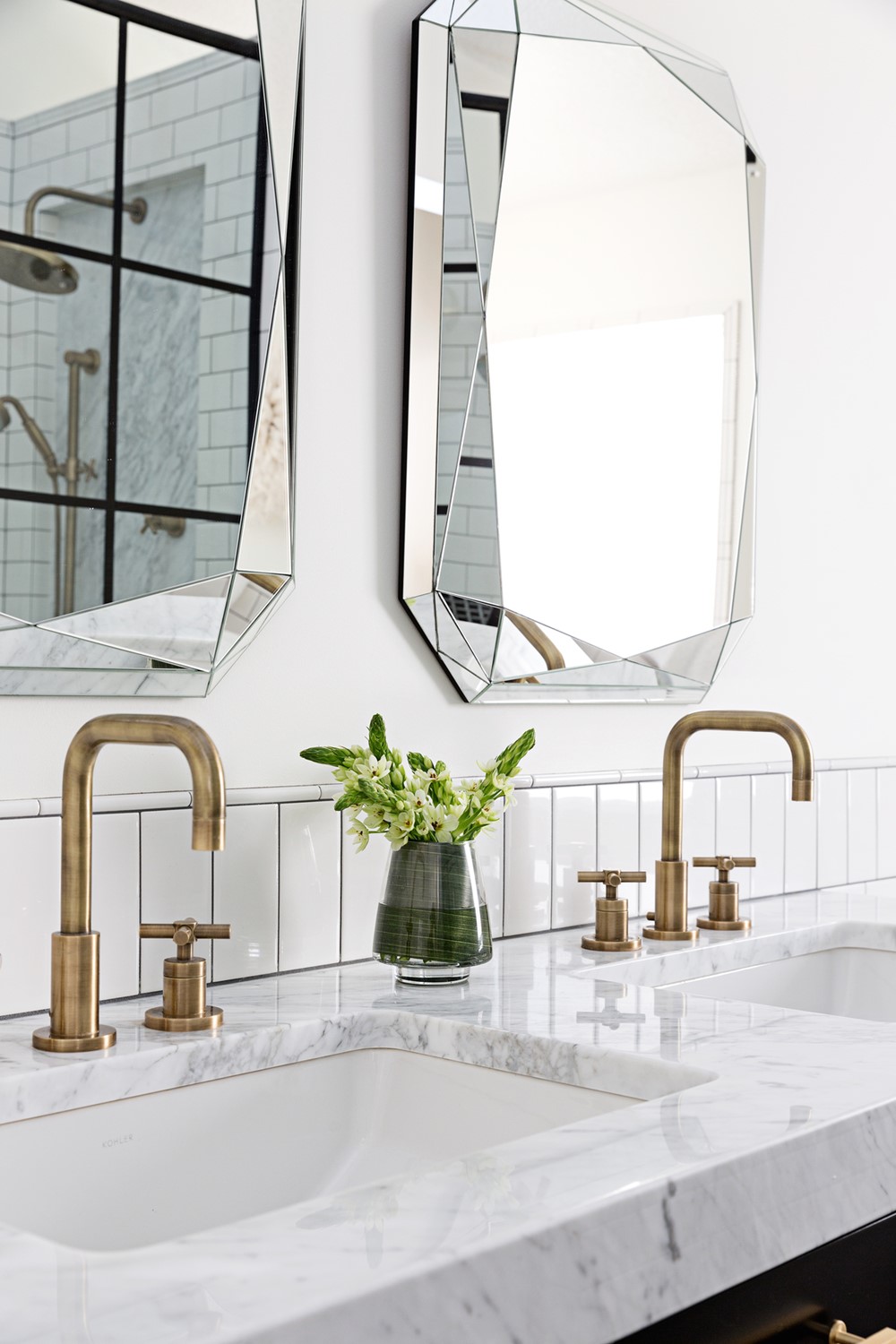
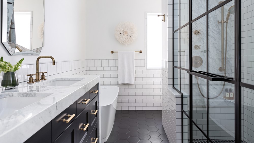
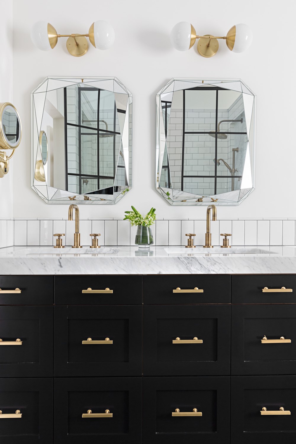
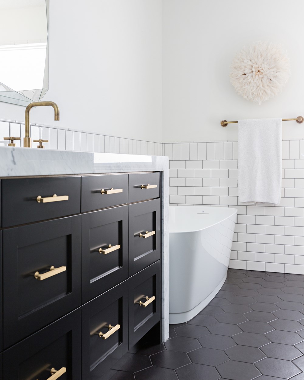
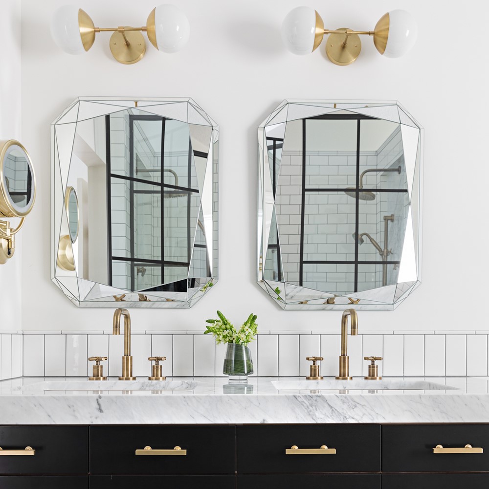
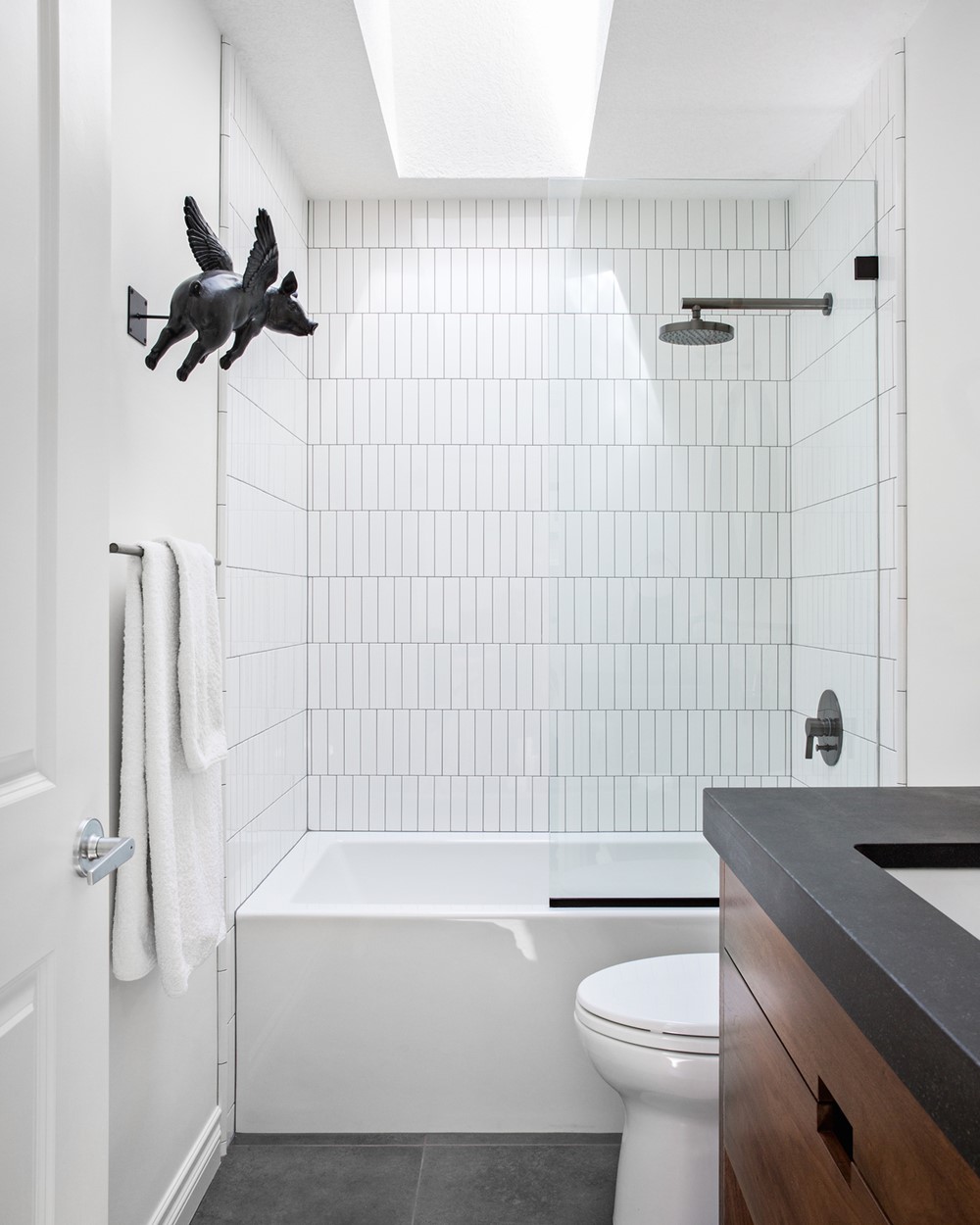
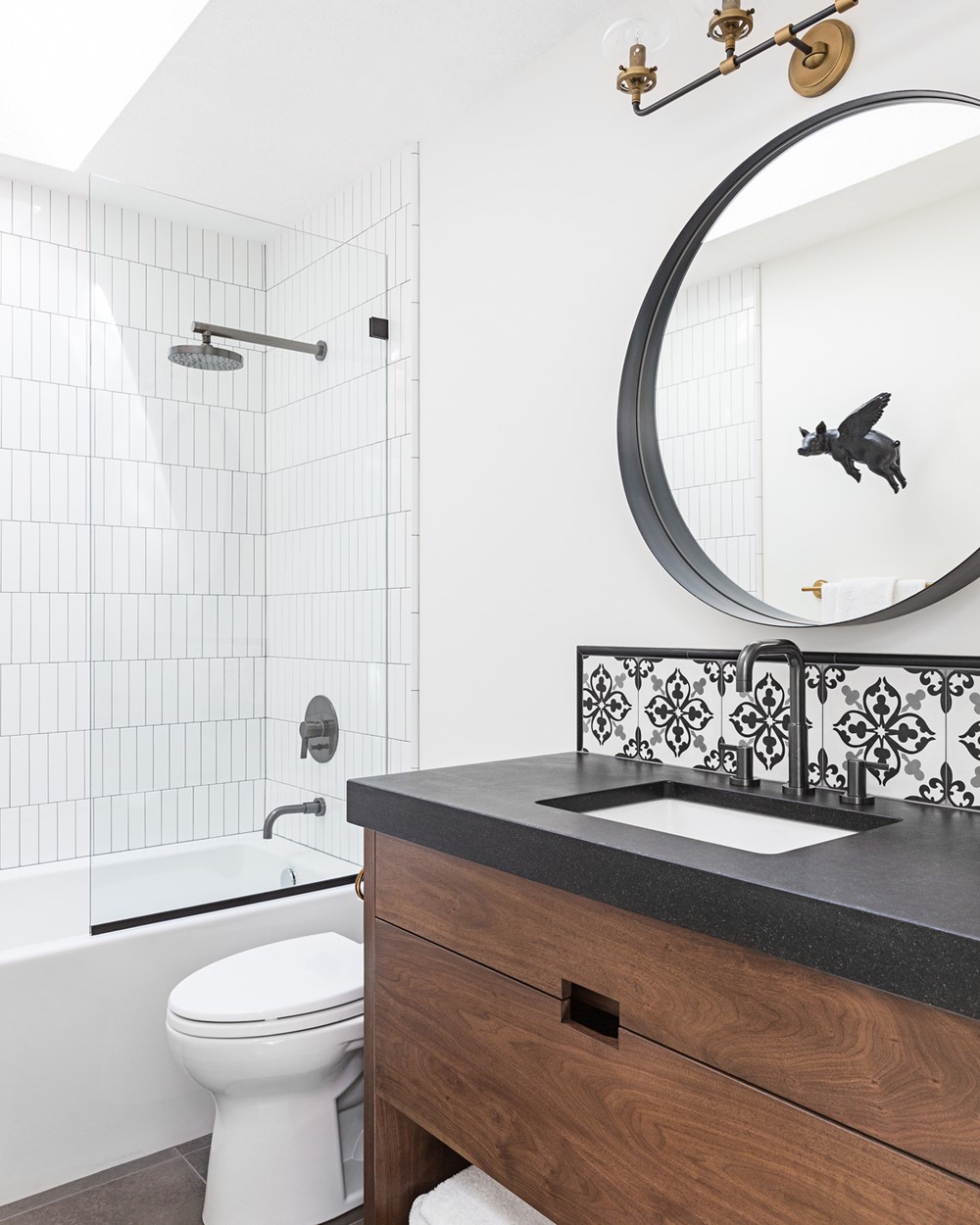
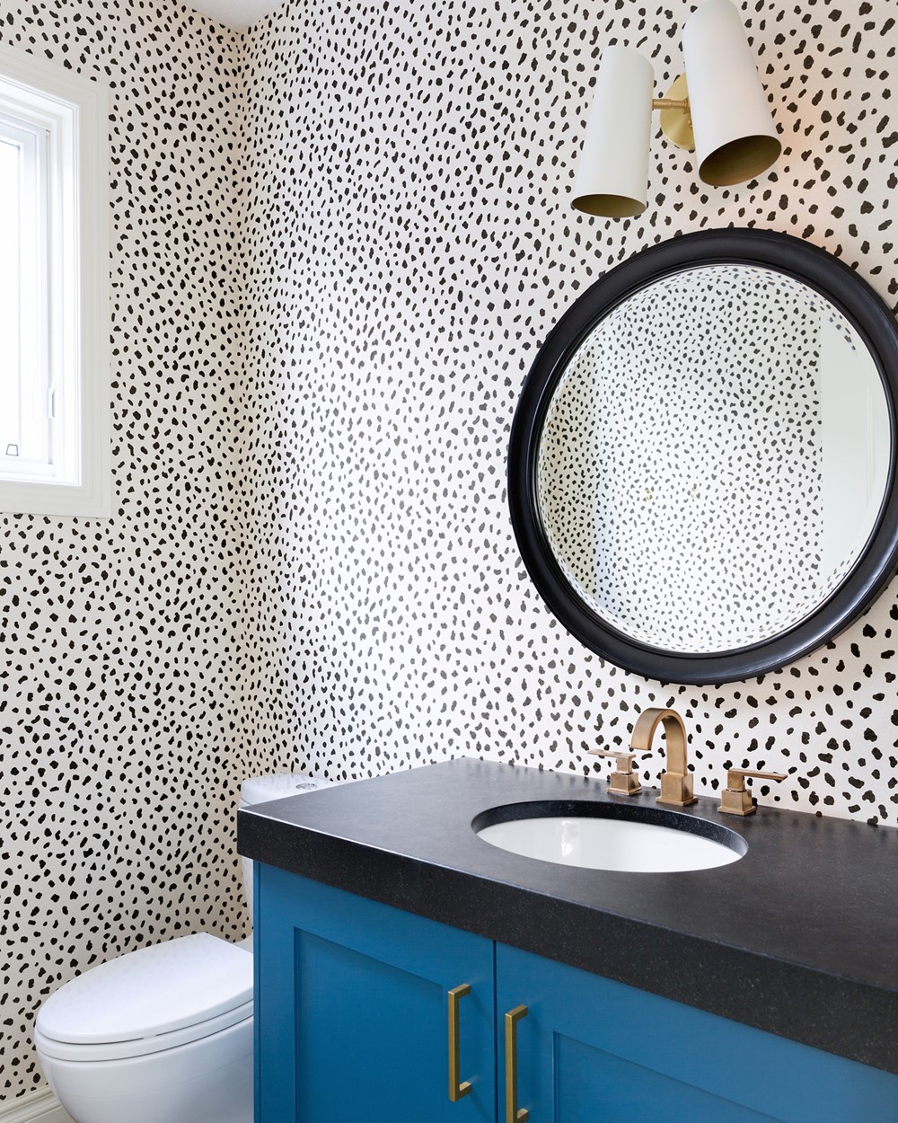
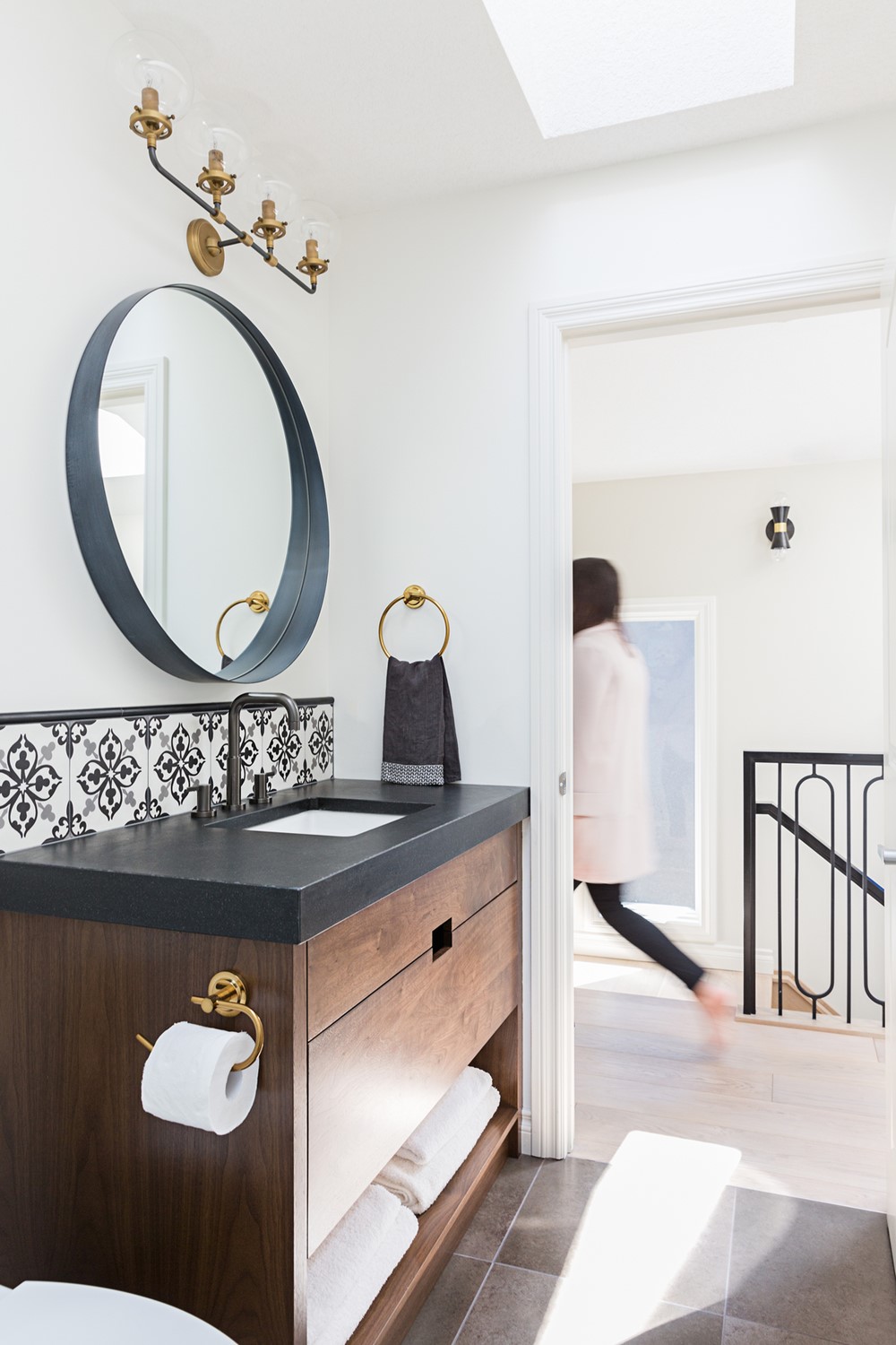
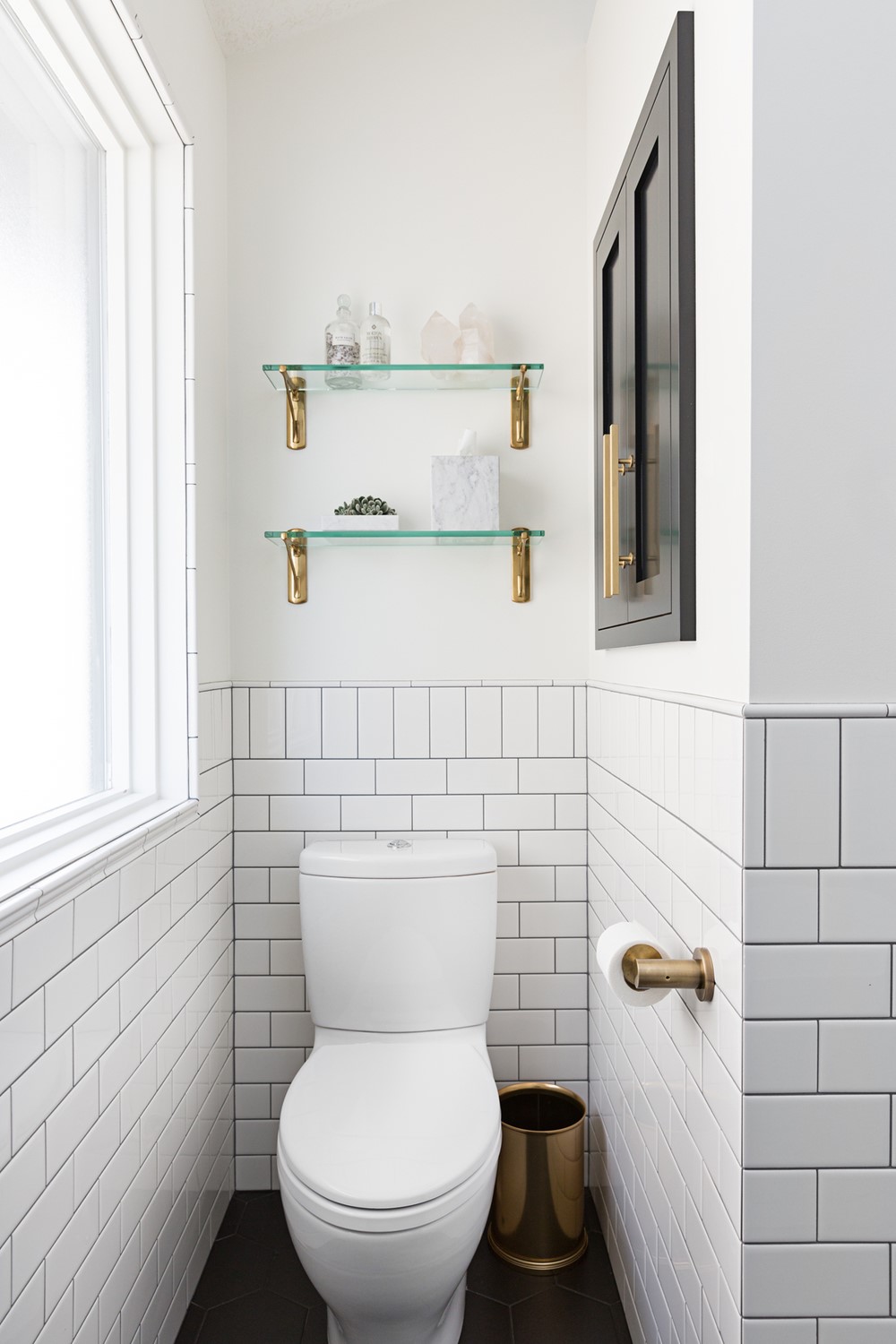
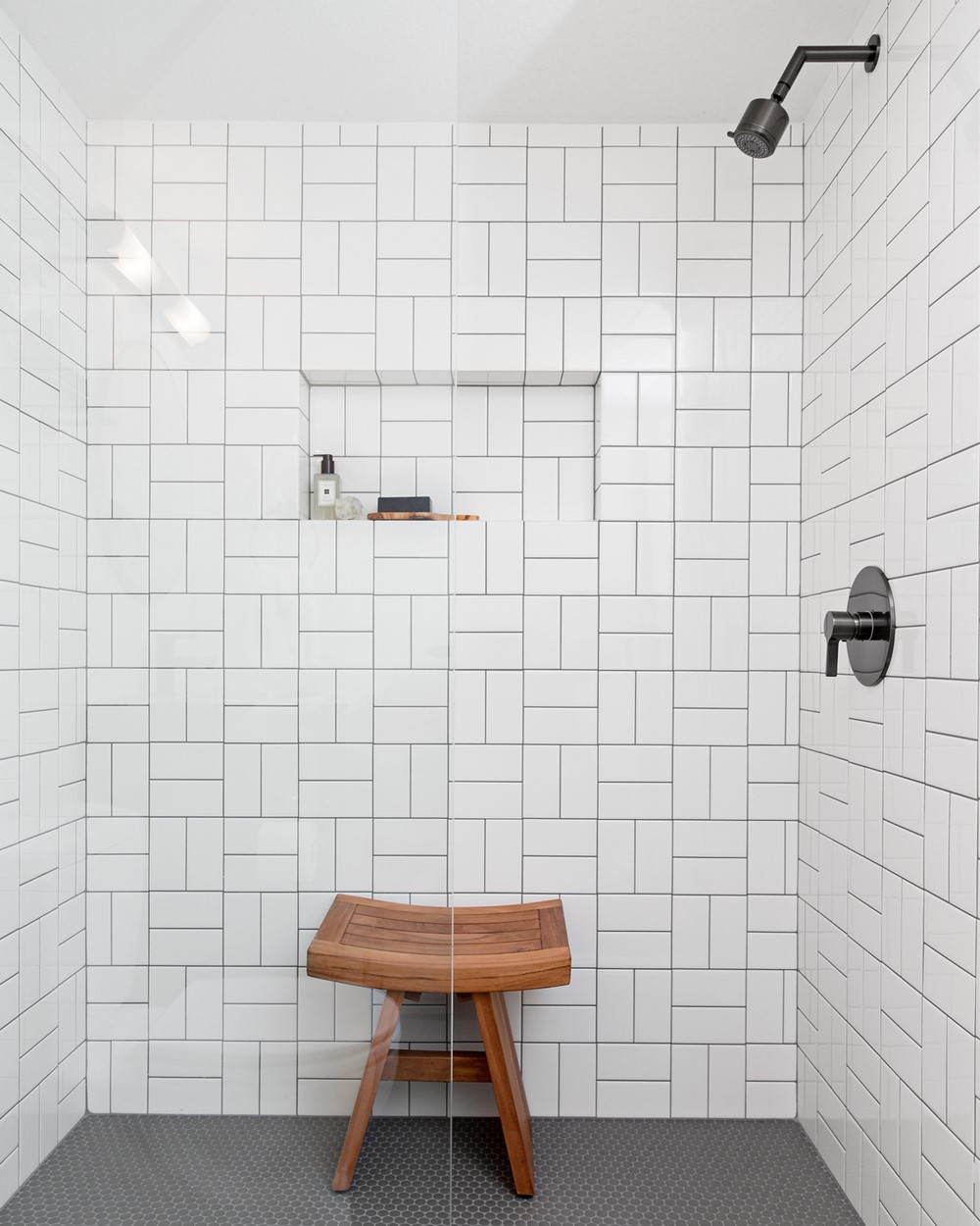
For this particular renovation project, our office provided both the design and the construction management. Luckily, the home is only three blocks from our office because we were there almost every other day from beginning to end of construction! A general challenge throughout the whole project (including design) was the small size of the principal bathroom. The overall room was only 8’ wide and 10’-7” long. Our design team proposed 11 different options before landing on the final space plan. Given the tiny footprint of the space, scheduling trades became a bit of a juggling act as there was really only room for one person to work in the space at a time.
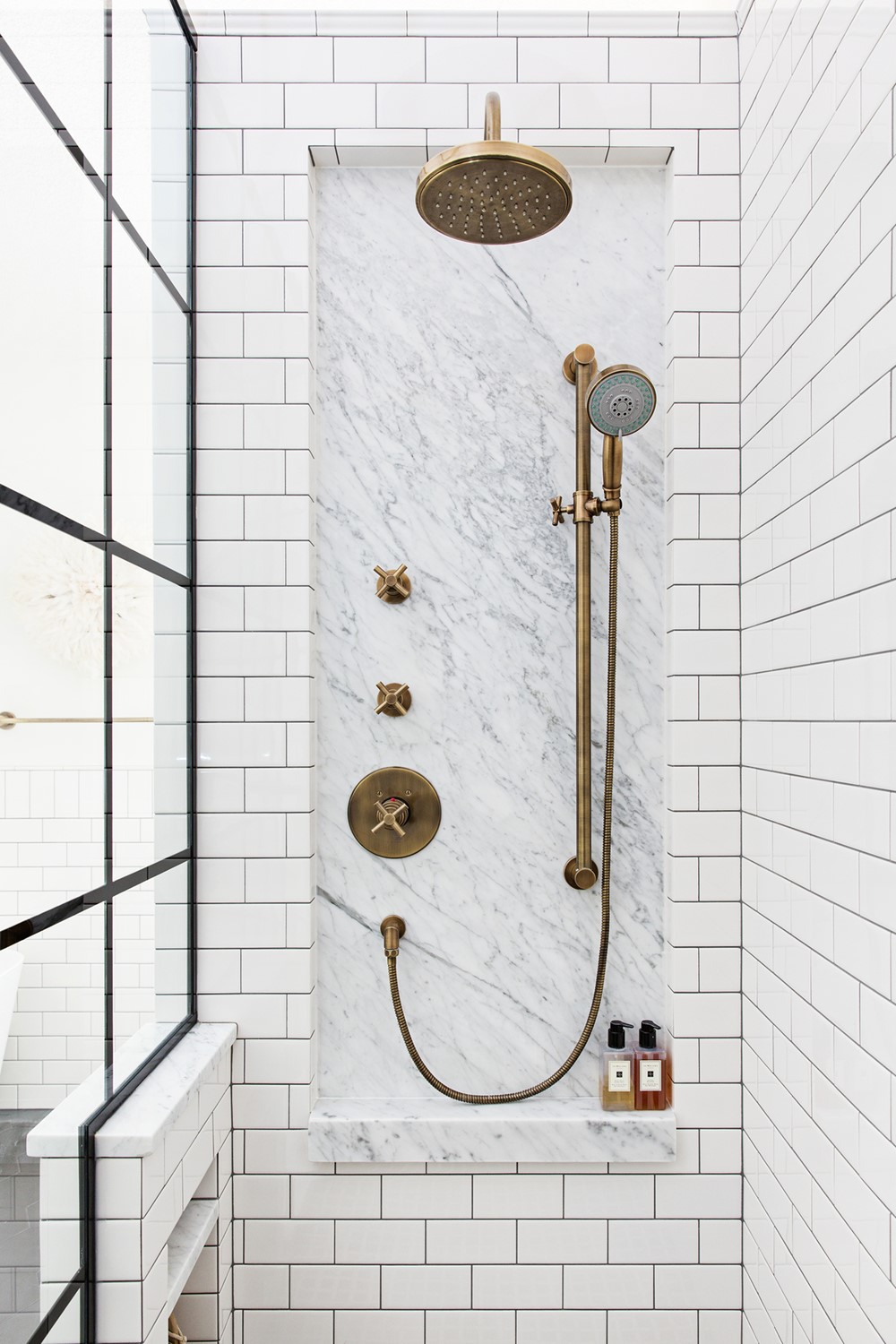
One of our main construction obstacles was executing the principal bathroom’s “marble niche” detail. After our clients selected the most beautiful Newport Brass plumbing fixtures we knew we wanted to make them one of the main features in the space. We designed an oversized niche detail to frame the brass fixtures. The back of each niche (there are two in total, one on each end of the shower) is a 30” x 60” slab of marble. The marble acts as a beautiful visual interruption to the large expanse of subway tile, and provides added emphasis to the plumbing fixtures. However in order to pull off this detail, we had to coordinate a TON of small details between trades to ensure the access points for plumbing were cut into the marble slab correctly.
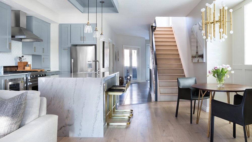
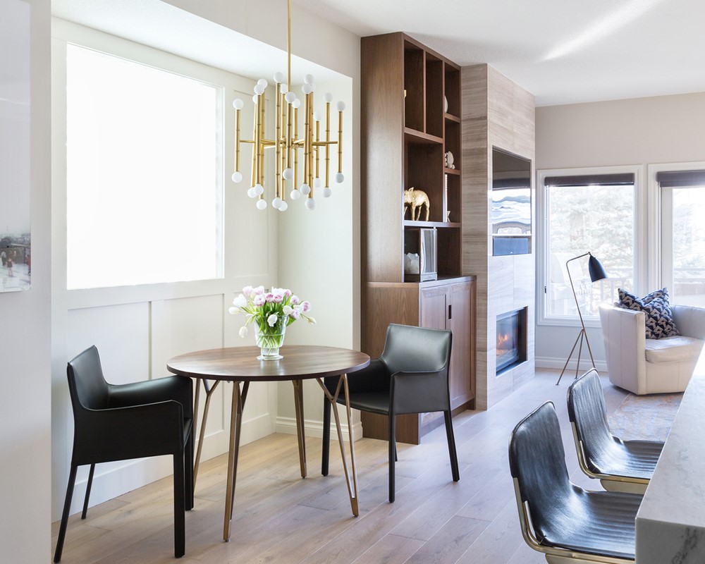
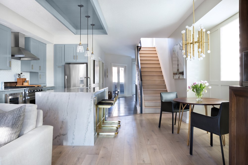
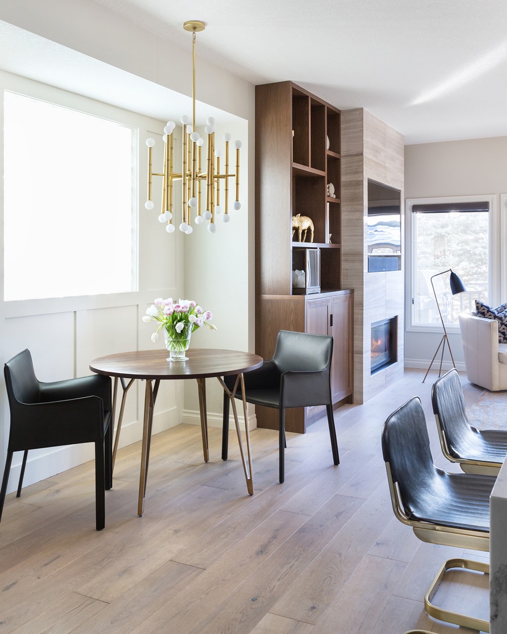
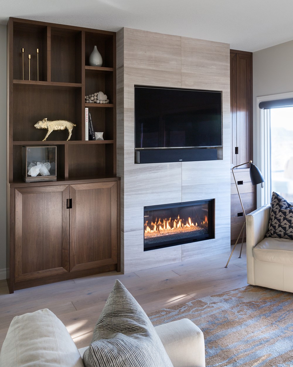
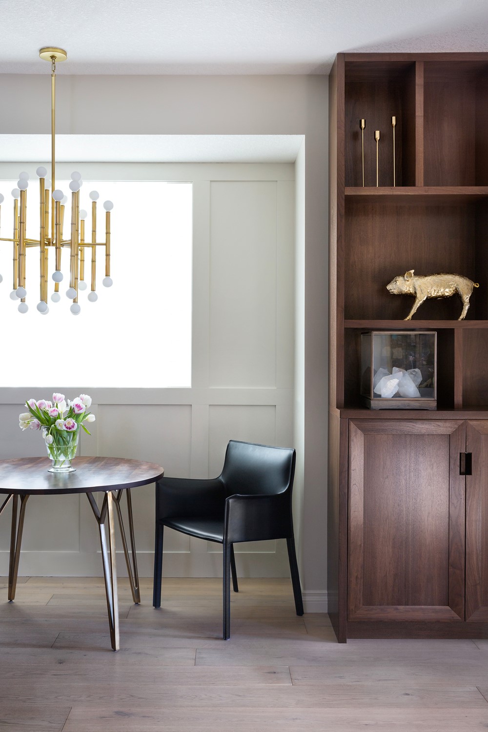
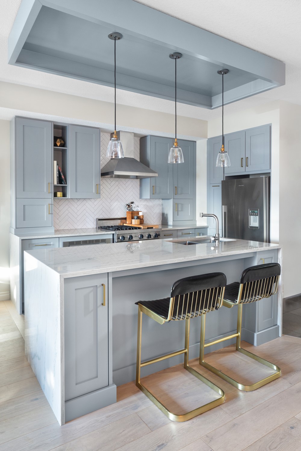
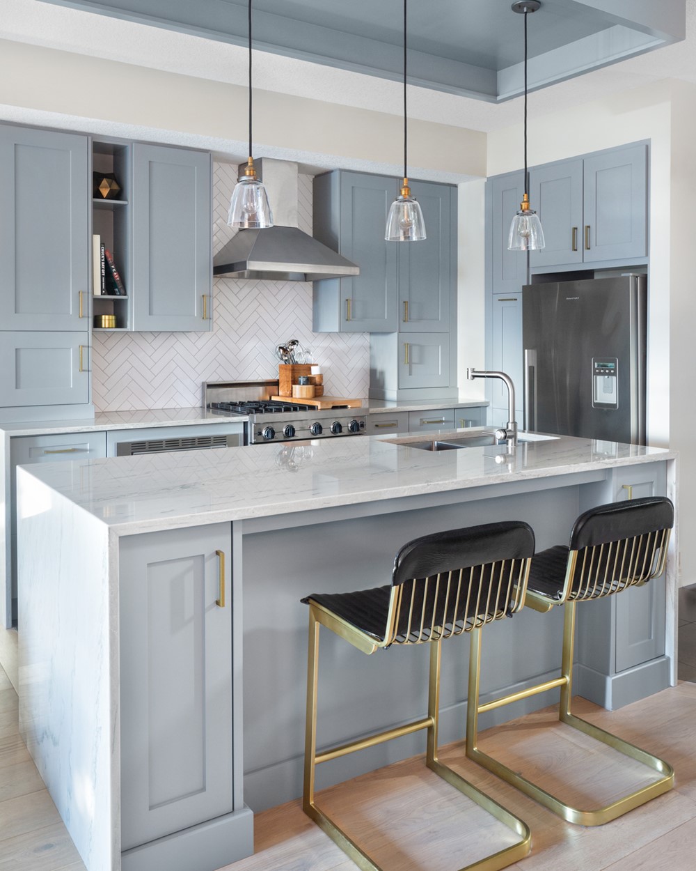
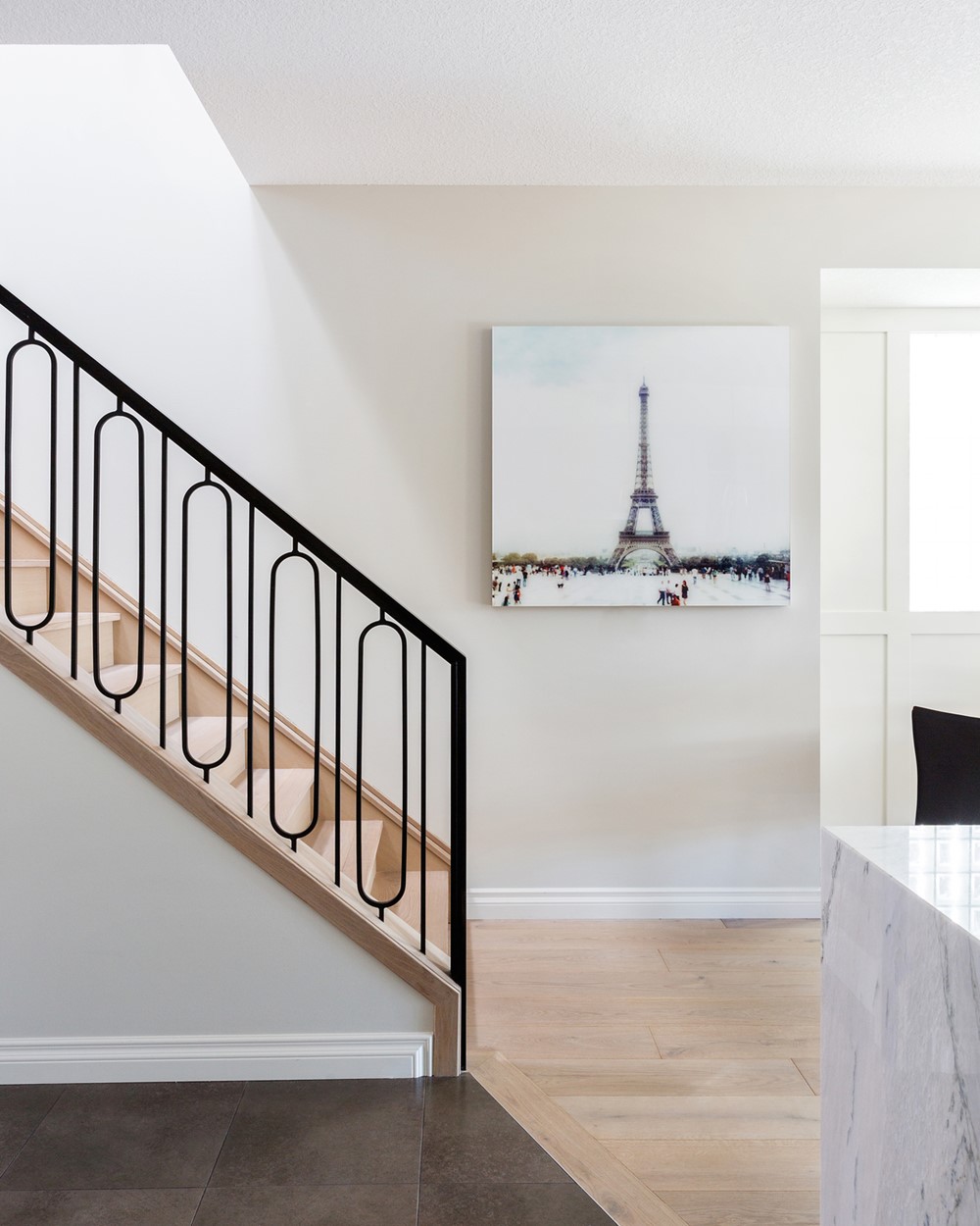
Over the span of two years, the rest of the house was transformed from a dated dark space into a light-filled stylish home. It began with updating the floors from the original maple hardwood to a wide-plank oak in a smoky matte finish. From there, everything else then had to live up to the same sophisticated standard as the floor. The walls were brightened up with a warm white paint and the fireplace was reimagined into a floor to ceiling vein-cut limestone to create a modern focal point. Just as we thought the remodel was complete, our client called to add the kitchen (the only un-renovated area) into the scope of work. We sprayed out the dark espresso cabinets with a soft grey and swapped out the dated backsplash for with a bright white tile installed in a herringbone pattern. The previous two-tiered counter was streamlined with a single level waterfall counter in a white Macaubus quartzite.
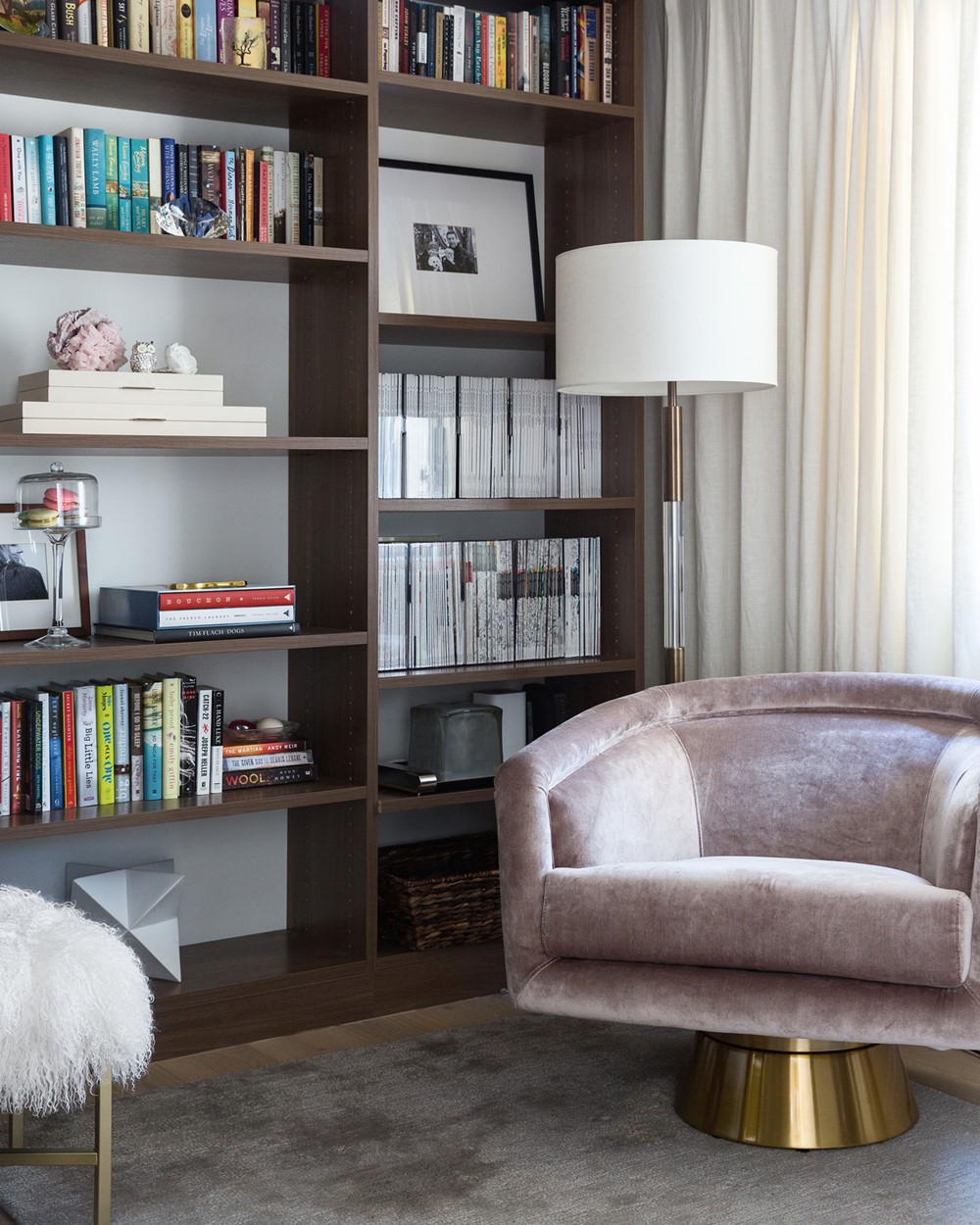
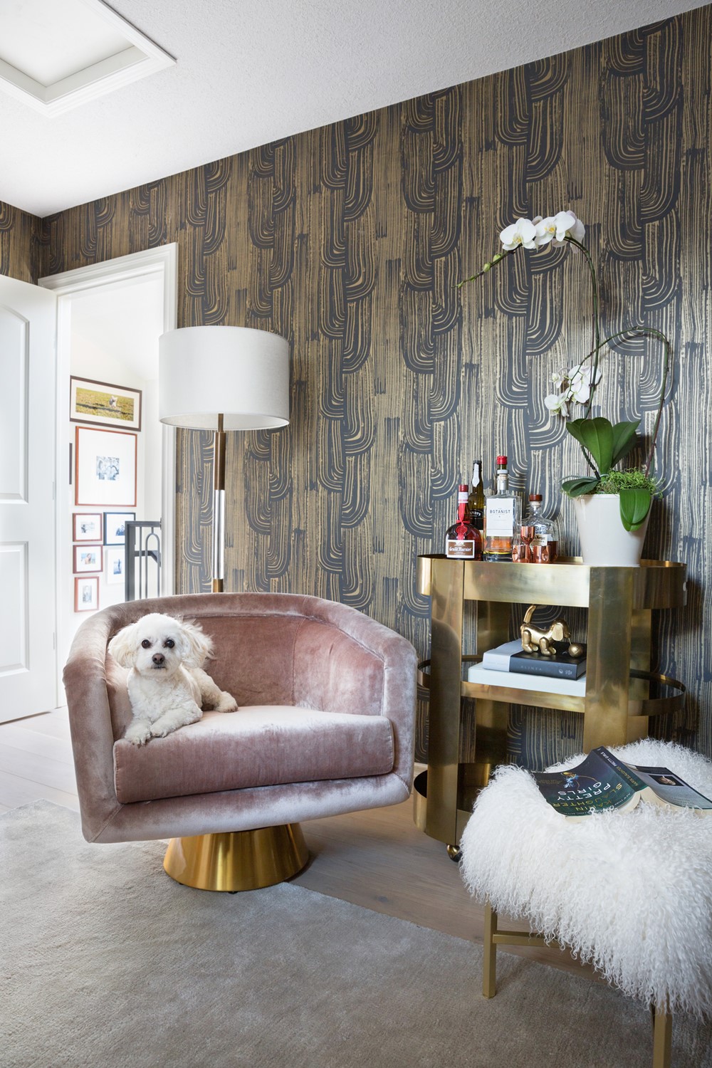
While the entire home took on a fresh and bright new look, our client asked to keep one room dark and moody, the den, which features a dramatic black and gold Kelly Wearstler wallpaper, a velvet Jonathan Adler chair and a full height custom oak bookshelf- collectively creating a glamourous study to accommodate the keepsakes and favorite books.
