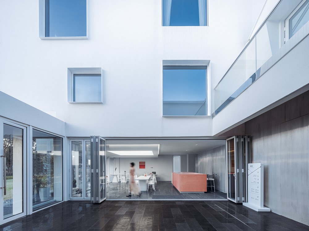
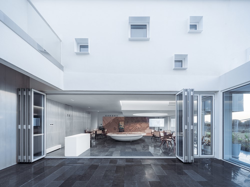
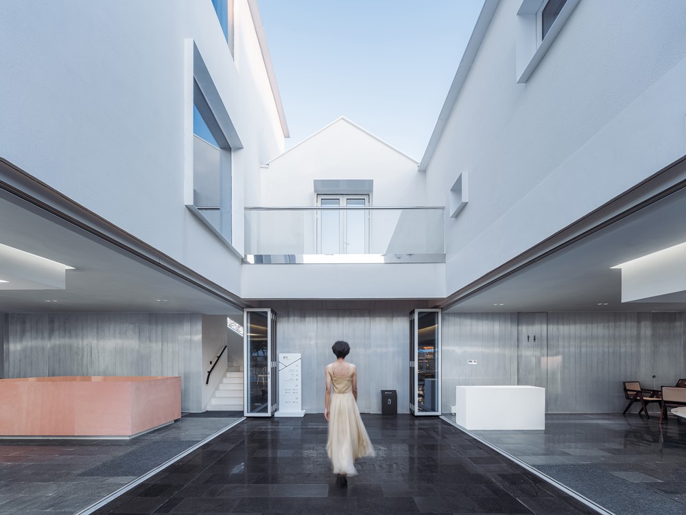
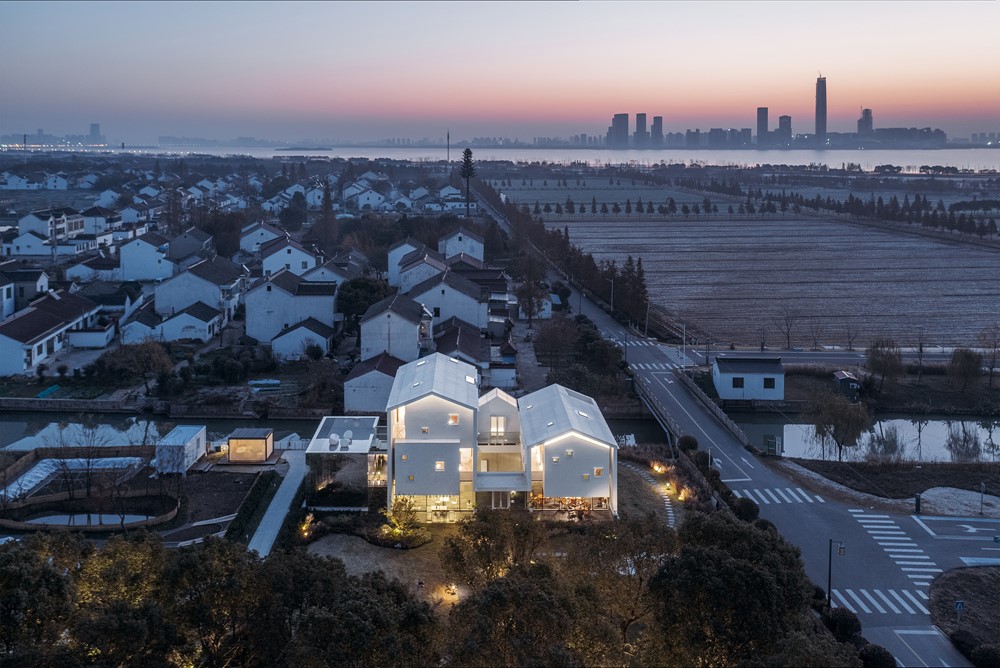
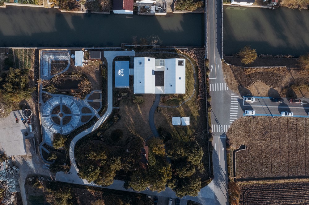
The White Section Homestay designed by Wutopia Lab in Suzhou was opened in October 2021 in West Lindu Village on the shore of Taihu Lake. It is invested by Jingcheng Culture Tourism Development (Suzhou) Co., Ltd, a subsidiary of TONGCHENGTRAVEL, and managed by Taolu Brand homestay. The White Section Homestay is the first prototype building that is a rural revitalization project developed by TONGCHENGTRAVEL and the Hengjing government in Lindu Warm Village. Photography by CreatAR Images.
.
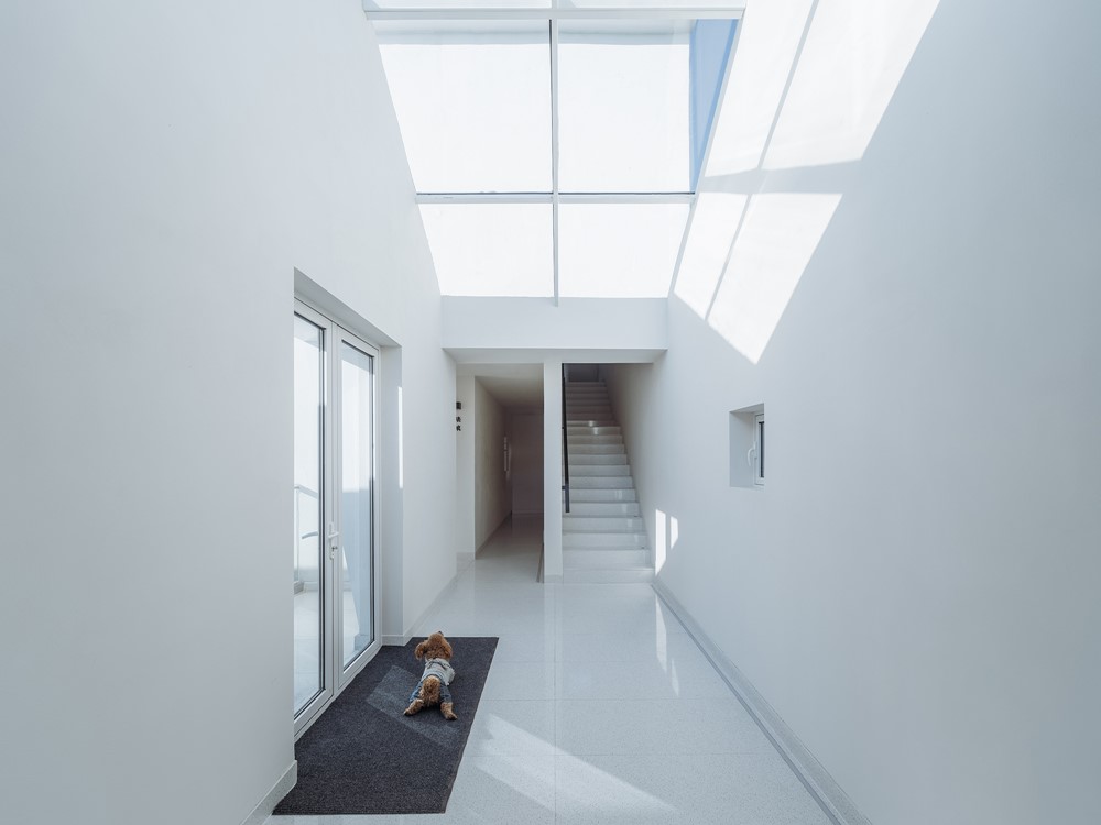
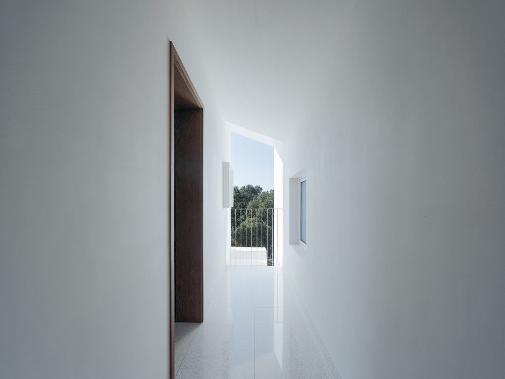
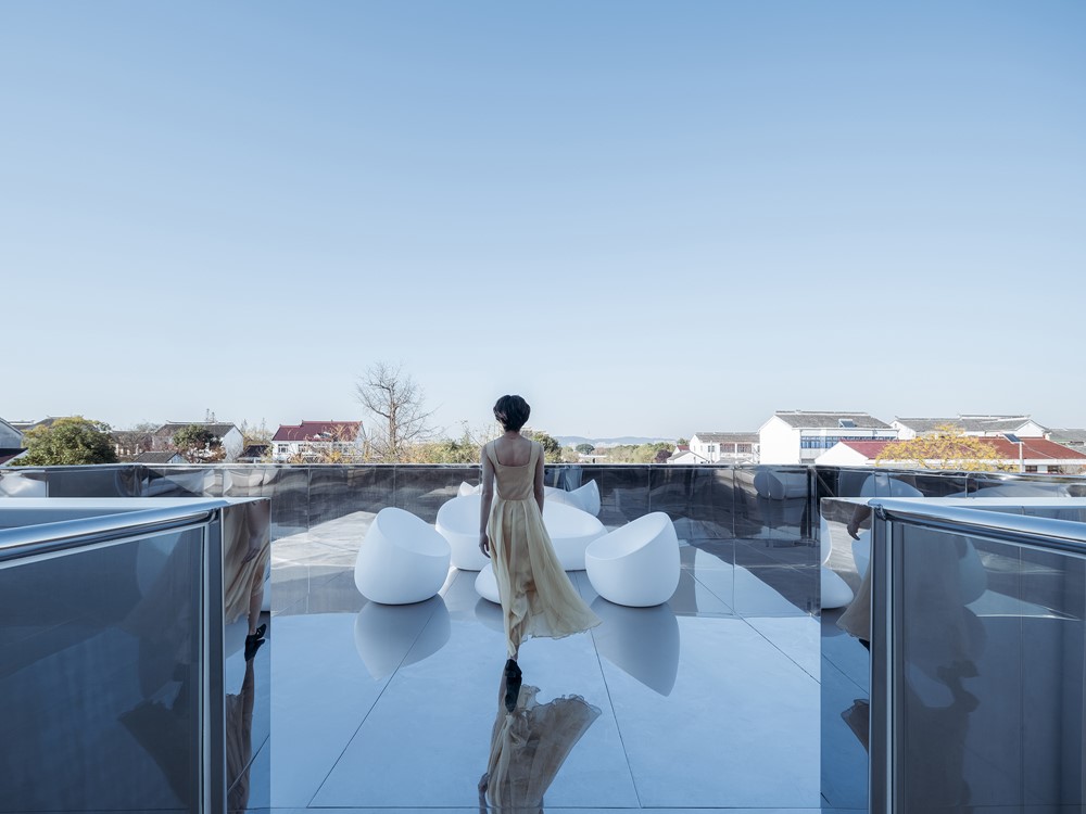
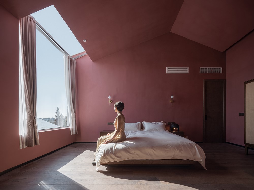
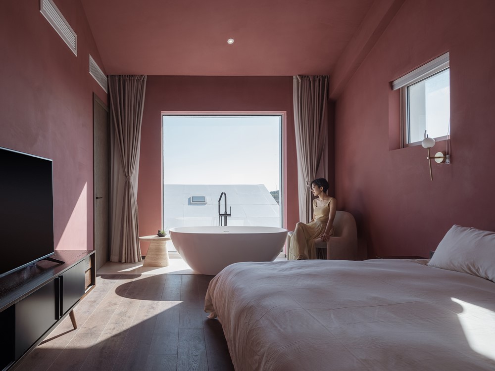
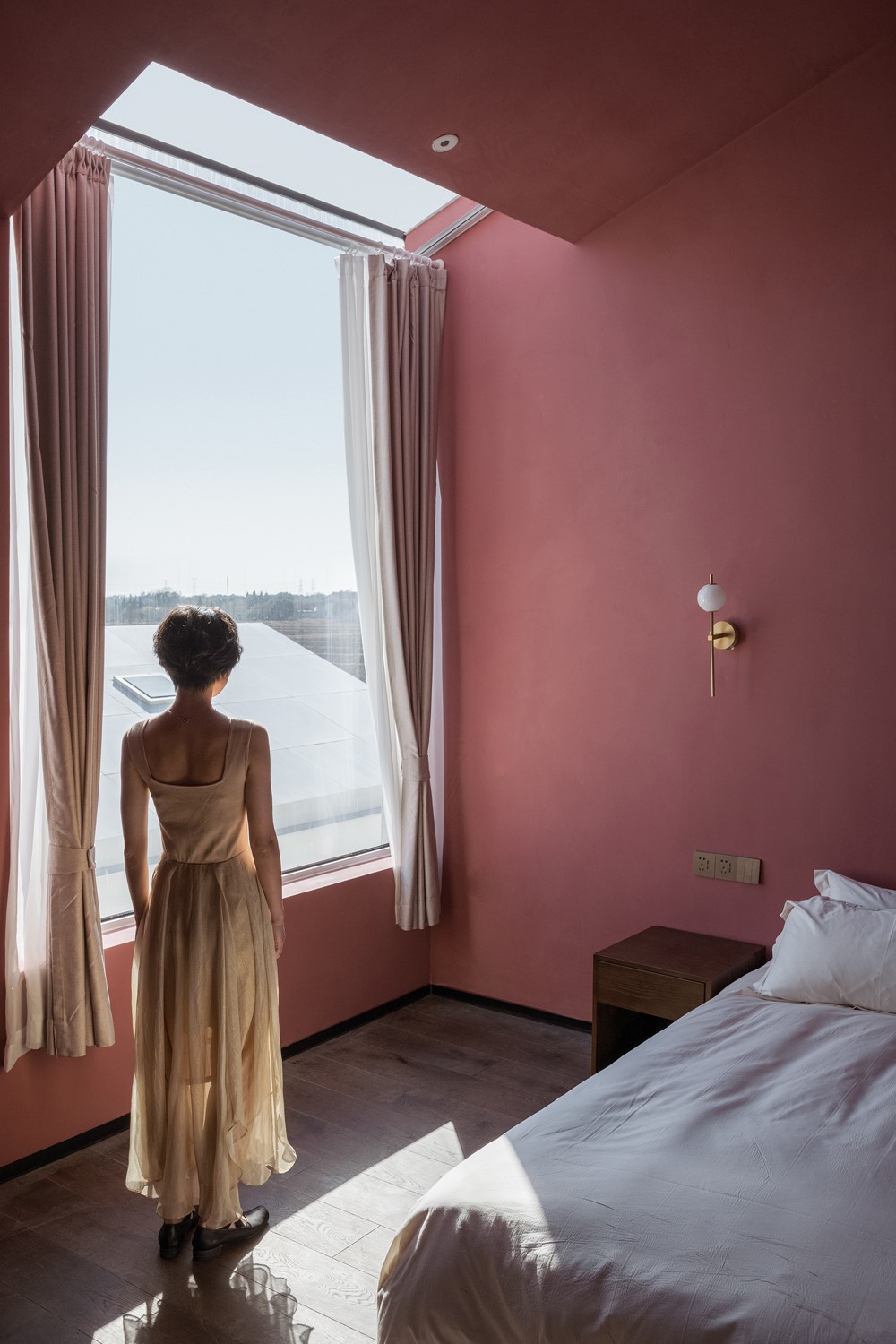

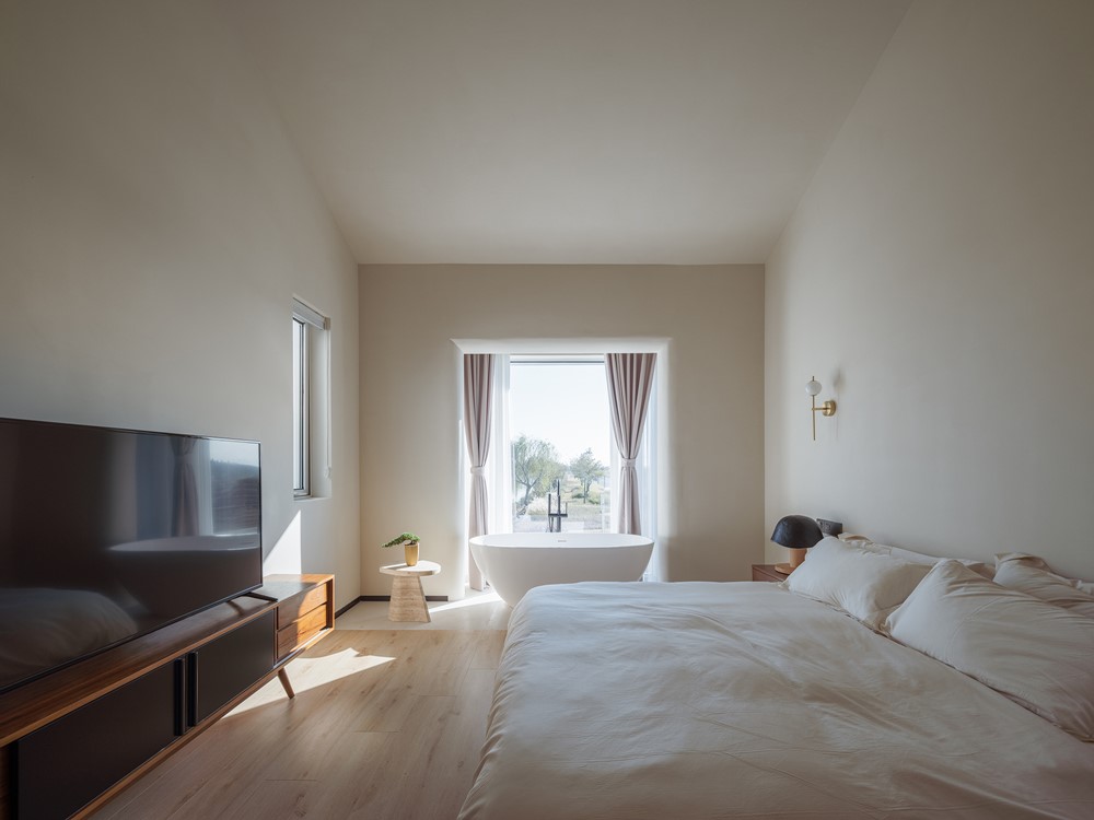
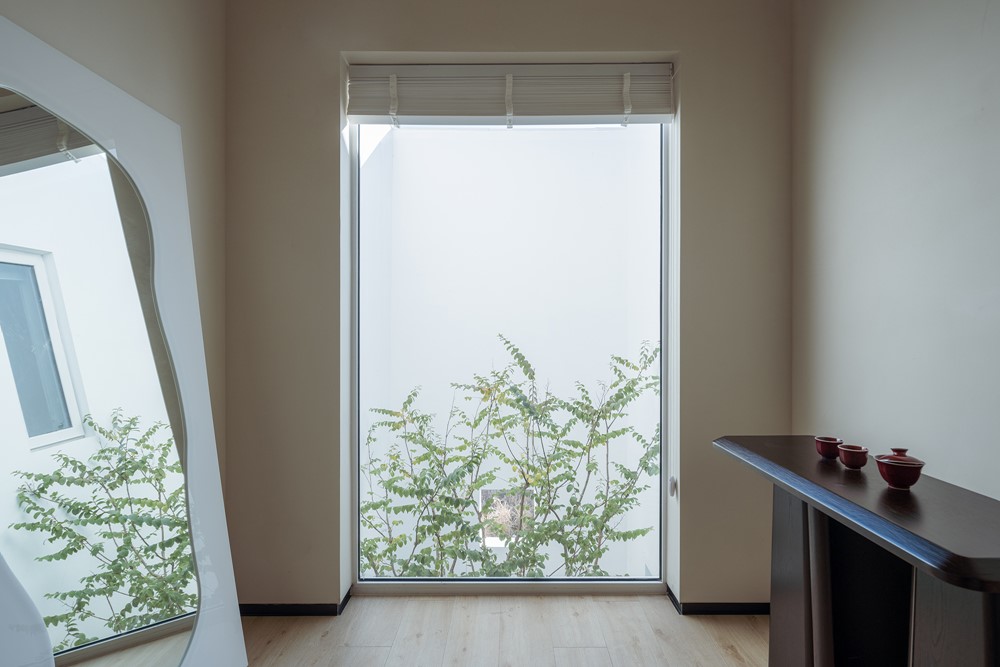

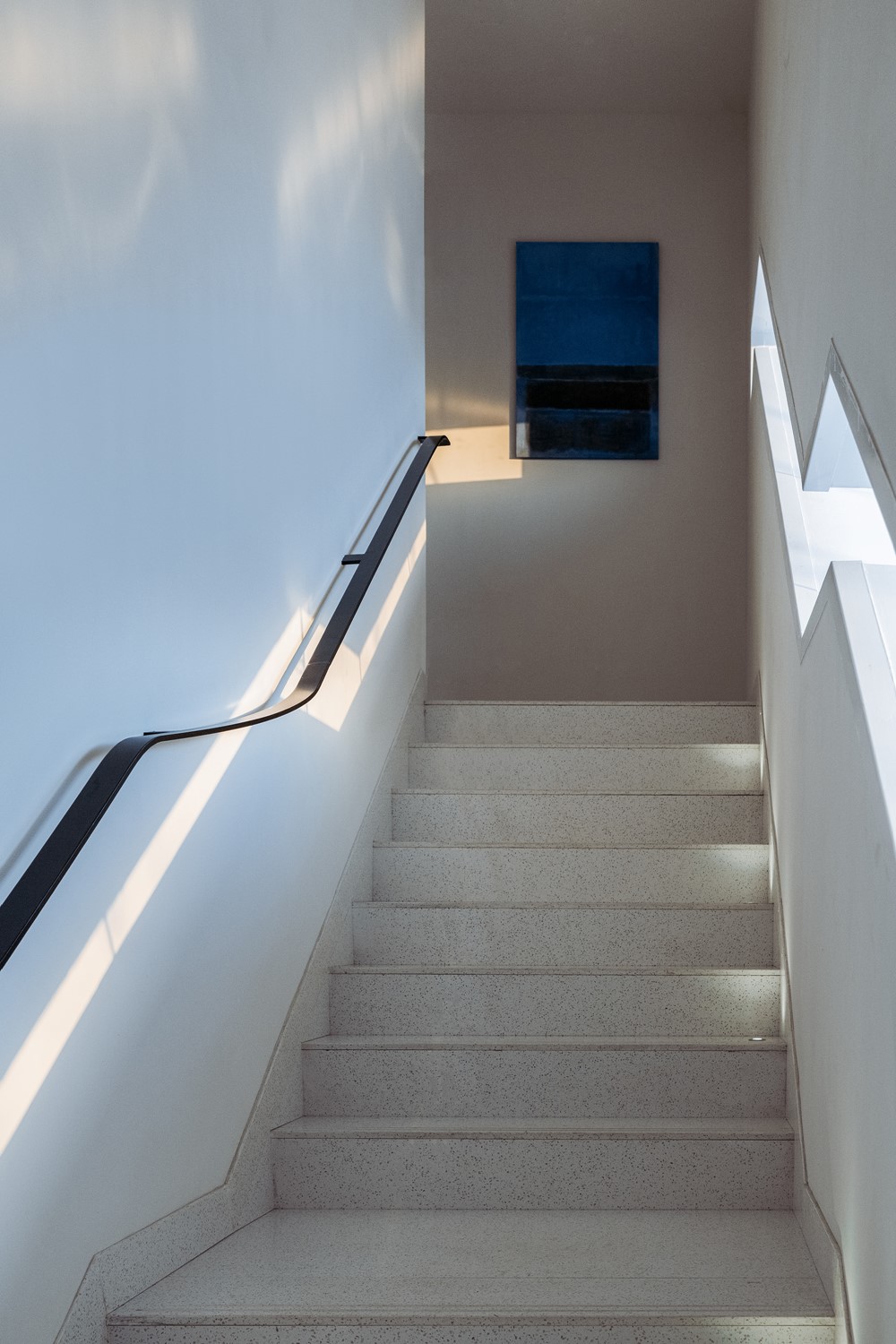



I Would Like to Relax
The weather was excellent when I visited the site. I was even a little drunk in the golden winter day. The most attractive to me, a middle-aged man, is in a daze in such a peaceful and tidy village to ease the pressure from struggling life! I hope that the Section Homestay could express this relaxed and lazy state, rather than haggle over every ounce with precision.
Cut in Half
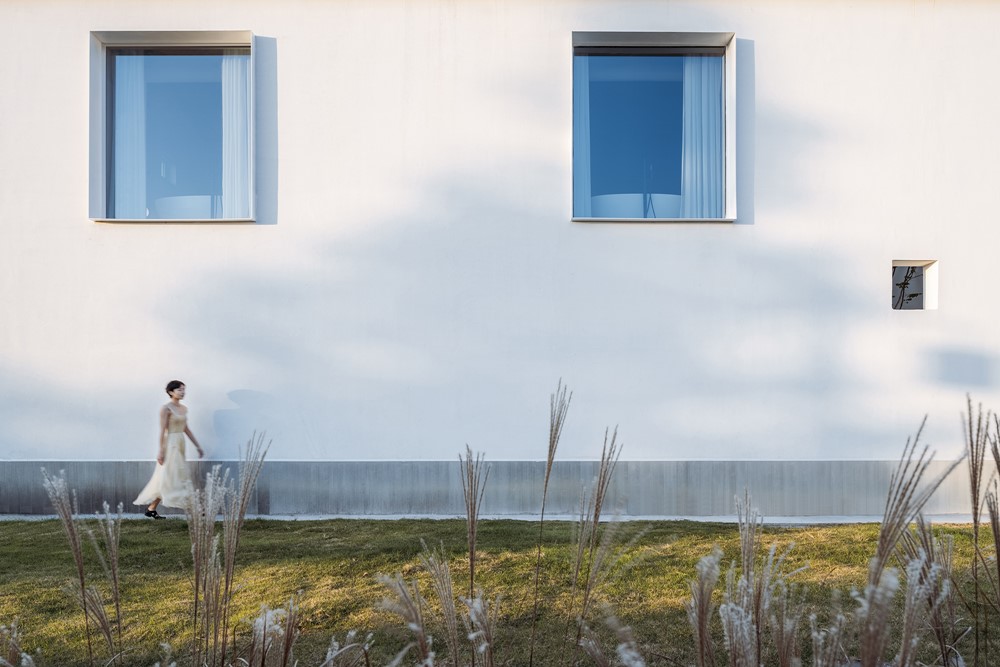
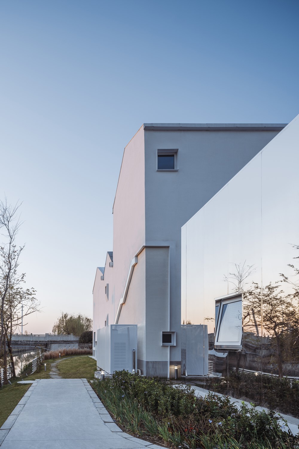
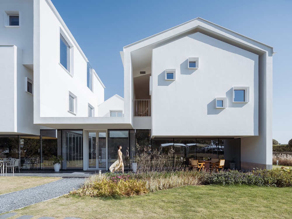
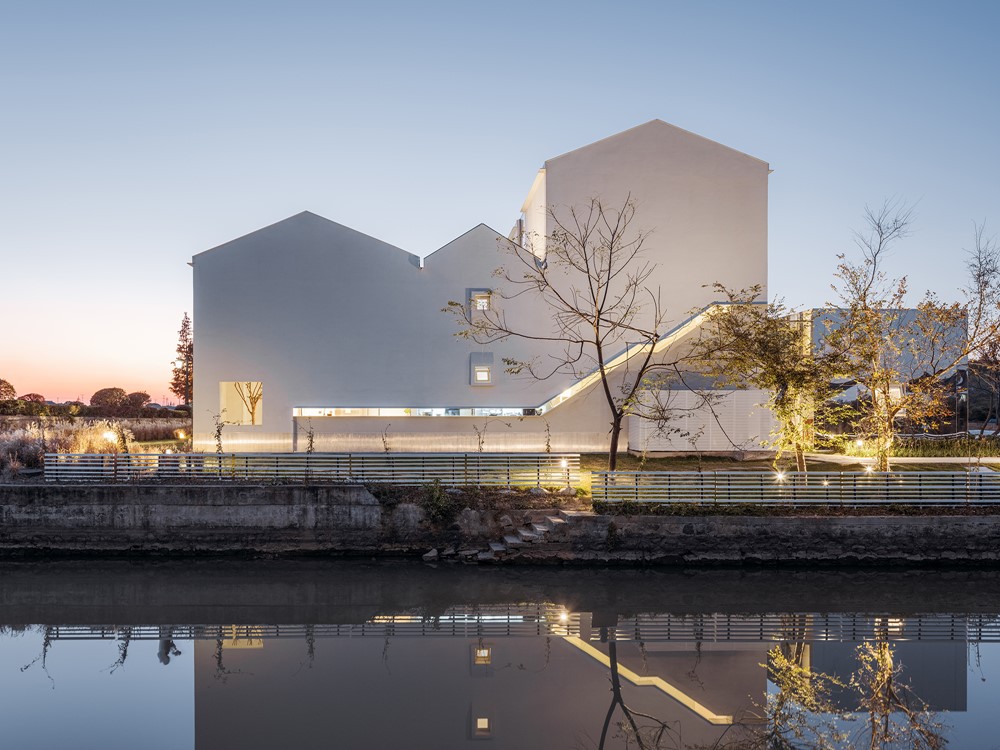
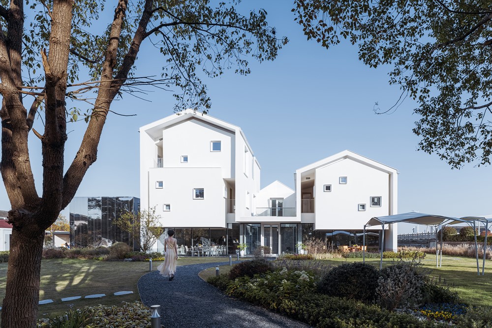
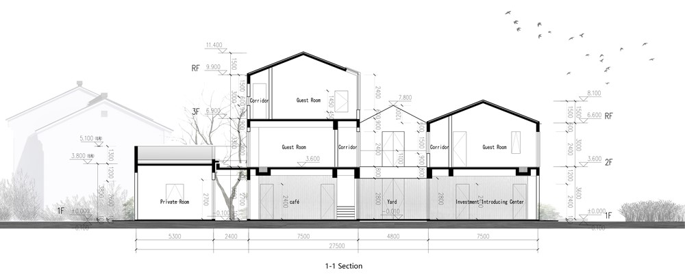
The Section Homestay is the redesign and reconstruction of the dilapidated house on the original site. The architect cannot change the footprint of the building. It is interesting that the rural buildings in the suburbs of Suzhou were not courtyards, but an “C” layout. It seems to be half of the courtyard, which inspired me. Half is fine, I decided to design the west facade as a section to expose the internal spatial organization. The Section Homestay seems to be the half of the house left by dividing a complete courtyard into two separate houses. This was the origin of Section Homestay. The visible half house with the invisible half house were the complete Section Homestay, a typical Suzhou courtyard.
Shell
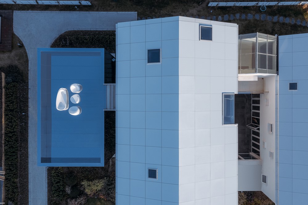
Since it is a section, I decided to treat the outer contour of the building as a continuous shell with thickness. The thickness of the shell from the wall to the roof is controlled at the same 300mm. That’s right, this section should be seen clearly on the west facade. In order to maintain this continuous section, I did not use the common blue tiles for the roof in Jiangnan region, but used a white aluminum cover to maintain visual continuity with the white wall. Considering that the sloping roof should fall freely while not destroying the continuity of the section, a white metal cover flashing was specially designed on the cornice to help the rainwater drop away from the wall.
Cavity
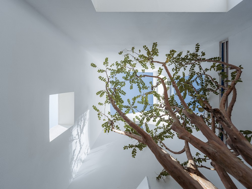
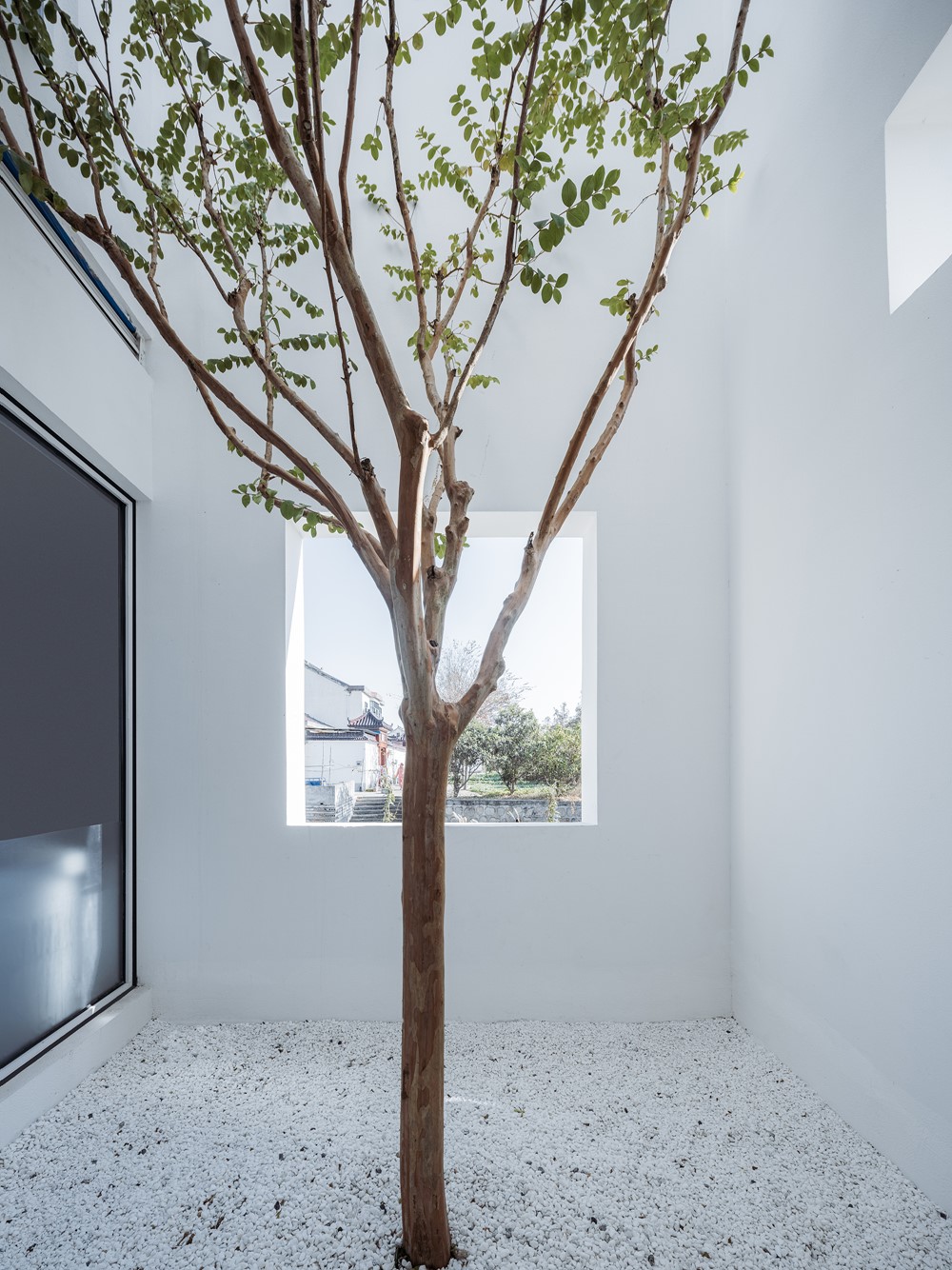
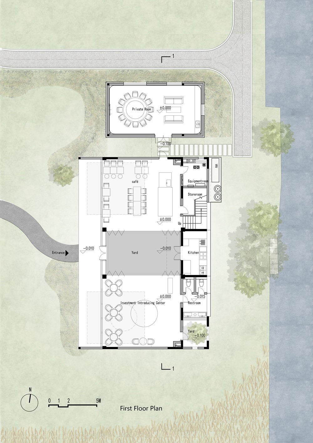
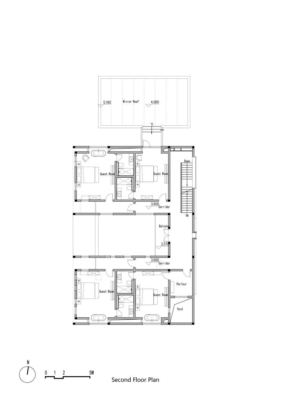
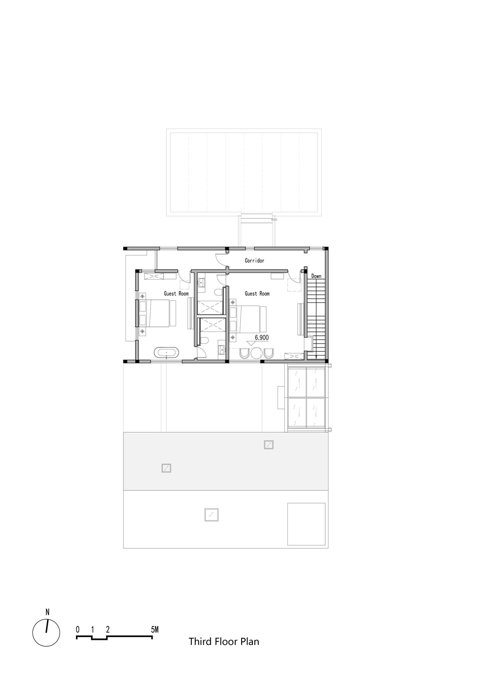
Then I regarded the interior of the building as a cavity. Any cavity is unlikely to be filled with various functional spaces like modern buildings. Therefore, I decided to release the first-floor space and blur the boundaries between indoor and outdoor. I defined the first floor as the void in the cavity. It could be used to rest, show or drink. For the guesthouse space on the upper floors, I regarded them as organs in the cavity. I treated each room as an independent volume (organ), instead of treating all rooms including the corridor as a unified volume to be placed in this cavity.
