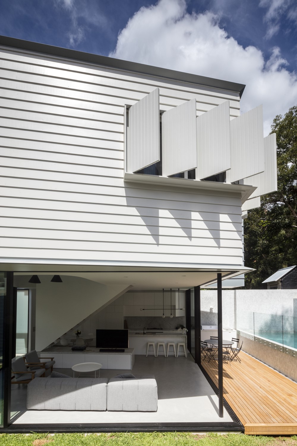
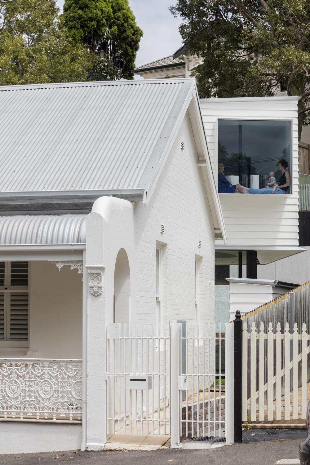
Peekaboo House designed by Carter Williamson Architects is named for the large box window that hangs from the level 1 addition, where the building is strategically shifted to take advantage of views towards nearby Punch Park. The Peekaboo window is symbolic of the generosity and joy embedded into the architecture. The window seat is accessed via a curved bridge, framing a generous curved void, and creates a moment for quiet reflection or play for the young family. From this spot, the best backyard in Balmain, Punch Park, can be enjoyed while still in the home. Photography by Brett Boardman.
.






Our Principal Architect’s family grew up on this street in street, loving the community nature and amenity of Punch Park. Fig trees, tennis courts, and a playground means Punch Park is embraced as the backyard by the surrounding community.
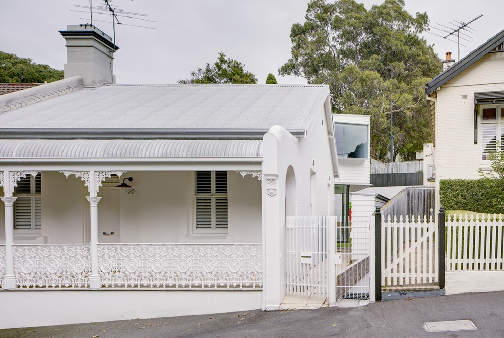
The street plays host to a row of six double frontage Victorian semis. Having lived overseas for the best part of a decade, our clients returned with a mature and thoughtful approach to housing requirements for them and their growing family. Naturally, when combining our Principal Architects personal history and emotional response to Balmain with our client’s ambition for their home resulted in the incredible catalyst for Peekaboo House.
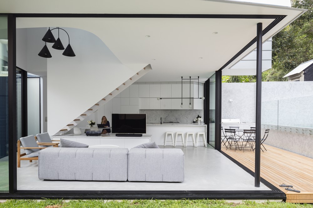
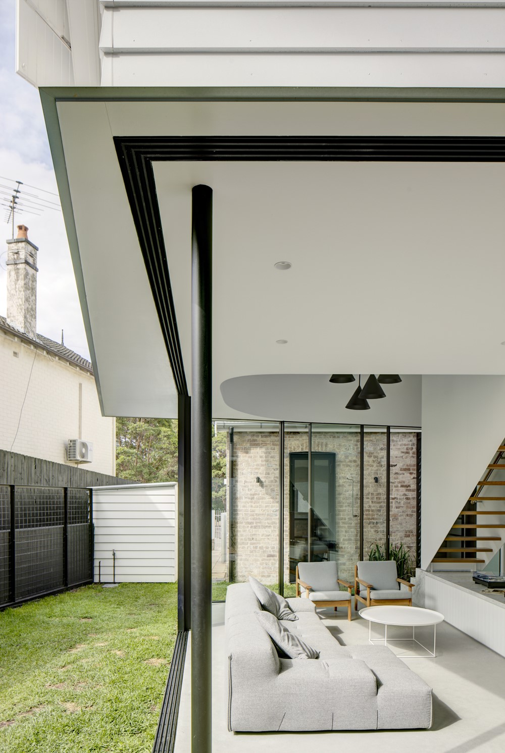
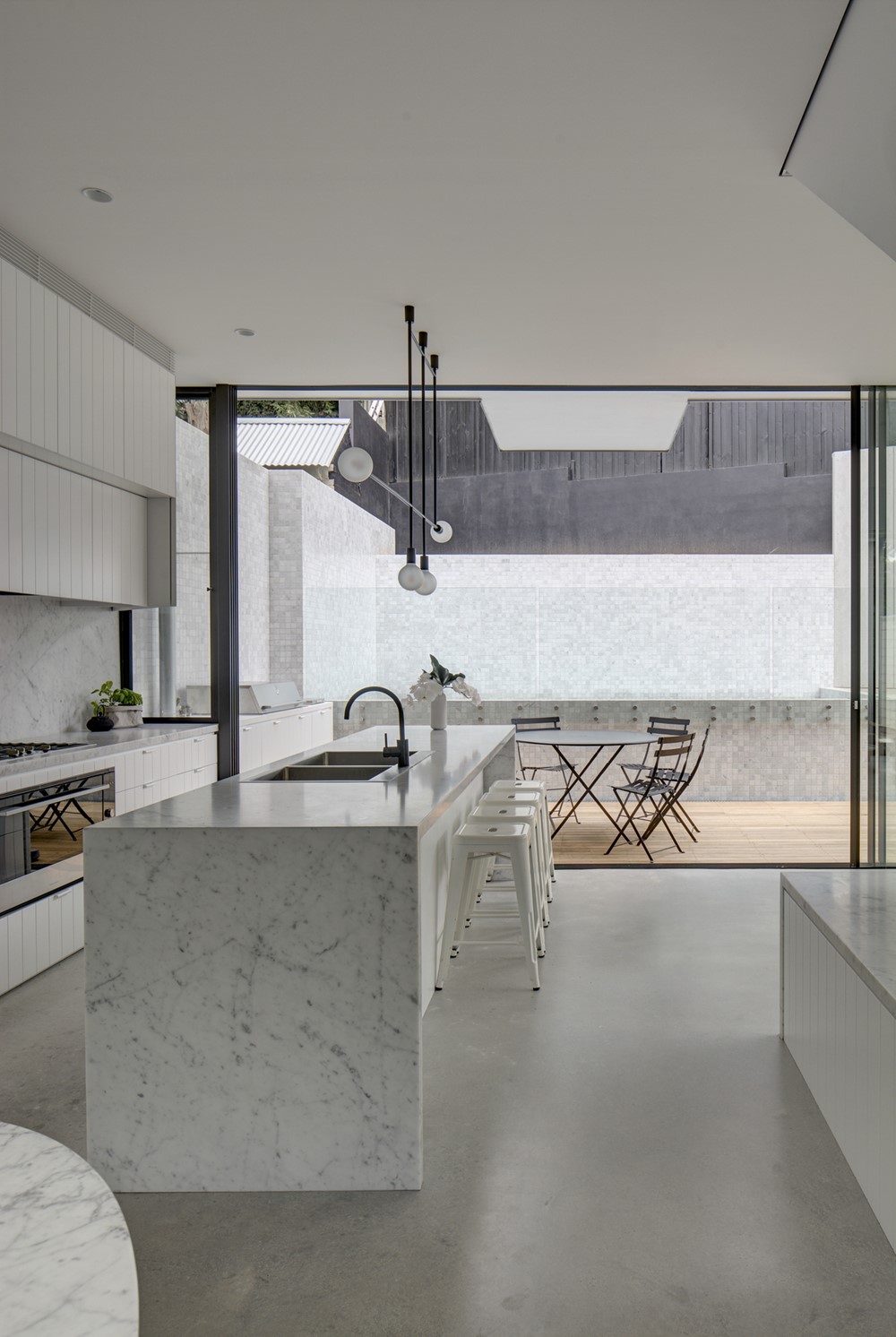
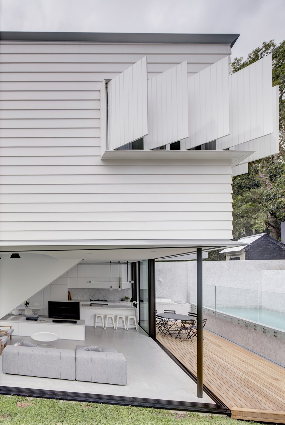
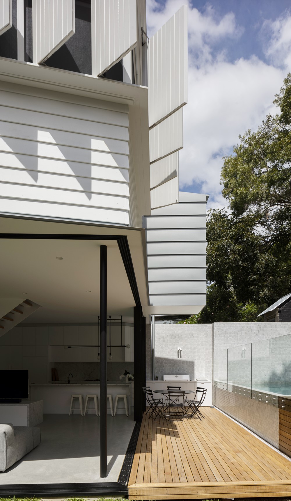
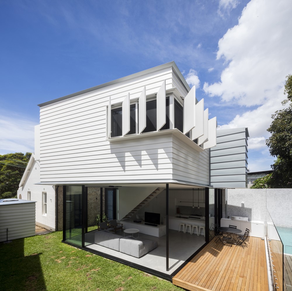
Our approach preserved the Victorian façade, carefully updating the rooms within, designing the rear addition of Peekaboo House as a pavilion that opens on three sides to the garden. The addition replicates the square Victorian plan, but by shifting it slightly allows for a courtyard, simultaneously opening up the home to the yard and framing different spaces of the garden.
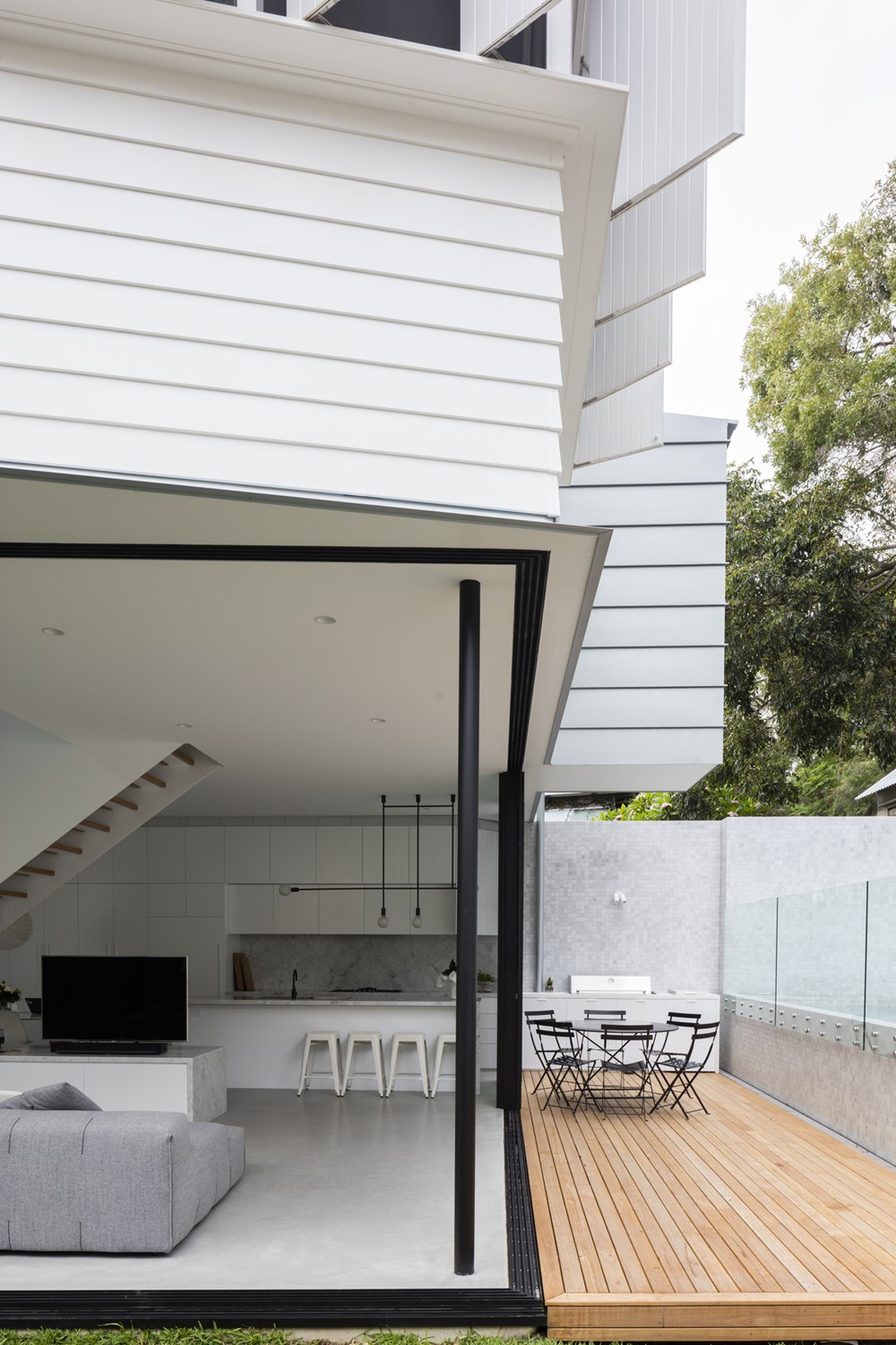
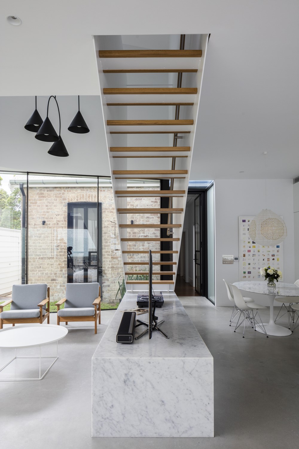
When working with existing buildings, the conversation is often how we express the relationship between the existing home and our new addition? The use of white allowed for the form of the addition to be articulated in a pure way, whilst also providing a broader, more democratic, progressive way of reading architecture. Each form, old and new, is painted in the same colour but articulated differently in materiality and detailing; traditional and contemporary now blend together seamlessly whilst simultaneously accentuating the variation in detail
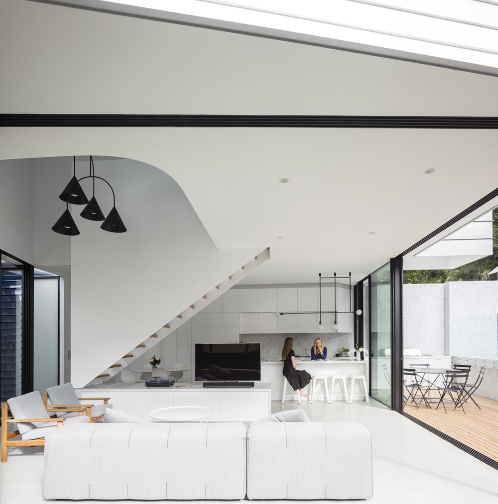
The Pavilion dissolves as large glass doors slide away to connect to the backyard, creating a truly open living environment. From the backyard, the weatherboard cladding lining the level 1 addition is on display, a style quintessential of Australian Victorian homes, another nod to the preservation and respect towards Balmain heritage.
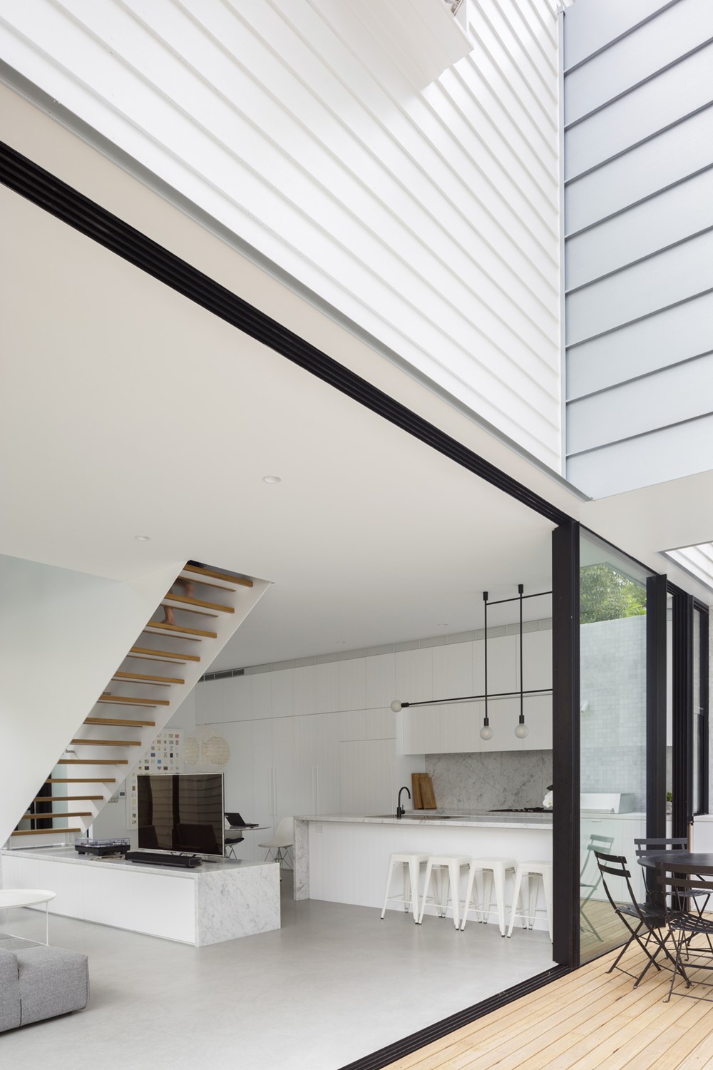
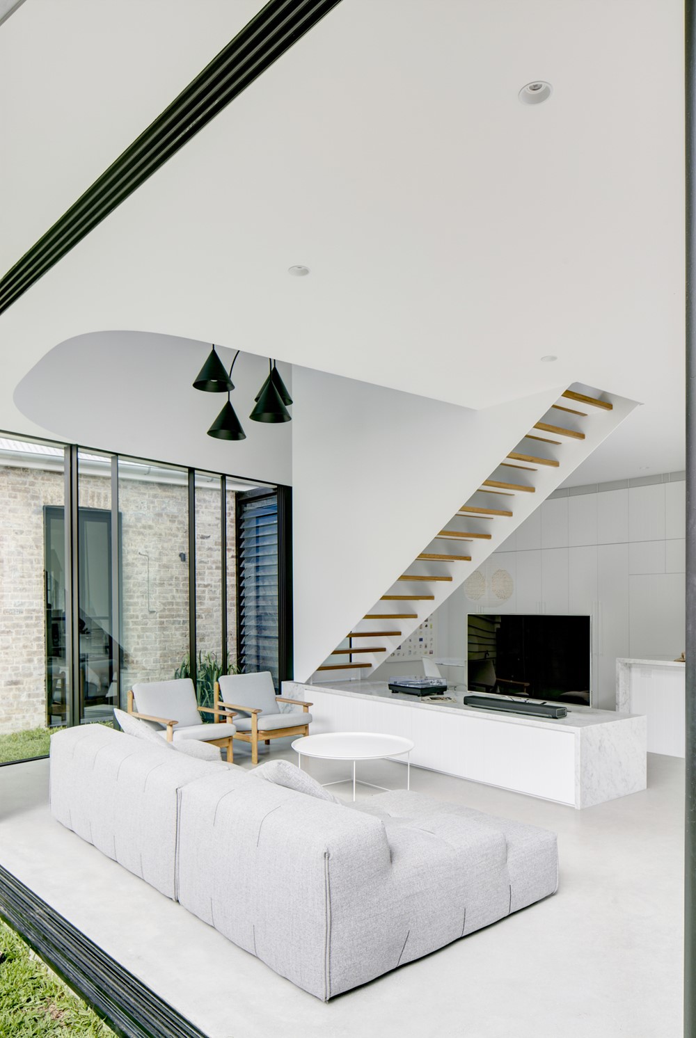
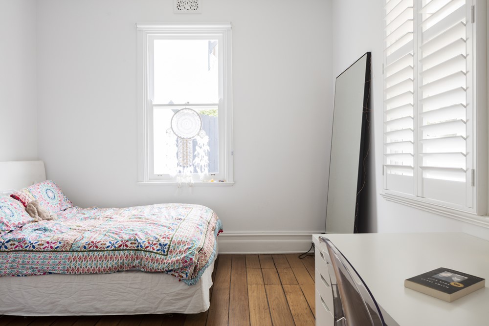
Walking from the house’s front bedrooms to the kitchen, living and dining room, the extensive yet measured use of white, combined with the open plan volume layout creates a truly breathtaking living environment.
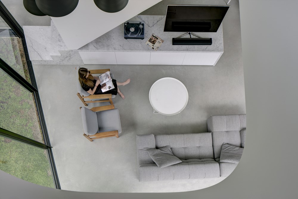
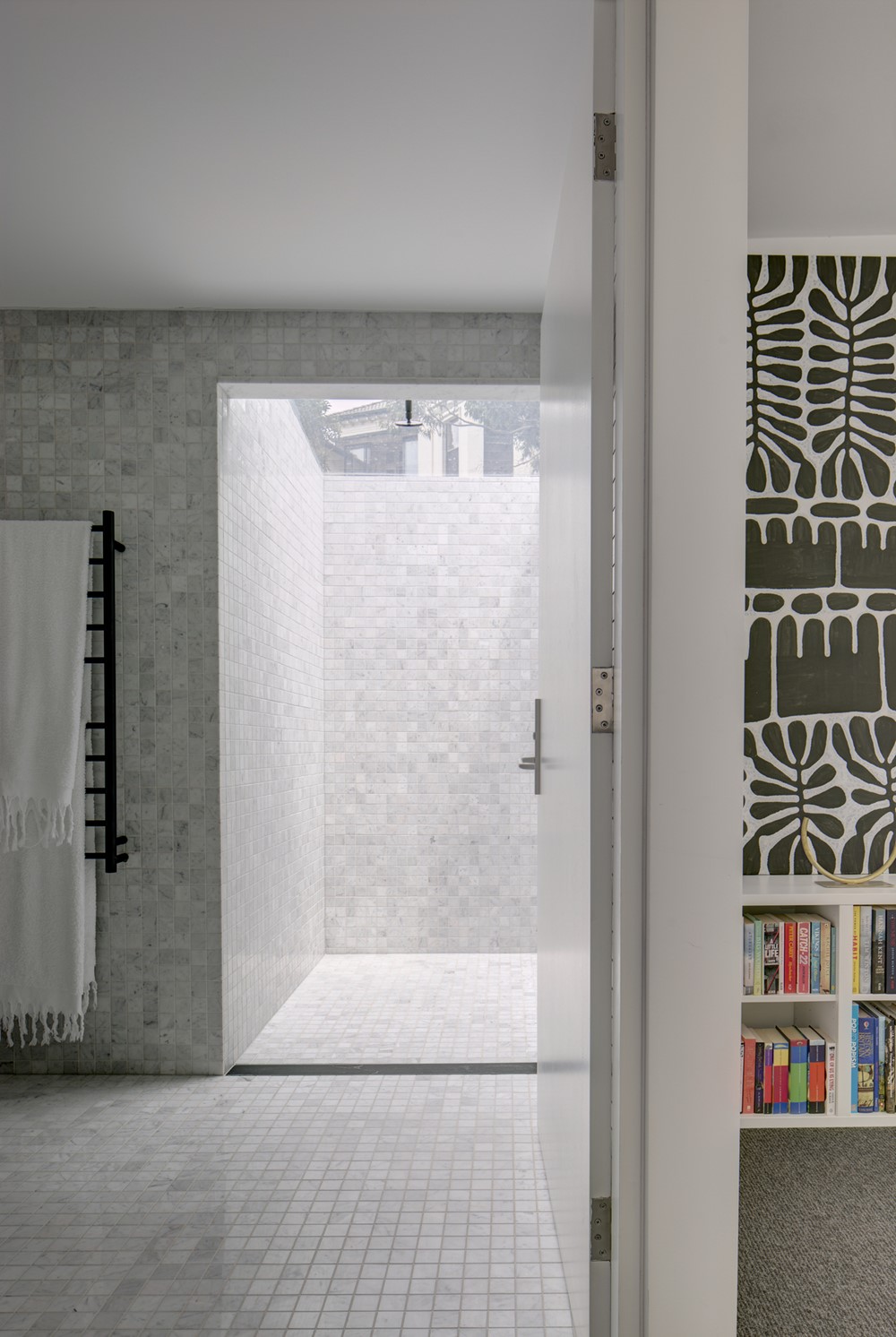
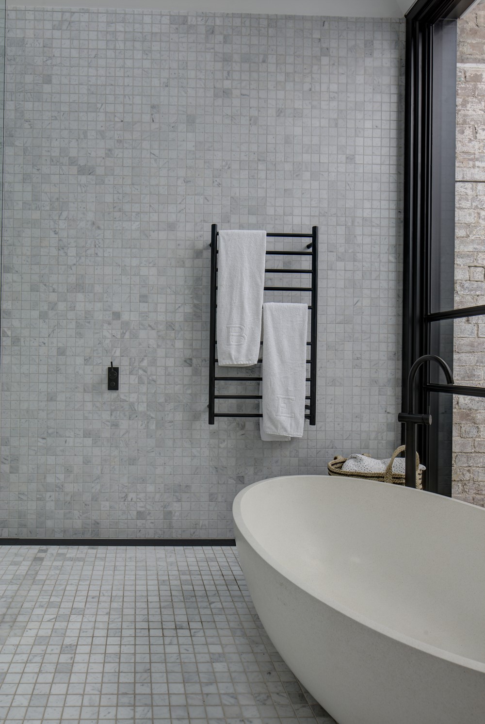
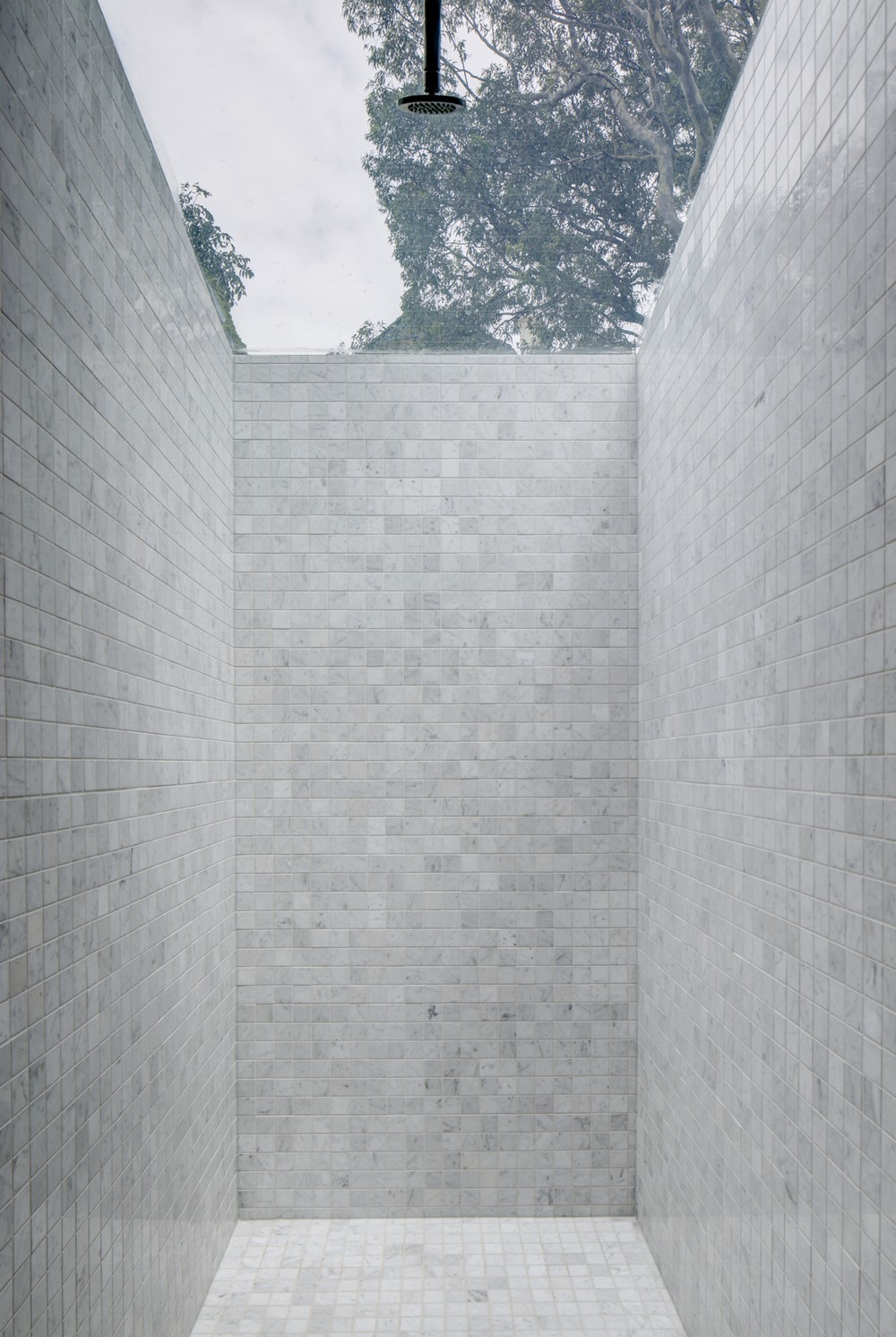
Peekaboo House’s colour palette remained largely white, changing in texture and materiality. White Carrara marble forms the island bench, splash back, and a strong plinth for the white steel plate staircase. Marble tiles extend from the kitchen, into the yard to line the elevated pool. A robust neutral grey polished concrete floor provides a datum for family life, interior design complimented by our client’s tasteful selection of furniture and hanging artwork, culminating in a finely crafted, effortlessly comforting home robust enough to be enjoyed by the growing family.
