This project designed by Reena Sotropa In House Design Group was a full home renovation for a young family that purchased a “new-to-them” home in the early weeks of 2020. The home purchased was renovated to suit a style that didn’t match their aesthetic; that’s when they called us to essentially re-renovate and furnish the entire house to make it feel more like it was theirs. Photography by Phil Crozier.
.
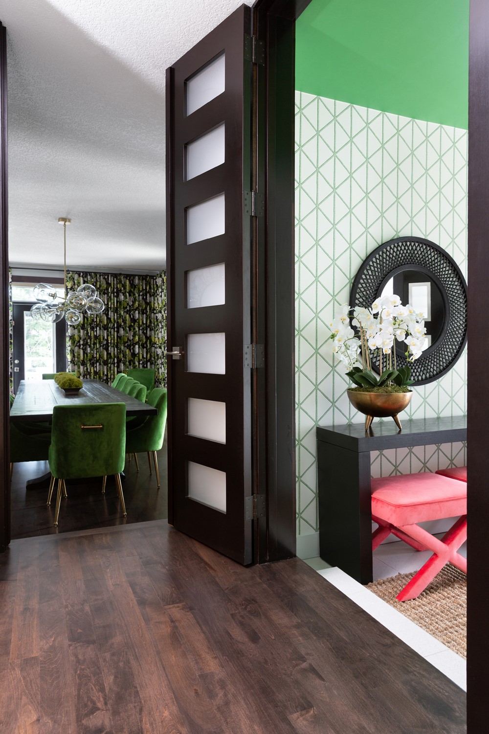
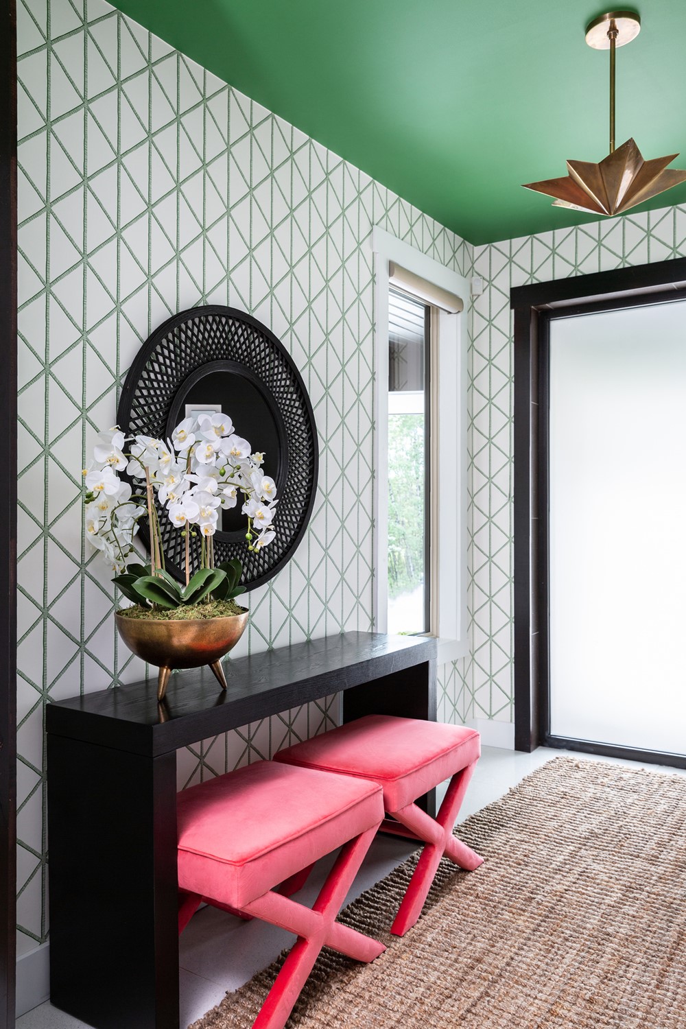
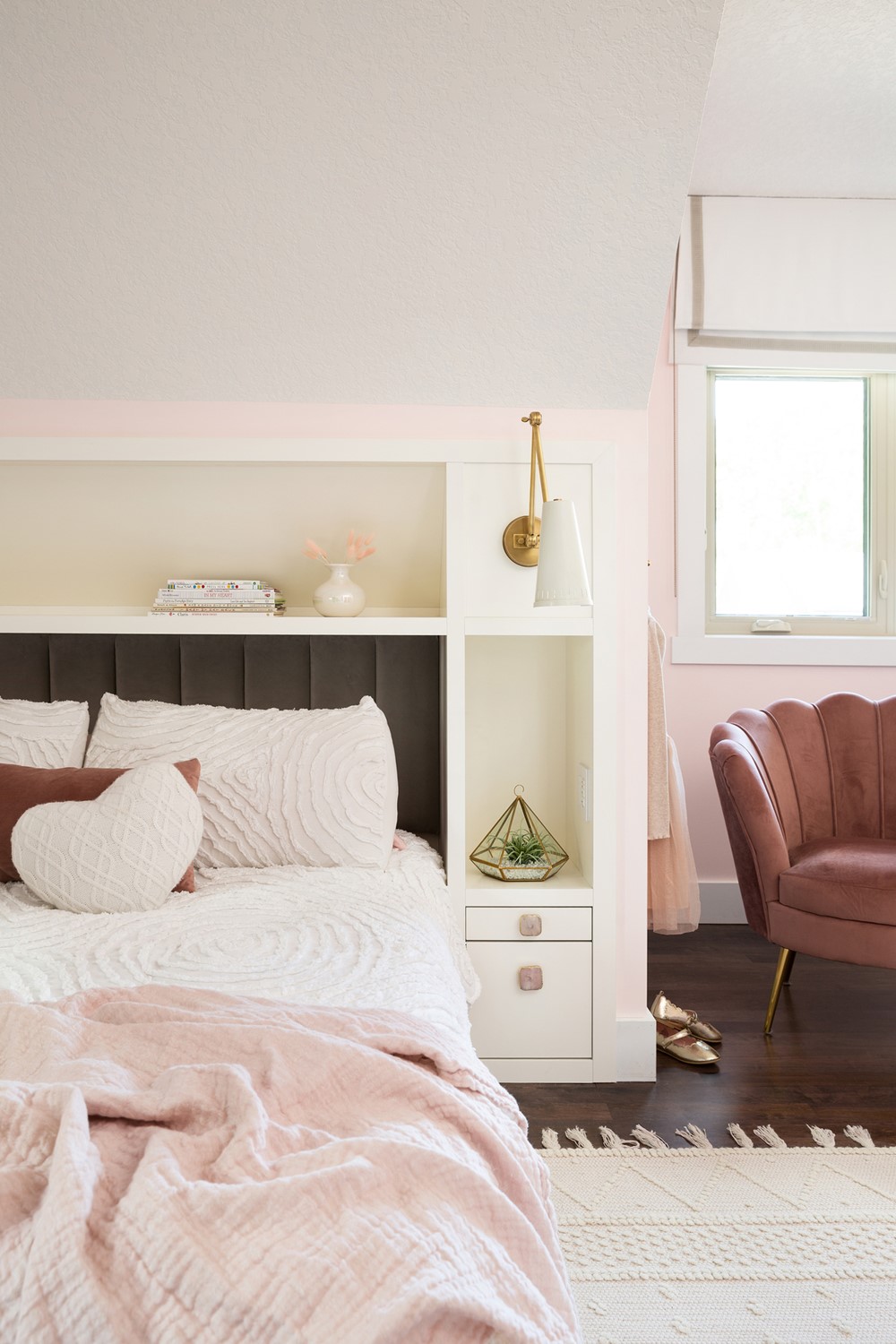
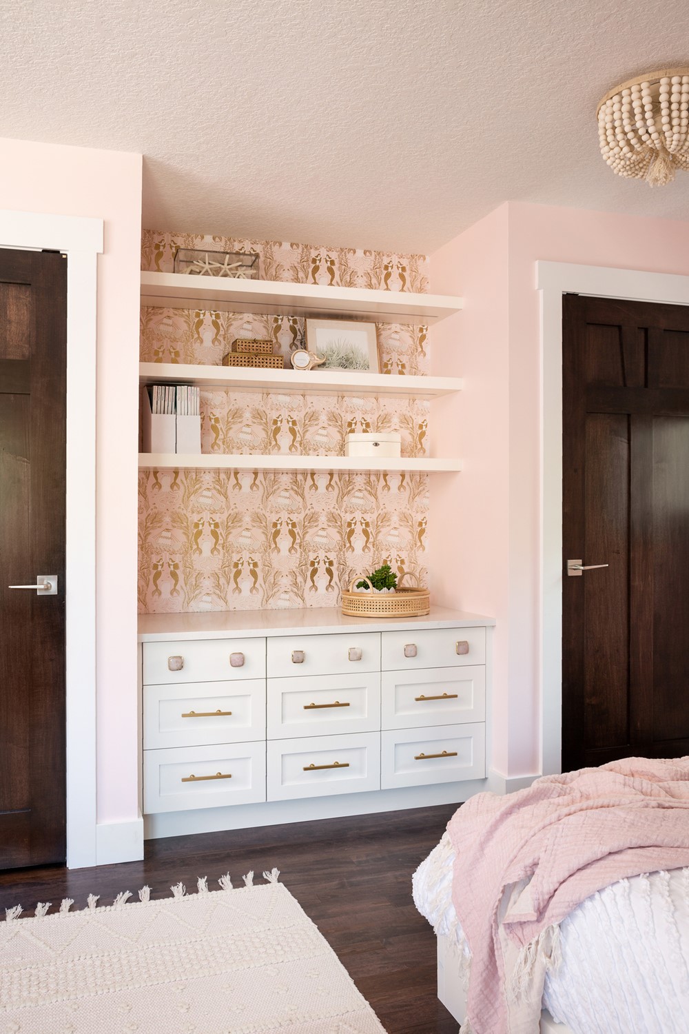
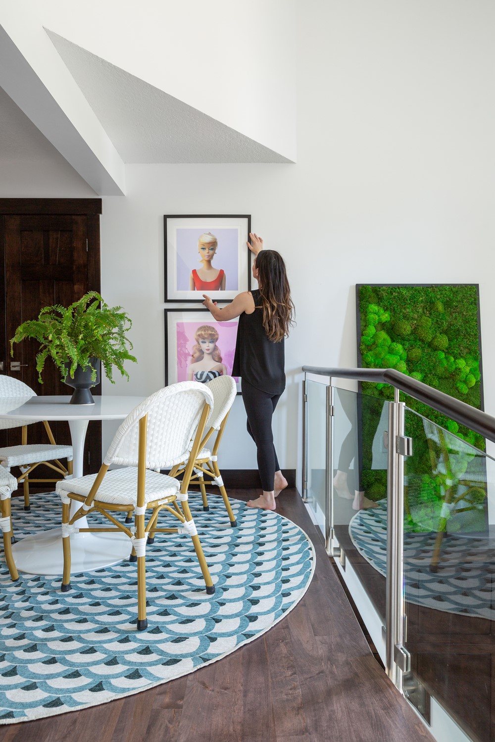
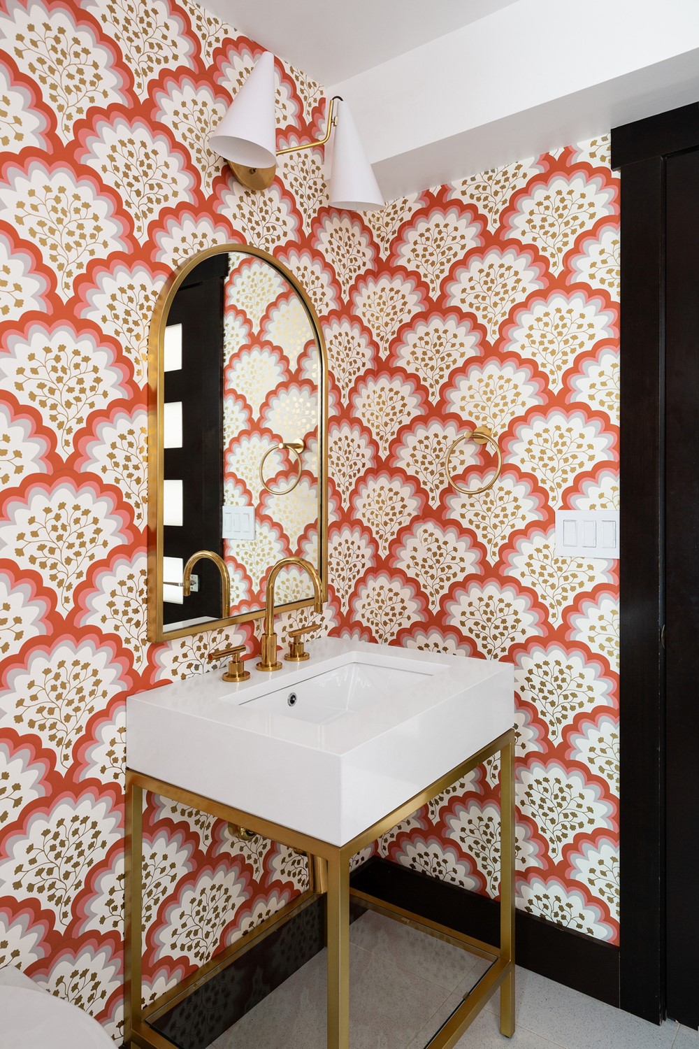
“Our clients have an incredibly colourful and playful personal style that they wanted to reflect in the re-design of their own home. A saturated Kelly Green ceiling paired with bamboo trellis wallpaper in white and green makes for a bold first impression in the entry foyer. When we set out to determine the colour palette for this home, our clients fell in love with a Thibaut floral print that we chose to incorporate as a wallpaper on their main floor living room. Every other colour on the main floor was pulled from this pattern with a special emphasis on coral and green: our clients’ two favourite colours!
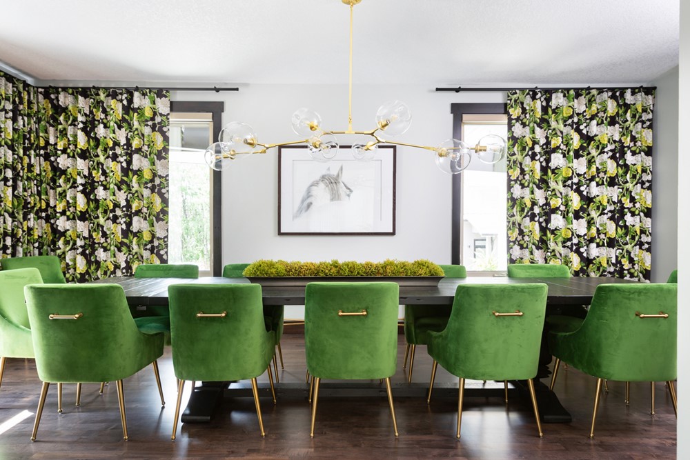
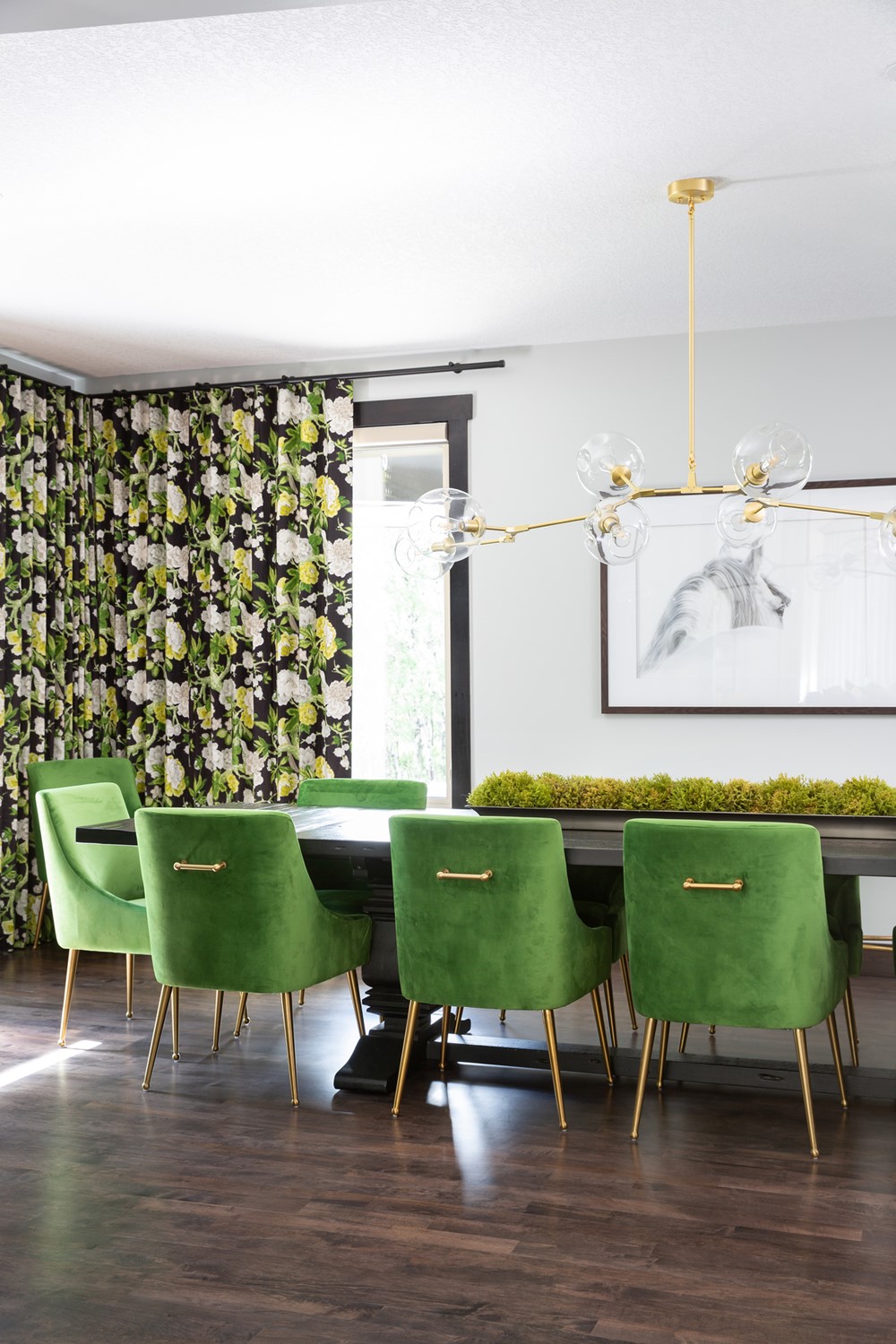
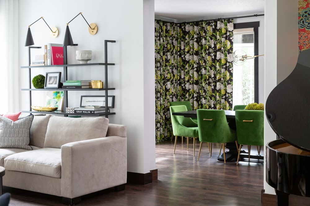
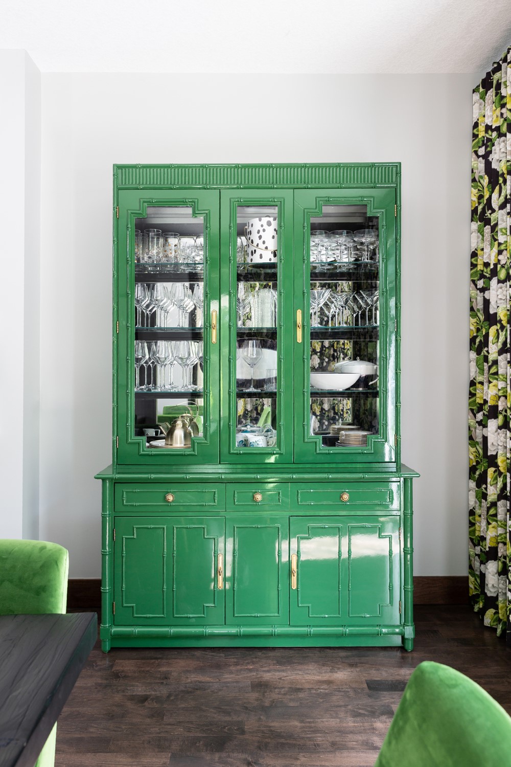
Our clients are huge entertainers, so maximizing space for large dinners and parties was a must. One of the very first changes we suggested to the previous floor plan was to reimagine the main floor TV room, opening it up onto the adjacent living room to serve as their formal dining room. The space boasts some of the boldest patterns in this home with two full walls of drapery in an oversized floral printed Schumacher fabric. The green bamboo hutch in the dining room was a serious second hand score! Our client found this Thomasville cabinet for a steal of $200! We had it refinished and lacquered in Kelly Green to bring a big dose of personality into the dining space.
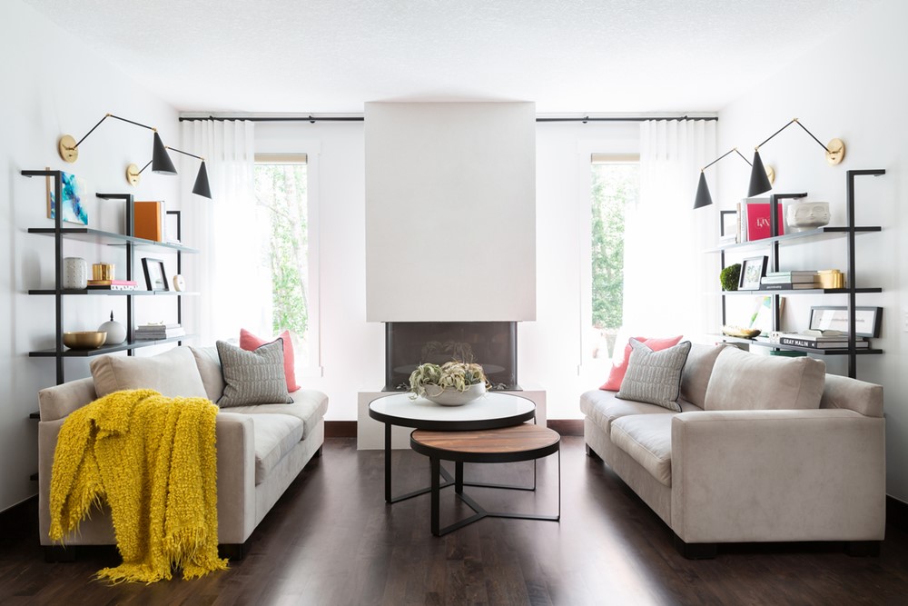
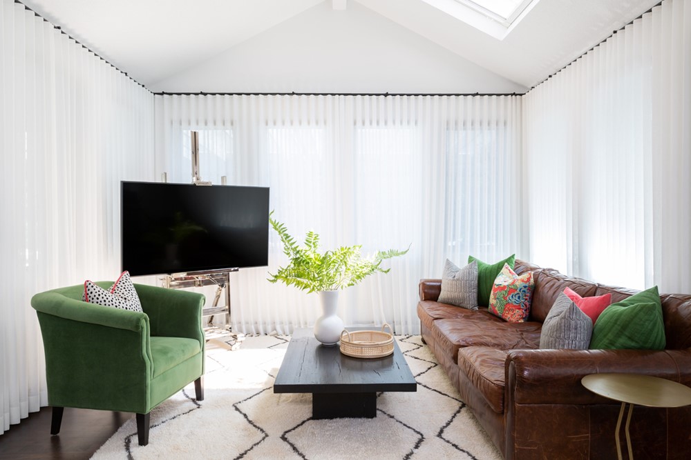
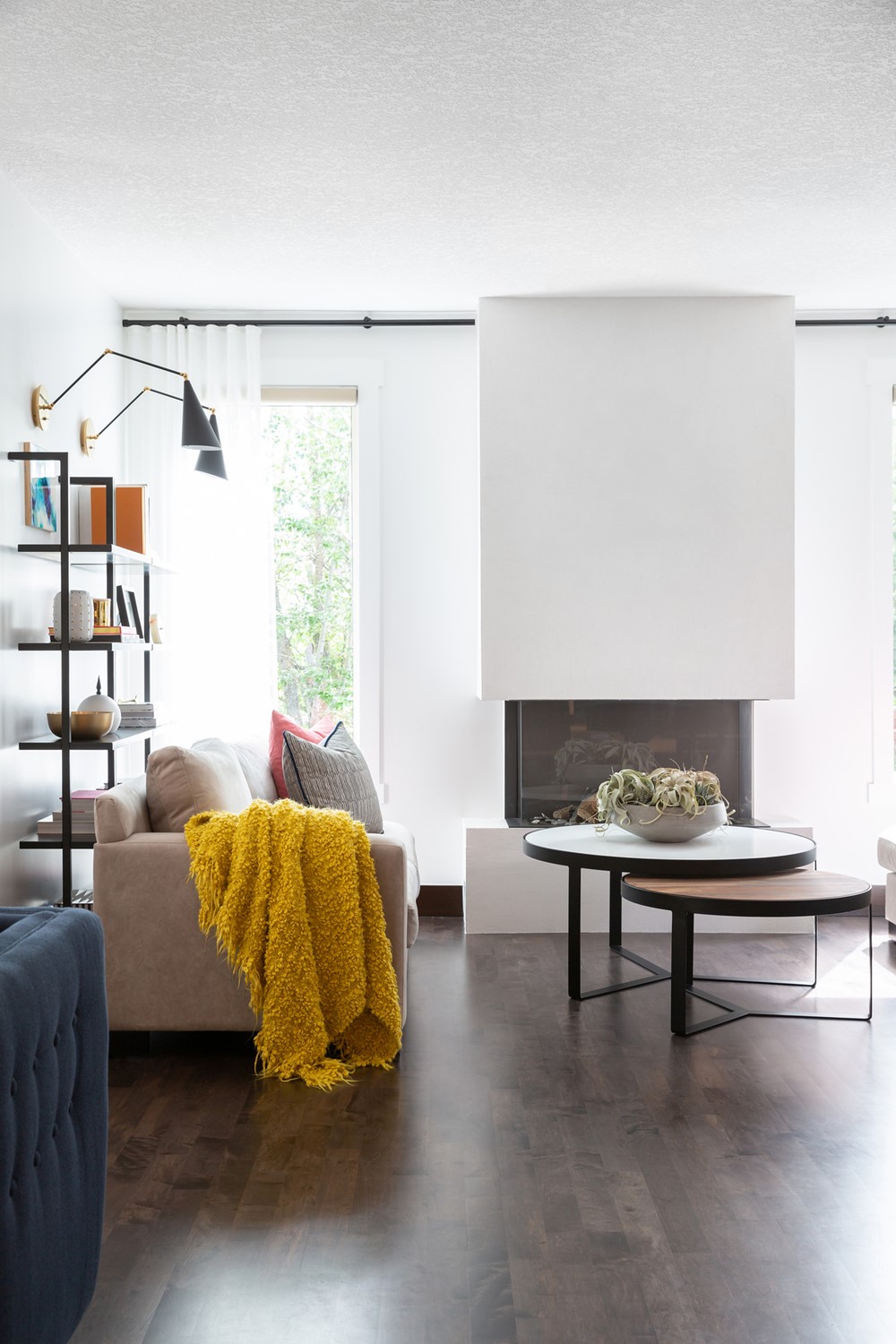
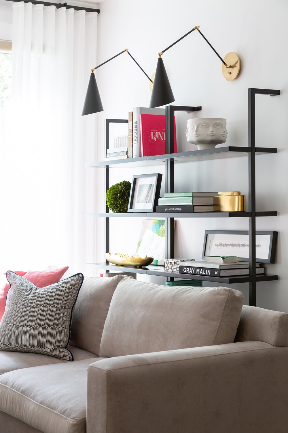
The main floor living room is a large L-shaped room that opens up onto the dining room and kitchen. One end of the “L” serves as a TV watching area for the whole family with three full walls of sheer drapery. The opposite end of the “L” features a three-sided fireplace clad in white limestone plaster. Between the two spaces sits our client’s baby grand piano.
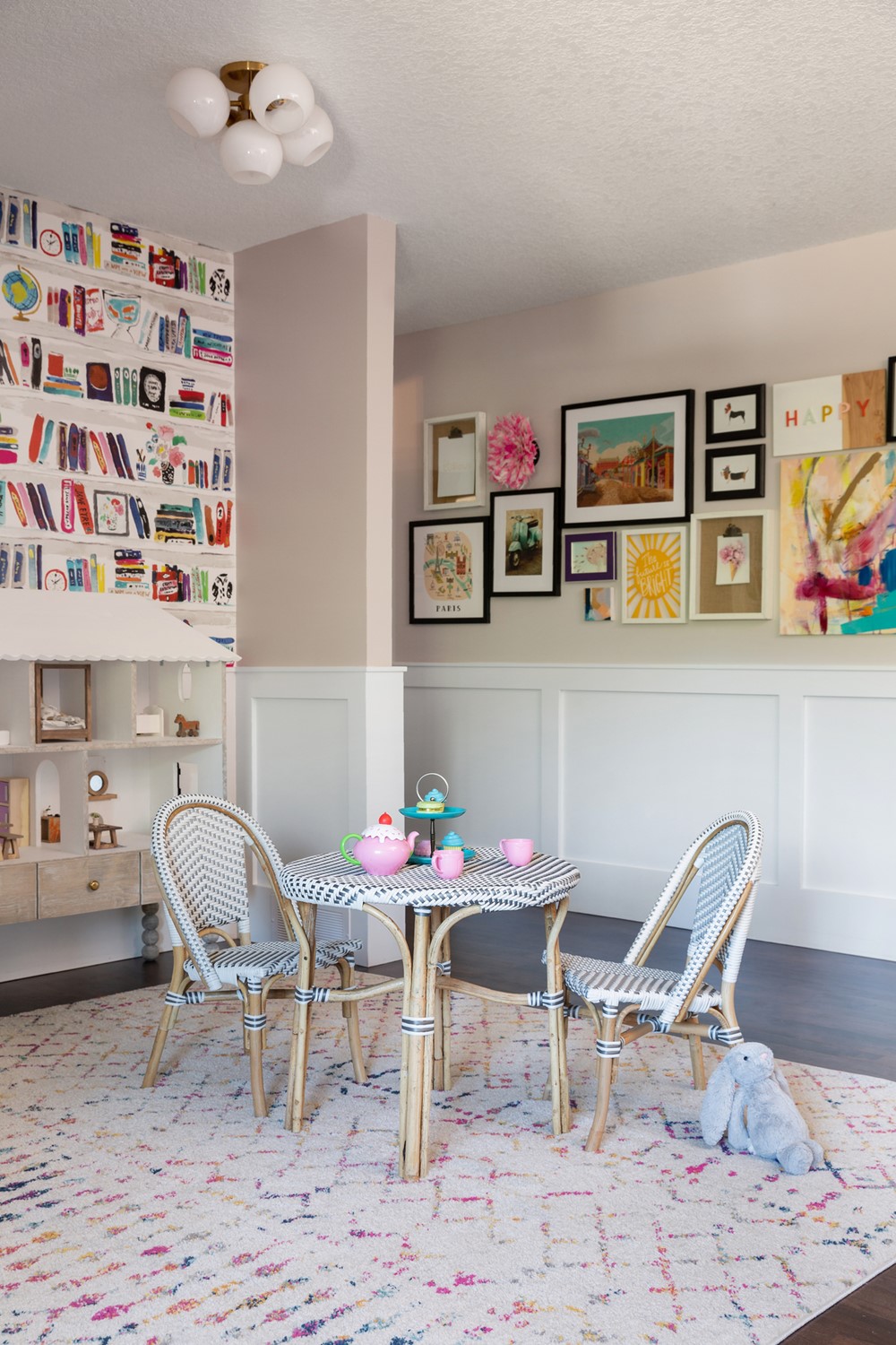
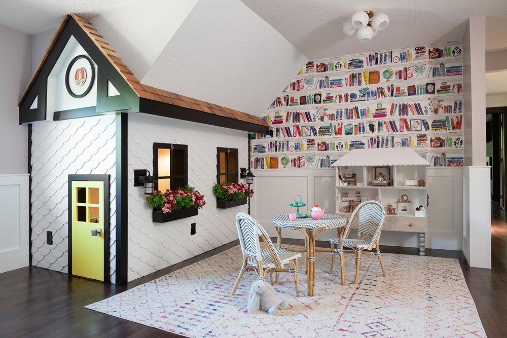
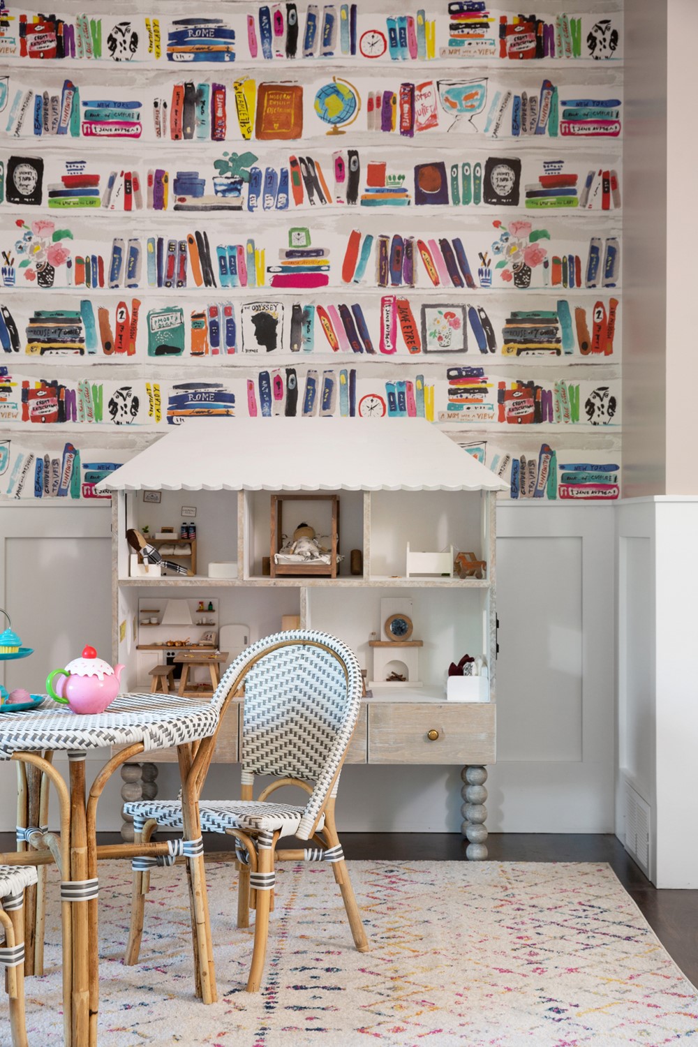
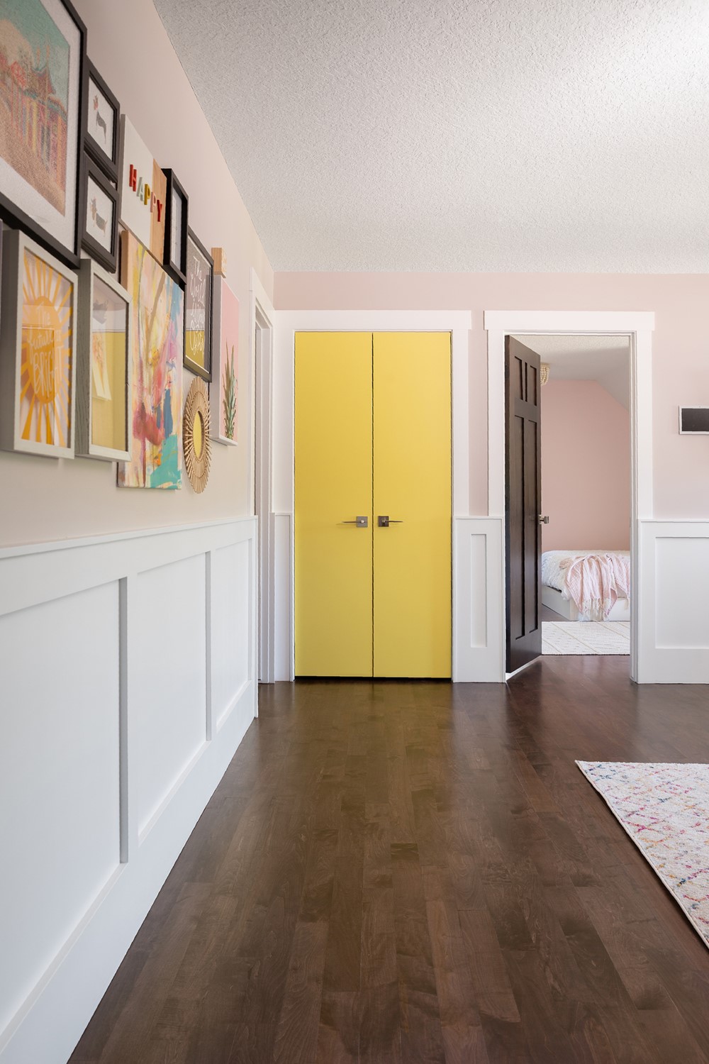
We reimagined the second floor, opening up an existing bedroom onto the adjacent hallway to create a playroom for our clients’ two young children. A whimsical playhouse is built into the eaves of the roof and clad with scalloped cedar shingles. We chose to wrap the playroom with half-height wainscoting to protect the walls from the hardwearing littles who would occupy this space. Kate Spade wallpaper brings a big dose of colour and charm to this otherwise white monochromatic interior. The room is decorated with a large gallery installation of art, prints and treasures.
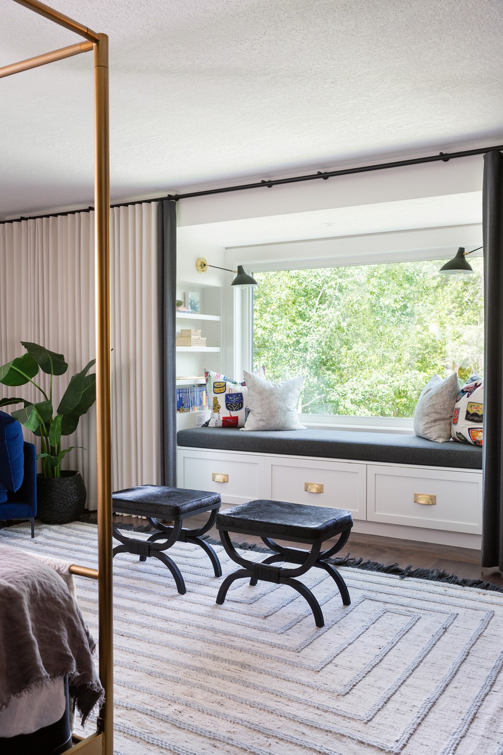
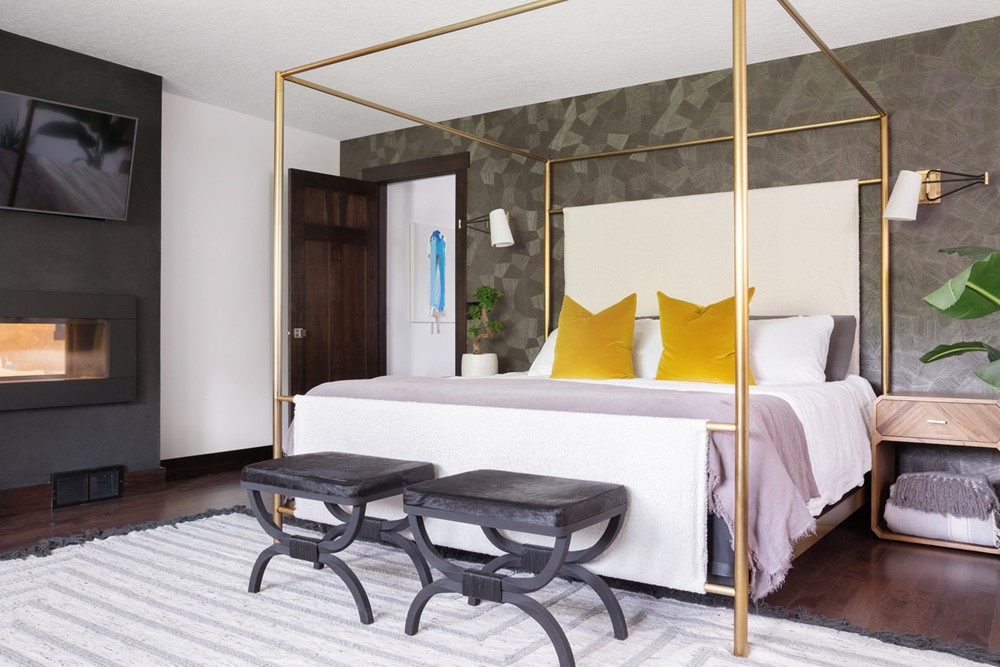
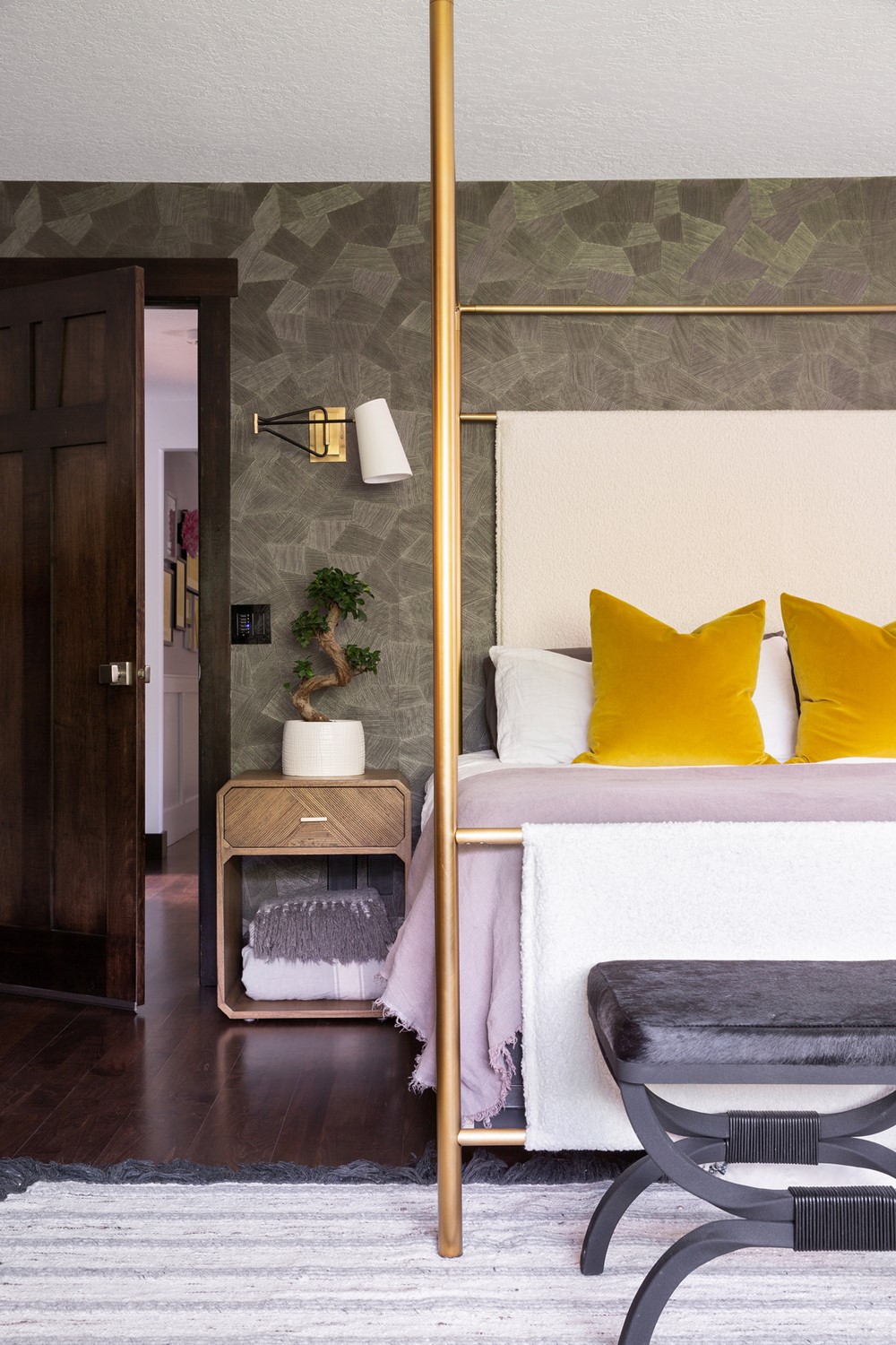
Like the rest of their home, our clients wanted their bedroom to better reflect their fun personalities and tastes. They dreamed of having a window bench to take full advantage of the beautiful view outside. To maximize storage we decided to incorporate drawers below and open bookcases above. We then cozied up the area with custom pillows reinforcing the colour scheme of the adjacent dressing room wallpaper and installed a full wall of drapery. Opposite to the window bench, a brass frame canopy bed sits central against geometric textural wallpaper featuring grey and olive tones.
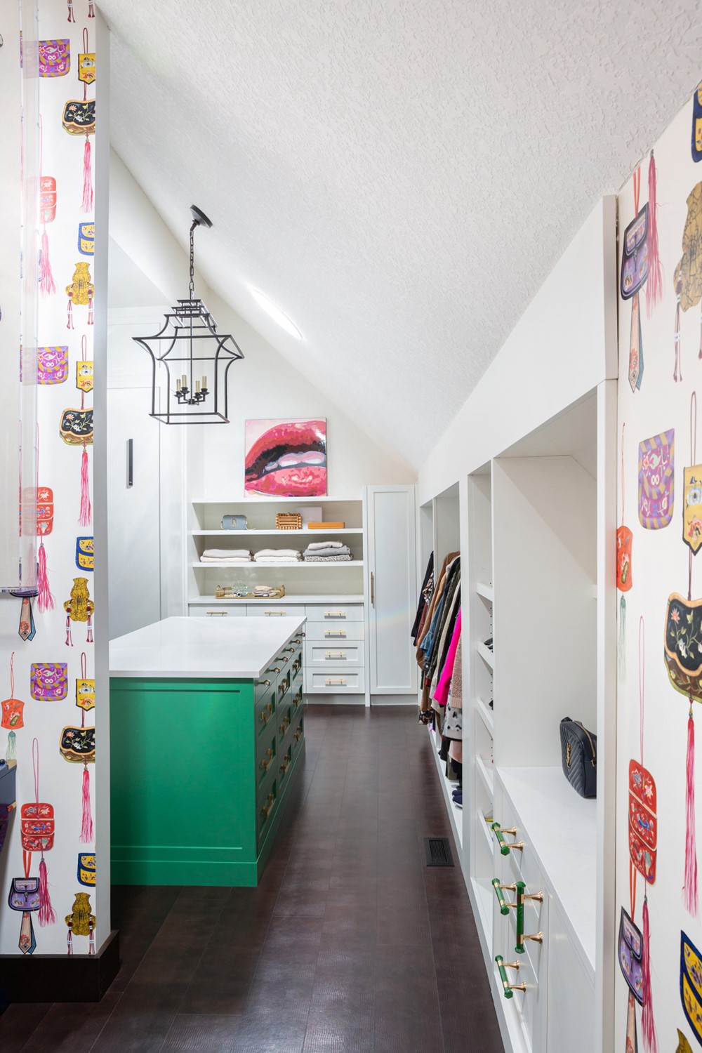
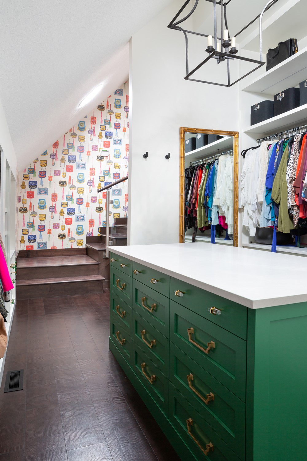
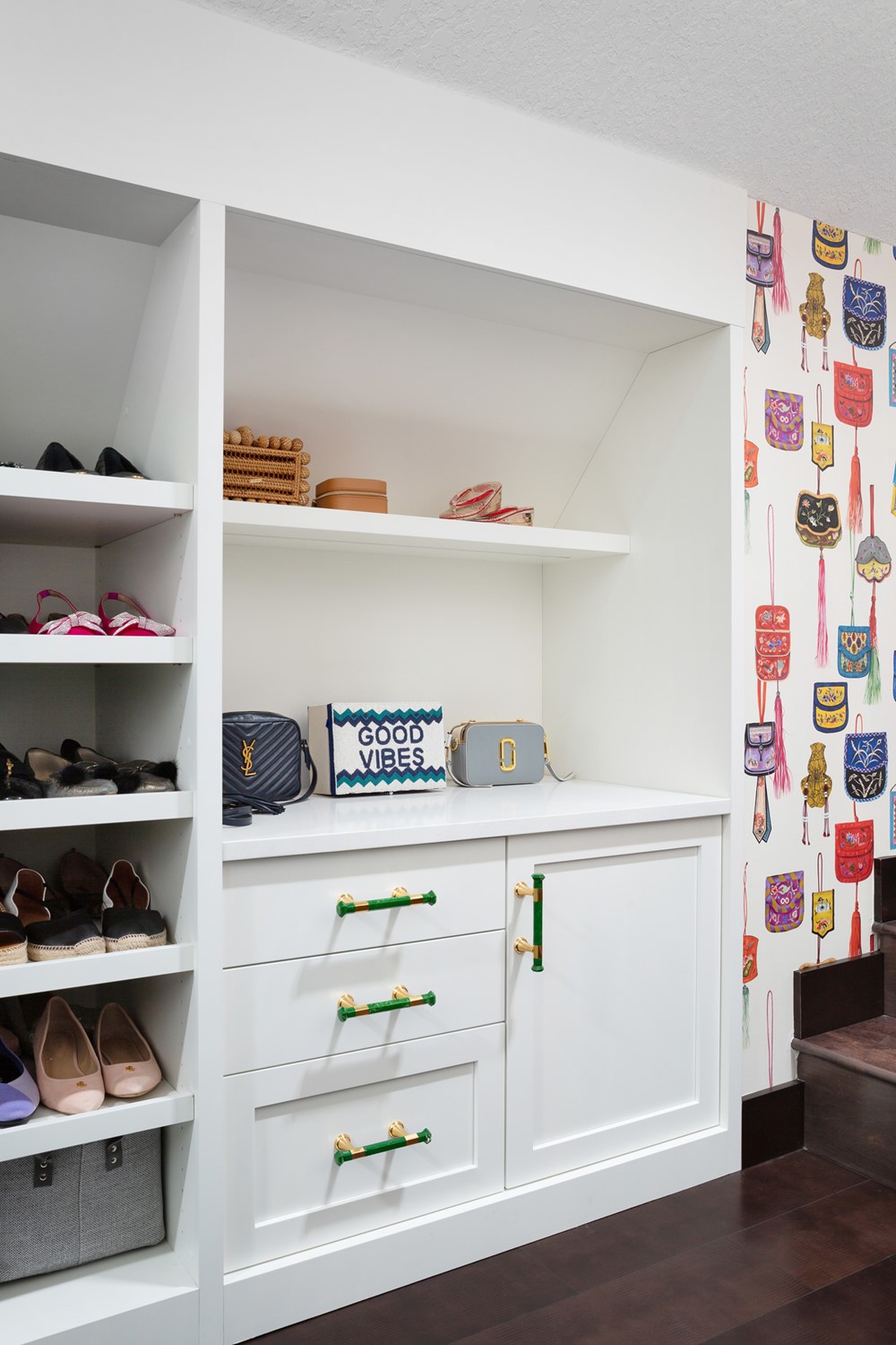
What used to be a home theatre was split to become a home gym (accessible from the common area of the second level) and the walk-in closet/dressing room of our client’s (and our own) dreams! The closet features a purse-patterned Manuel Canovas wallpaper and a striking green island storing all of the accessories a girl could ever want.
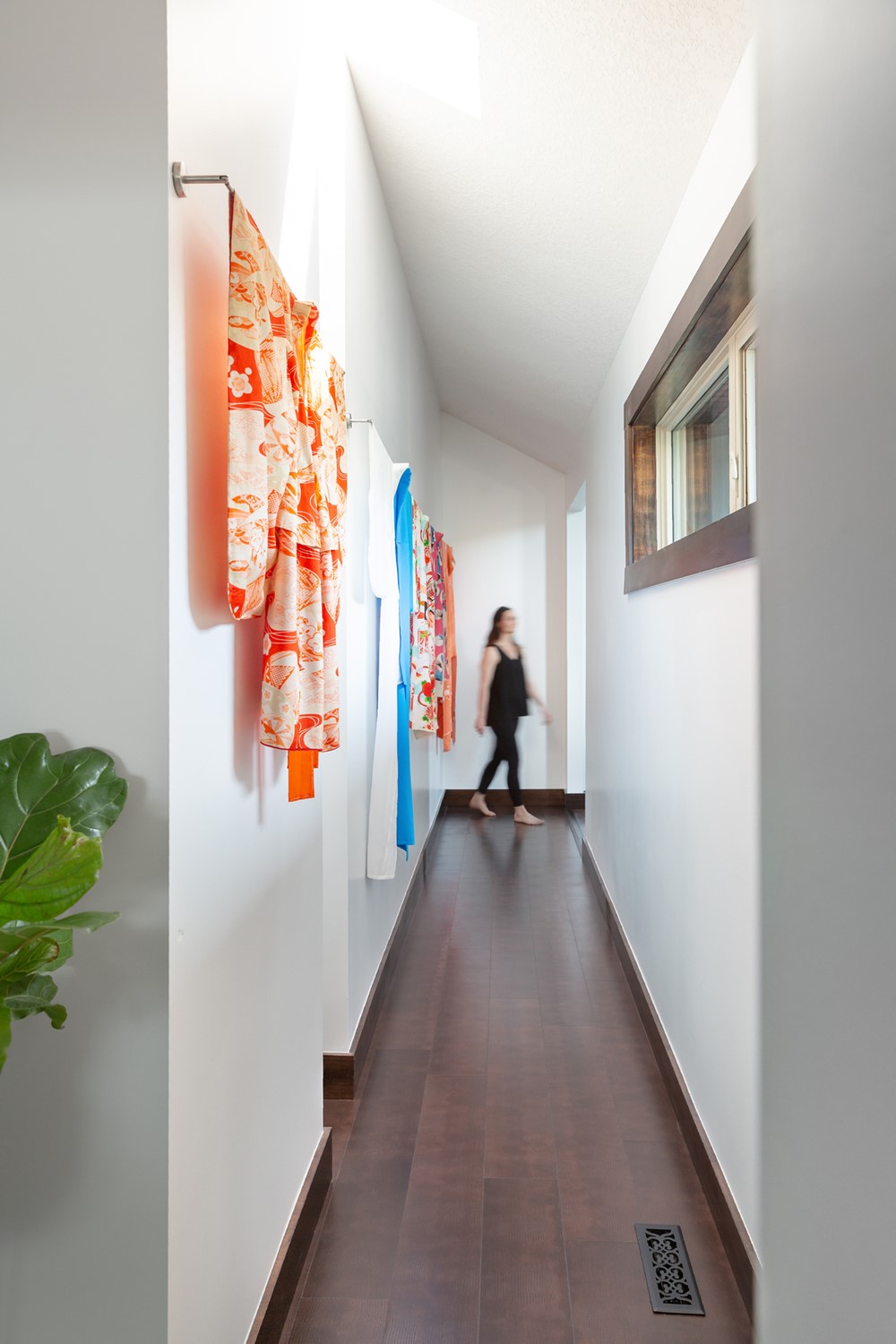
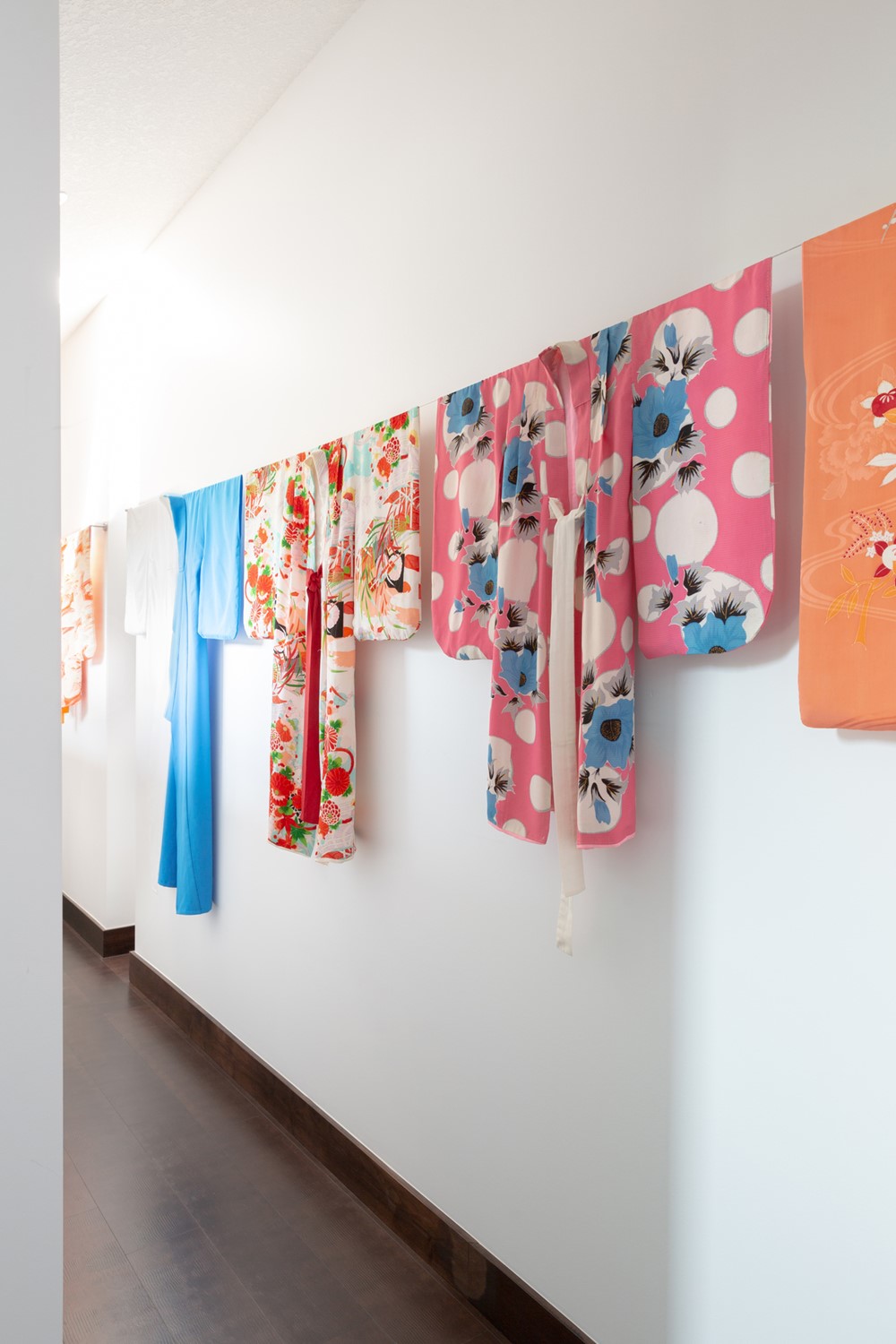
Rather than hanging traditional artwork, our clients owned a collection of beautiful kimonos and fans gathered from their travels and passed down from family that we wanted to feature somewhere in their house. The hallway leading to their newly renovated home gym was the perfect blank canvas for these treasured heirloom pieces.”
