Cougar Ridge Reno by Reena Sotropa In House Design Group. Cougar Ridge Reno by Reena Sotropa In House Design GroupThis young family of three originally came to us for help redesigning their kitchen, hoping it would hold them over for a few more years as they had plans to move into a larger and newer home. However, the scope quickly changed to include updates to the entire 1950 square-foot residence as our clients slowly fell back in love with their home seeing the renovation unfold. Photography by Phil Crozier.
.
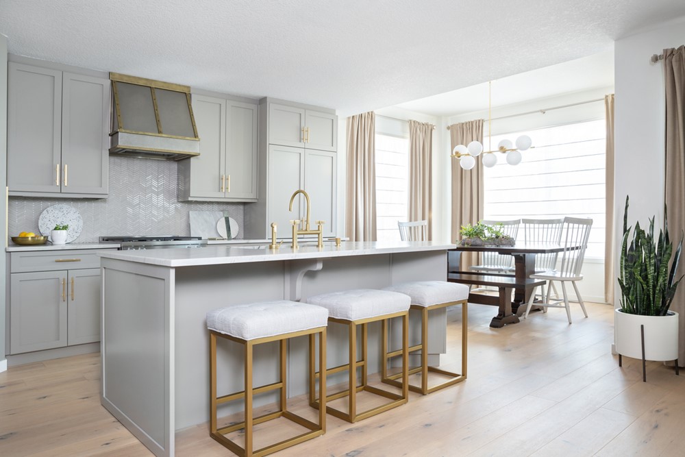
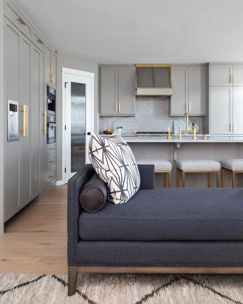
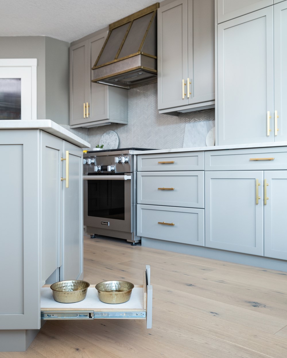
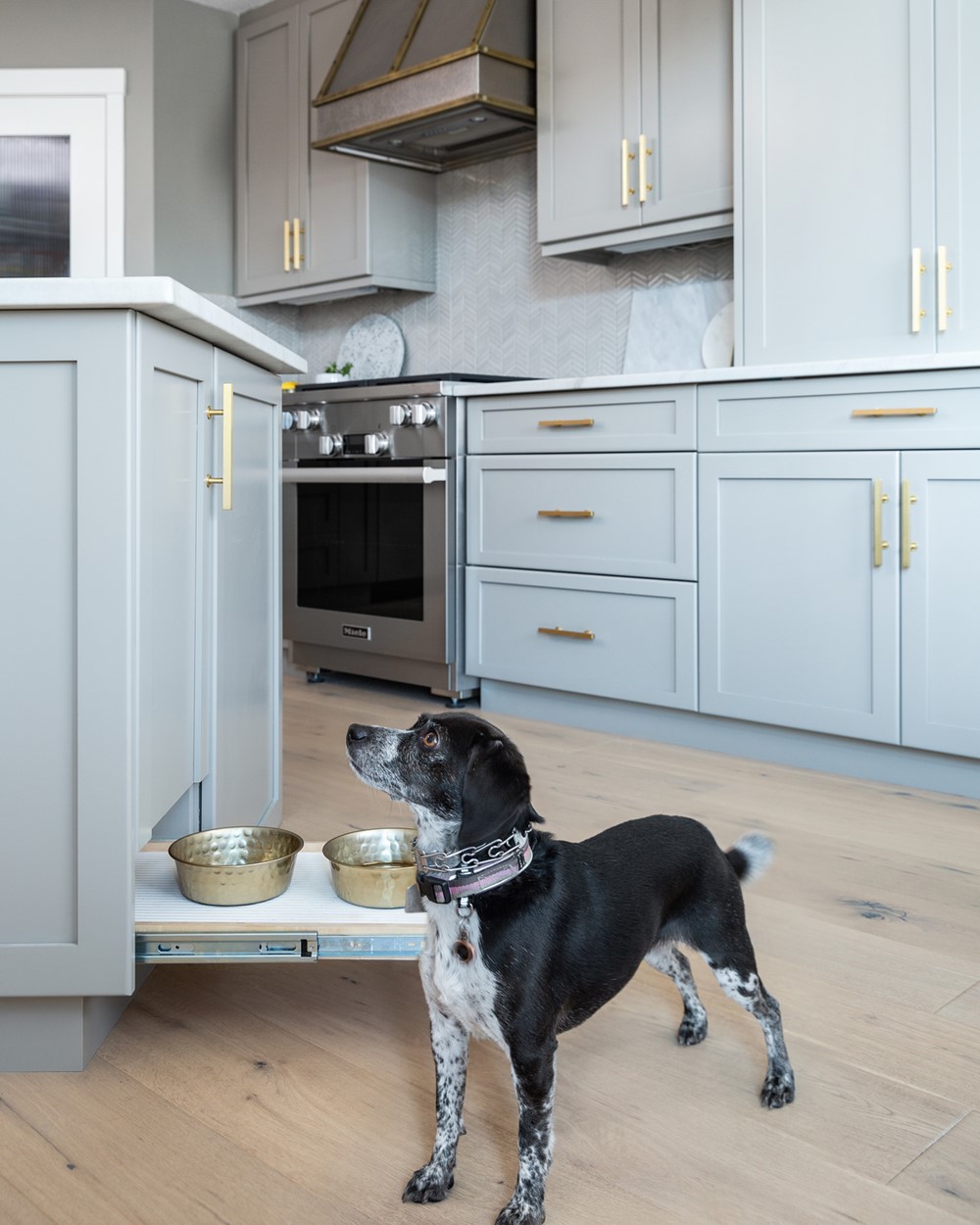

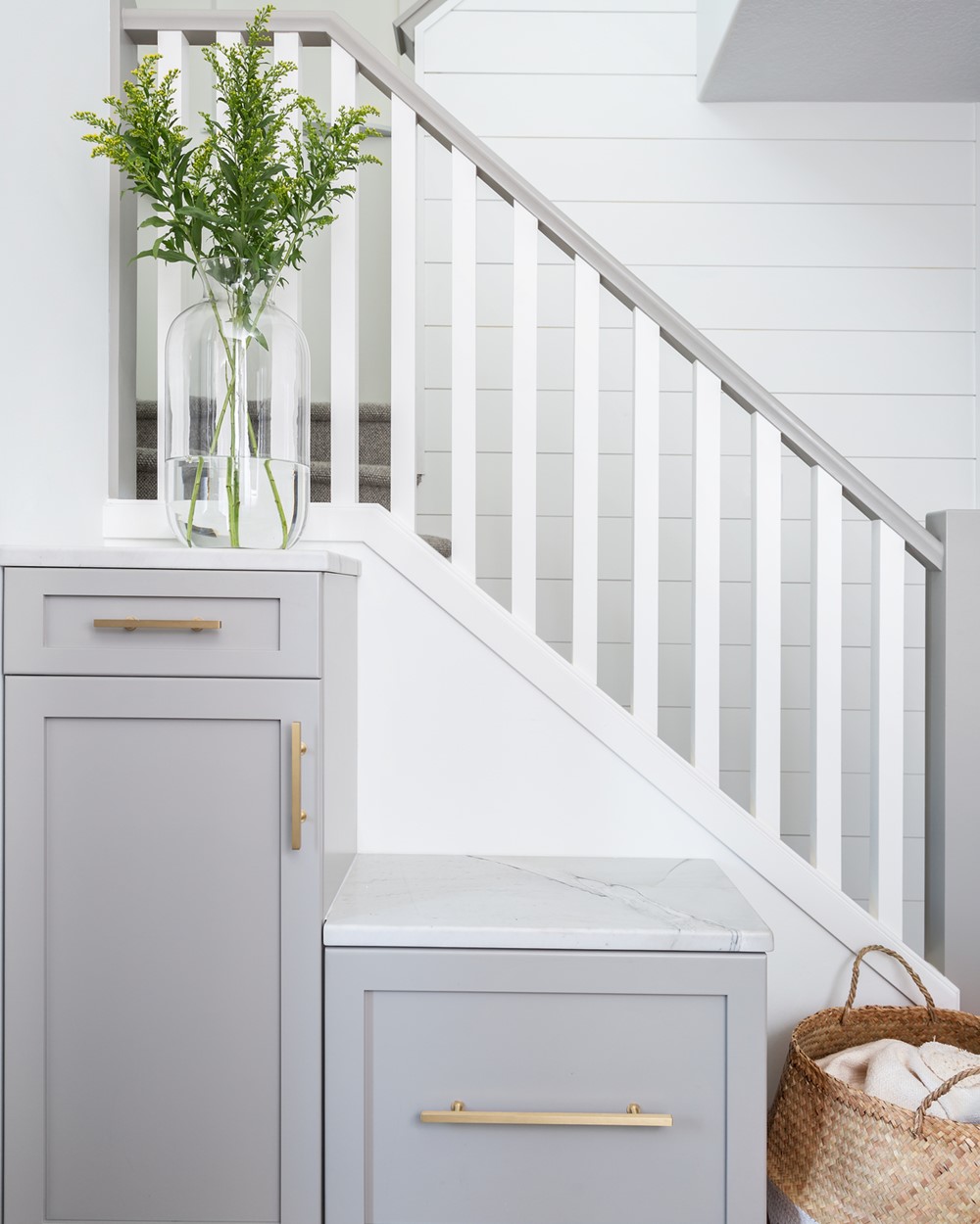
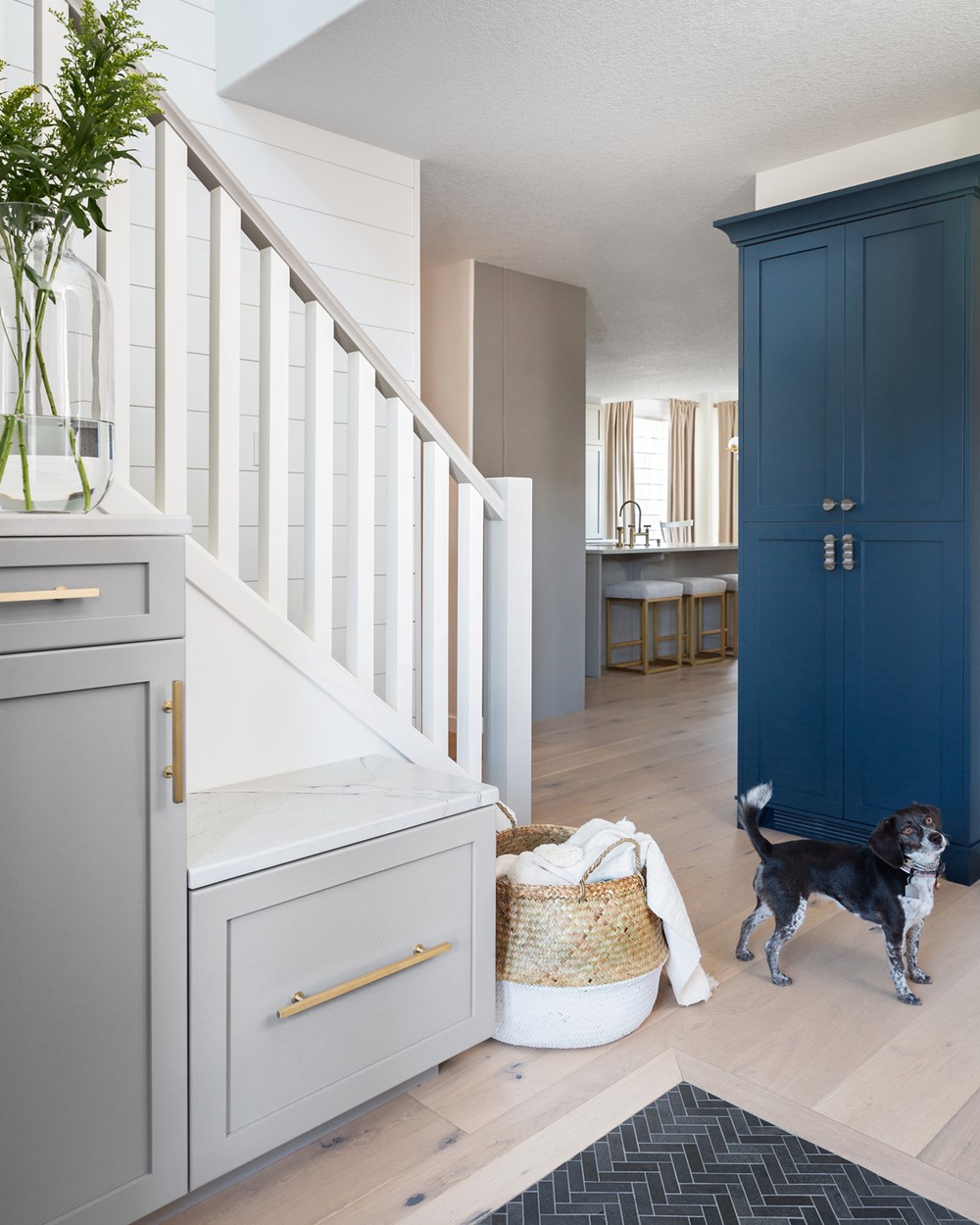
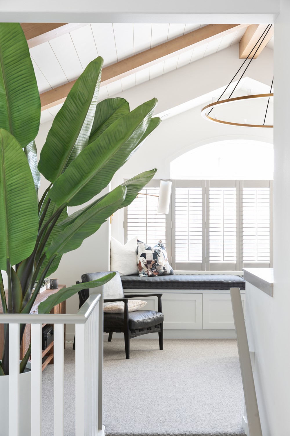
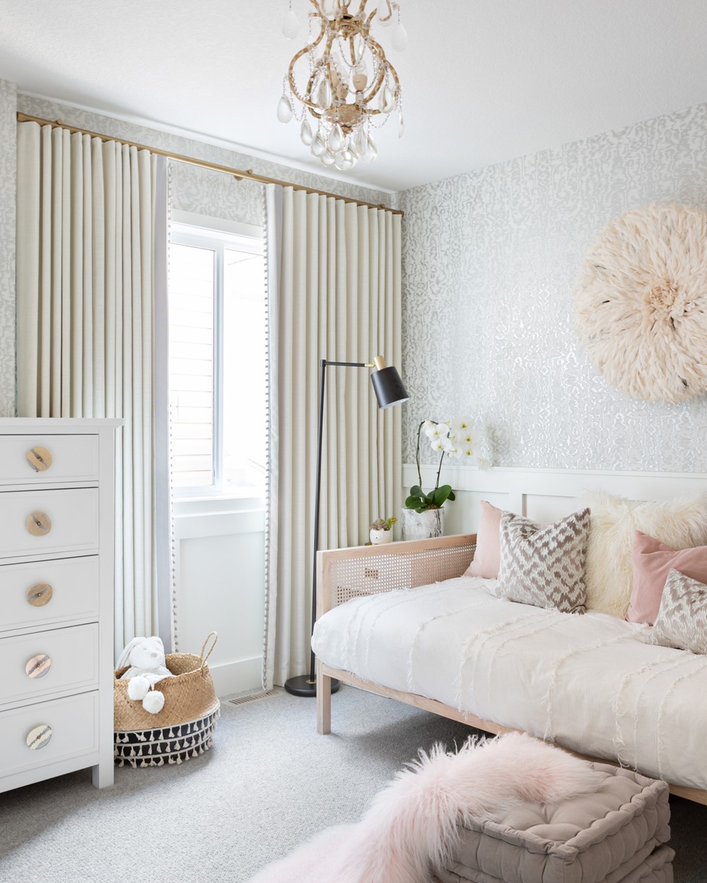
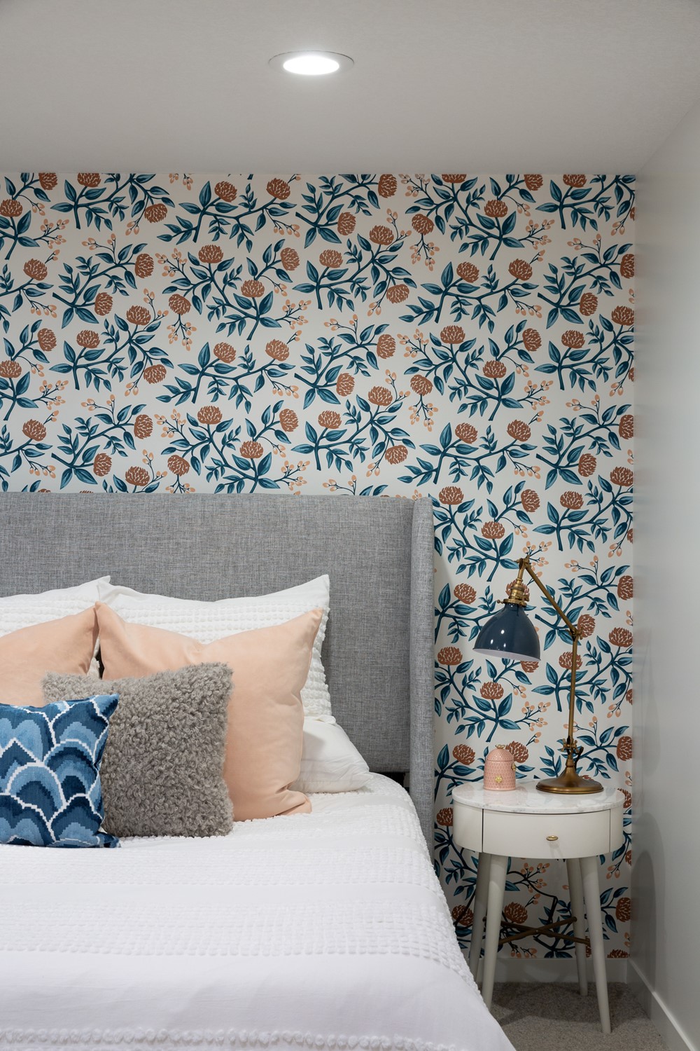
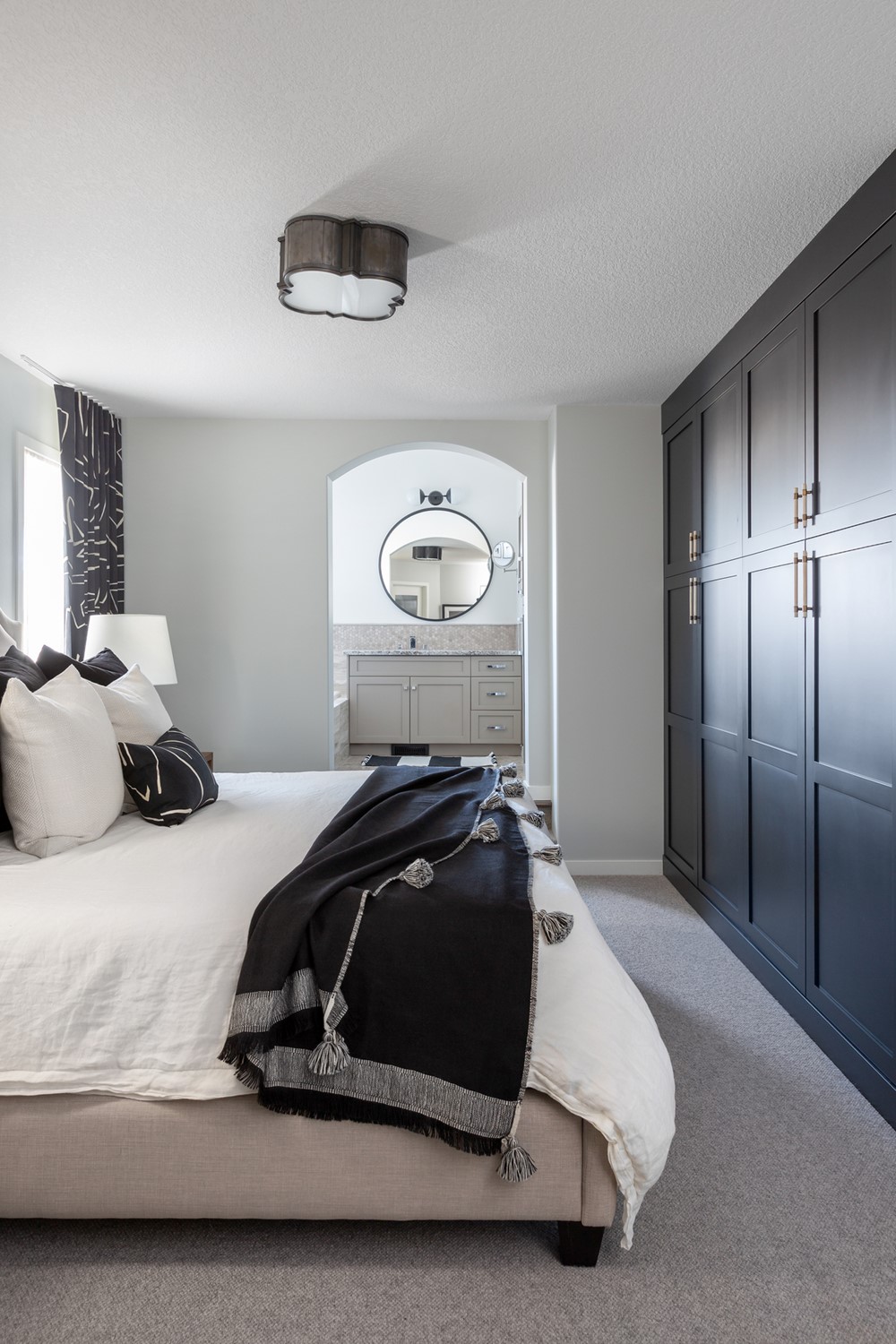
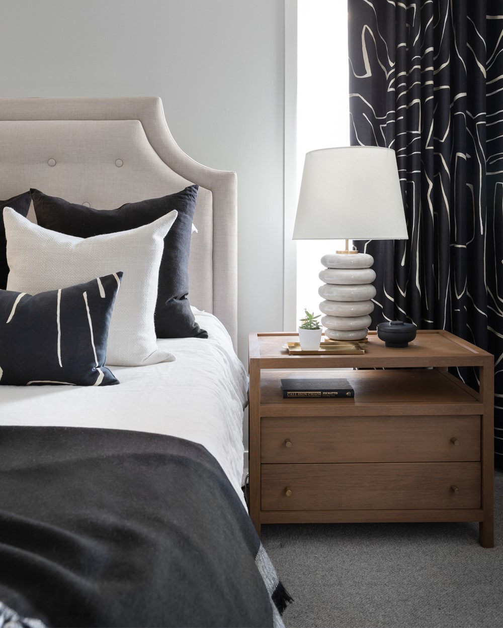
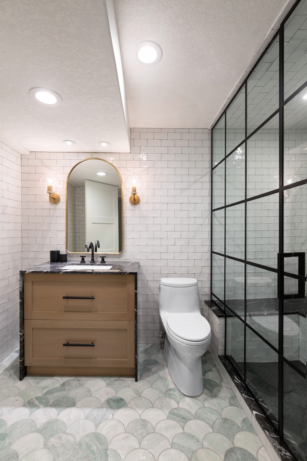
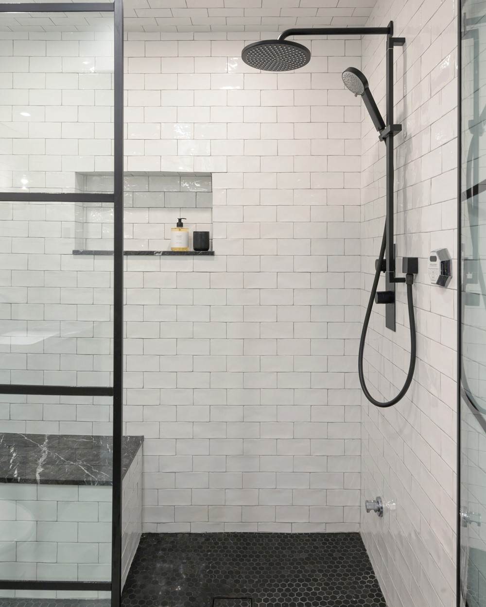

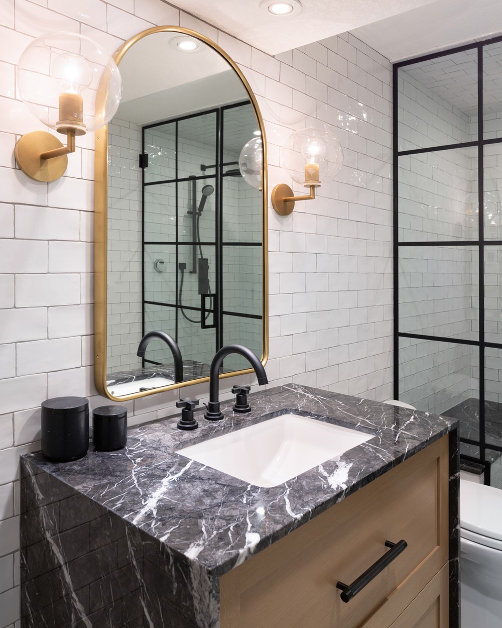
Our clients built their home over 15 years ago; they liked the overall layout of the house, but were no longer in love with the finishes. The original kitchen consisted of dated maple cabinets, granite countertops, slate tile, and was lacking the storage that their family desperately needed. Knowing this, our senior designer, Alanna Dunn, started tackling the kitchen by re-designing the island and extending one of the walls of cabinetry to include more storage space. The previous kitchen island was a two-tier surface and an irregular shape. Alanna removed the secondary counter-height and with the new counter surface at one consistent height, the kitchen and adjacent living room instantly felt more connected to one another. The previous jigs and jogs of the island were paired back up to maximize storage – allowing the island to now house the dishwasher, garbage and recycling bins, and a pull-out dining shelf for their dogs’ food bowls! When it came to addressing the existing millwork and additional required storage, we chose to keep as much of the existing millwork as possible, painting it to match the new pieces for a completely seamless look. The kitchen is finished off with new white macaubus quartzite countertops, chevron backsplash, brass hardware, upgraded appliances, and a custom hammered metal range hood.
Once the kitchen makeover was complete and our clients had officially decided to stay put in their home, they pulled the trigger on replacing the slate tile floors throughout the main floor with wide width white oak hardwood. The addition of one consistent flooring throughout the home immediately connected the adjacent spaces and gave the house the harmony it was desperately lacking, resulting in the appearance of a larger and more open floorplan.
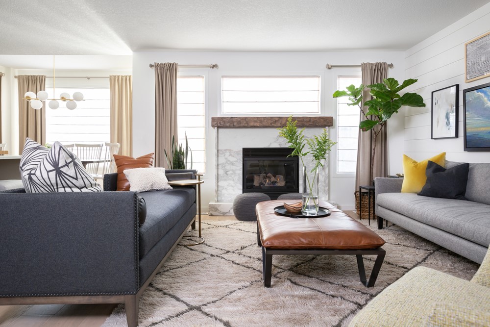
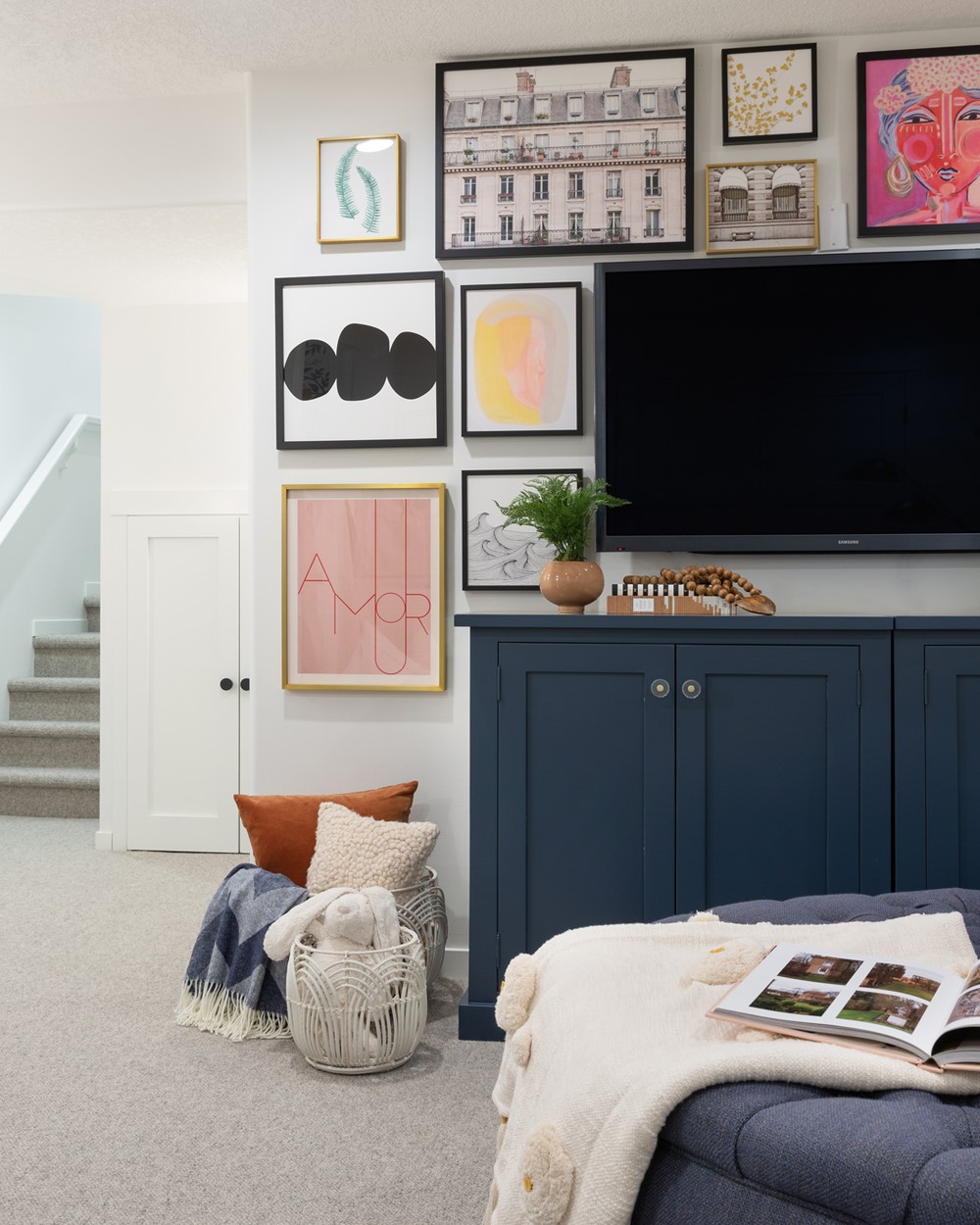
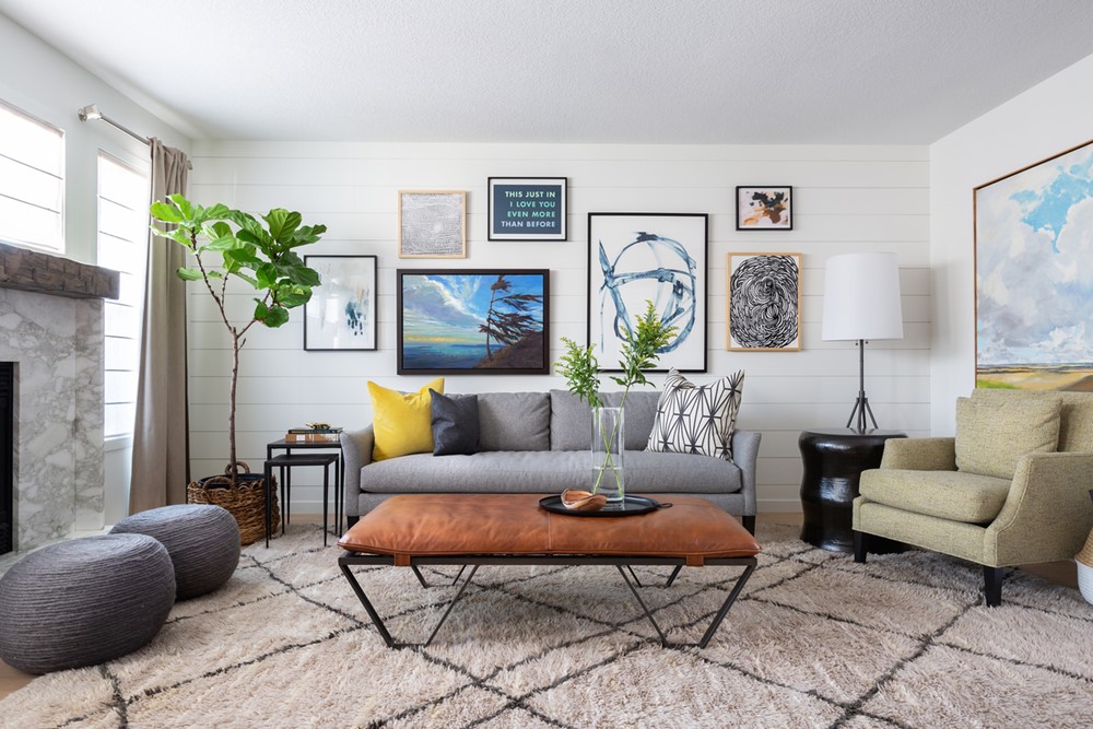
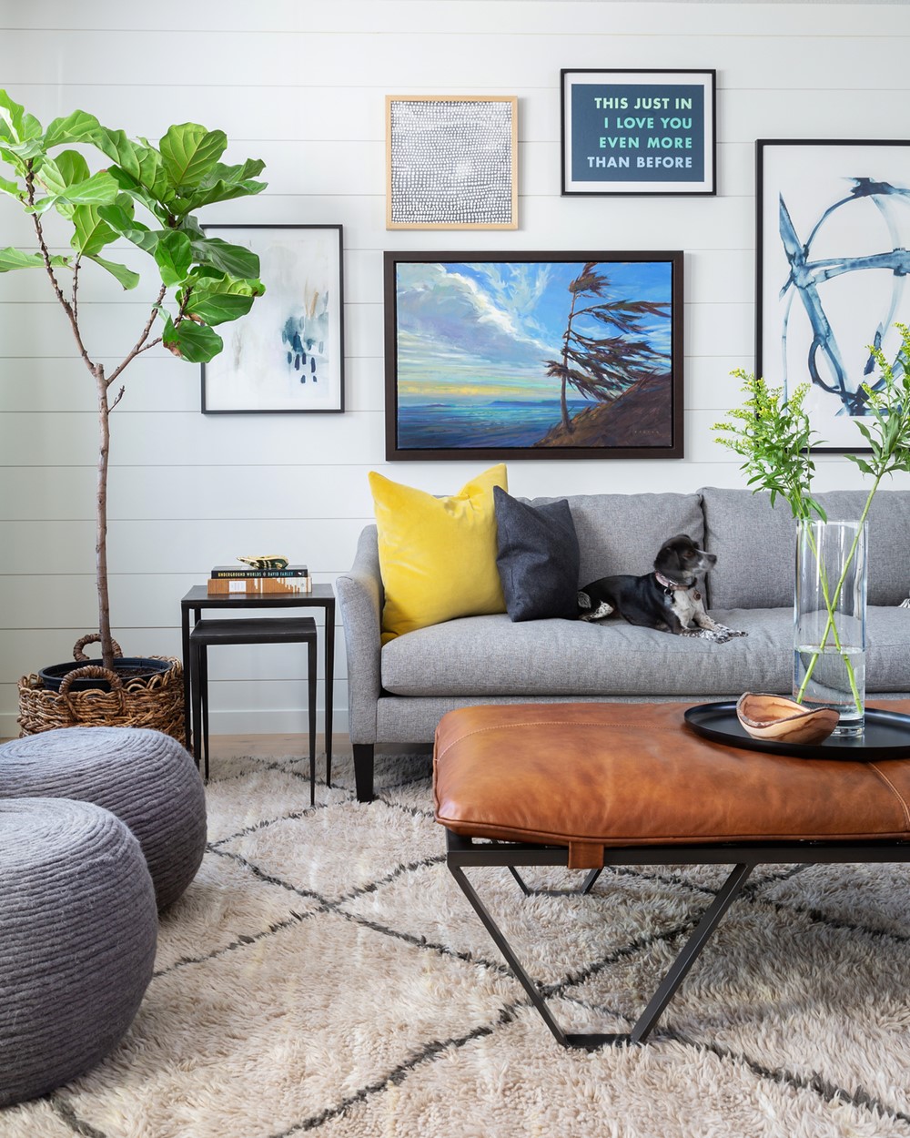
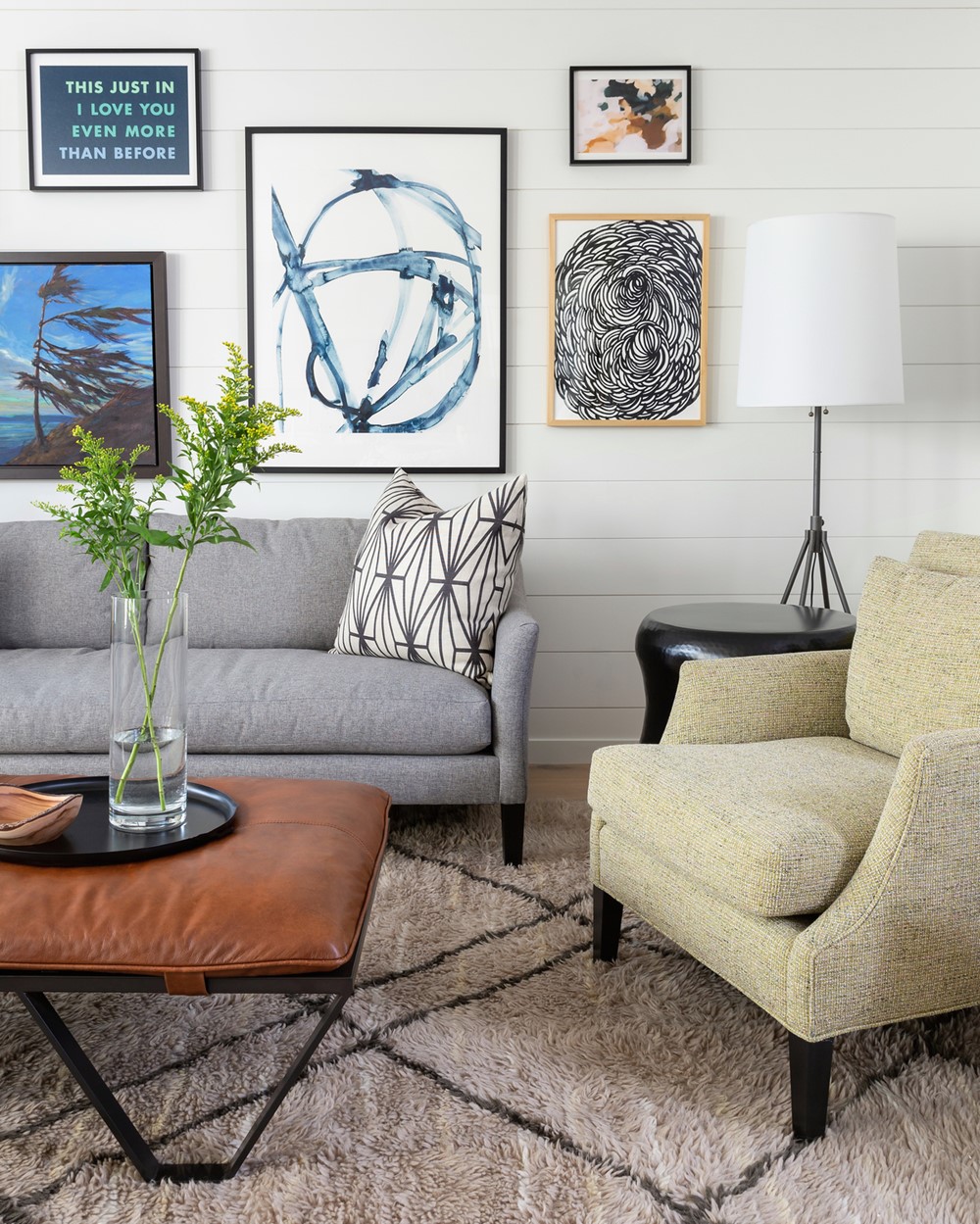
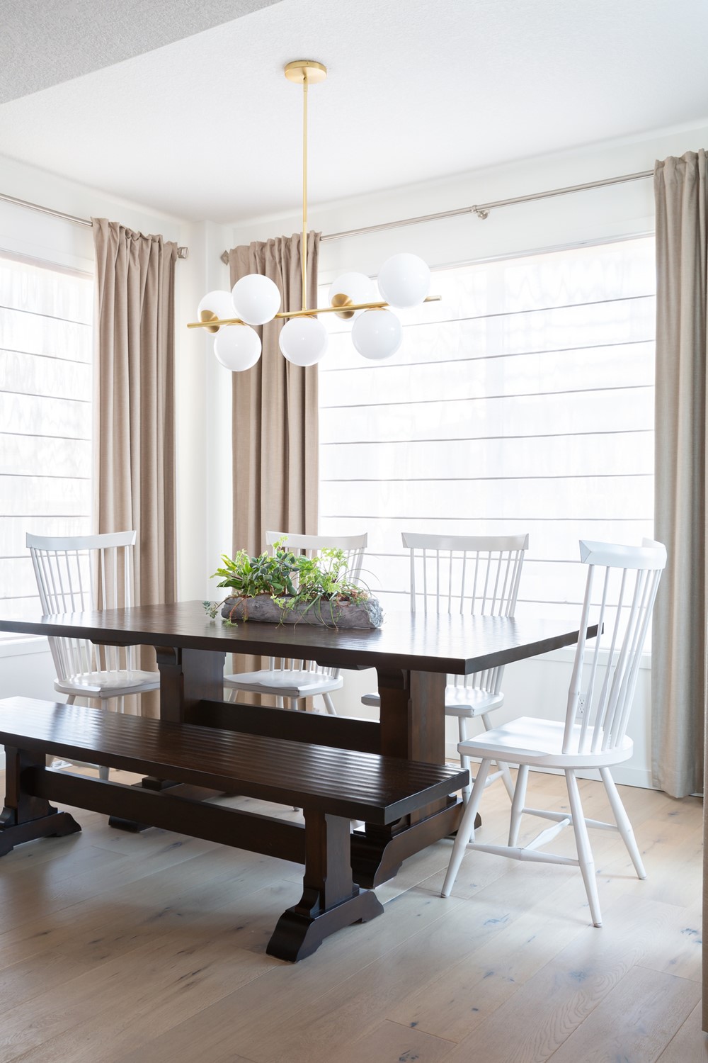
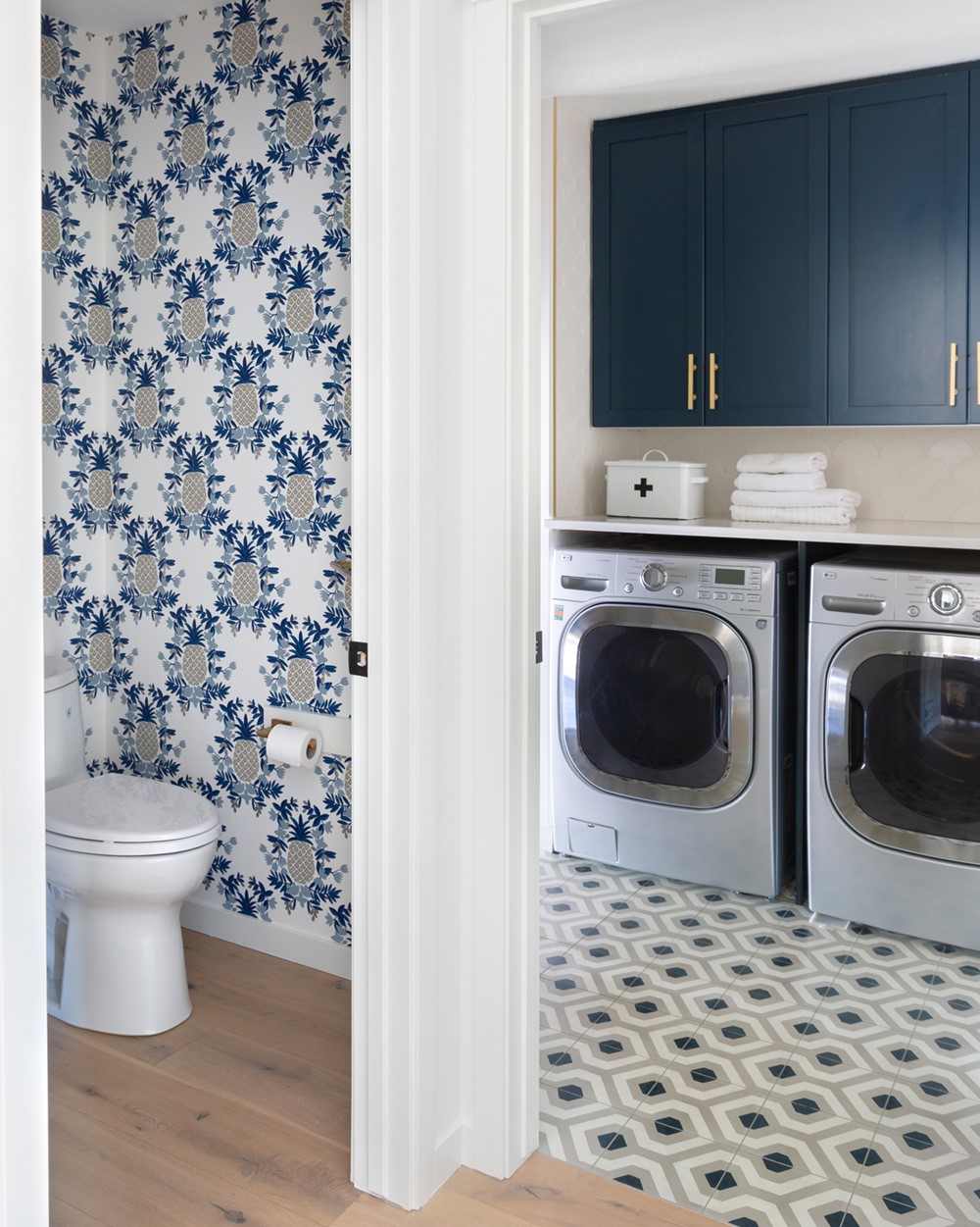
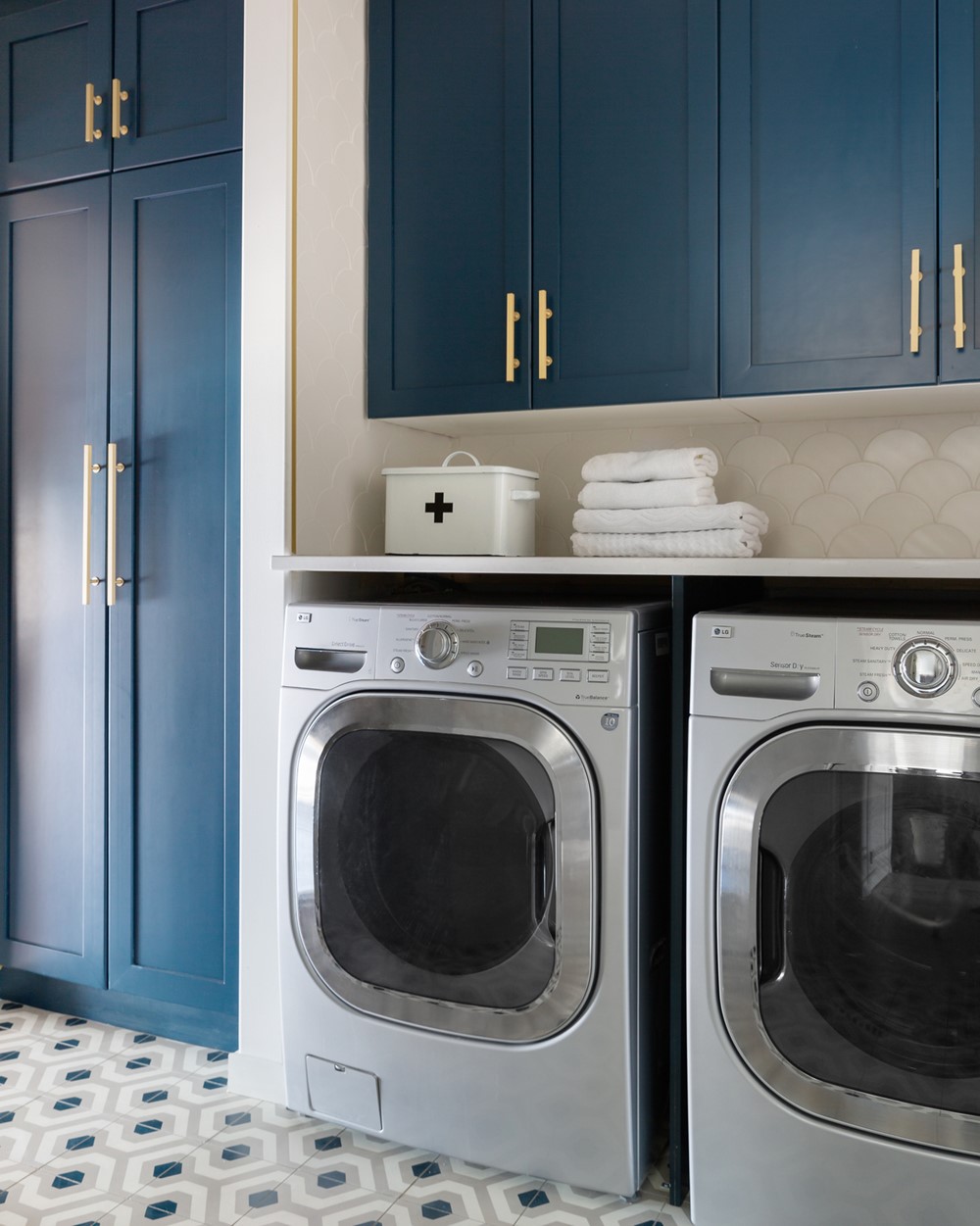
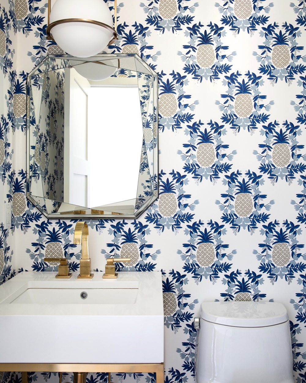
Adjacent to the kitchen are the dining room and living room. We incorporated our clients’ existing trestle table, bench, and Windsor chairs, but changed the feeling of the space with a new light fixture overhead. White studio shades were installed to allow natural light to pass through while maintaining privacy. For the design of the living room, our goal was to maximize seating through furniture selections. A large ottoman serves as a coffee table and also as additional seating when pulled up against the sofa while a Beni Ourain rug defines the room within the open concept floor plan. Our client also owned an eclectic collection of art that we featured in a gallery wall that adds a punch of colour in the otherwise neutral space. When the kitchen, main entry, and living room were completed, we realized that blue had quickly become our accent colour, so we were intentional by incorporating this into both the new powder room and laundry room designs.
