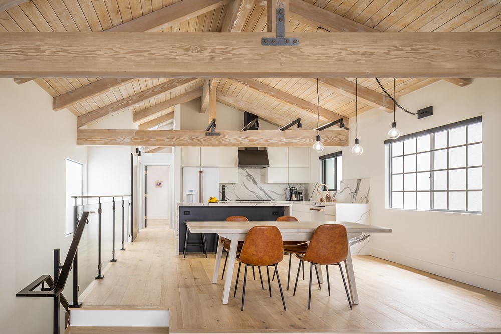
Hermosa Beach Residence Remodel is a project by West Edge Architects. Beyond its location, our clients were drawn to the detached row house in Hermosa Beach principally because of the vaulted ceiling running almost the full length of the second floor. Connected to the ground floor by a two story entrance and stair space, the second level includes the principal living spaces, along with the master bedroom and outdoor decks on both the street and rear yard ends of the house. Two smaller bedrooms and a shared bath occupy the ground floor along with the main entrance to the house, located mid-way between the street and rear yard. Photography by Taiyo Watanabe.
.
“Challenges
Our clients were less enthusiastic about the poorly configured and unpleasant kitchen, and a bathroom that served both the living spaces and the master bedroom.
Strategy
The decisive change to the floor plan layout was to shift the main circulation path toward the north side of the house, directly adjacent and parallel to the stair space. To accomplish this, the floor needed to be extended across a small portion of the two story space. As a result, we were able to reconfigure and enlarge the kitchen and the dining room, and add a separate master bathroom. The existing bathroom was converted to a powder room for guests.
A generous amount of space above the first floor ceiling allowed us to reroute the ducting serving the second floor. This in turn enabled us to remove the ceiling over the kitchen and new master bathroom. Finally, the orientation of the master bedroom was flipped so that the closet was moved to a dressing area, separated from the sleeping area by two oversized pocket doors in a new partition wall.
Inventions
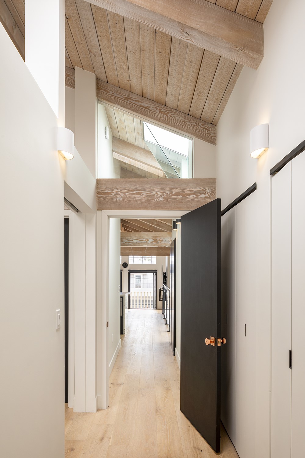
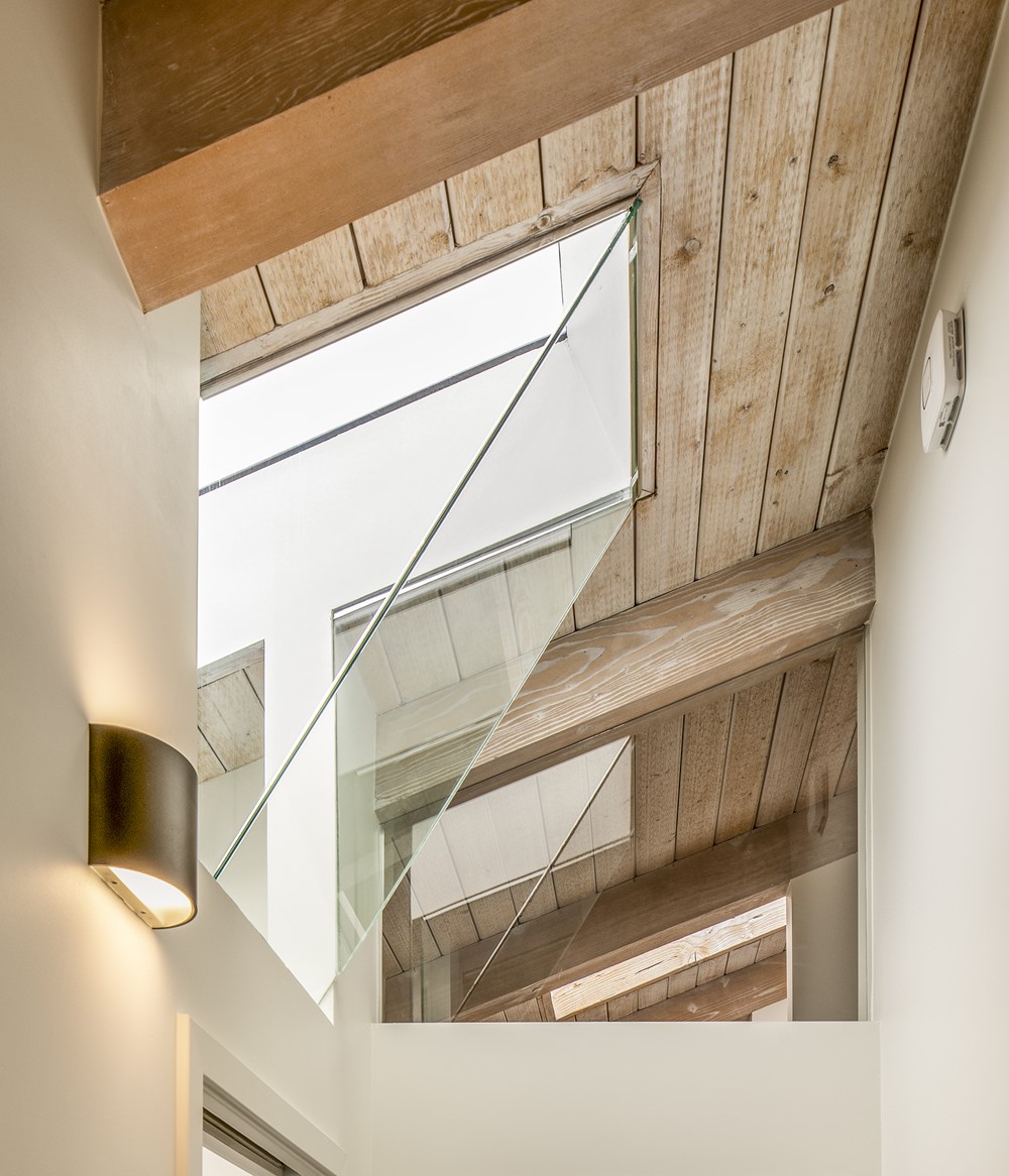
Realigning the circulation positioned new walls under existing skylights. Rather than move the skylights, we created folded glass transom windows to allow the light from the skylights to illuminate both sides of the new wall while preserving acoustic privacy between spaces.
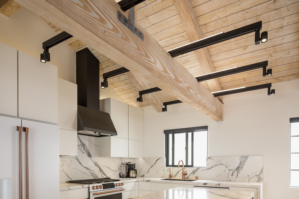
The kitchen design includes a generous island. To work in the now open ceiling , we designed a light fixture that provides both general illumination for the kitchen and task lighting for the island. By utilizing a series of aluminum extrusions that extend from both sides of the newly exposed wood truss, we were able to support linear up-lights for general, indirect illumination and adjustable track lights to illuminate the island counter’s work surface.
Clients
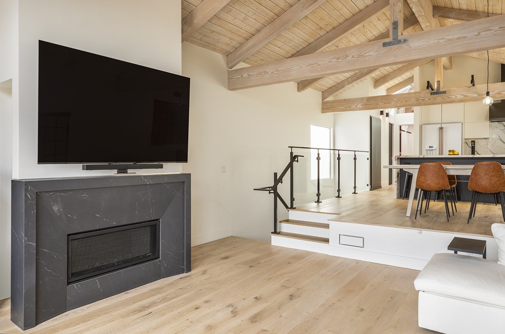
Our clients did a wonderful job selecting appliances, fixtures and hardware. All their choices made throughout the project upheld a high standard and were consistently minimalist in their aesthetic. As part of the overall transformation, the original textured wall surface was smoothed over and the rustic stone fireplace was replaced with a design utilizing large format, smooth stone surfaces. The tile surfaces in the master bathroom also utilized larger format materials with minimal grout joints. Even the HVAC registers are minimal in appearance. Phase two of the plan includes a new back yard deck, new exterior doors and windows, and exterior siding.”
