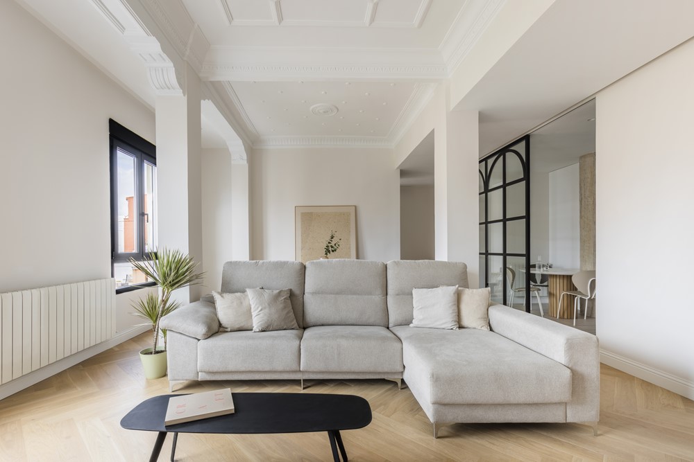
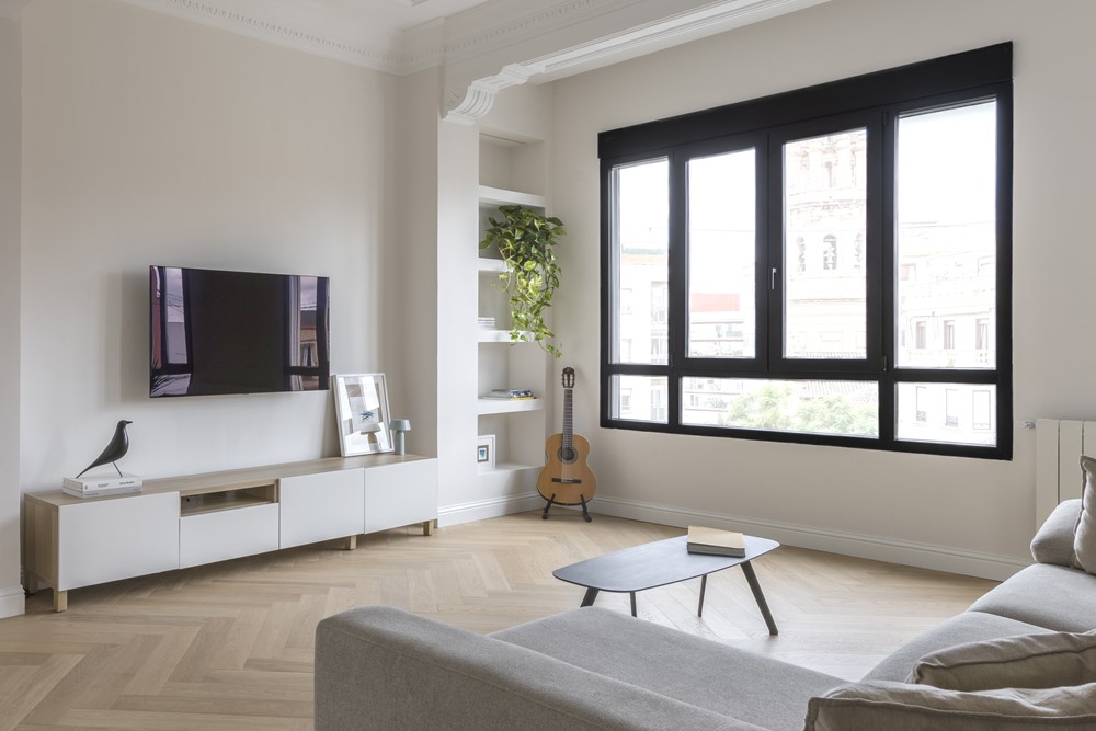
Casa Landete designed by Destudio sees the light as a comprehensive housing reform project and exudes harmony, elegance and modernity in each of its rooms. Touring this emblematic house of the Valencian expansion represents the union of the classic and the renovated, a mixture that combines perfectly with the way we live in homes today. Photography by Maria Mira.
.

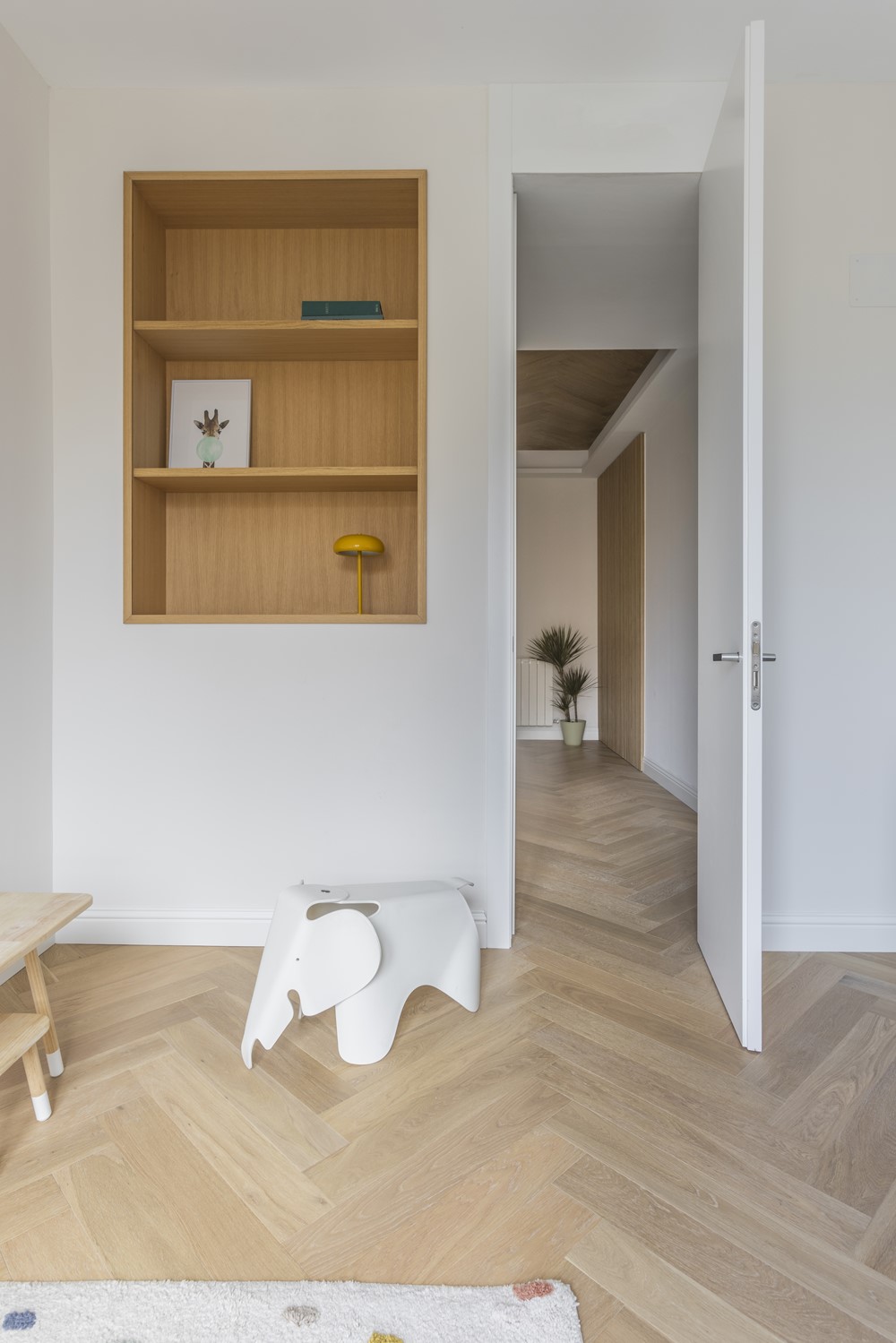


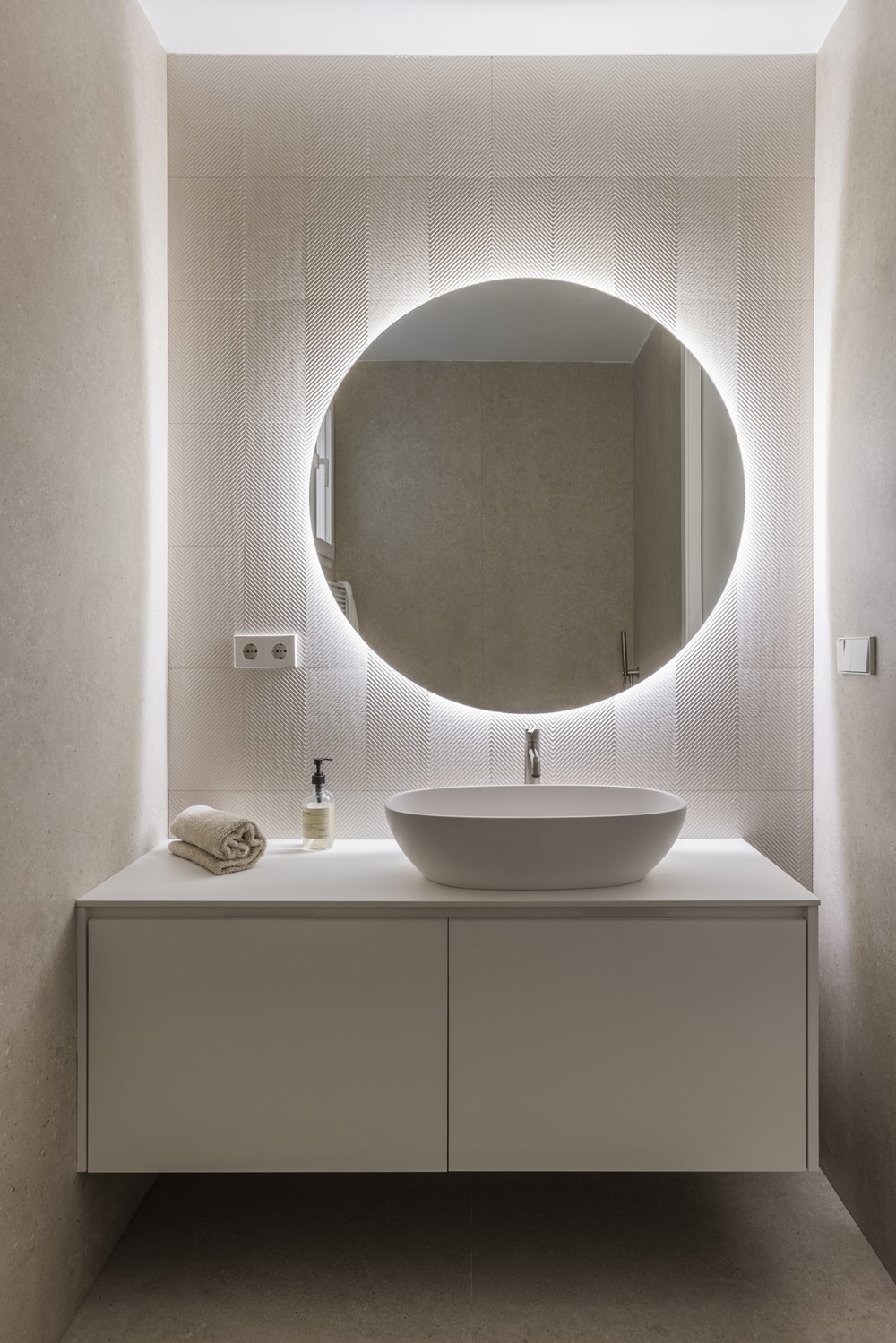

“We had a blank sheet of about 136 m2, more than enough space to design a modern home and meet the needs of customers. The volume of the house has allowed the team of architects to give meaning to each of the spaces and play with a 100% functional layout.
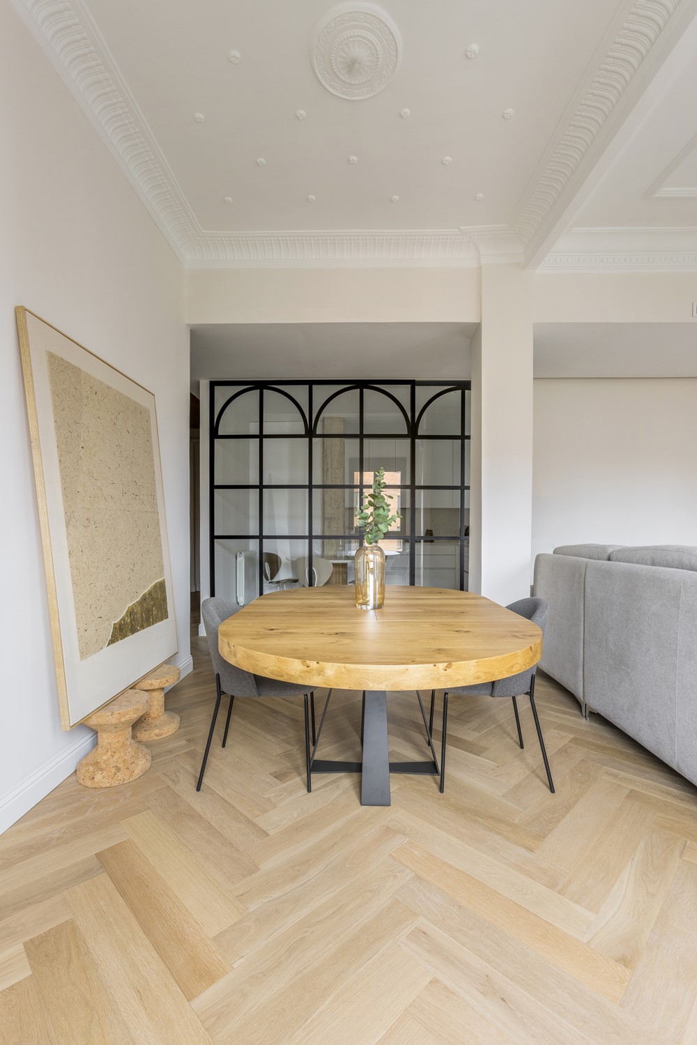
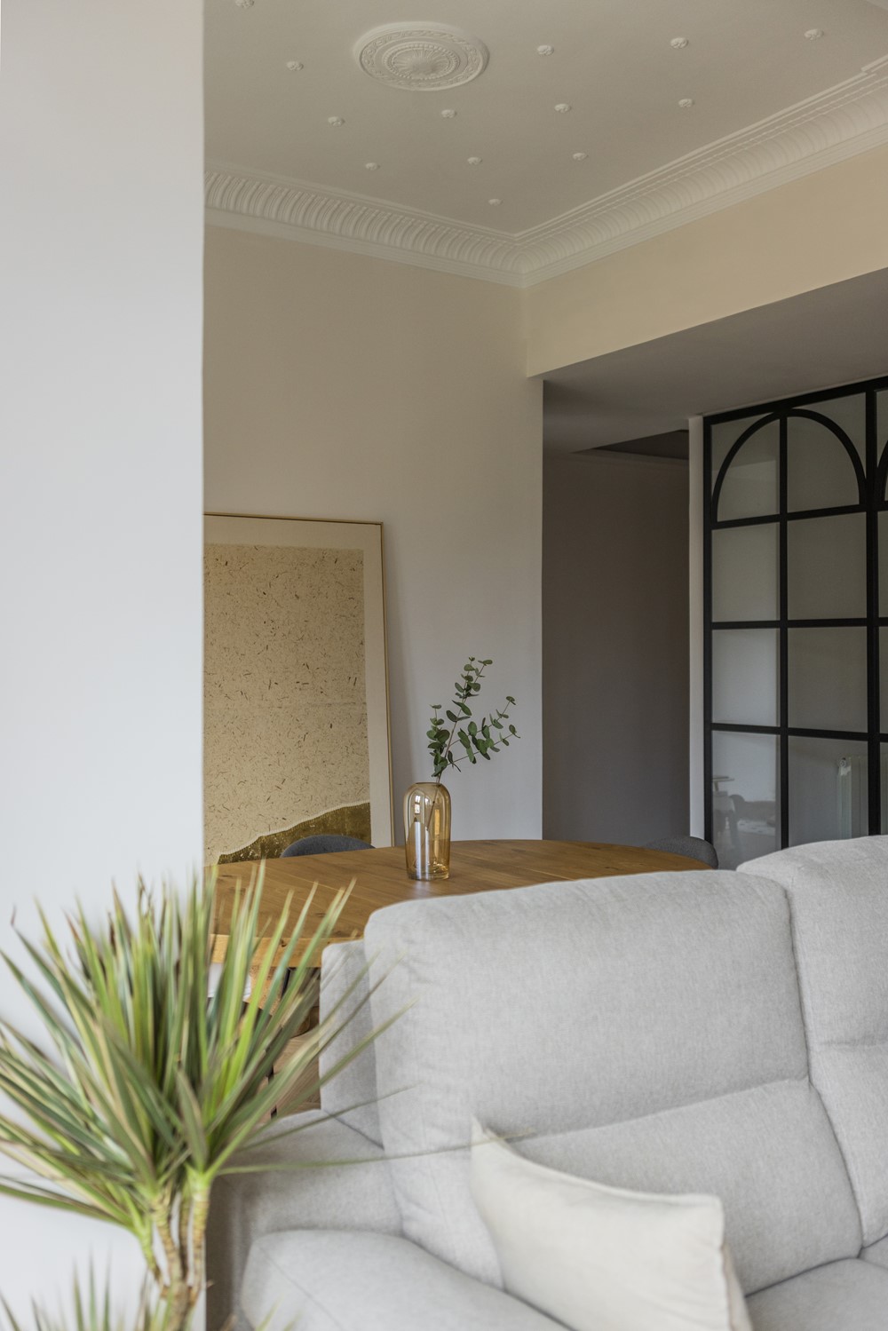
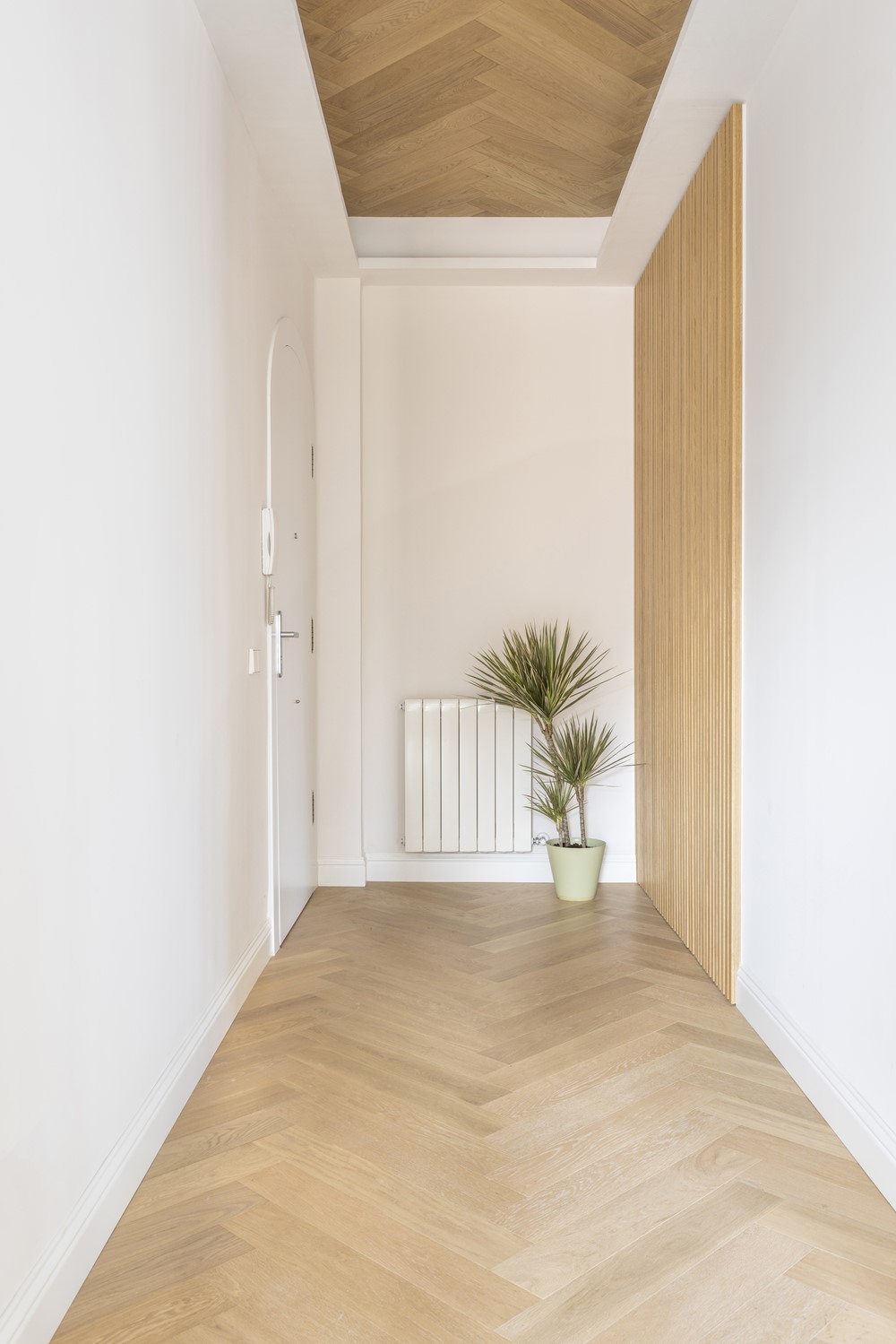
Casa Landete welcomes us with a totally custom-designed entrance hall. The recessed false ceiling covered in natural wood stands out, as in the rest of the house. Precisely one of the original elements that they wanted to preserve were the ceilings in the living/dining room area of the house. They have been restored with the intention of preserving that classic touch of Casa Landete and thus accompany the rest of the interior design.
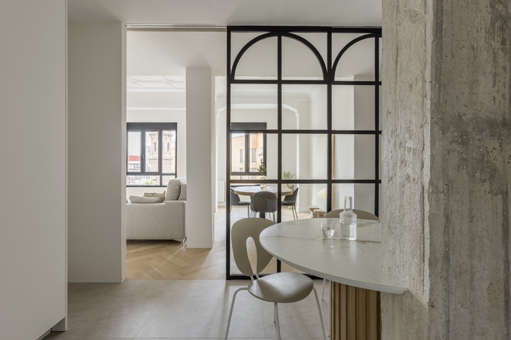
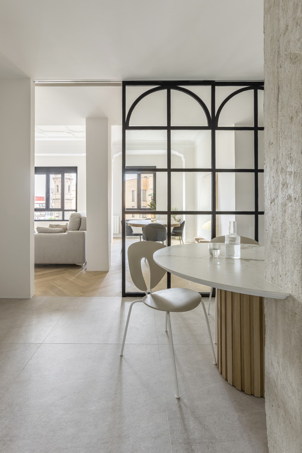
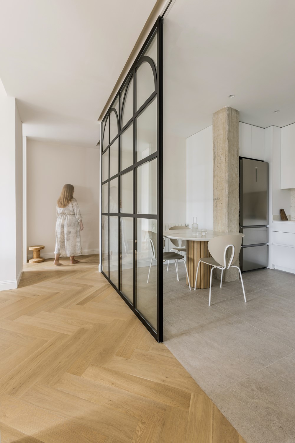
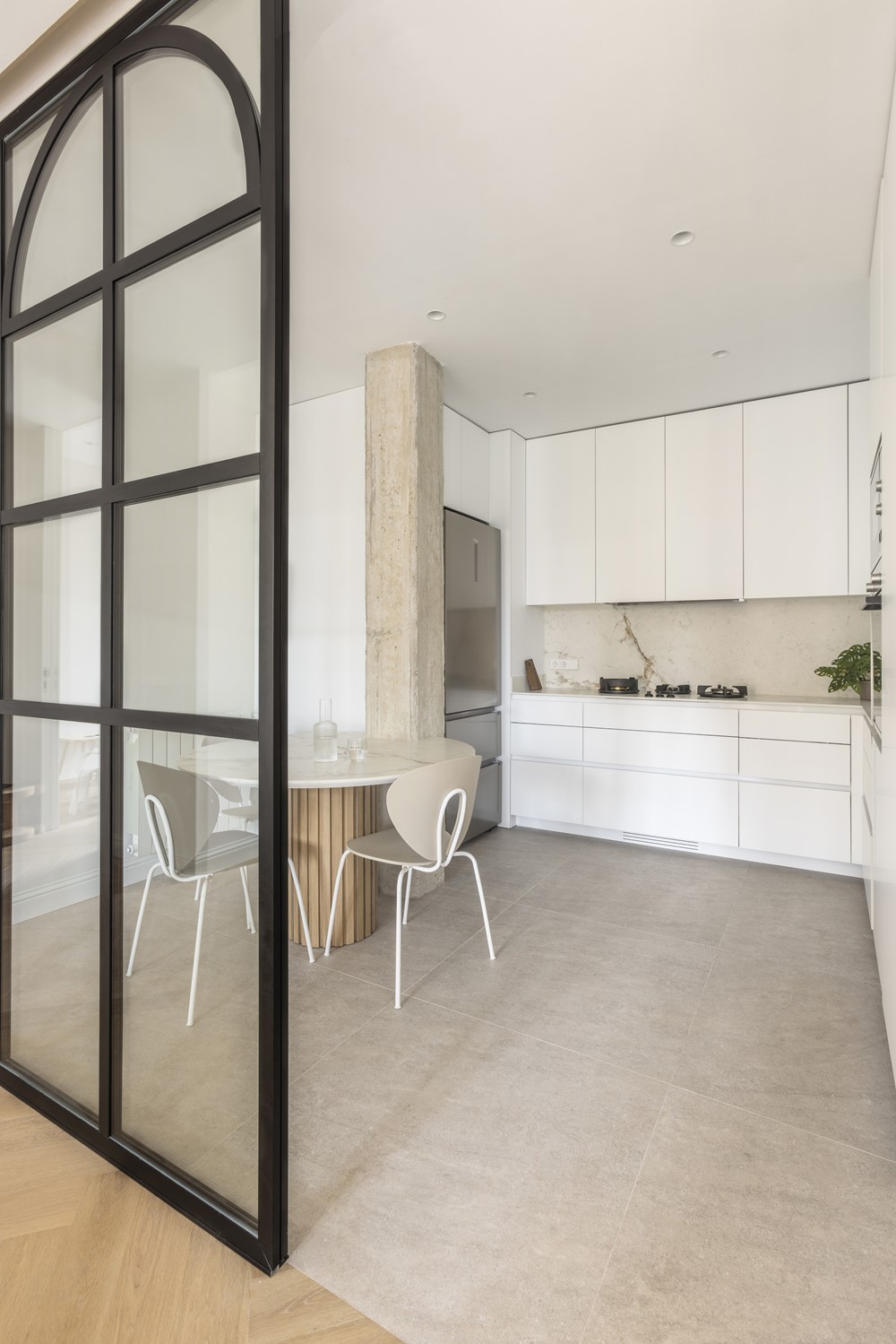
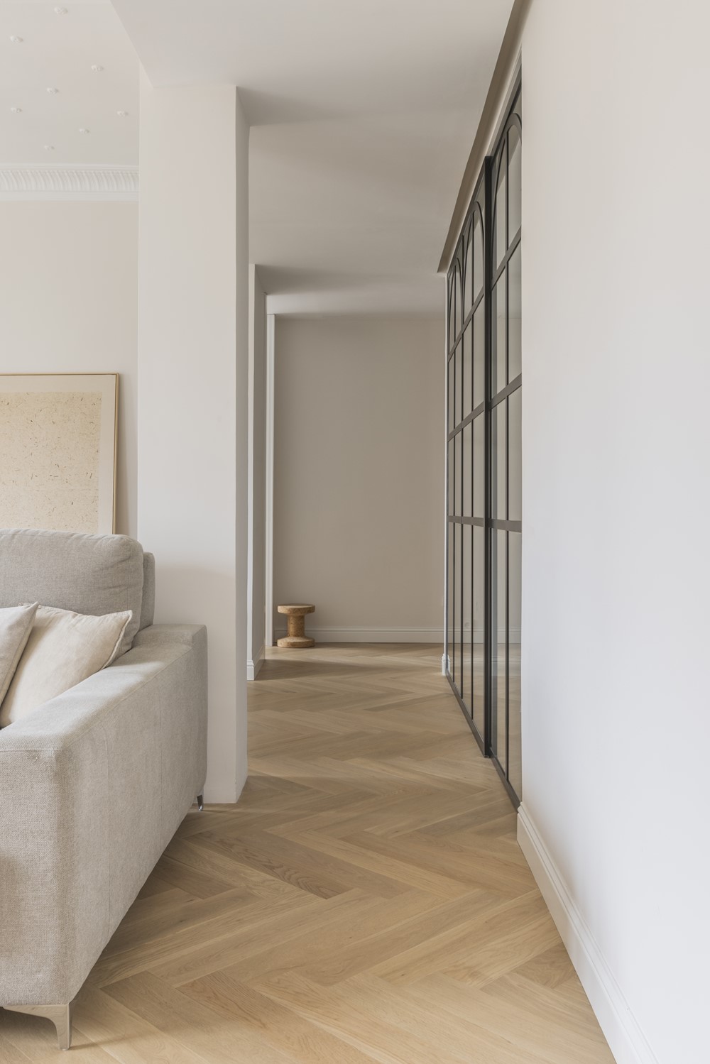
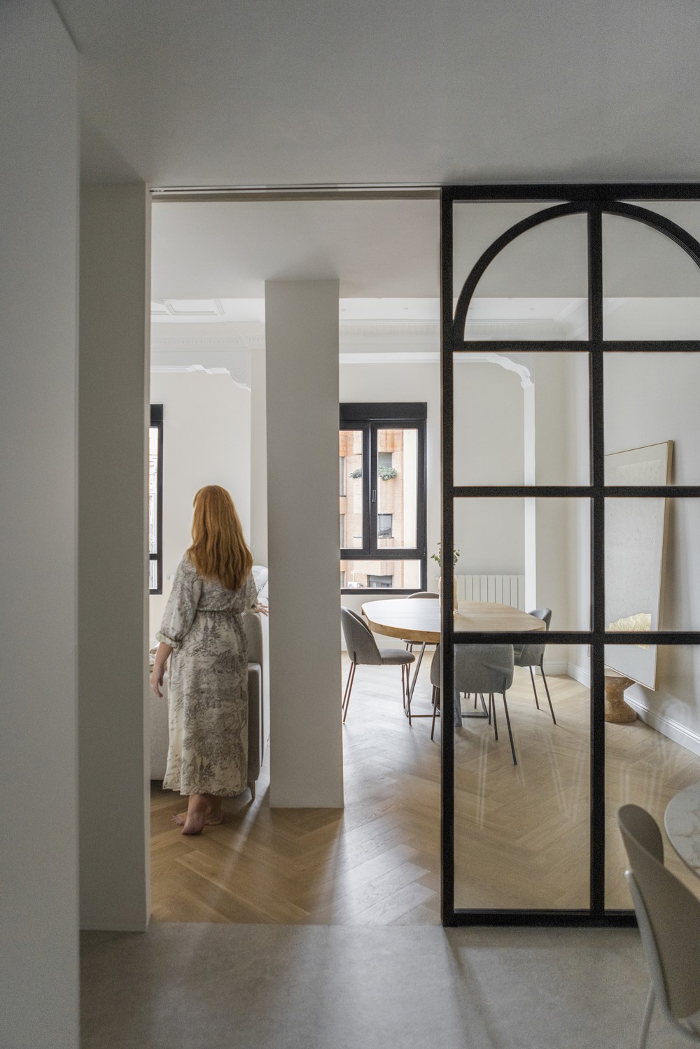
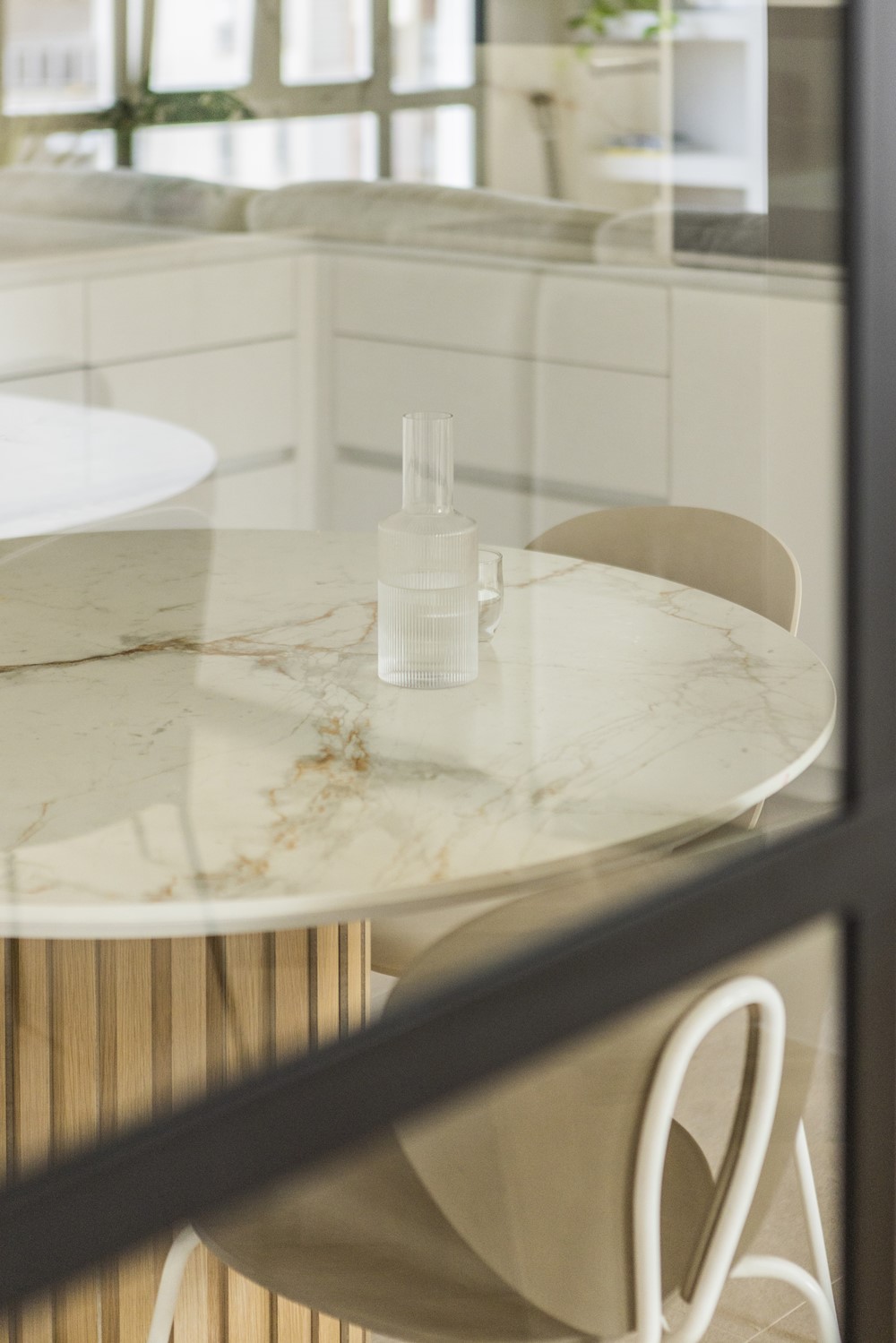
The kitchen is one of the most important rooms in today’s homes, knowing how to integrate it with the rest of the house is essential. In this case, functionality and comfort have been chosen. The round table predominates, perfectly integrated with the exposed concrete pillar and with a wooden chopsticks support. Another of the characteristic elements of the kitchen are the burners integrated into the countertop, which provide a sense of continuity to the space and do not break the aesthetics of the room but rather add that innovative point. This kitchen is separated from the living/dining room with a glass and black lacquered aluminum sliding door, thus allowing natural light to enter and providing a feeling of spaciousness to the entire environment.
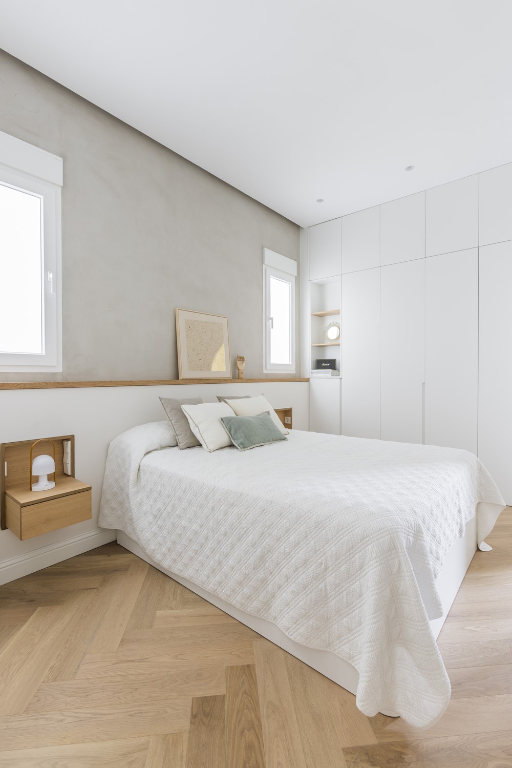
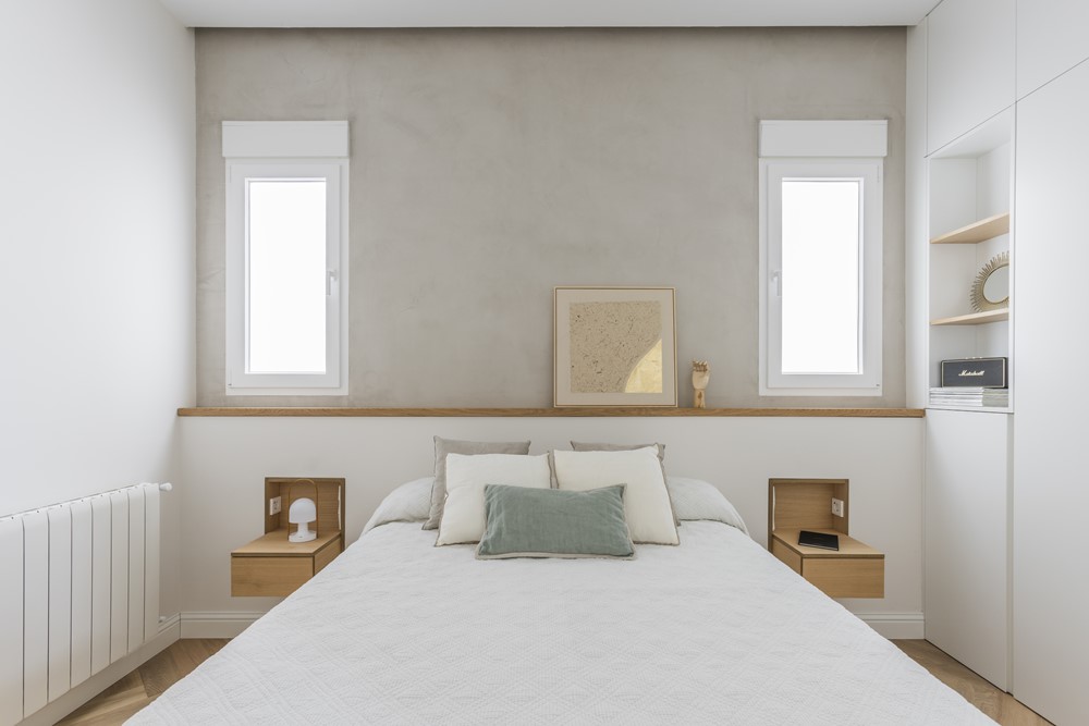
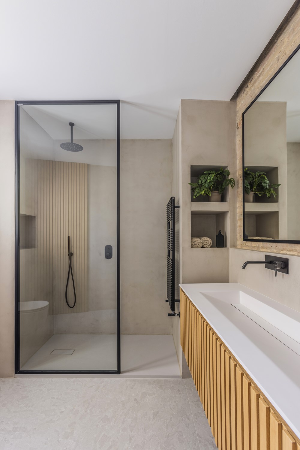
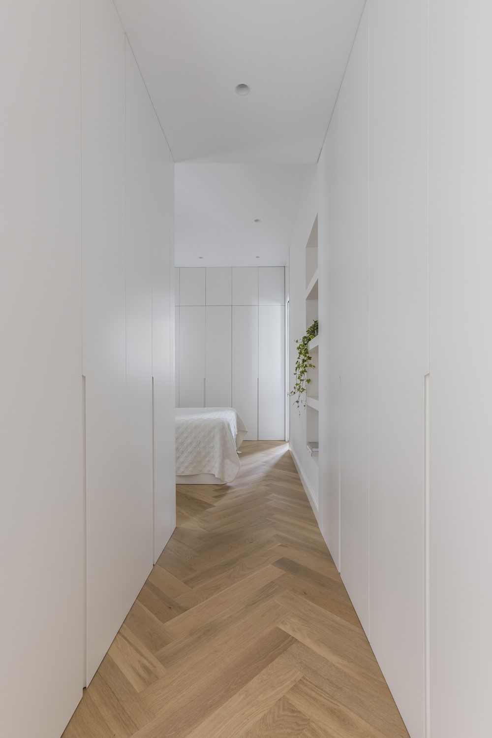
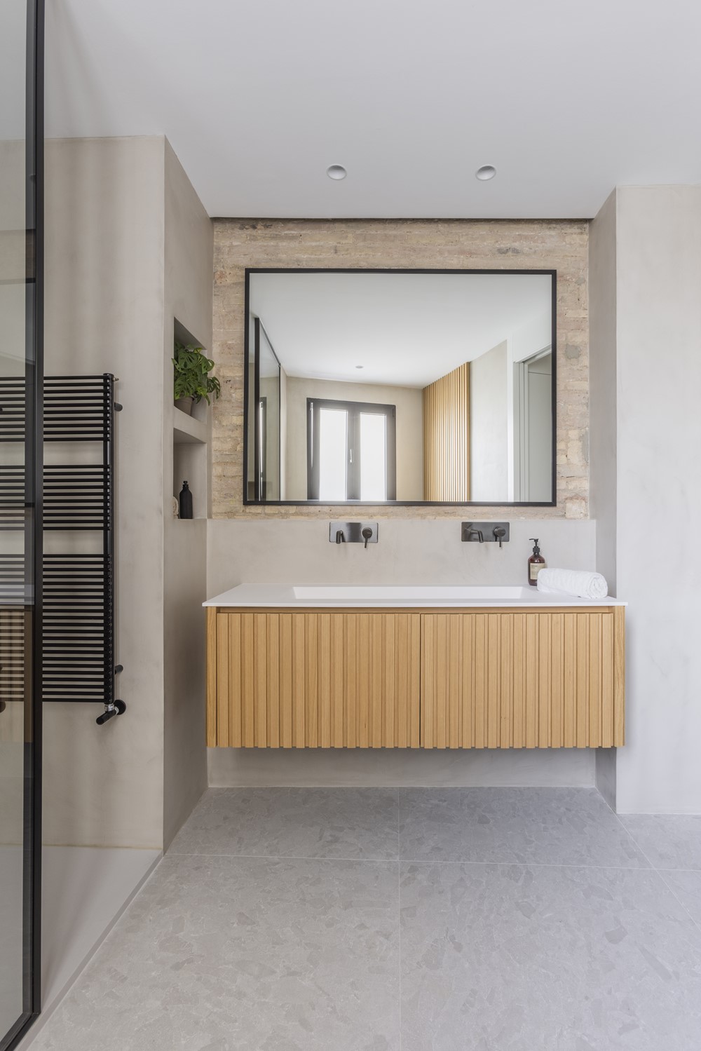
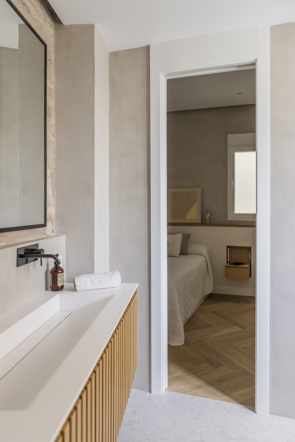
The night area has a master bedroom with an en-suite bathroom. In said bedroom, a masonry headboard with integrated bedside tables has been designed. As a final touch, highlight the microcement of the wall of the headboard. In the bathroom, the exposed brick wall predominates, which we wanted to bring to light, and the rest of the microcement lining on the walls.
In short, this comprehensive housing reform project represents the balance of materials and careful interior design, which dresses and gives a sense of home to every corner.”
