Silva Jardim House is a project designed by Estúdio Pedro Haruf. Rua Silva Jardim is a unique address in the city of Belo Horizonte, I have always looked at this small three-block street, which goes from the Floresta church to Rua Sapucaí, with an admiring gaze. A stone street, with simple houses and country air, a few meters from the hypercenter of the city. Photography by Dentro Fotografia, Studio Tertúlia.
.
One of the most beautiful graffiti panels in BH (made with the participation of my brother-in-law Lucas Torres) is on Rua Silva Jardim, and that’s where Benfeitoria was born, a key place in Belo Horizonte’s culture of the last decade. It was always there, intimately connected with that address.
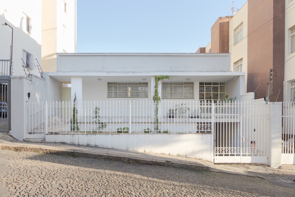
In 2021, Fábio, a friend and client, bought a ‘modernist’ house almost on Rua Sapucaí, a little house that he had already admired several times. I affectionately call it ‘modernistinha’, because although it is not a masterpiece of the city’s modern architecture, it moves me because it is a neighborhood house, ordinary in the sense of being a popular, common, recurring architecture, but which keeps in its intention a modernist aspiration, of a Brazil of the 50s, with aesthetic and cultural relevance.
Fábio is part of a family of creative entrepreneurs, he is the son of designer Regina Misk and entrepreneurs Eduardo and Rafael Quick. I had already worked with all of them on other projects, there were always opportunities to learn by working. It was a happy destination to have this client for a project to be carried out at the address that also spoke about me.
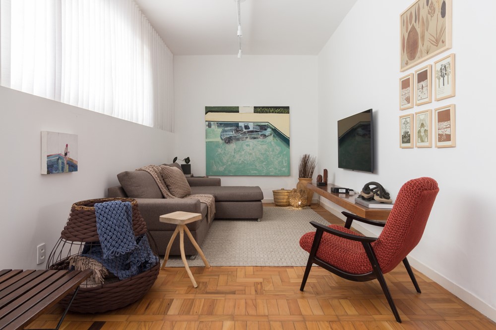
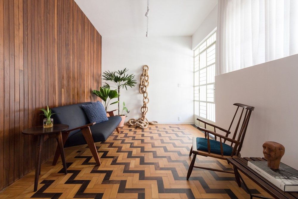
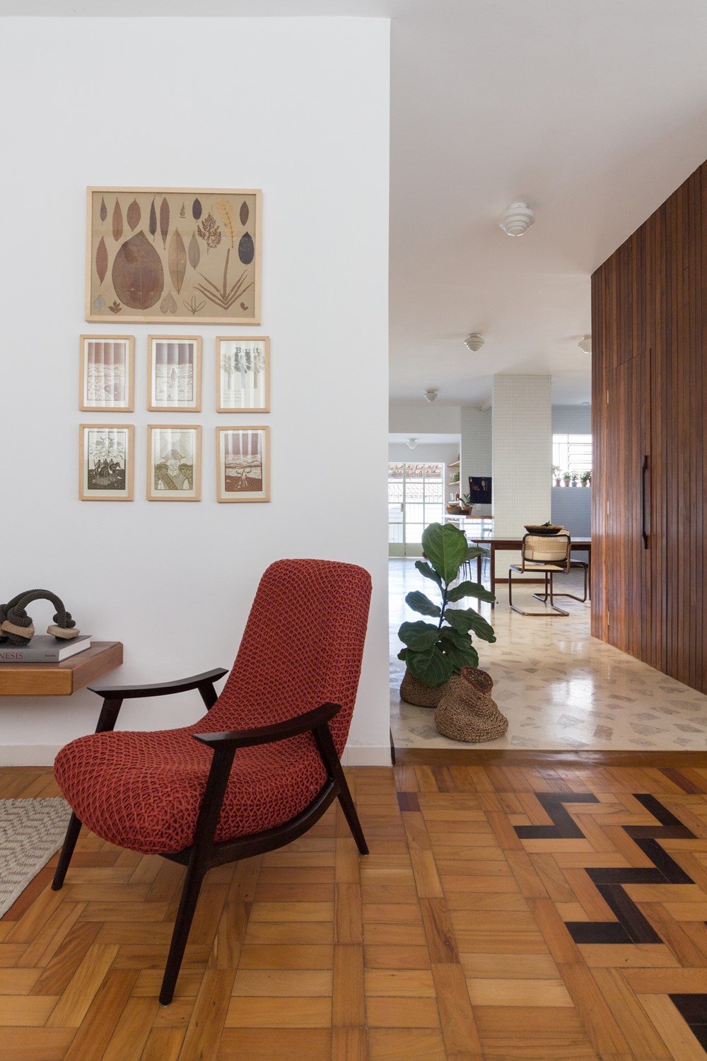
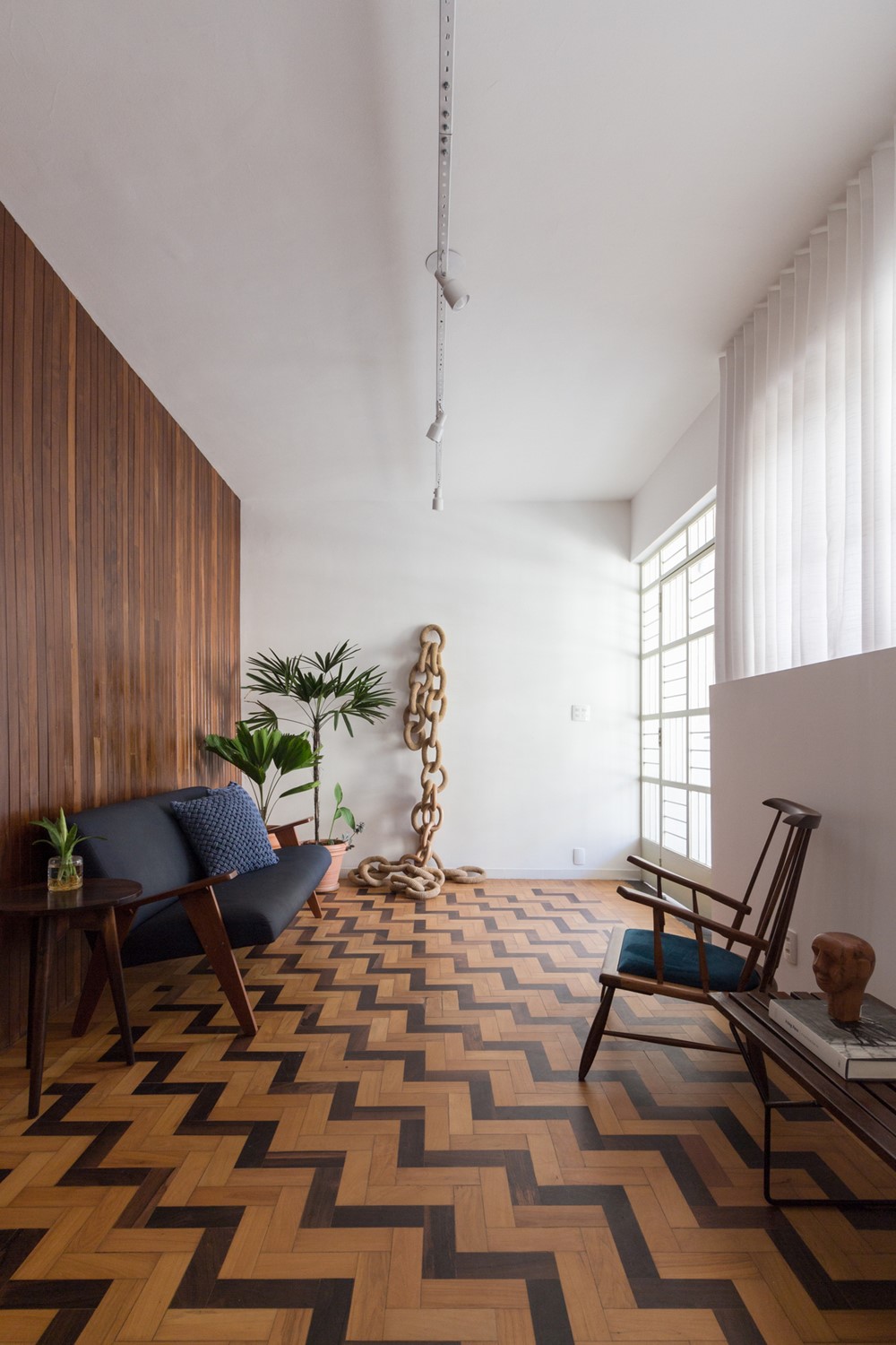
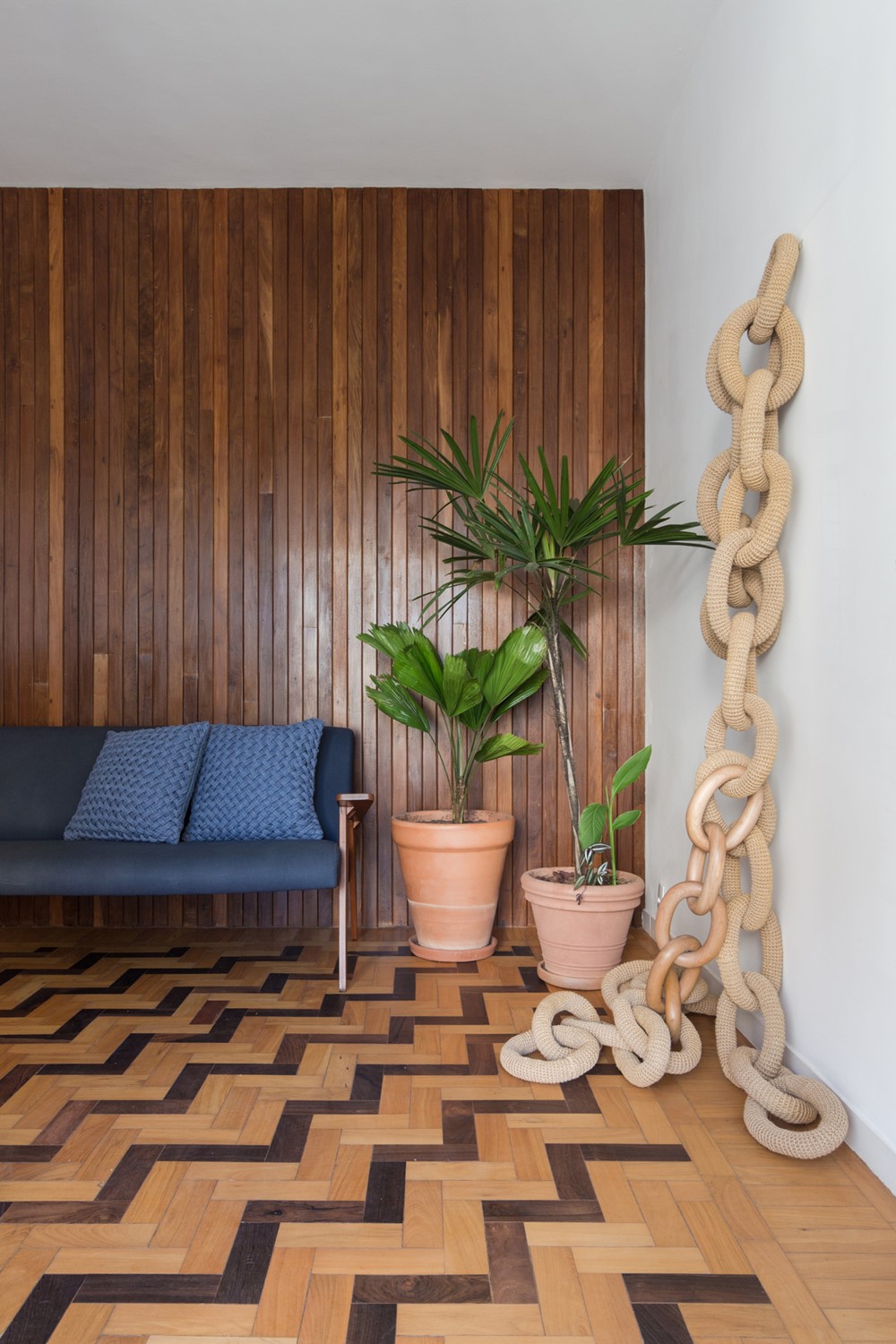
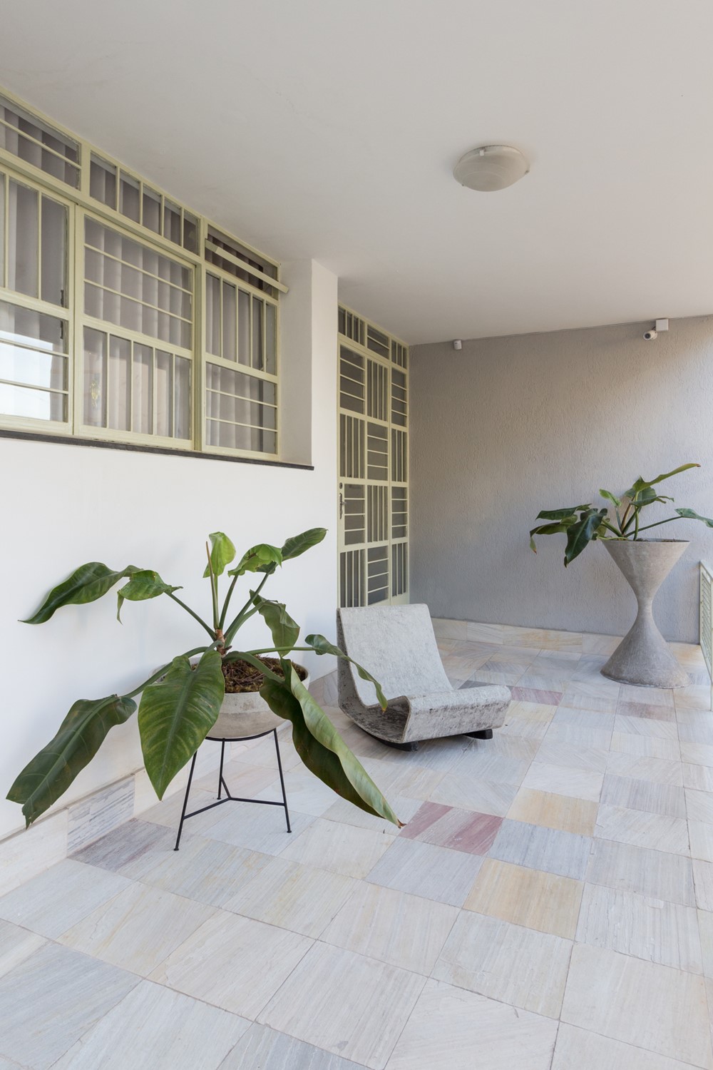
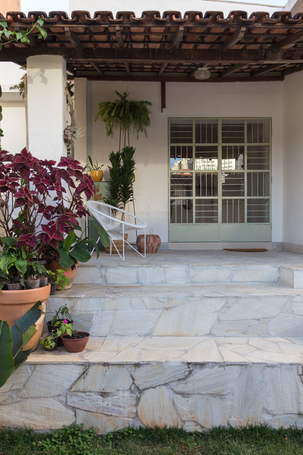
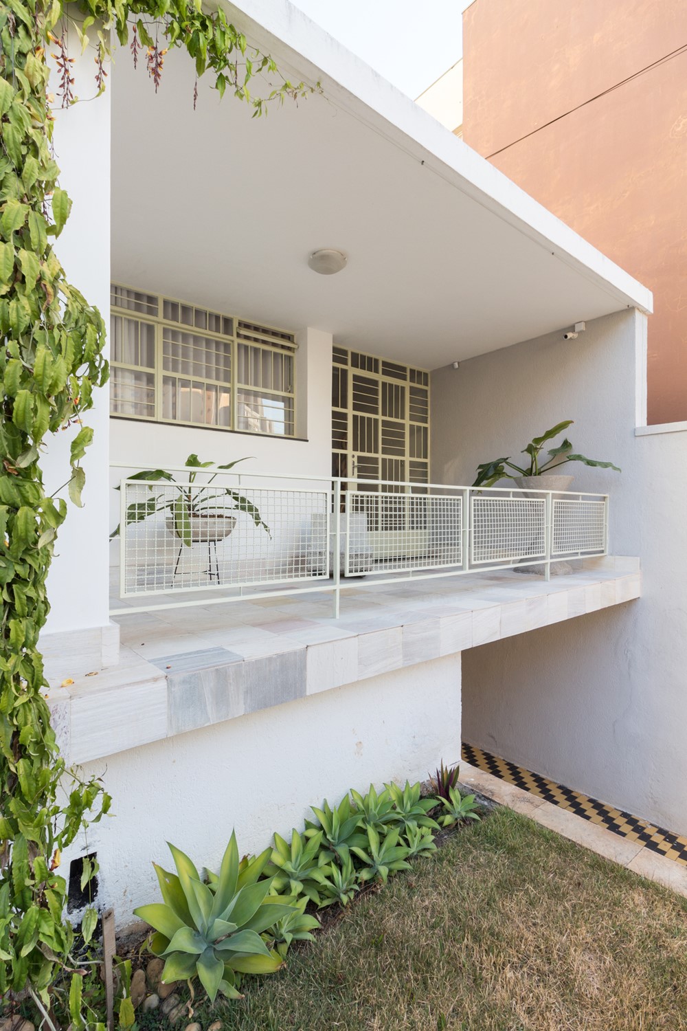
The house presented some important ways for us to work, such as recovering and enhancing the living room floor, a taco designed with pieces of peroba and braúna; the railings in metalwork with geometric designs and the backyard, a luxury in the heart of Belo Horizonte
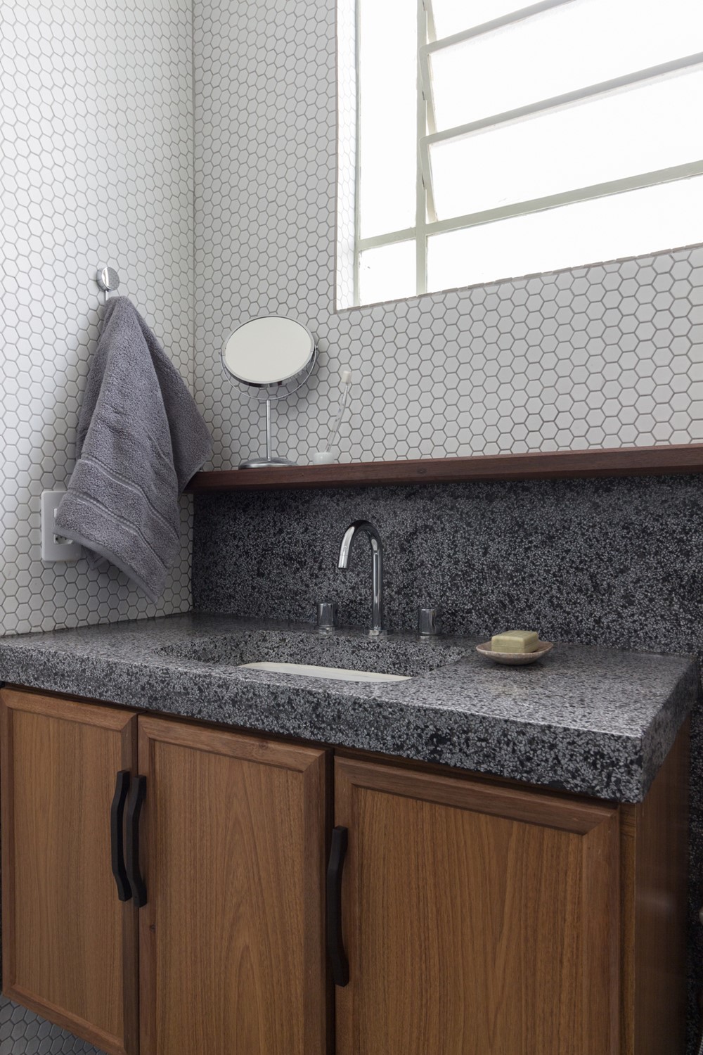
And years of commercial rents also offered us challenges to overcome, such as excessive compartmentalization, a very narrow corridor connecting the living room and the pantry, and the careless choice of ceramic tiles in almost every house.
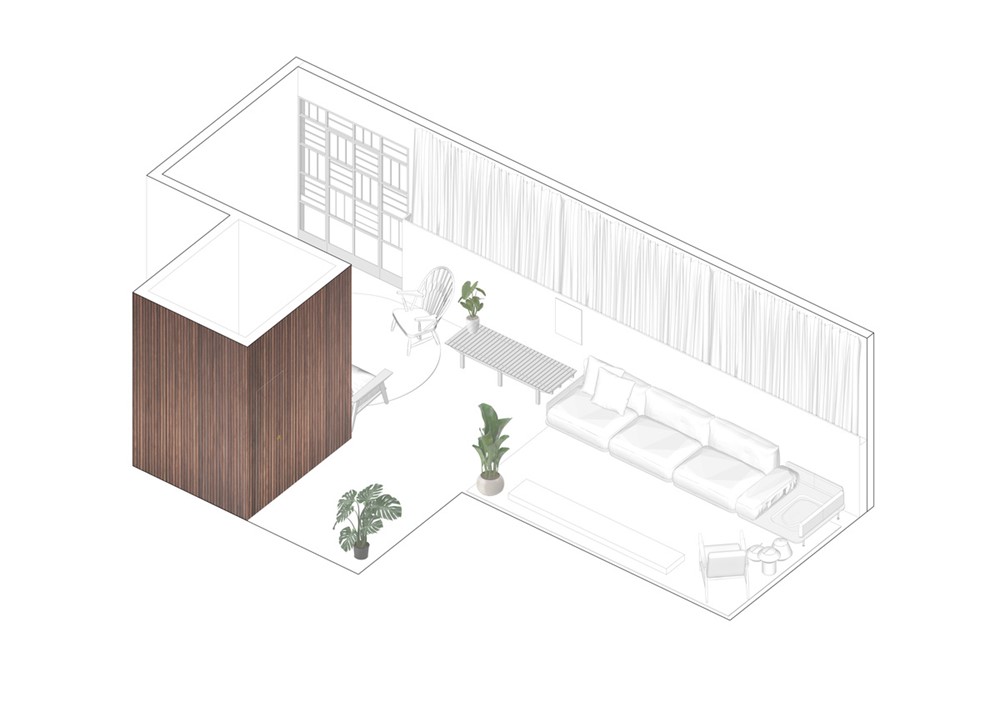
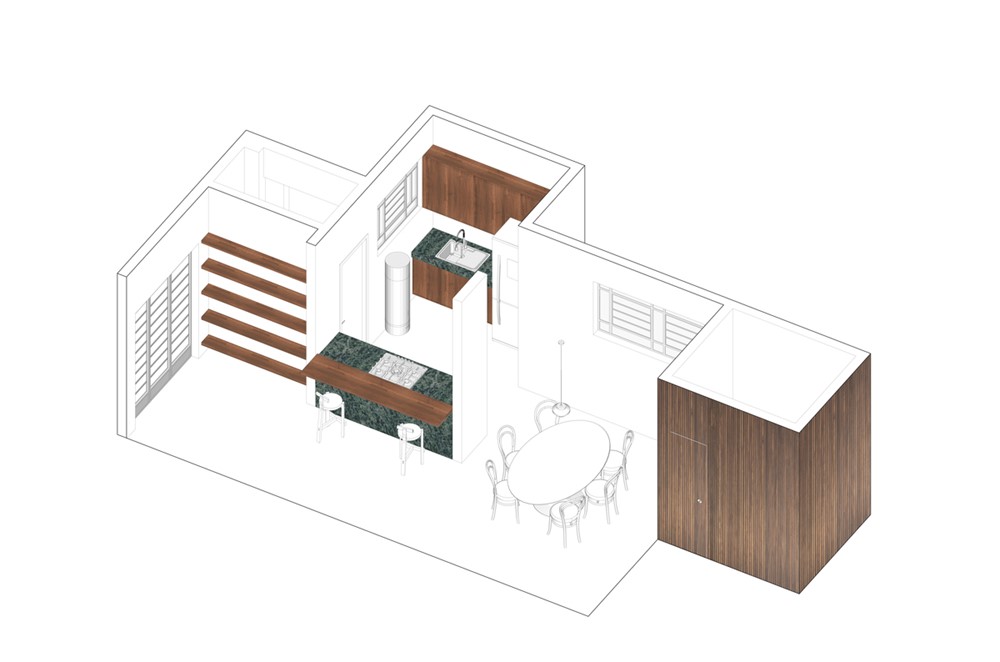
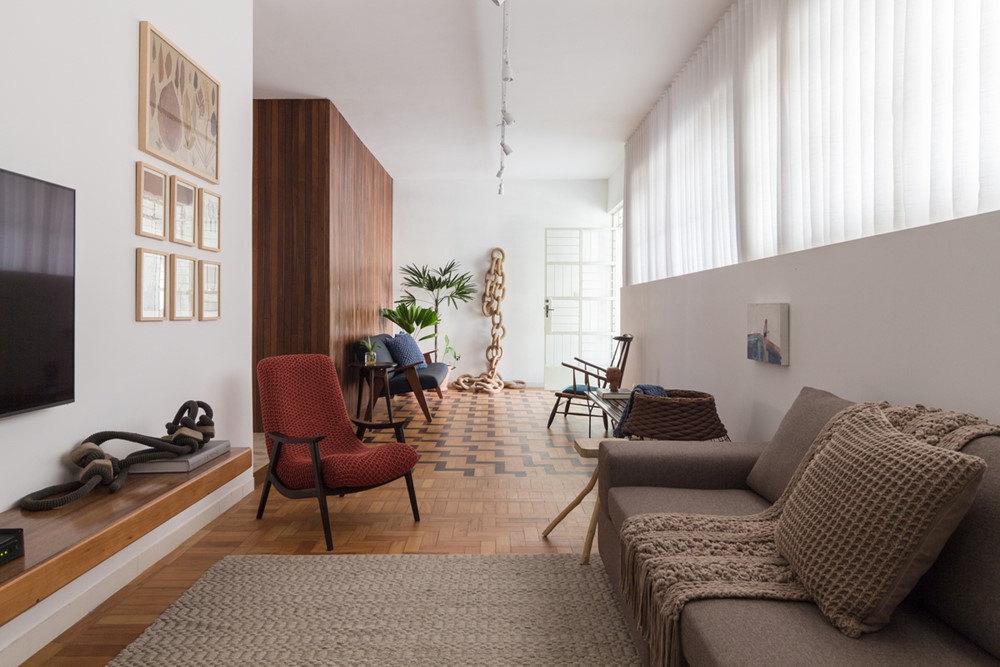
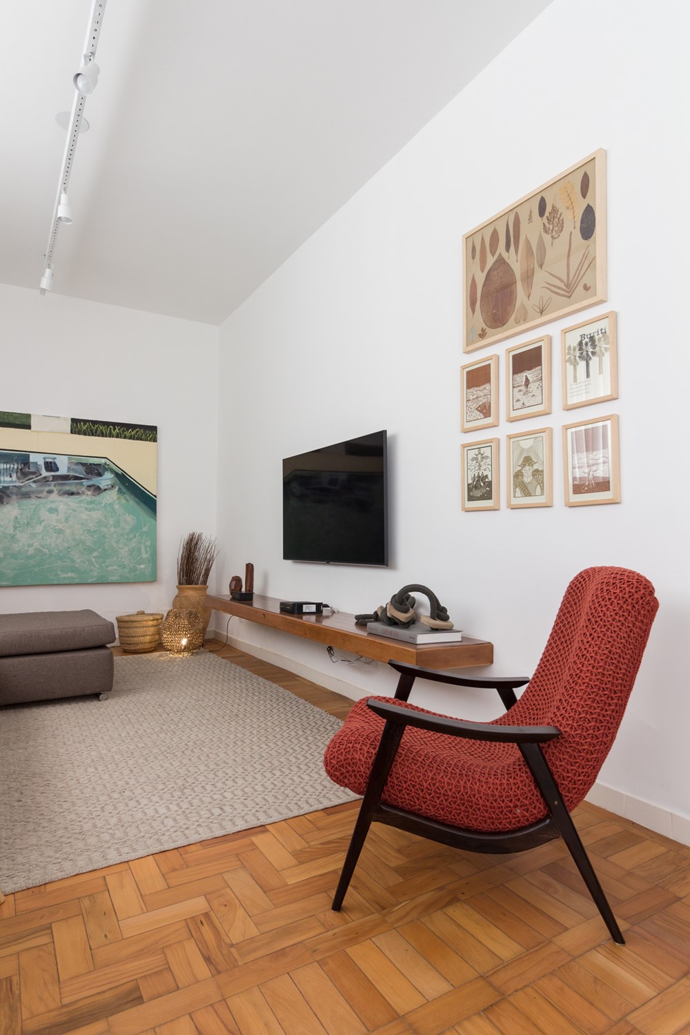
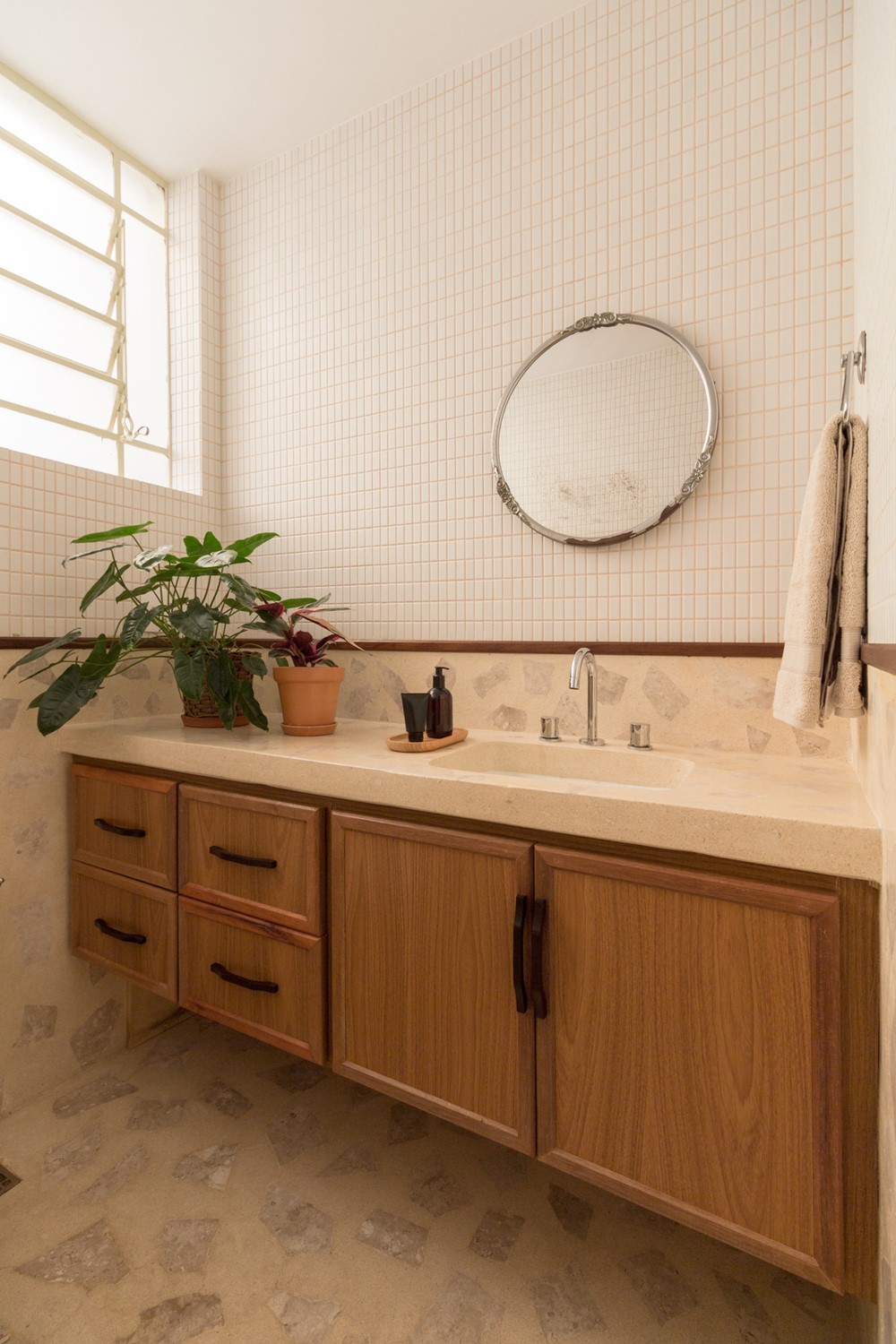
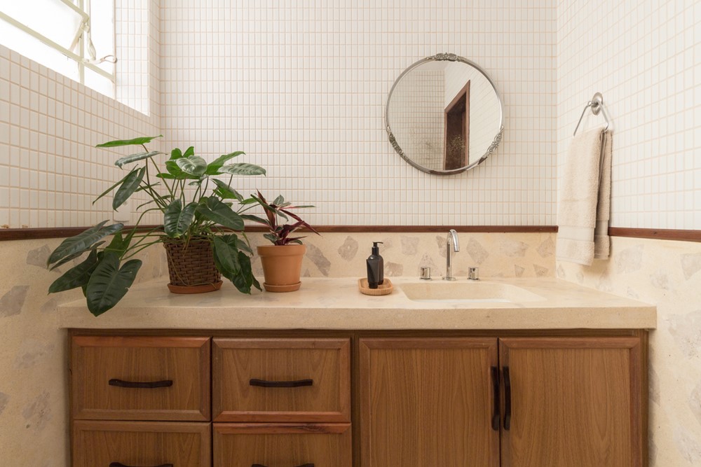
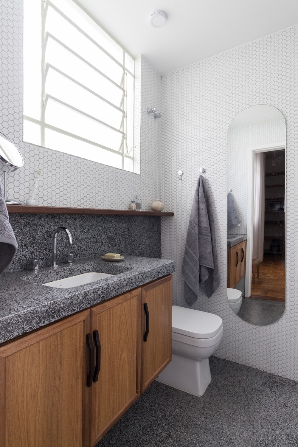
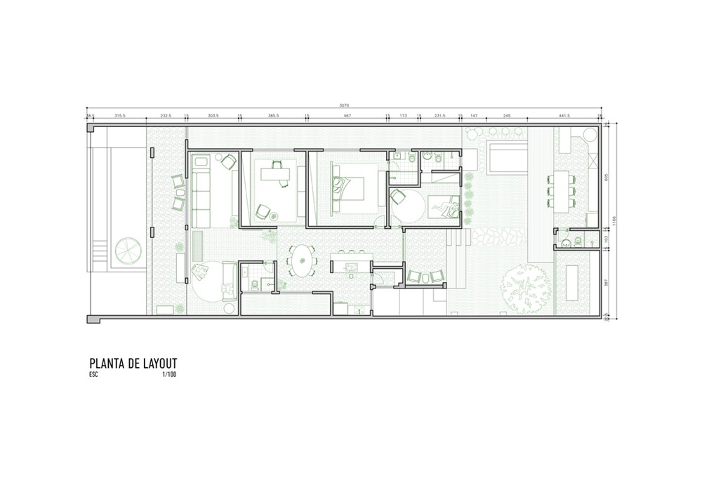
With a tight budget, we opted for a floor plan with few modifications, removed the wall that divided the living room and TV space, and reduced the social bathroom in order to create a more comfortable connection between the spaces.
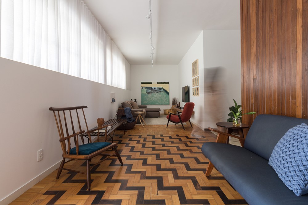
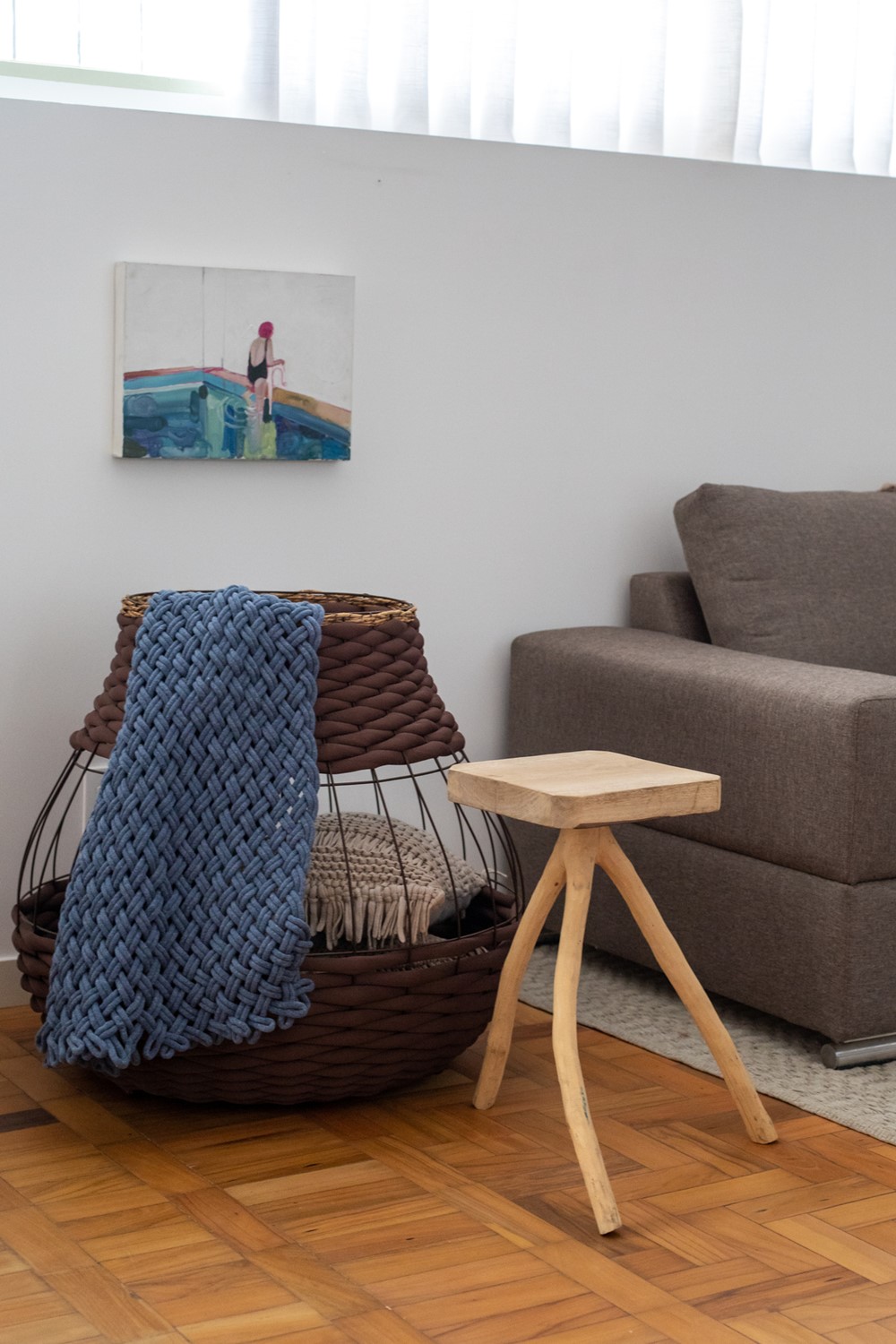
In the living room, there are two tall windows of slightly different sizes, we solved this difference by means of a curtain that crosses the room from outside to outside. We made a half wall in drywall, with an inverted curtain that hides the base of the curtain creating a linear aspect in the room. This way we reduce the cost of the curtain and don’t lose wall space for pictures and adornments.
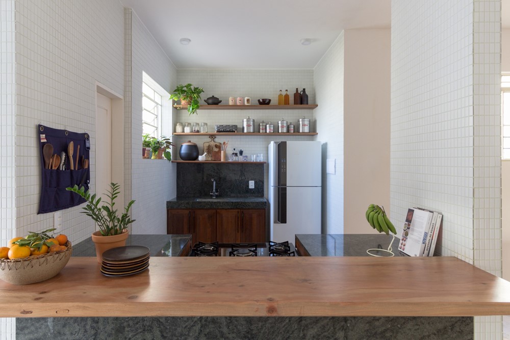
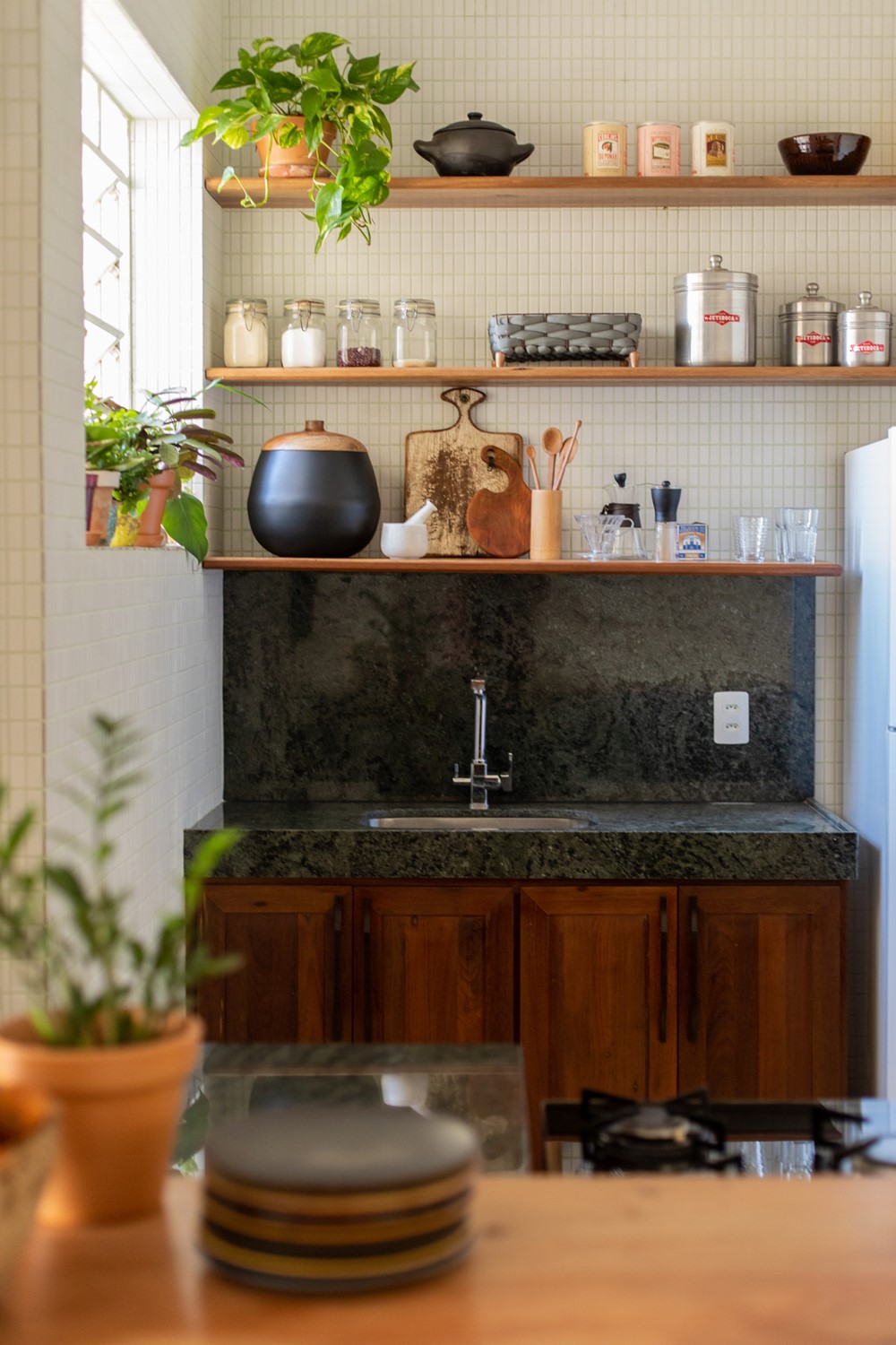
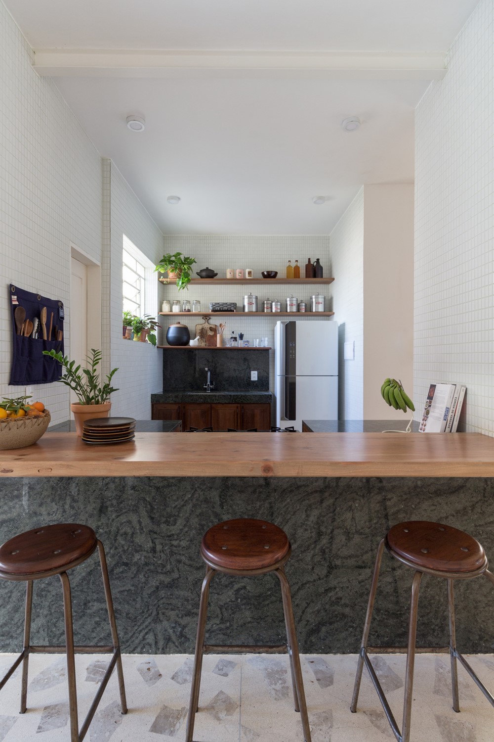
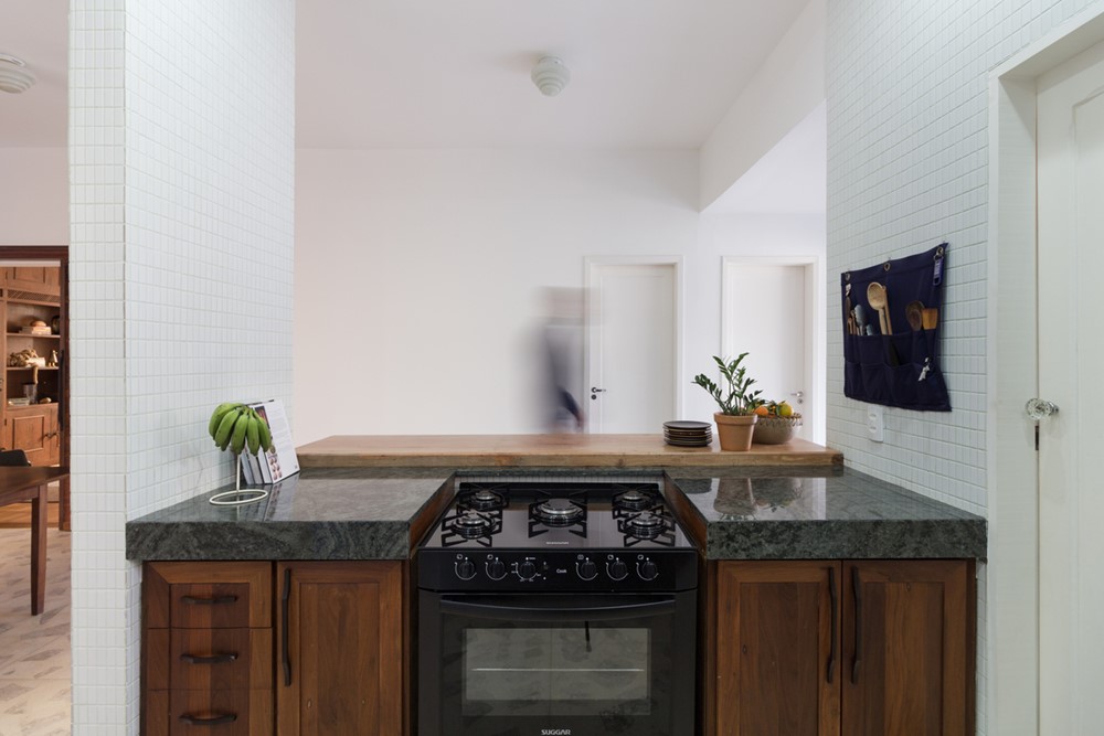
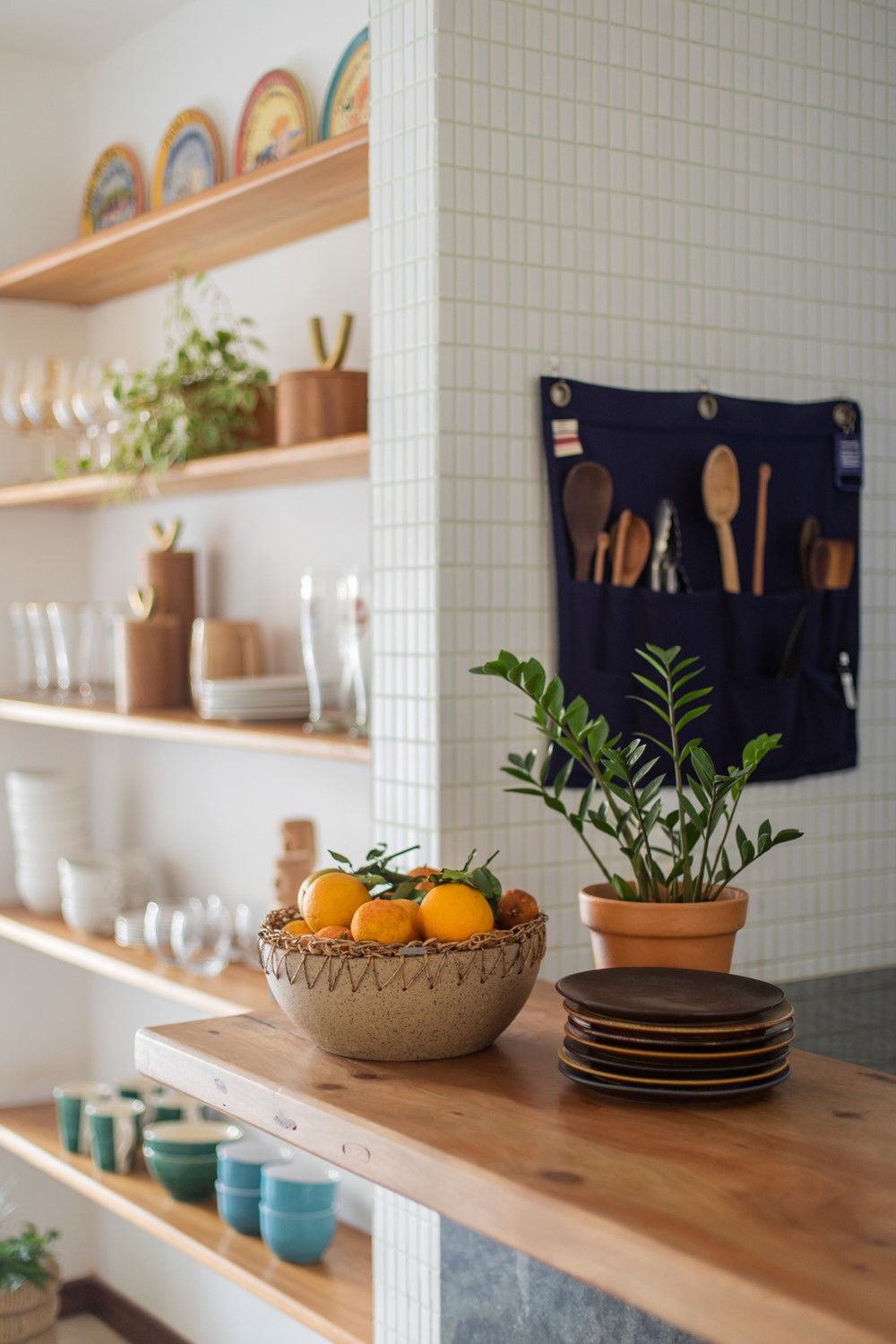
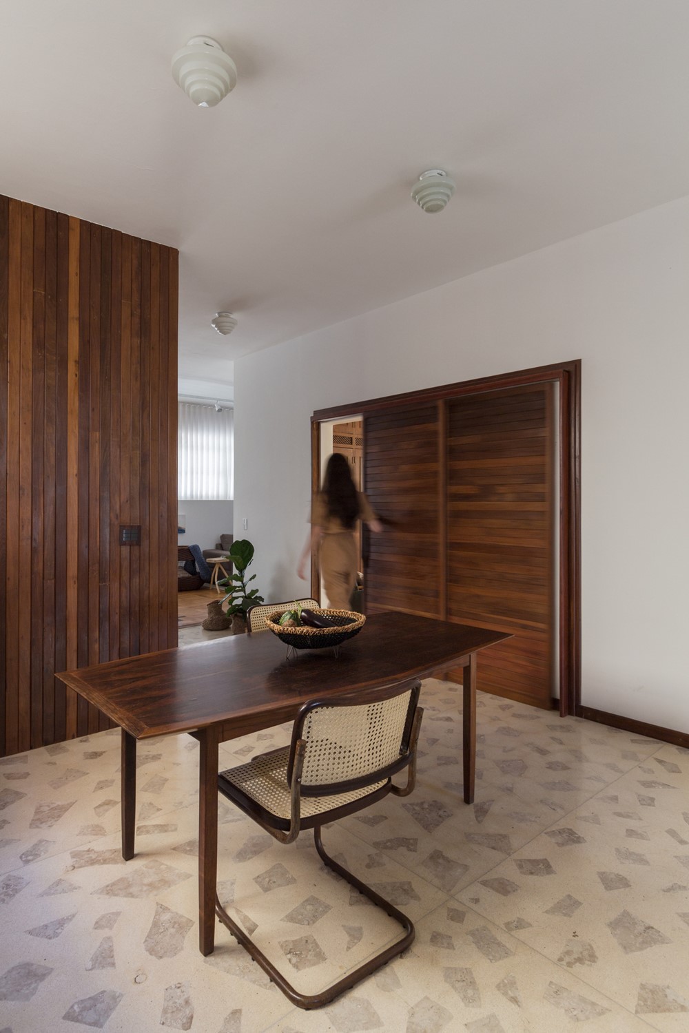
The kitchen was opened and extended towards the pantry, creating a relationship between the quick meal counter, the dining room and an open pantry that serves as a connection to the backyard porch. A secondary corridor that connected the original kitchen to the outdoor area was transformed into a closed pantry, which expands the storage and storage area.
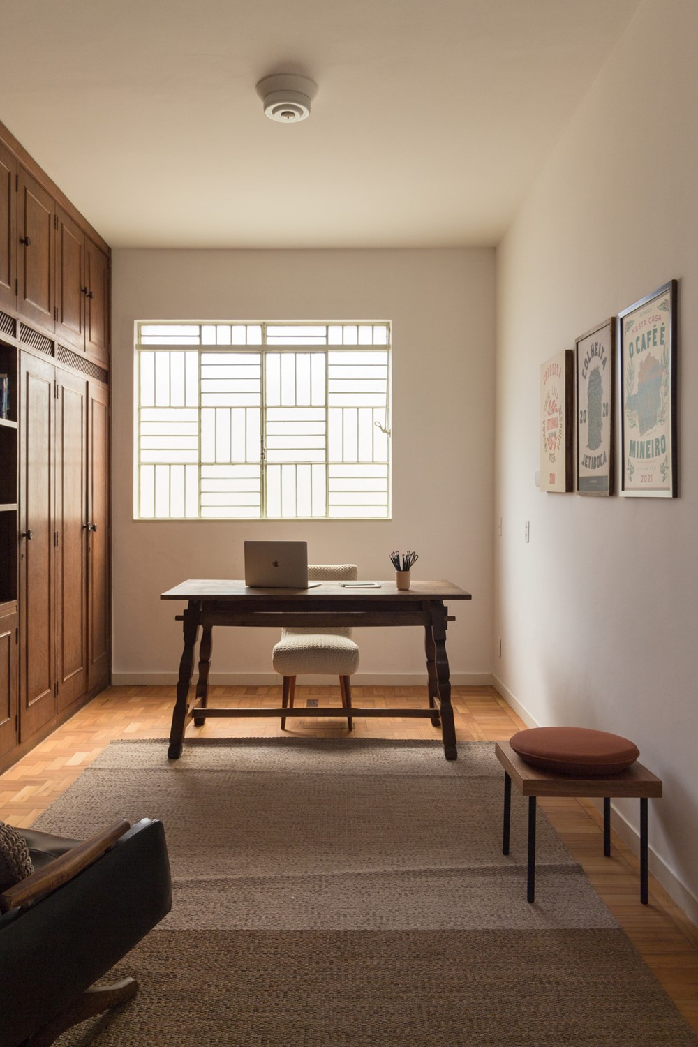
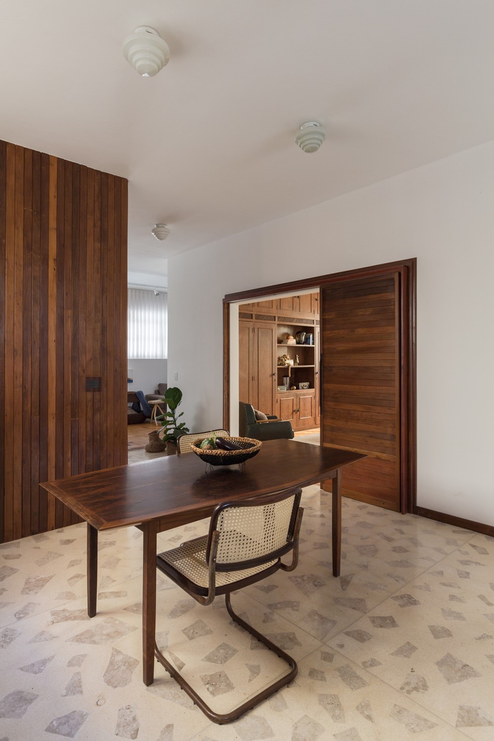
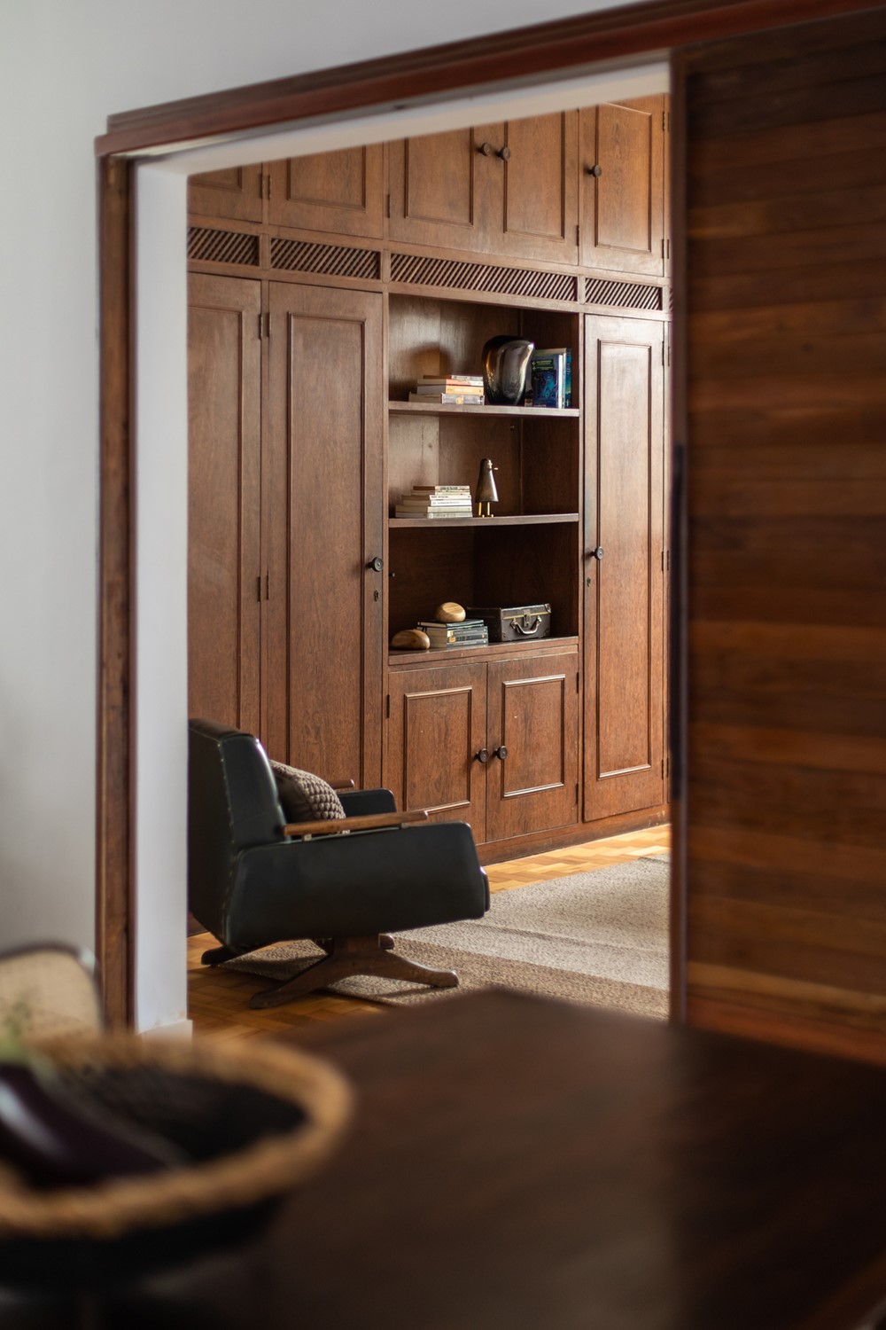
In addition, we decided to open the wall of the bedroom that was transformed into an office to create even more amplitude in relation to social spaces, and a large wooden shutter door allows the use of this space in an intimate and reserved way when necessary.
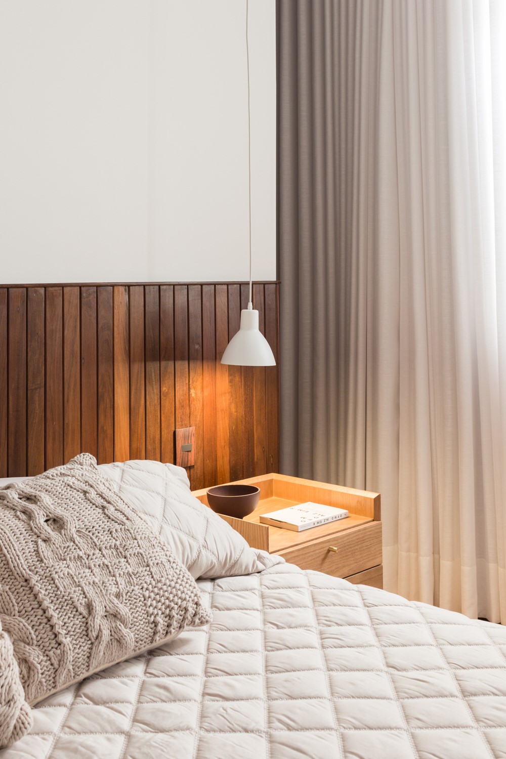
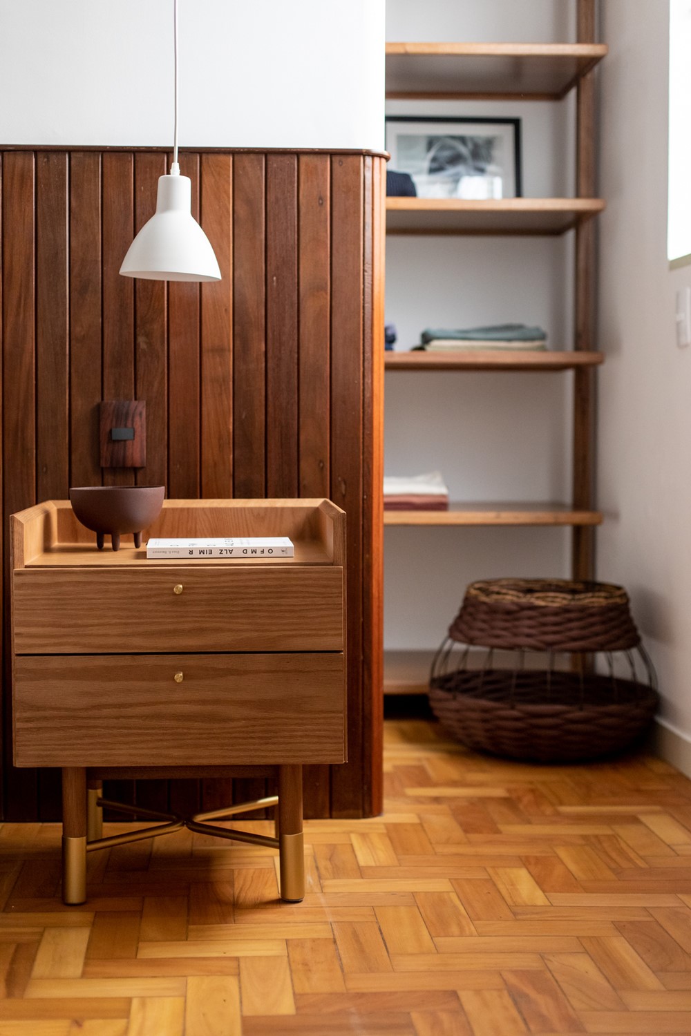
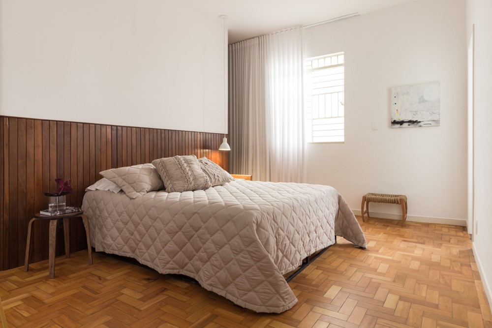
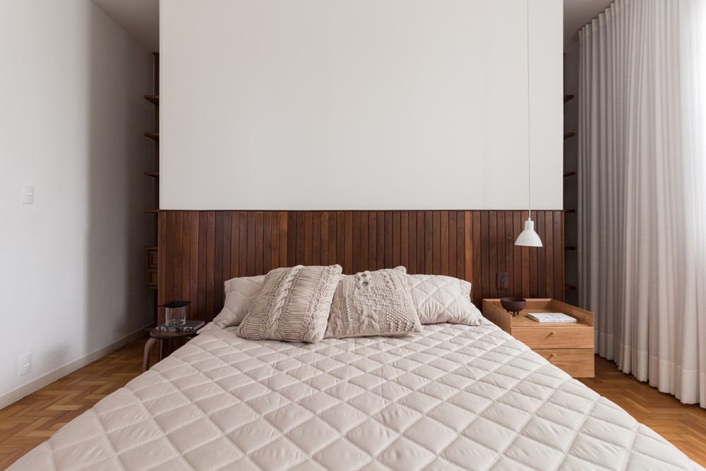
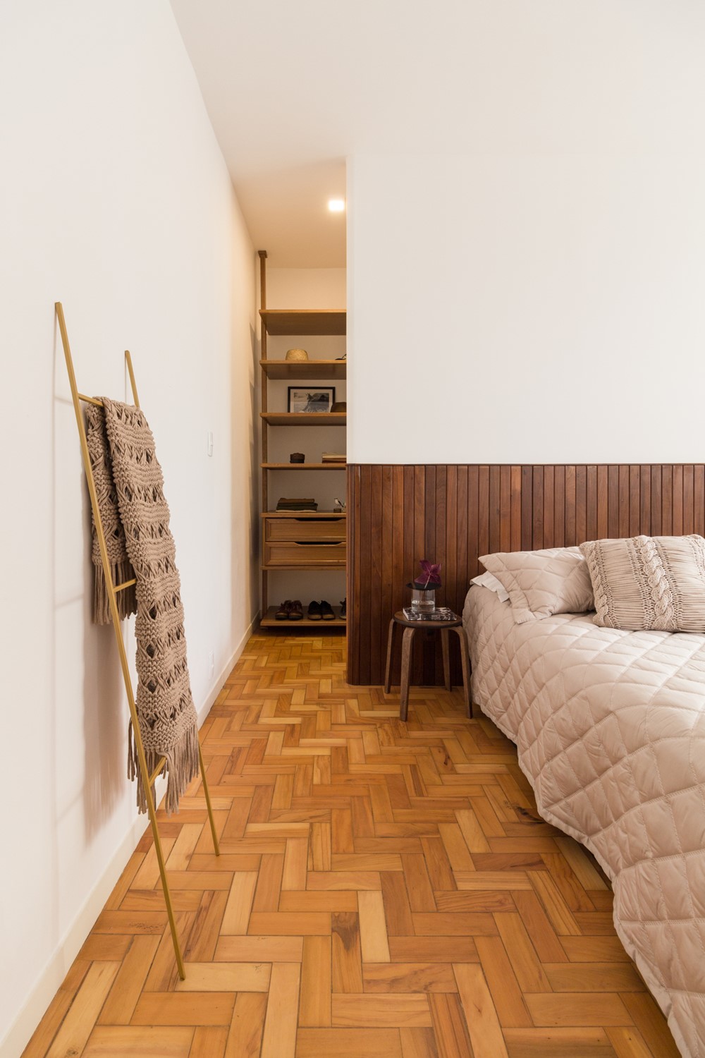
In the master bedroom, we created the closet behind the headboard wall, which was executed in wainscoting and plaster panel with rounded edges, and makes the division between bedroom and closet fluid.
