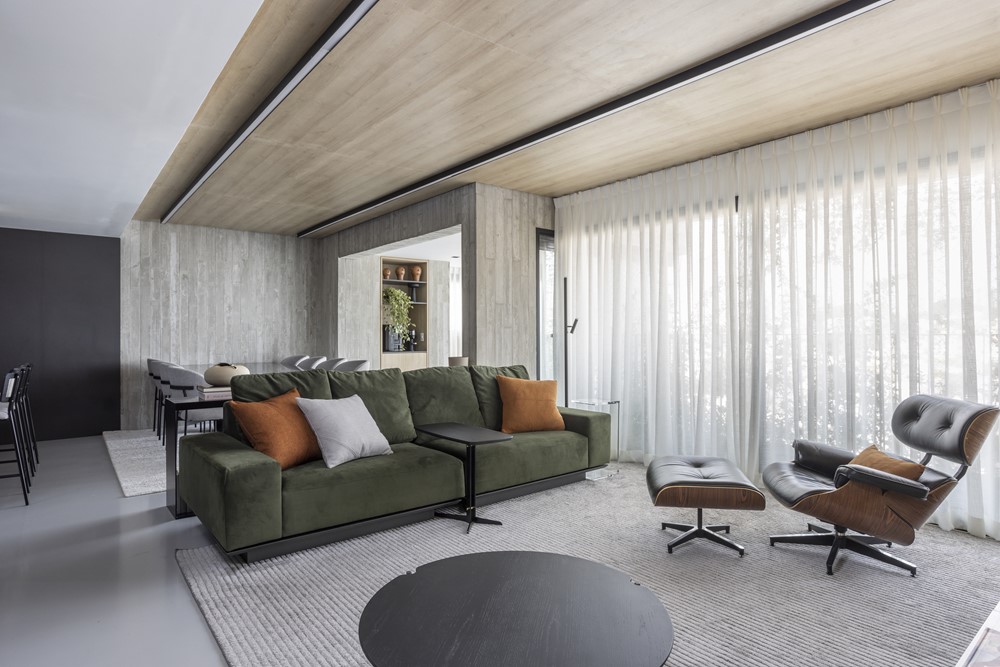
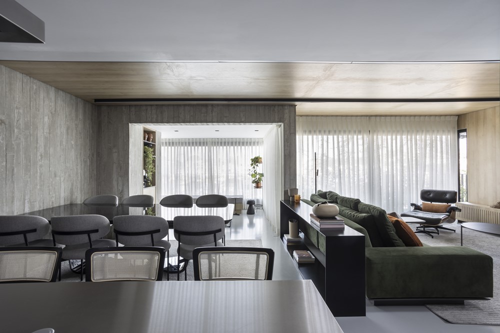
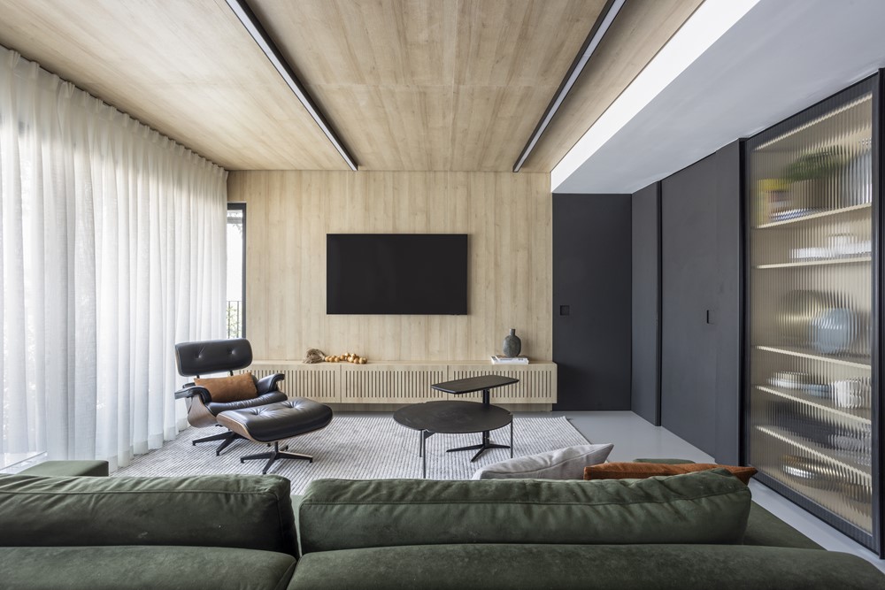
Modern and minimalist apartment with timeless design has a renovation project signed by the office NOSSA Casa Arquitetura and Cristiane Trolesi. With neutral tones and a mixture of materials and straight lines, the project of the 130m² apartment in Vila Ipojuca in São Paulo, signed by the architect and interior designer, Daniele Capo, responsible for running the office NOSSA Casa Arquitetura and in partnership with the architect Cristiane Trolesi, was thought in a simple way, but modern and minimalist. The idea was to create a harmonious and cozy environment, in which all the elements talked to each other. Photography by Evelyn Müller.
.
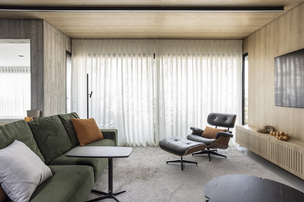

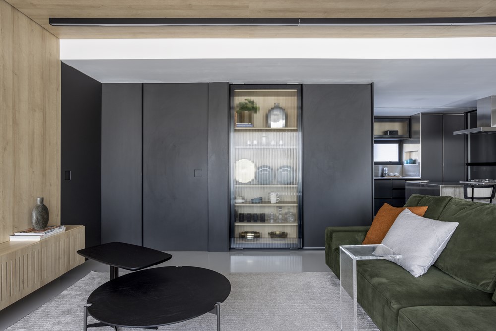
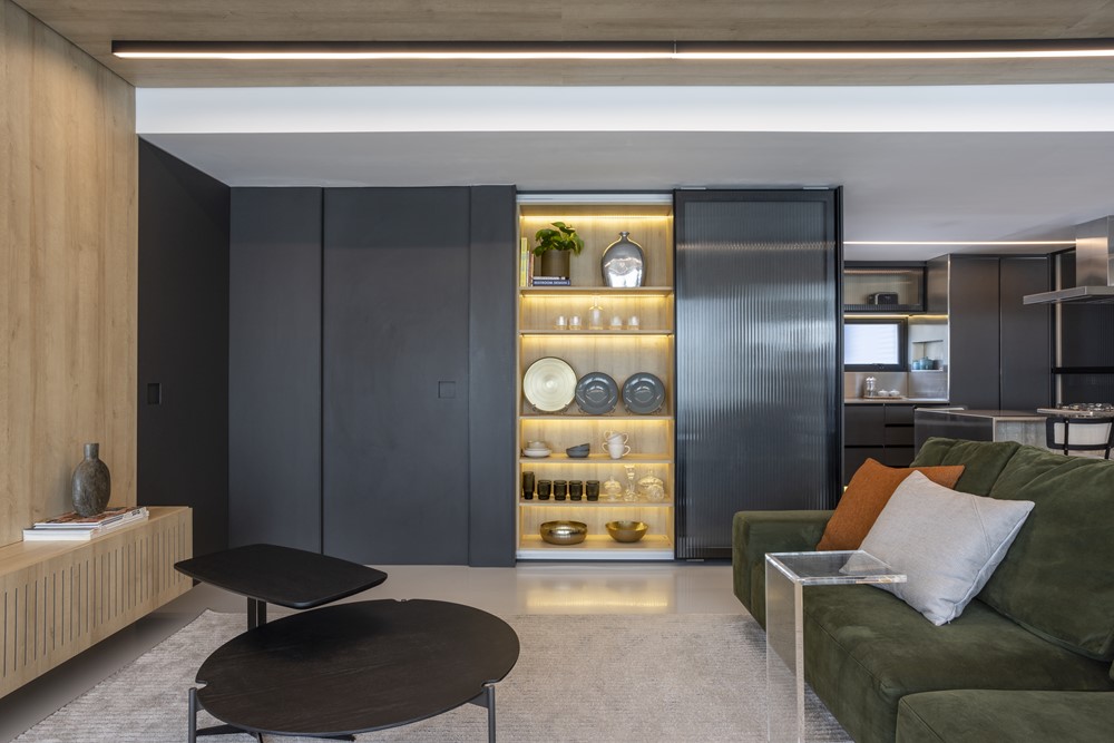
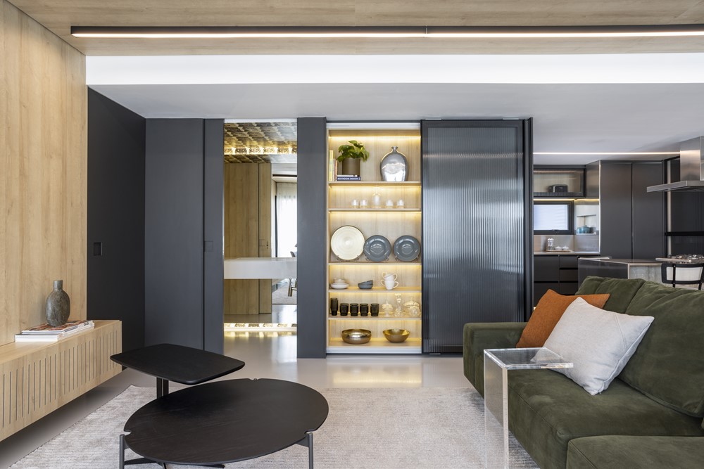
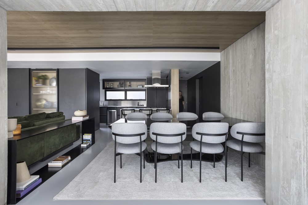
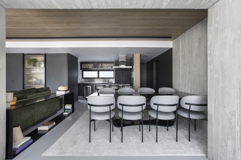
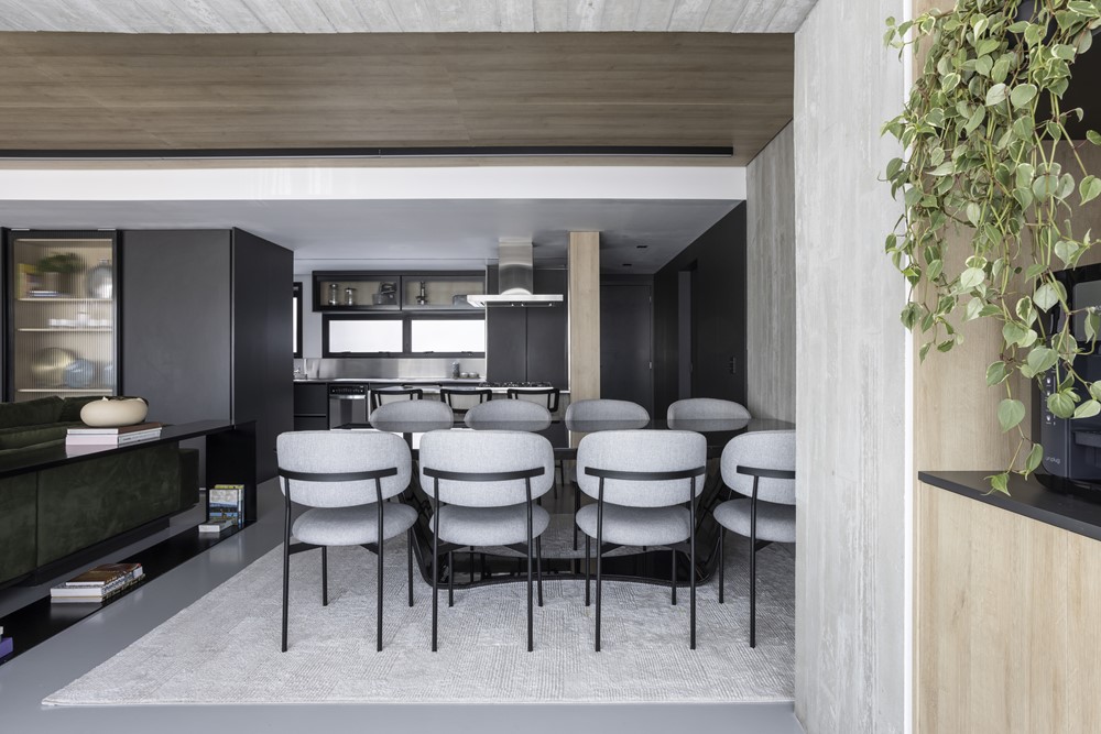
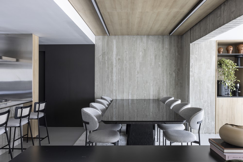
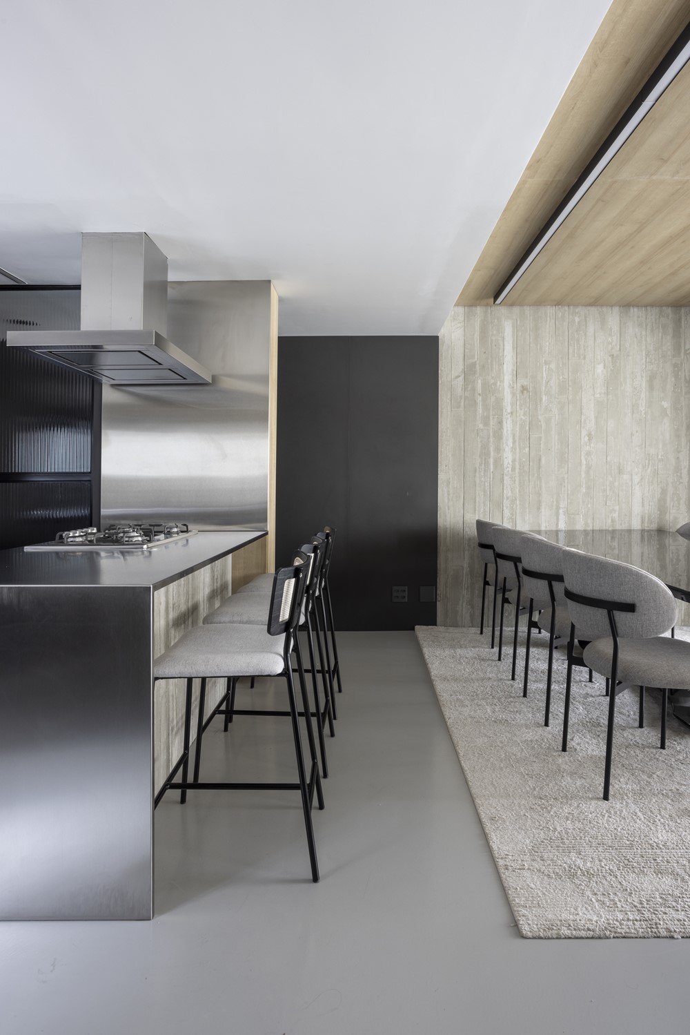
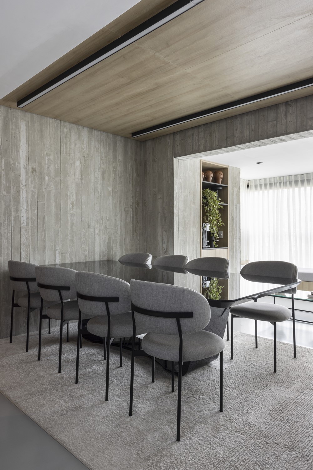
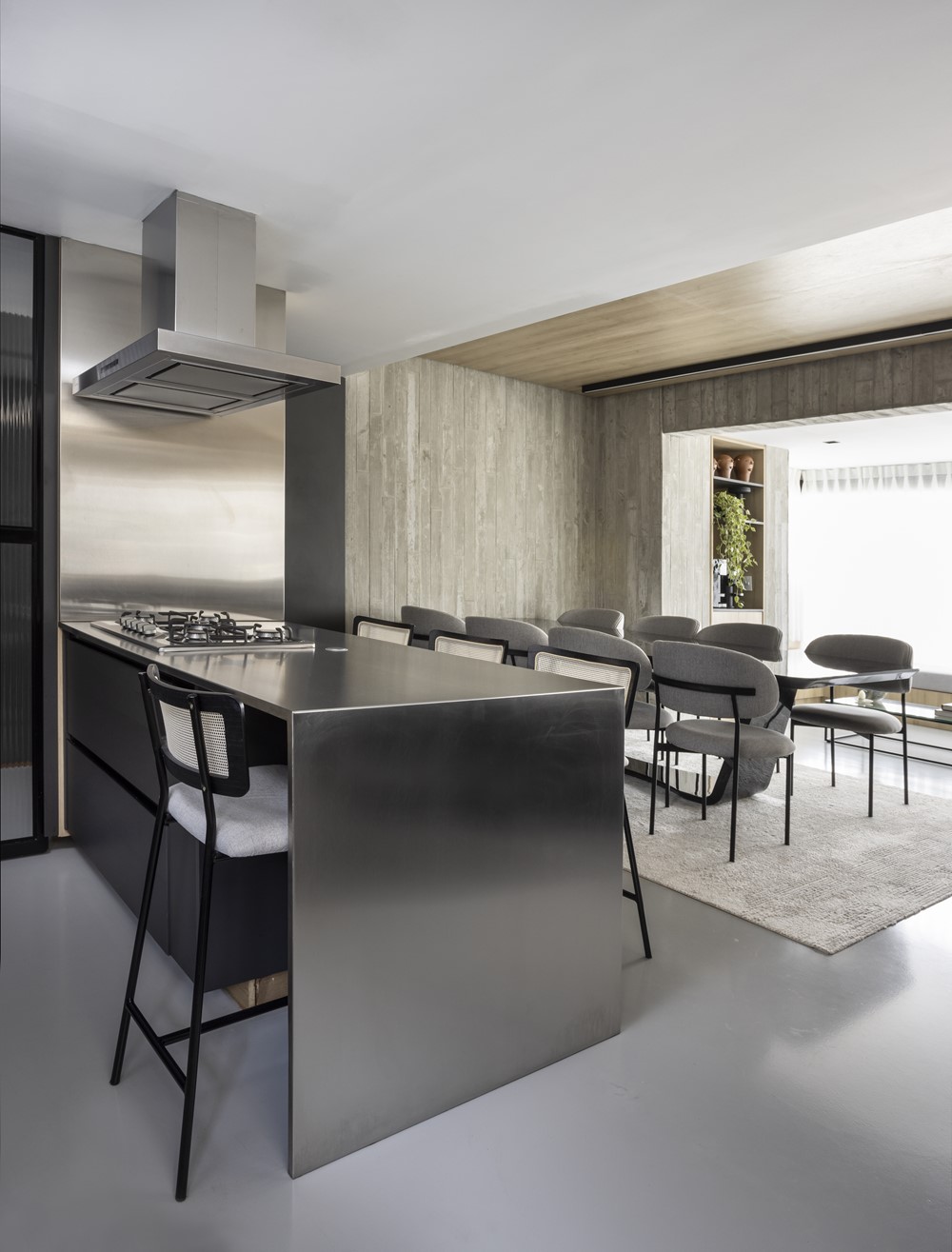
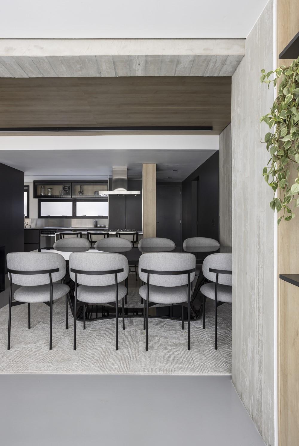

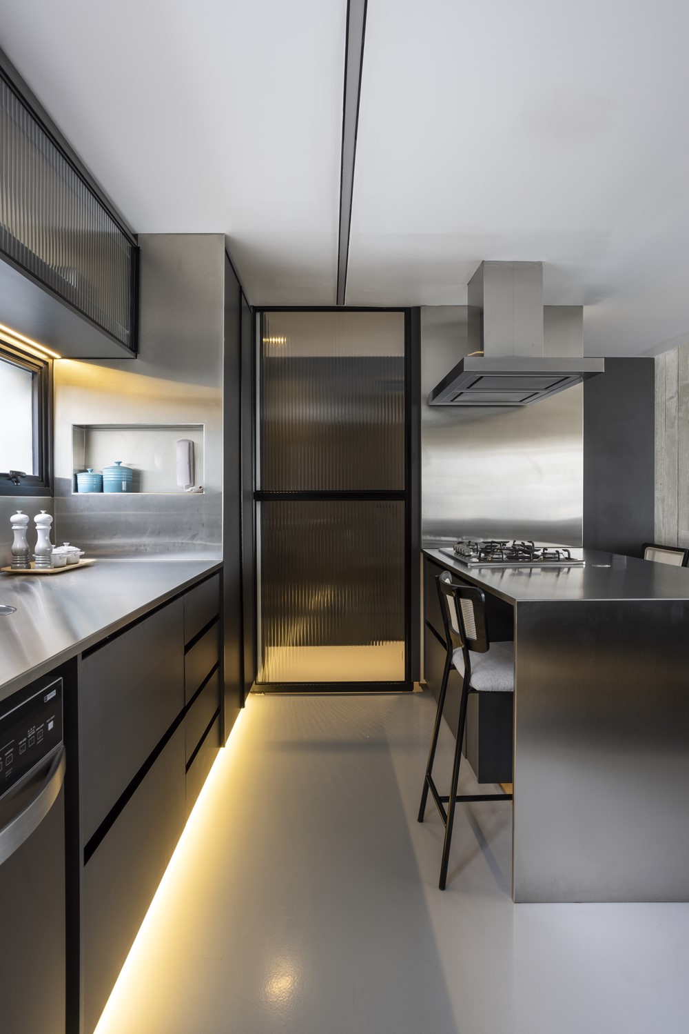
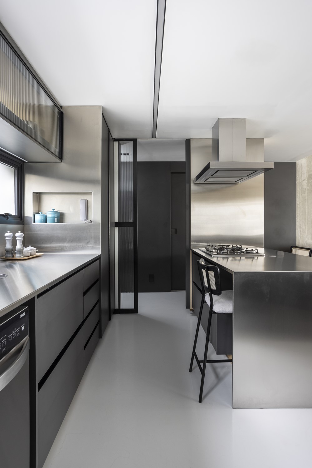
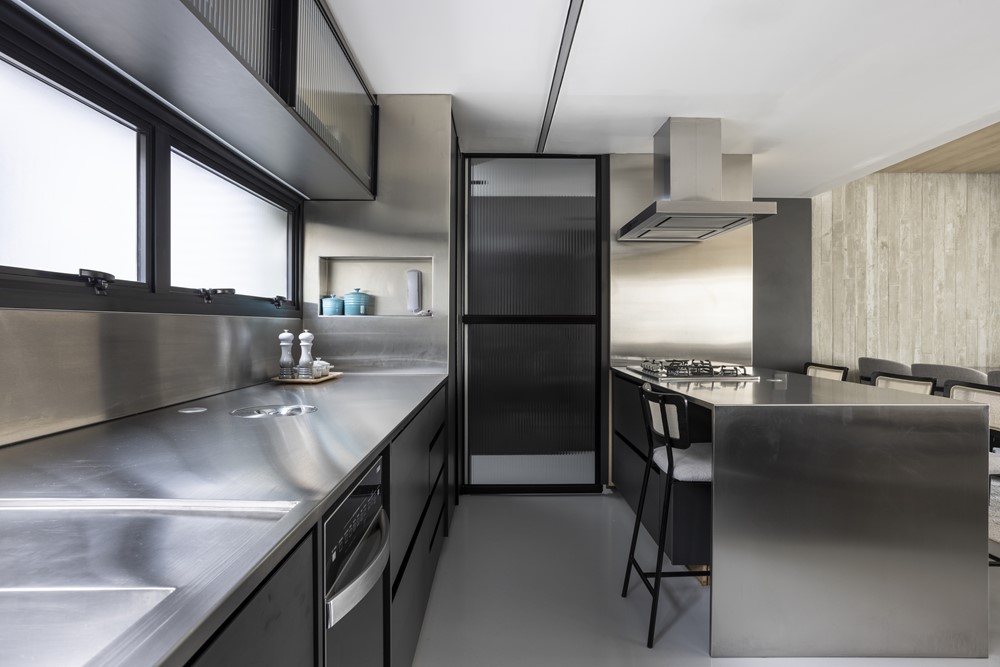

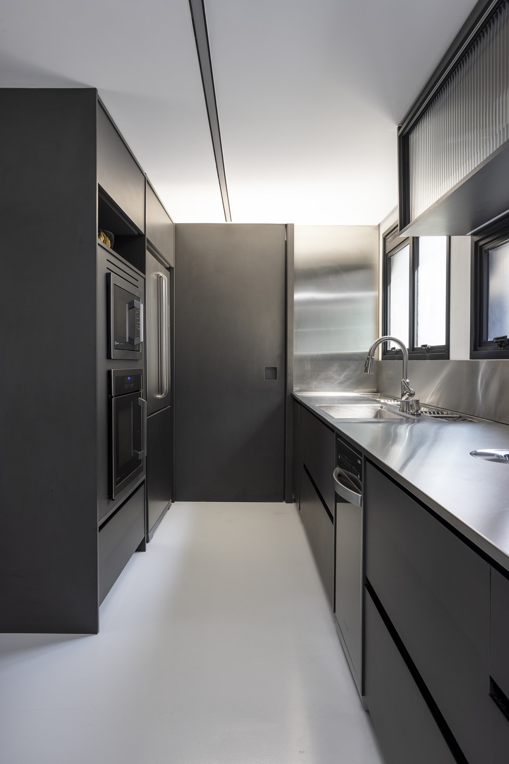

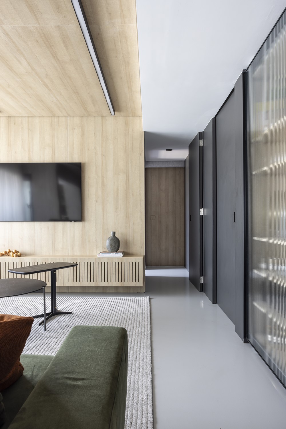
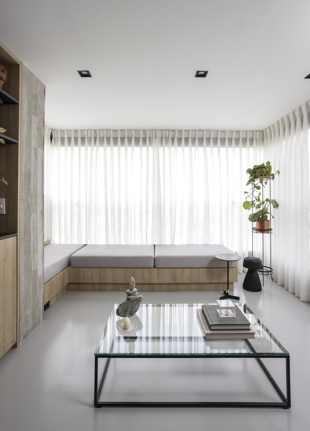
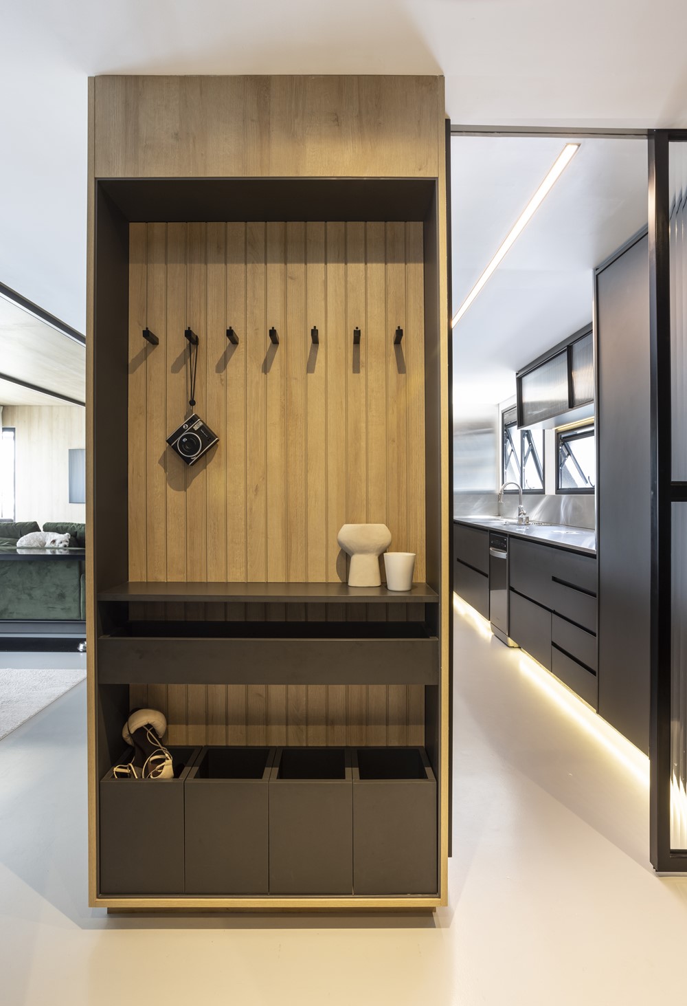

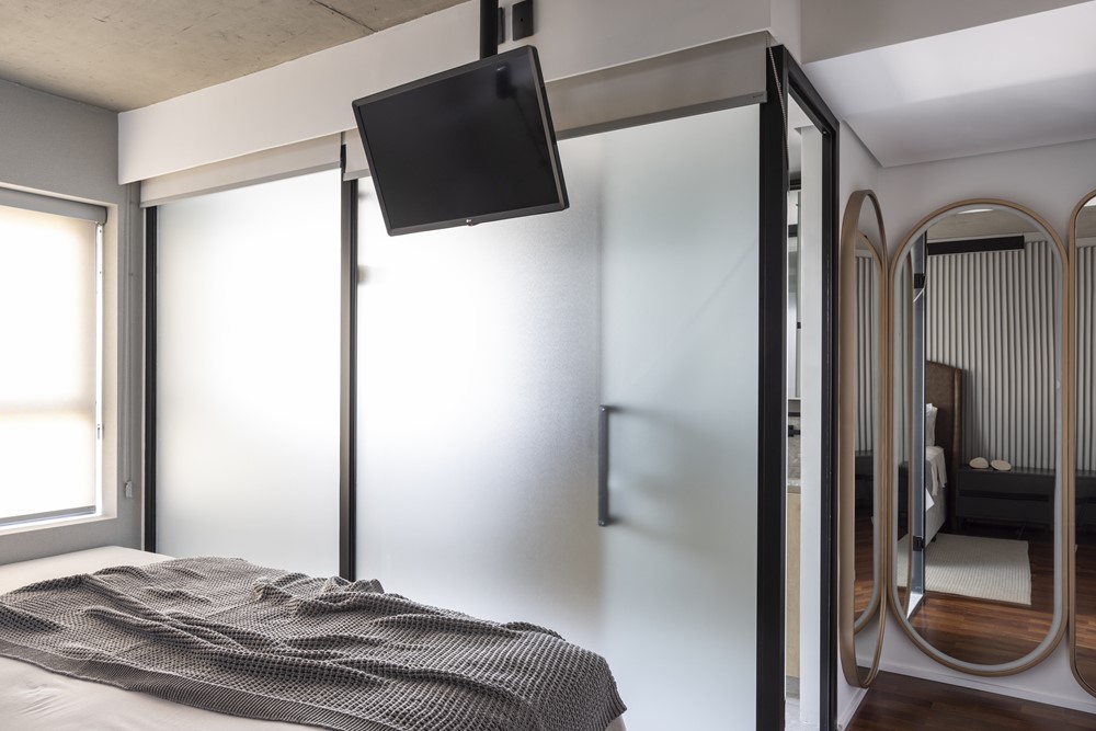

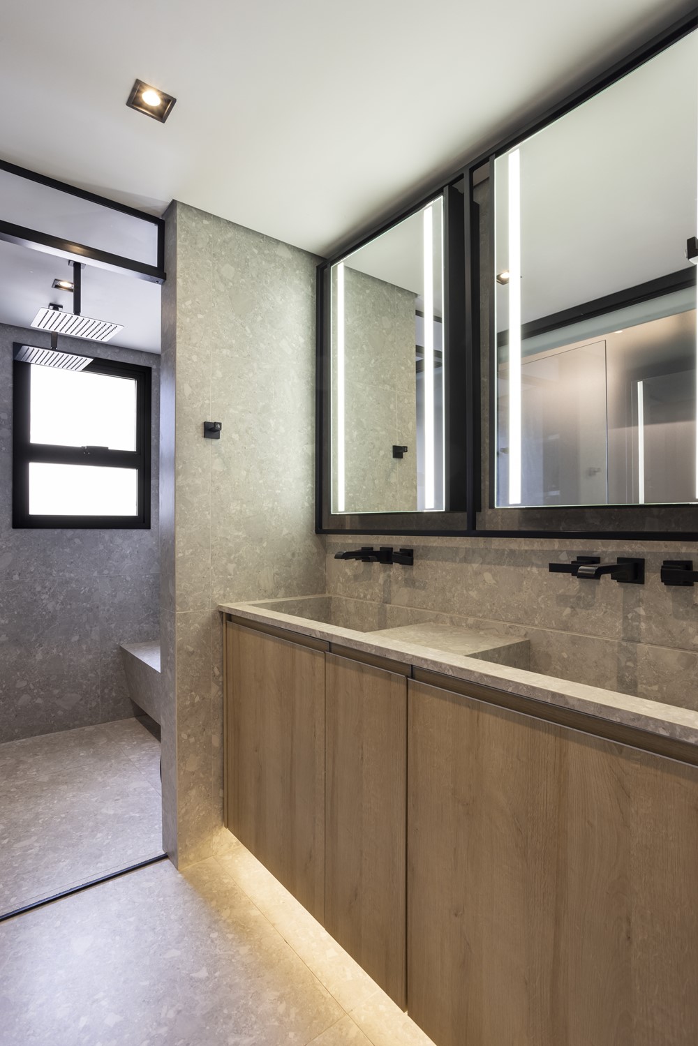


With the premise of meeting the wishes of a young couple, the apartment renovation project has a timeless design and has a lot of personality, since the interest of the clients was for a project without much information. The materials used are the main part of the project, the concrete along with the stainless steel, wood and resin help to build the contemporary and timeless concept.
The main objective was to work a wide layout and with integrated environments, such as the total integration between living room, kitchen and balcony, creating a more versatile and spacious environment. The savings of material disposal were even greater because the customer had already approved the project before the delivery of the keys. With this, the office contacted the construction company to avoid wasting material. Therefore, it was not necessary to install the countertops, metals and coatings in the wet areas, as everything would be changed.
The straight lines were worked thinking of the minimalist air and, following this thought, the office chose to hide all the doors in the wooden panels, which gave even more lightness to the environments. The main materials used were wood and concrete.
For the environment of the room, it was decided to use concrete slats, which give a brutalist air, but that opposes the wooden lining. Some other elements also end up giving an important and differentiated highlight to the project, such as the stainless steel, present in the two countertops of the kitchens and the “glass box” of the suite.
In terms of lighting, the proposal was to look for options that would create cozy scenes. In the room, two linear profiles run from end to end through the environment. To create a punctual lighting, the office chose to leave the dishes illuminated.
For the kitchen environment the lighting was thought as a differential, the masonry bases (socules) are illuminated indirectly, creating a very interesting aspect to the environment.
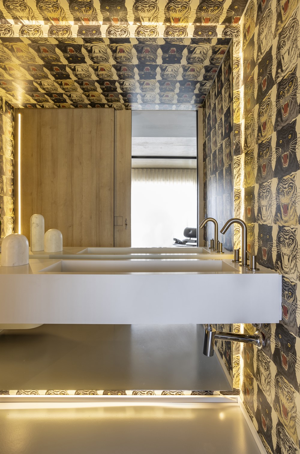
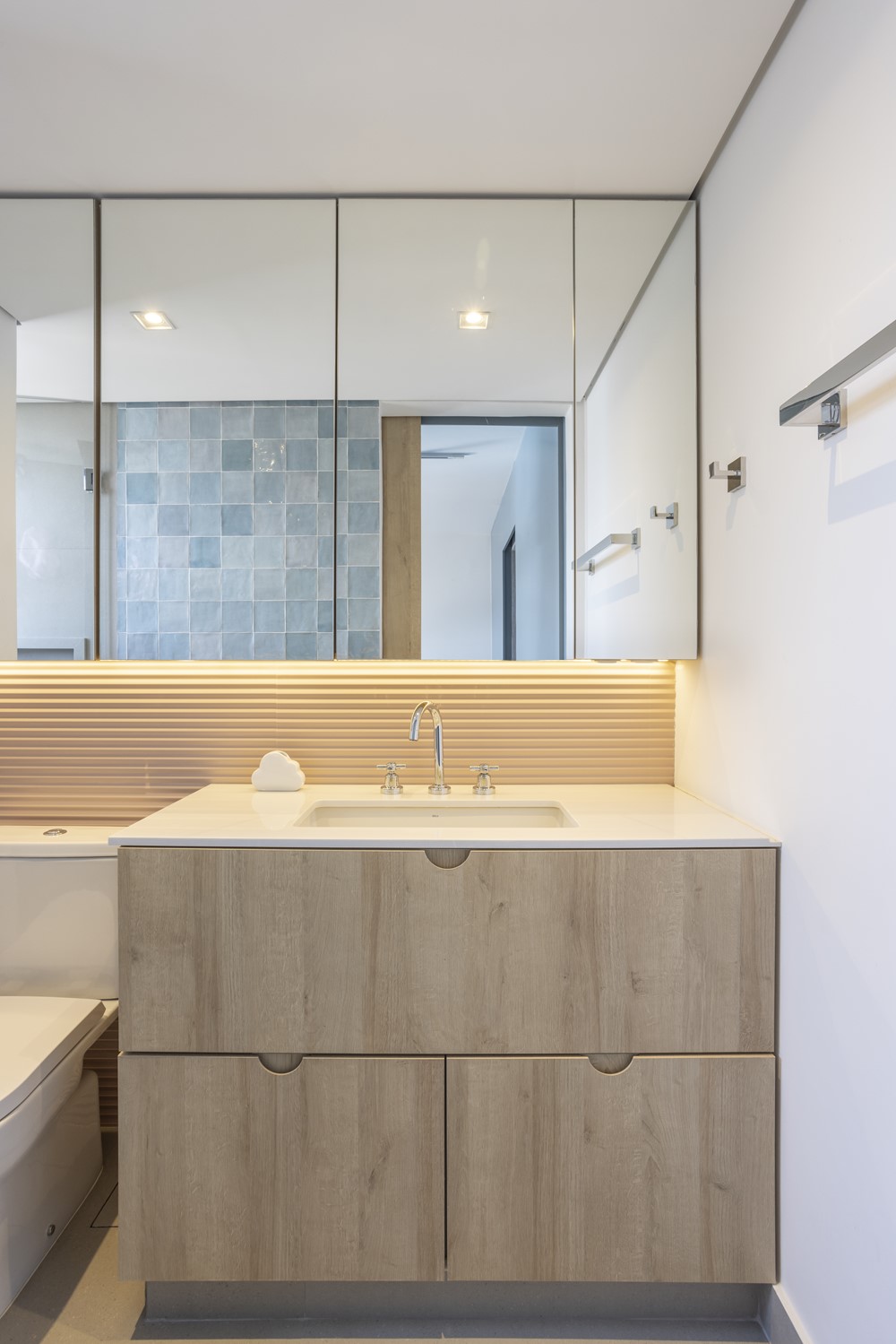
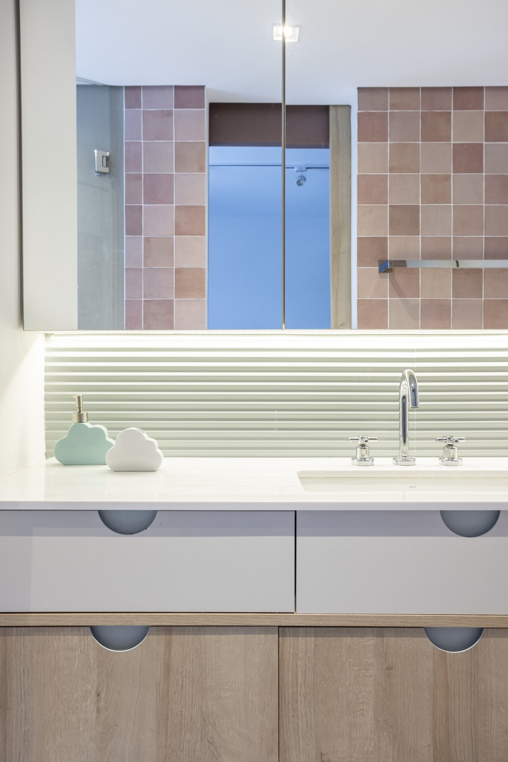
In the couple’s bedroom the profile was also used in cozy shades. Already in the bathroom, followed with the pattern on the bases, in addition to all the mirrors being illuminated, because the client is an influencer and needs good lighting. In the toilet, indirect light (behind the mirror) and punctual light was used on the wooden panel.
The biggest intervention made by the office was the change of place of the toilet. Originally, it was in the entrance of the apartment, on the left side, however, more space was needed in the suite, because the client needed a lot of closet. With this, it was necessary to take a part of the service area to make the new toilet.
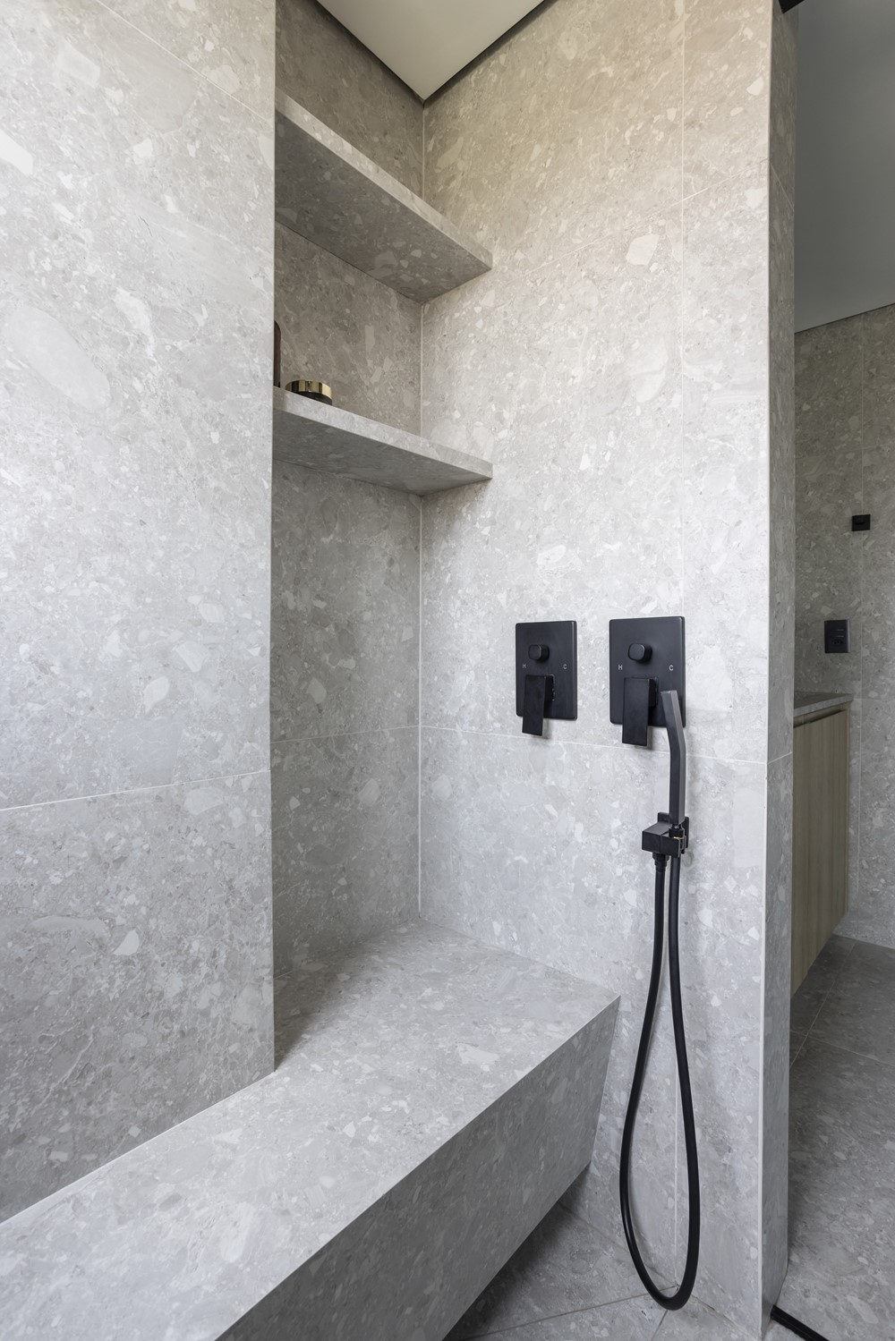
In the master suite, the option adopted was to leave the concrete apparent on the slab, there were some interventions such as the disassociation of the bench and shower with the toilet area, letting the toilet cabin stay where, initially, was the toilet – occupying a much smaller area, precisely to have space for cabinets, in addition to the removal of the masonry walls and the insertion of a glass partition with film.
TECHNICAL
Project: Our House Architecture
Architecture: Daniele Capo
Management/Coordination: Our House Architecture
Location: Vila Ipojuca – São Paulo – SP
Year: 2022
Area: 130m²
Photo credit: Evelyn Müller
Our House Architecture
