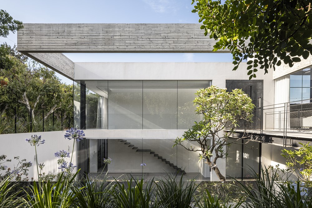
Next to an Avocado plantation, a unique architecture combined with modern elements is built from the ground up by Architect Raz Melamed, who designed this three generation home overlooking a view taken straight from a postcard. Photography by Amit Garon. Assistant Photographer: Michael Shevdron.


The structure is home to a couple with three children, and their eldest daughter who had three children of her own. The family asked for a space to house their extended privacy while maintaining privacy for everyone.
The design plan answered this need by creating two separate houses,
one house for the parents and the children and a second house for the daughter and grandchildren), who share the same yard and pool, but keep separate from each other thanks to the topography.
The fronts of each house face the street and two overlook the pool.
A floating concrete beam wraps the building and ” protects” it from the passers by, creating a uniform facade for the street in the form of an airy membrane that is partially sealed and partially open. A patio sits between the wings in the corner of the house, overlooking the street it separates a yard to the basement above which a bridge to the main entrance to the house.
The beam is reflected in the mirror pool below, which turns into black terraces that descend towards the basement. These create an encounter with the patio vegetation that creates privacy, as well as curtains that are spread over the huge openings.
Above the patio the entrance bridge leads to the main door of the house, which is paved with stone that also extends to the inside of the house, signaling a prominent interior exterior connection.
This connection is strengthened through the large windows that project the view inward, and the entrance to the house is in sight.
Another element that reinforces continuity is the pergola that stretches along the second house, creating an axis that connects the two houses despite their different height across the property.
This structure reflects the architect’ s view: the more open = the more beautiful. Melamed uses a small number of walls for an open and clean look and a design in order to create an open space without divisions and sections by using constructive columns.
Moreover, the columns in the space are placed in a grid that does not line up with the front, allowing a sequence of windows without interruptions.


